
500 word synopsis
Draft 1:
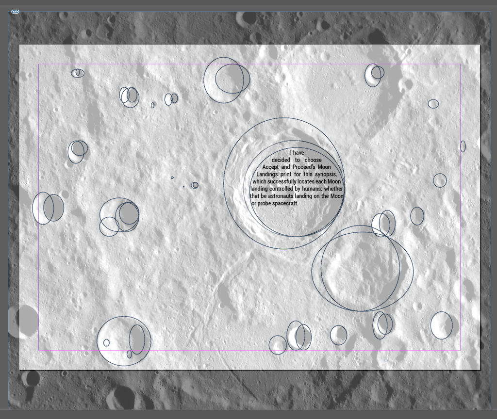
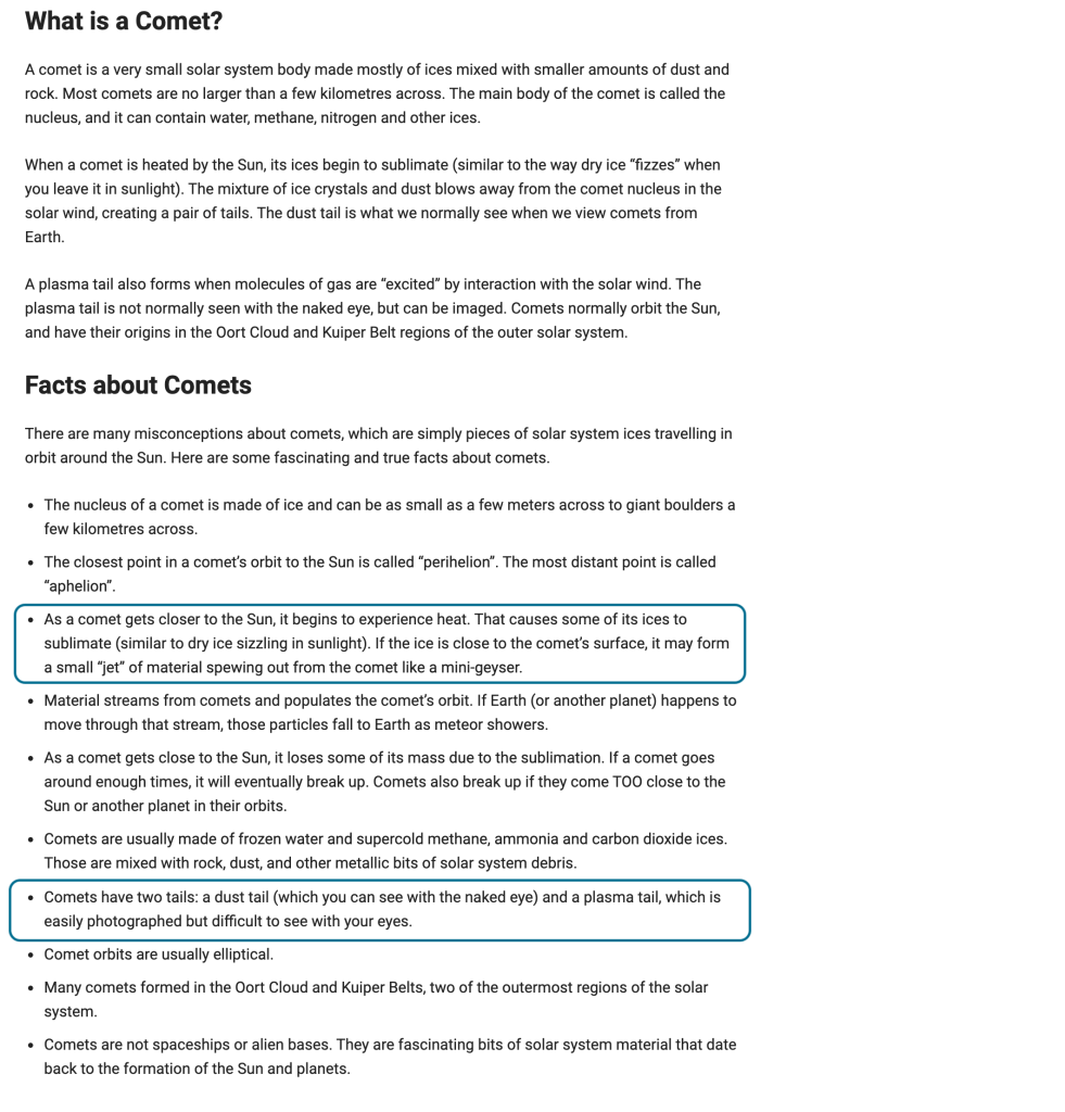
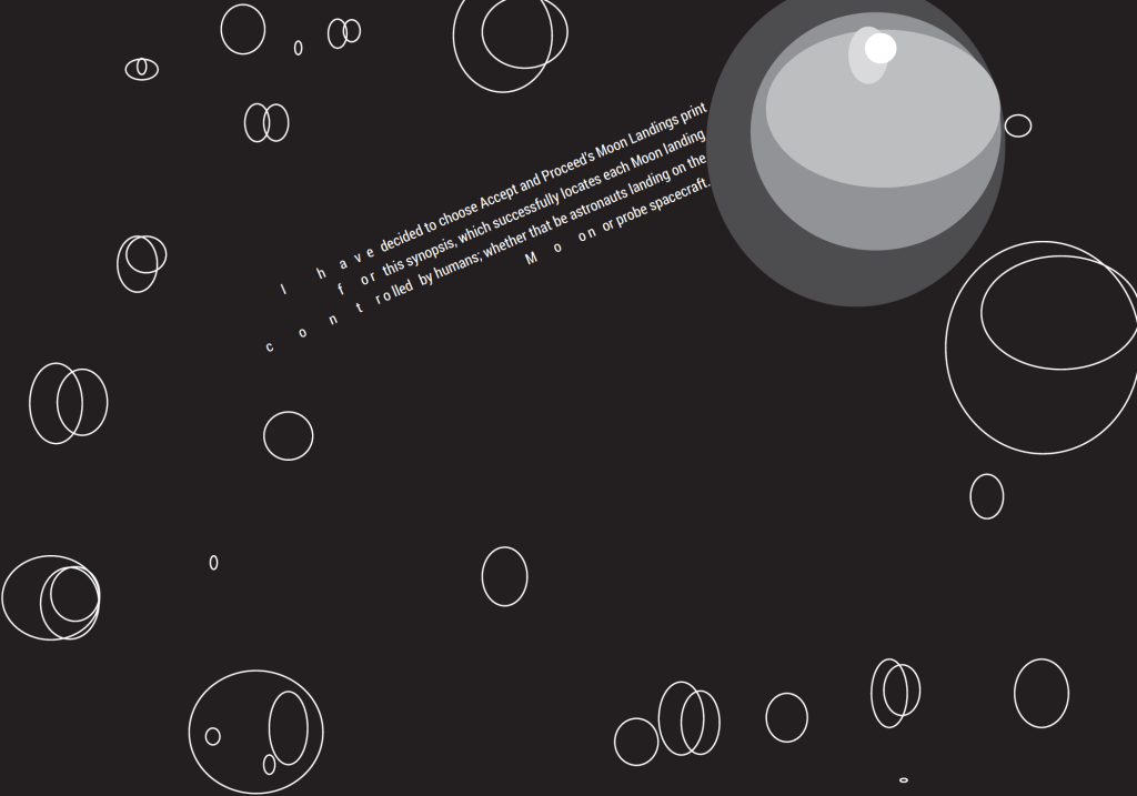
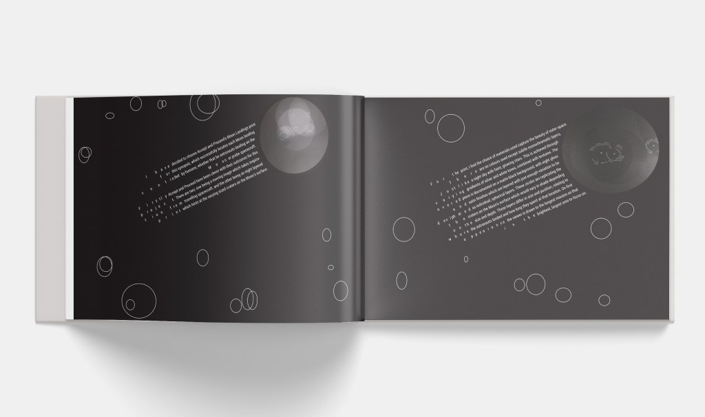
“I have decided to choose Accept and Proceed’s Moon Landings print for this synopsis, which successfully locates each Moon landing controlled by humans; whether that be astronauts landing on the Moon or probe spacecraft.
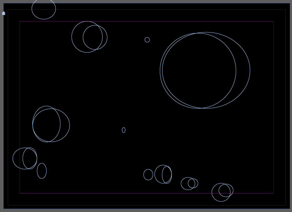
Firstly, Accept and Proceed have been clever with their outcomes for this project. There are two; one being a moving image which takes inspiration from travelling spacecraft, and the other being an eight layered print which hints at the varying sized craters on the Moon’s surface.
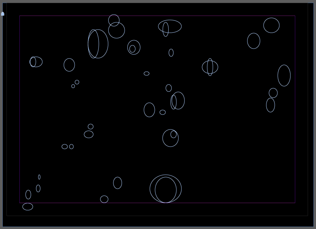
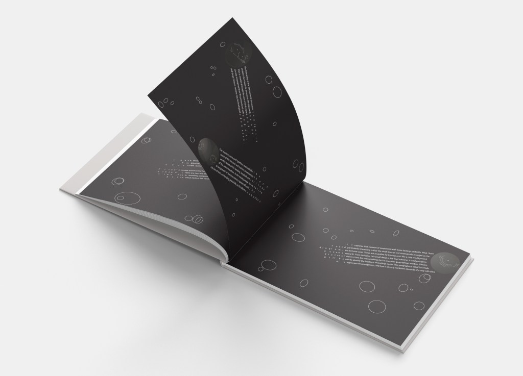
For the print, I find the choice of materials used capture the beauty of outer space. There are no colours used except subtle monochromatic layers, just like a night sky with faint, glowing stars. This is achieved through varying gradients of silver and white tones, combined with textures. The overall piece is documented on a matte black background, with eight gloss and satin finishes which are layered with just enough variation to be deciphered as individual, spherical layers. These circles are replicating the craters on the Moon’s surface which would vary in shade depending on the size and depth. These layers differ in size and position, relating to where the astronauts landed and how long they spent at that location. On first appearance, the viewer is drawn to the longest mission as that is the brightest, largest area to focus on.
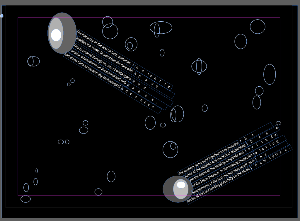
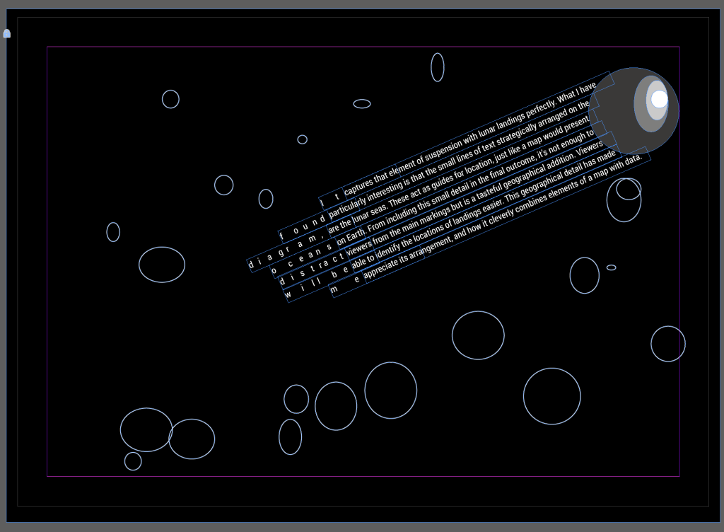
The hierarchy of the text on both outcomes, instantly enables the viewer to associate the data with space. This is created through the use of white space and circular arrangement on the printed and web pages, and drops hints at modern day technological advances. The modern, sans-serif typeface used includes the name of the mission and numerical sequences; these are dates of landing, longitude and latitude of the Moon location. In the moving image, the rotating arrangement of the text mimics spacecraft, as if the circles of text are landing gracefully on the Moon themselves. It captures that element of suspension with lunar landings perfectly. What I have found particularly interesting is that the small lines of text strategically arranged on the diagram, are the lunar seas. These act as guides for location, just like a map would present oceans on Earth. From including this small detail in the final outcome, it’s not enough to distract viewers from the main markings but is a tasteful geographical addition. Viewers will be able to identify the locations of landings easier. This geographical detail has made me appreciate its arrangement, and how it cleverly combines elements of a map with data.
I can see where six missions have resulted in mankind exploring the Moon’s surface as they are visible. However what I can also see is that there are at least eleven, very faint and almost transparent, probe landings where robots have landed. The opacity of these instantly tells me they were not very long missions but renders them successful as they completed their task. I would consider the final outcomes to be successful due to telling stories through data visualisation.”
Draft 2 – changed the last paragraph:
“I have decided to choose Accept and Proceed’s Moon Landings print for this synopsis, which successfully locates each Moon landing controlled by humans; whether that be astronauts landing on the Moon or probe spacecraft.
Firstly, Accept and Proceed have been clever with their outcomes for this project. There are two; one being a moving image which takes inspiration from travelling spacecraft, and the other being an eight layered print which hints at the varying sized craters on the Moon’s surface.
For the print, I find the choice of materials used capture the beauty of outer space. There are no colours used except subtle monochromatic layers, just like a night sky with faint, glowing stars. This is achieved through varying gradients of silver and white tones, combined with textures. The overall piece is documented on a matte black background, with eight gloss and satin finishes which are layered with just enough variation to be deciphered as individual, spherical layers. These circles are replicating the craters on the Moon’s surface which would vary in shade depending on the size and depth. These layers differ in size and position, relating to where the astronauts landed and how long they spent at that location. On first appearance, the viewer is drawn to the longest mission as that is the brightest, largest area to focus on.
The hierarchy of the text on both outcomes, instantly enables the viewer to associate the data with space. This is created through the use of white space and circular arrangement on the printed and web pages, and drops hints at modern day technological advances. The modern, sans-serif typeface used includes the name of the mission and numerical sequences; these are dates of landing, longitude and latitude of the Moon location. In the moving image, the rotating arrangement of the text mimics spacecraft, as if the circles of text are landing gracefully on the Moon themselves. It captures that element of suspension with lunar landings perfectly. What I have found particularly interesting is that the small lines of text strategically arranged on the diagram, are the lunar seas. These act as guides for location, just like a map would present oceans on Earth. From including this small detail in the final outcome, it’s not enough to distract viewers from the main markings but is a tasteful geographical addition. Viewers will be able to identify the locations of landings easier. This geographical detail has made me appreciate its arrangement, and how it cleverly combines elements of a map with data.
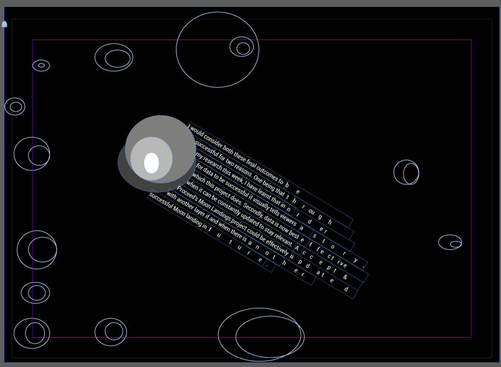
I would consider both these final outcomes to be successful for two reasons. One being that through my research this week, I have learnt that in order for data to be successful it visually tells viewers a story, which this project does. Secondly, data is now best effective when it can be constantly updated to stay relevant. Accept & Proceed’s Moon Landings project could be effectively updated with another layer if and when there is another successful Moon landing in future.”
Editorial references
I am generally really interested and excited about texture and I have spoken a little bit about the reference to the surface of the moon above. I instantly want to try and use this in my editorial in some way, so I’m researching ways in which this could work:
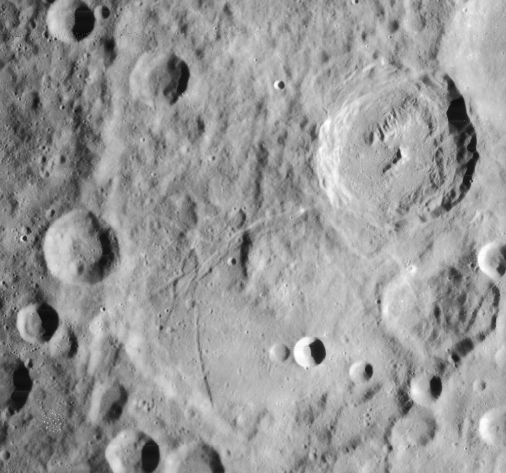
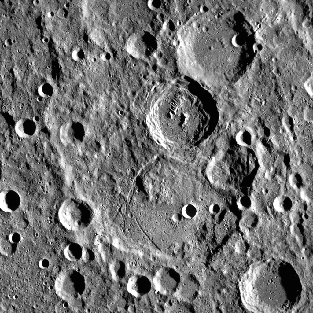
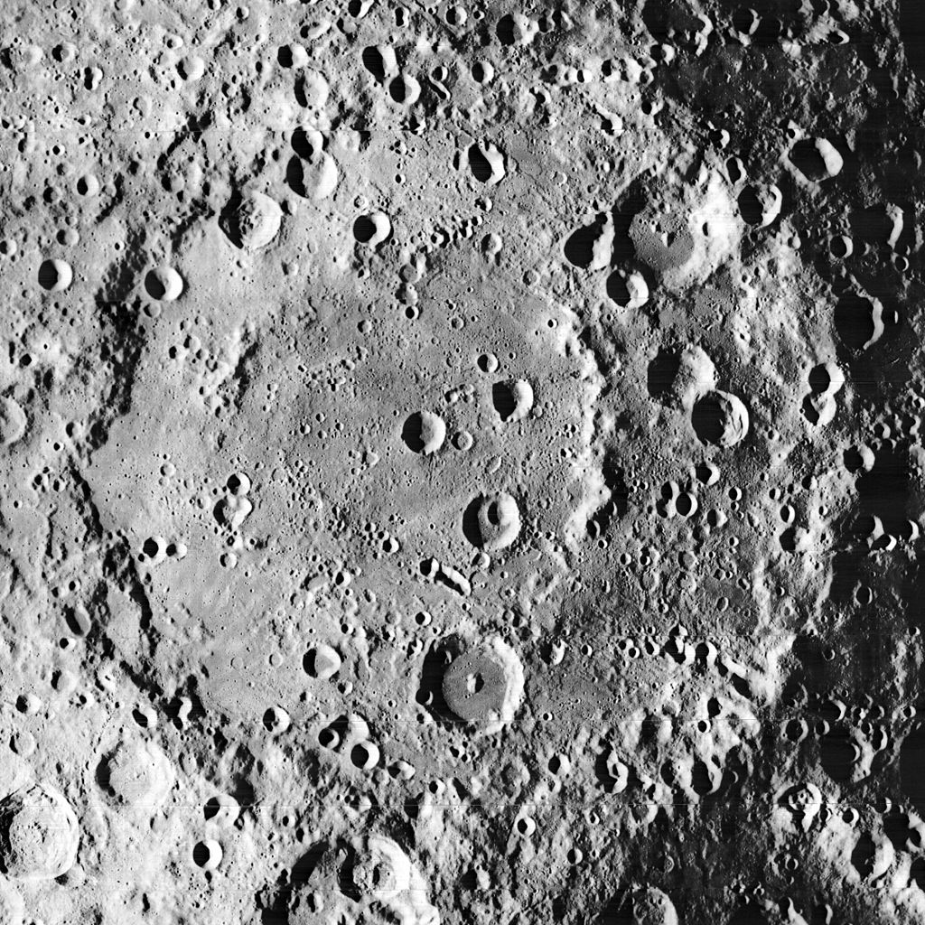
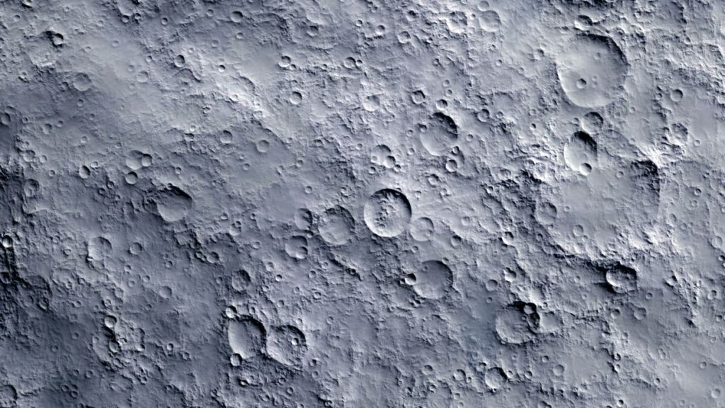
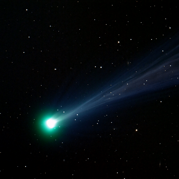
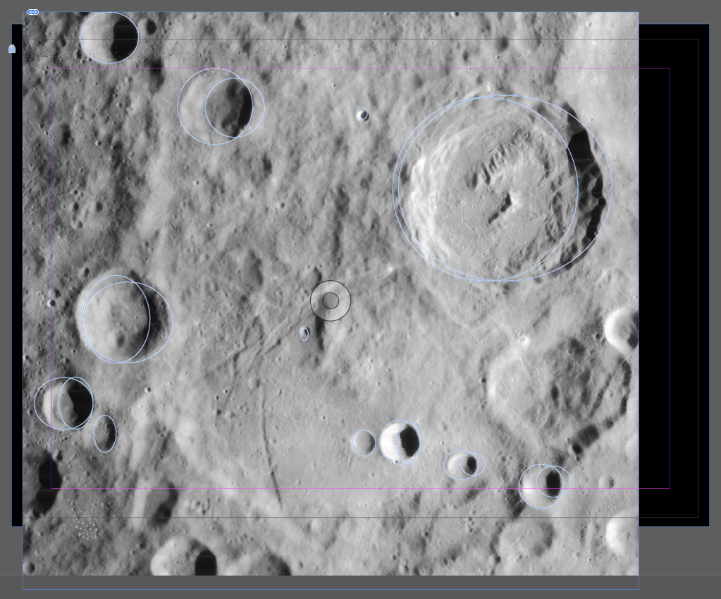
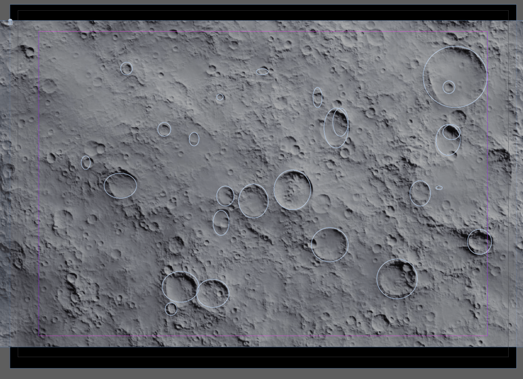
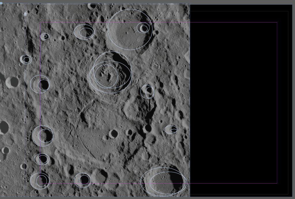
Rocks and rubble… Broken up asteroids and surface rock. The surface of the moon has many craters in it from comets which have landed and exploded, leaving dust, soil and general rubble. I have read a little bit about the Moon’s surface and why it looks the way it does and this article from New Scientist. Turns out the craters are created by ice.
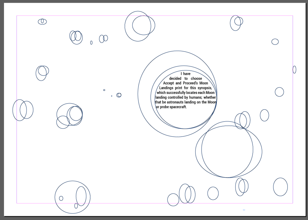
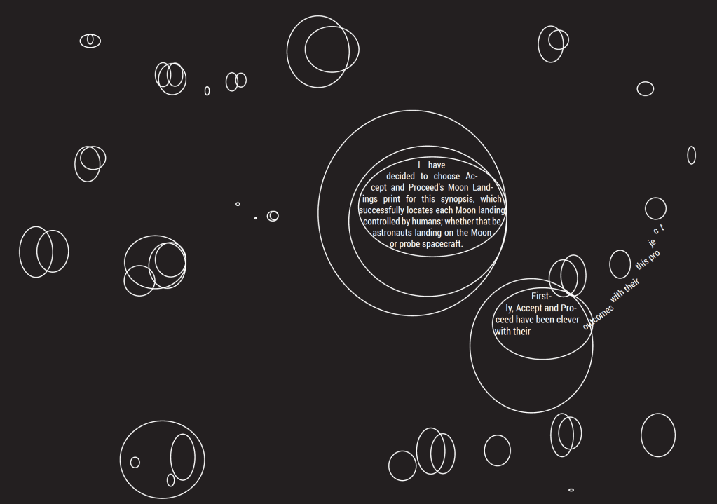
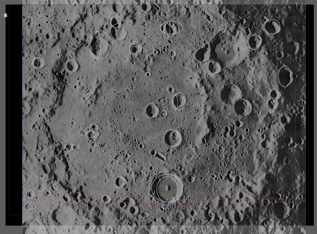
To begin with I have used the right image above as my background and traced circles over the craters to see what effect that would create:
Following on from my New Scientist research above, I have been reading about Uffe Gråe Jørgensen and how his team calculated the amount of iridium that asteroids would leave on the Earth and moon compared to comets – comets have more volatile elements and higher impact speeds due to their more elongated orbits around the sun, they would create giant plumes on impact, allowing more iridium to escape into space than during asteroid impacts.
The team predicted that asteroid bombardment would leave iridium levels of 18,000 and 10,000 parts per trillion in rocks on the Earth and moon respectively, while the same figures for comet bombardment would be about 130 and 10.
Ancient moon rocks returned by NASA’s Apollo missions have already confirmed that the lunar iridium levels are 10 parts per trillion or less. To find out the terrestrial value, Jørgensen’s team sampled some of the world’s oldest rocks from Greenland, aged 3.8 billion years, and asked a Japanese laboratory to assess their iridium levels more accurately than ever before. They contained iridium levels of 150 parts per trillion.
That strongly suggests comets, rather than asteroids, caused the violent bombardment.
Page 1:
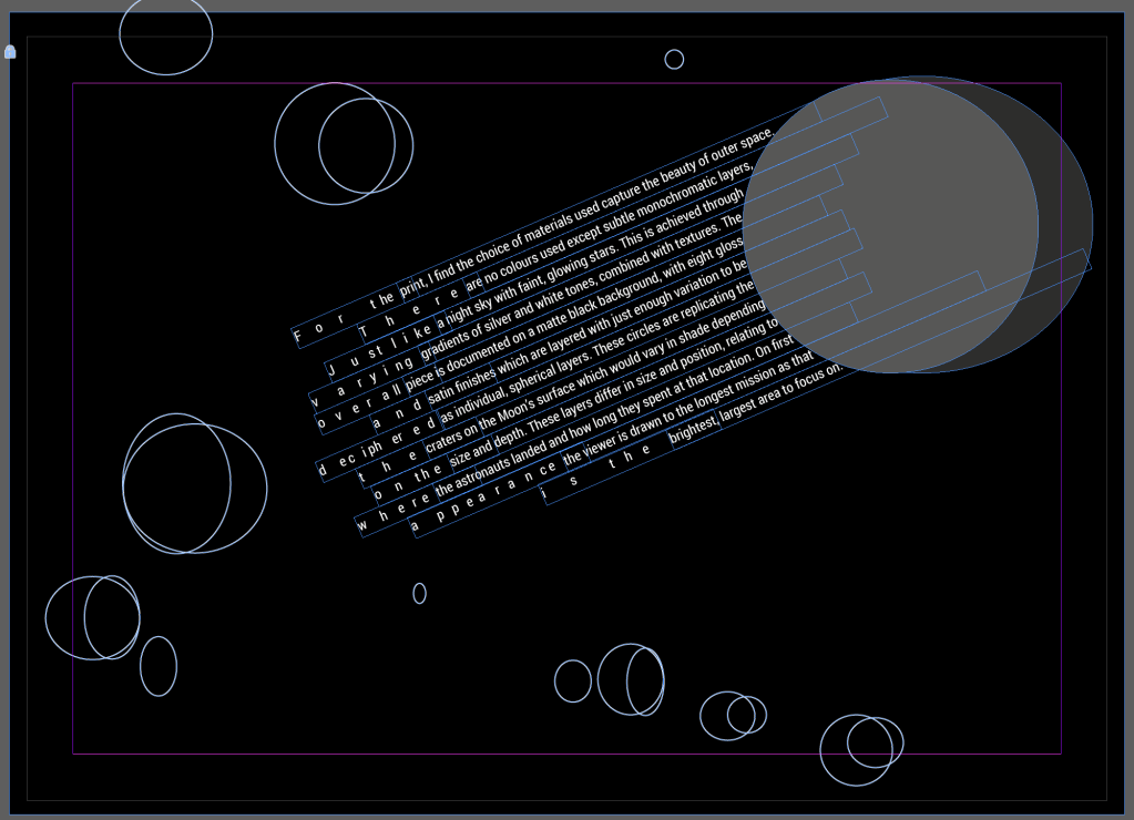
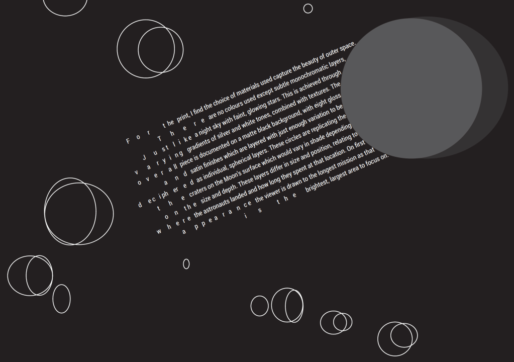
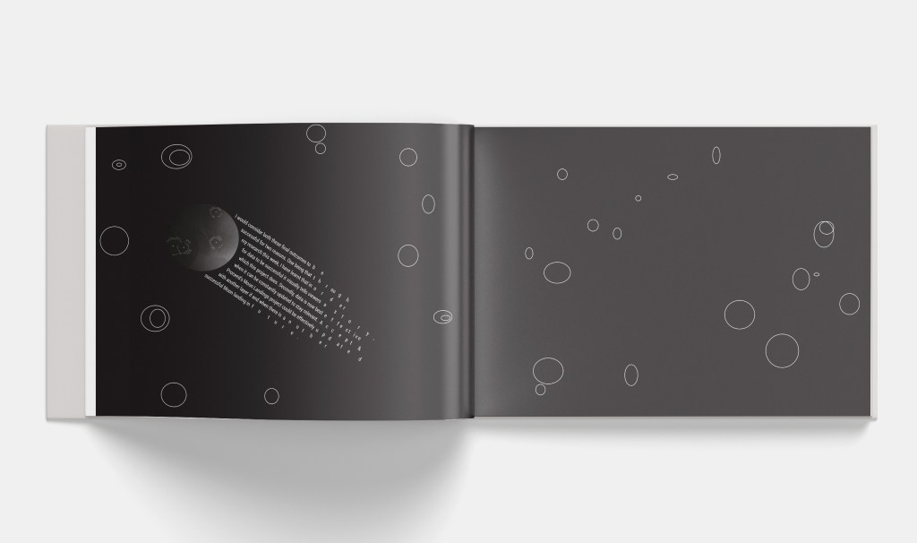
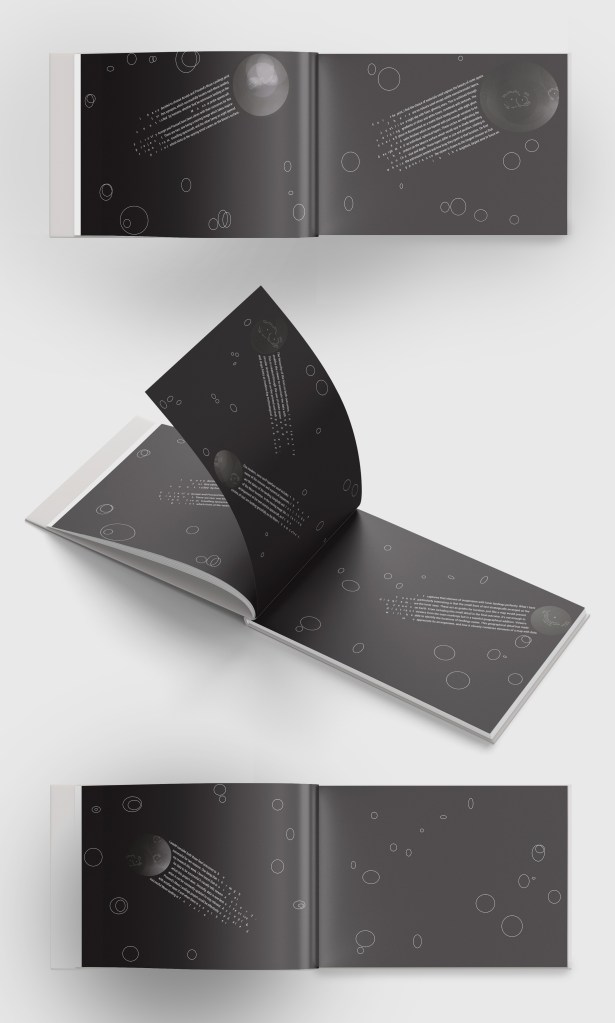
I thought about comets and how they travel. I decided to do an experiment looking like the circles were a rock with the text trailing behind at speed:
Page 2:
Page 3:
Page 4:
Page 5:
In regards to the final outcome I am satisfied that it is instantly associated with space and the visual language has stemmed from the Moon’s history. The text in the comets in my editorial is visually telling a story of how a comet travels and leaves trails of ice in the solar system; whilst the words themselves are experimental and can be read up-close.
High resolution images (to read text)
Editorial for ideas wall
Analysis
- I feel as though the composition and form of the shapes are presented well, and due to the colour scheme, shapes and heavy influence of space the viewer would instantly associate the spread with a space-related article.
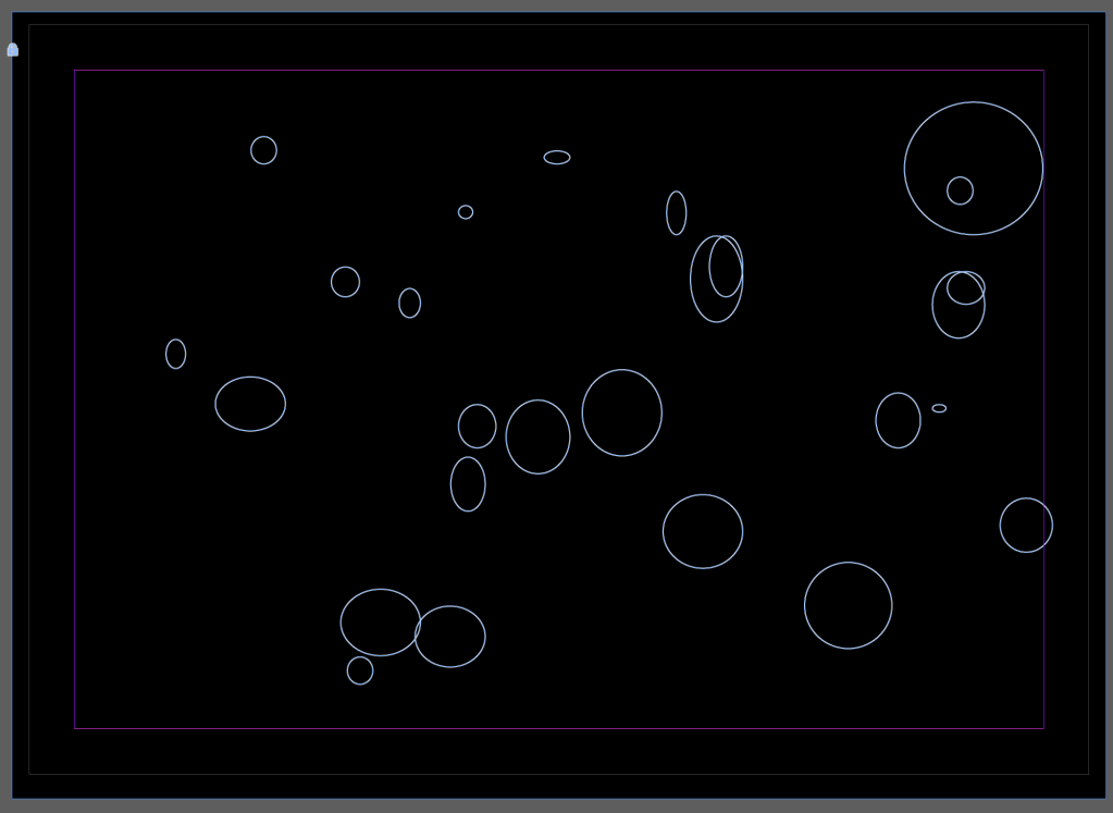
- There is something about the amount of detail in the meteorites themselves and the very simplistic circular shapes – although I traced these circular shapes from moon crater photographs I think they are not adding anything to the overall editorial design. There isn’t enough contrast and I think they actually distract from the typography meteor and ice trail.
- I want to experiment with the surrounding areas of the concrete poetry meteor and provide more contrast.
