
History Revealed
Lecture Material
History Revealed: Interpreting typographic vernacular
Video:
• Typefaces are not toys they’re tools
• Paula describes type as a visual language rather than branding logos
• Type is everywhere!
Stencilling lettering – China 8th century, Eskimo Baffin Island
Venitian Nizioletti type system – 1970
Video 1:
• 5000 messages a day on average are seen, clicked, tapped
• Ghost signs – ancient relics of typography that are ignored or even painted over but show through paint over time
• How typography on buildings changed from names to persuasive writing, messages about brands
Paris “metropolitain” railway underground identity
Hector Guimard – art noveau
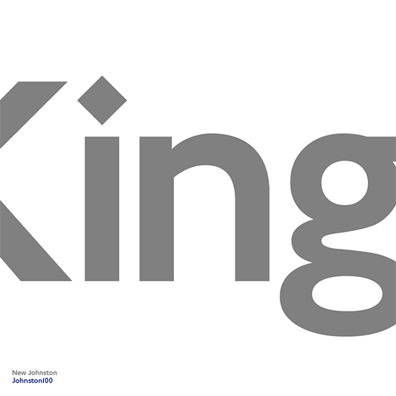
Undergound electric railway company – Frank Pick – Edward Johnston – Johnston Sans 1916 – sans serif was new and innovative for its time when serif’s were popular.
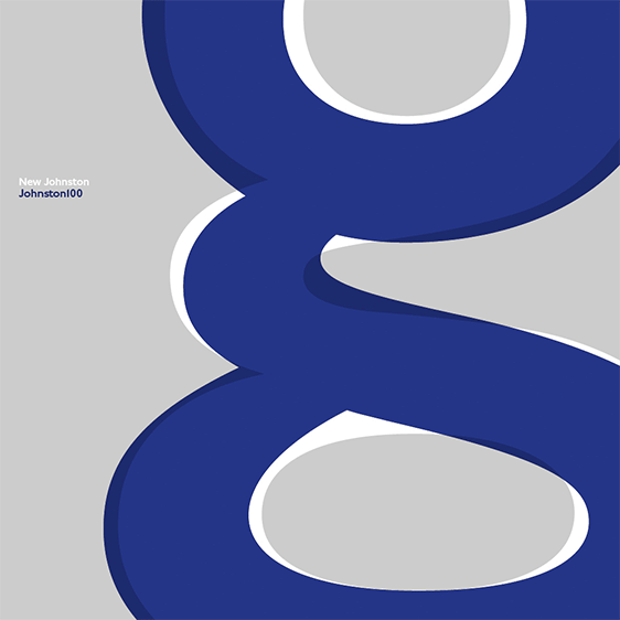
This then led to New Johnston by Banks & Miles, and MonoType digitising the typeface as #johnston100 which had the following changes:
• Introduction of the symbols such as the hashtag
• Slimmer, sleeker letters
• Extra thin weight “hairline” introduced as pushing the boundaries
Video 2:
• Old typefaces as influence in digitised typeface
• Old postcards from London underground as reference (scan in my postcards?)
• Hairline introduced as weight; pushing boundaries
Video 3:
• Harry Beck’s undergound map (he was an engineer)
• Form followed function
• Dropped all geographic references to make it a clear diagram; it would be too compressed if distance was demonstrated so it has been spread out. Revolutionary
Massimo Vignelli – New York signage in 1966 – Unimark was his (and three other partners) global company. Produced work with signature modernist style
Unimark’s graphic standards manual 1970 ensured all type was within boundaries, and Pentagram have recreated the book as a modern version of the original:
