
Fields of Practice
lecture material:
How has Globalisation affected your business?
Simon Manchipp
Notes: Different cultures, new ideas to come from this. Chinese medicine, mainstream design, Indian approaches, people management, it’s a good thing. Unstoppable force, through technology, and communication, reaching many people.
Simon very much views globalisation as a useful tool for inspiration, communication and advances in technology. I really like that cultures were mentioned, and how strong influences from globalisation shape the way design evolves, particularly in contemporary design. This results in information being easily accessed worldwide, which is definitely a benefit to the creative industries.
Sam Winston
Notes: Prefers to drop by. Global, Speed, Connectivity. Basic operating still. Digital does only get you so far, until being hands on.
Sam appears to be hesitant that globalisation works effectively in his career, explaining that to enable success as a designer there is a large element of creativity that does not occur through digital platforms. This is a perspective that I think is in the minority. Sam approaches work in a very distanced way, including working often by himself in a quiet environment. This does question whether smaller companies even need globalisation, do they really benefit from it? I do think that it doesn’t hurt to reach out, and like Sam said, even if he utilises globalisation in a way that means he just has to travel to see a client, then that works too.
Regular Practice
Notes: It’s an option to work in different countries, printing quality is better in certain places.
I have chosen to elaborate on this statement from Kris, when he mentioned how printing is often better in certain place. Globalisation means that as a design studio you can benefit from using a high quality production, therefore resulting is better finals and quality.
Sarah Boris
Notes: Potential for more clients, and people viewing her exhibition.
Sarah has mentioned a really valid point about globalisation which is not something I initially thought of. I instantly think of how accessible things are as opposed to how work can be promoted far more efficiently globally. As consumers, having access to purchase anything at the touch of a button means better business.
Intro Design
Notes: “People” people. Engagement is preferred with client. Easy miscommunicated online, whereas a meeting solves everything. If clients would prefer online, this option is available.
Globalisation is all about having the ability to engage with the world, and it sometimes may not be preferred in studios but the option opens up pathways. And most importantly, keeps clients satisfied with doing business.
Harriet Ferguson
Notes: London based, MA. Pearlfisher studio, Hendricks gin. 1886, parent company not them. Misleading consumers. Don’t look at competitors, look at ideas from books and theatre, films, museums and illustrations. Karma cola, impact on planet. Proceeds go to charity.
I really loved that Harriet described how some companies mislead others with false information, Hendricks Gin being a great example. Misleading customers into thinking their brand is over a hundred years old with integrity, history and quality when it is actually the parent brand that dates back from 19th century. Hendricks is only 21 years old, founded in 1999. Arguably, Hendricks are being clever and luring customers in with false information, but I believe brands should be honest and utilise that in best practice.
I also want to explore the fact that Ferguson talked about not looking at competitors work and instead, finding your own inspiration. I really agree with this and there has already been so much inspiring work from previous decades (as discussed last week in week 2) that it would seem a shame just to try to take influence from competitors alone.
I also am intrigued by Karma Cola who according to Harriet, don’t use plastic packaging, and have done a little further research on them:
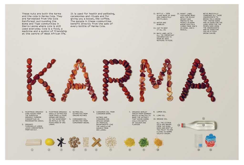

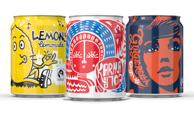
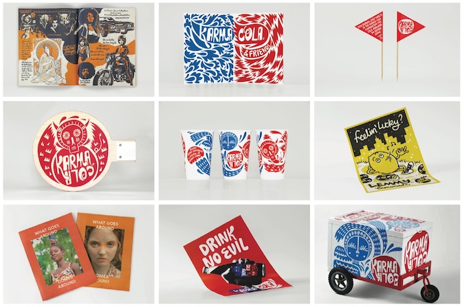
This is a quite the comparison to Coca-Cola who are notoriously un-ethical and partake in large amounts of greenwashing. This brand are real, ethical, and give back to the communities such as The Karma Cola Foundation. Their packaging designs are modern, stylish and convey meaning. The varied use of colour keeps the brand exciting, and the typography is really fun, with a sense of hand writing about it.
Patrick Thomas
Graphic Artist, Author and Educator. During the webinar Patrick discussed the recreation of “A Tale of Two Cities” written by Charles Dickens . Thomas has created an emoji form of the text, and has instantaneously presented a modern day interpretation of the novel:
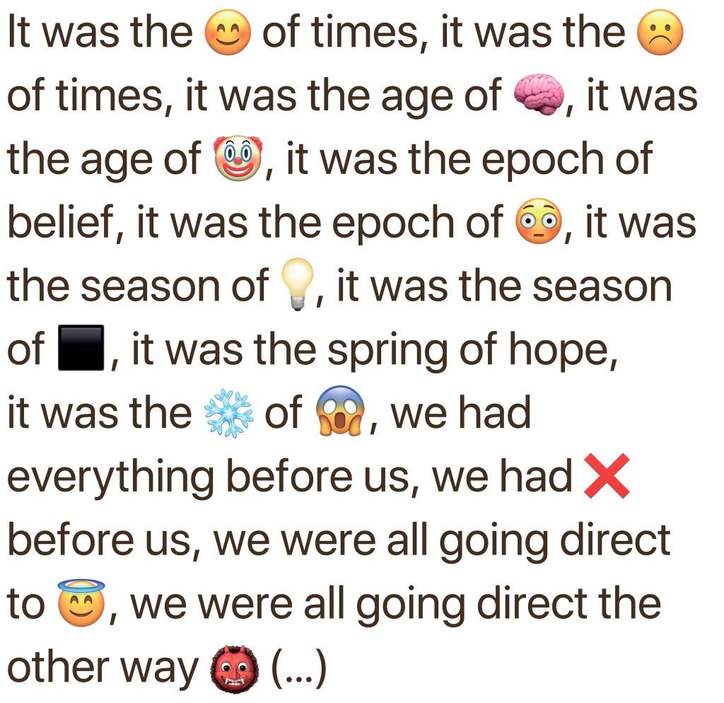
I think this is really clever and I like that you would be guessing what the emoji’s represented if you did not know the original text. It probably encourages people to read the original. Mostly, this is a great representation of the modern world. In comparison to the 19th century, the 21st century is an extremely visual era and although people can read, most would prefer a lot less text, and probably even solely images. This is what makes graphic design so effective as an industry.
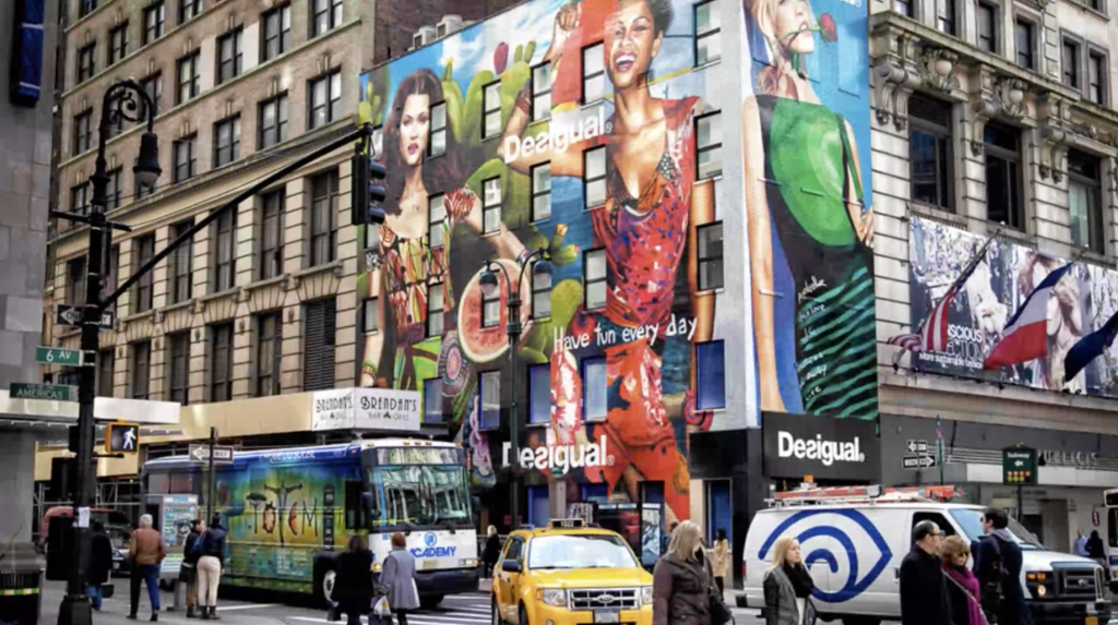
Patrick also explained in the webinar his “Desigual” logo design. To see how effective a Helvetica typeface logo looks when on printed collateral and made extremely large scale for city billboards is fantastic. It looks so effective and because the logo is bold, and simple, it is so versatile. The clip below links to an instagram mash-up video of the branding identity on Patrick’s profile:
