
Story Told
Lecture Material
Colophon Foundry
Peggs typeface


Smorgasbord typeface
• 2-3 months for small projects, 14 months for much larger projects to create typefaces for smaller vs larger businesses
• Consider different associations with a business/client
• Consider audience as typeface is viewed by lots of people in different perspectives
• Looking at the history of welsh language and its references; depicting the vowels and phonetic spelling in comparison to English
• Liaised with a fluent welsh language speaker to gain insight
• Research into Welsh typography and language; prestige looking type. Medieval typography. Bring it into a modernised light whilst respecting Welsh heritage
• References in typeface linking to the curvature of a harp such as the digraphs:


DD is pronounced as a heavy sounding “TH” in welsh. The tilt in the lettering to the left is a subtle hint at the Welsh instrument of Wales, the harp. CH is pronounced often as ‘K’ therefore linked as one letter. I really like how the letters that sound like one letter in English are joined up – I think this would actually help people to learn and understand Welsh too! The LL for instance below is two sitting inside one letter ‘l’. The typeface is subtle, educational yet effective.
British airways
• Negus & Negus were commissioned to design identity for British Airways in 1973. It was successful at the time, with the iconic ‘speedbird’ design added which was created in 1932 by Theyre Lee-Elliott (an artist). It represented speed, travel and heritage
• Landor Associates unveiled a new design for British Airways in 1984, which resulted in the airlines becoming privatised
• In 1997, Newell & Sorrell were commissioned to make a better identity within it’s competing market; a friendly and approachable airline, therefore created a human-like typeface
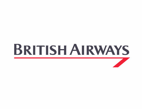
1984 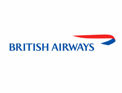
1997
1997’s version is slightly quirkier with its lettering flicking slightly the left, and the curved ‘speedbird’ adaptation looks as though it is in flight, like a flag. This is a really well rounded design; it’s friendly and welcomes its audience. This is exactly what the airlines needed and Newell & Sorell were successful in achieving this.
Lance Wyman
• Used museum as a source of inspiration for Mexican history
• Referenced optical art in the typography design with lines and shapes
• Wyman’s work became a political statement for revolutionary party protests
• Collection of sporting events laid out in grid form from Mexican heritage inspiration
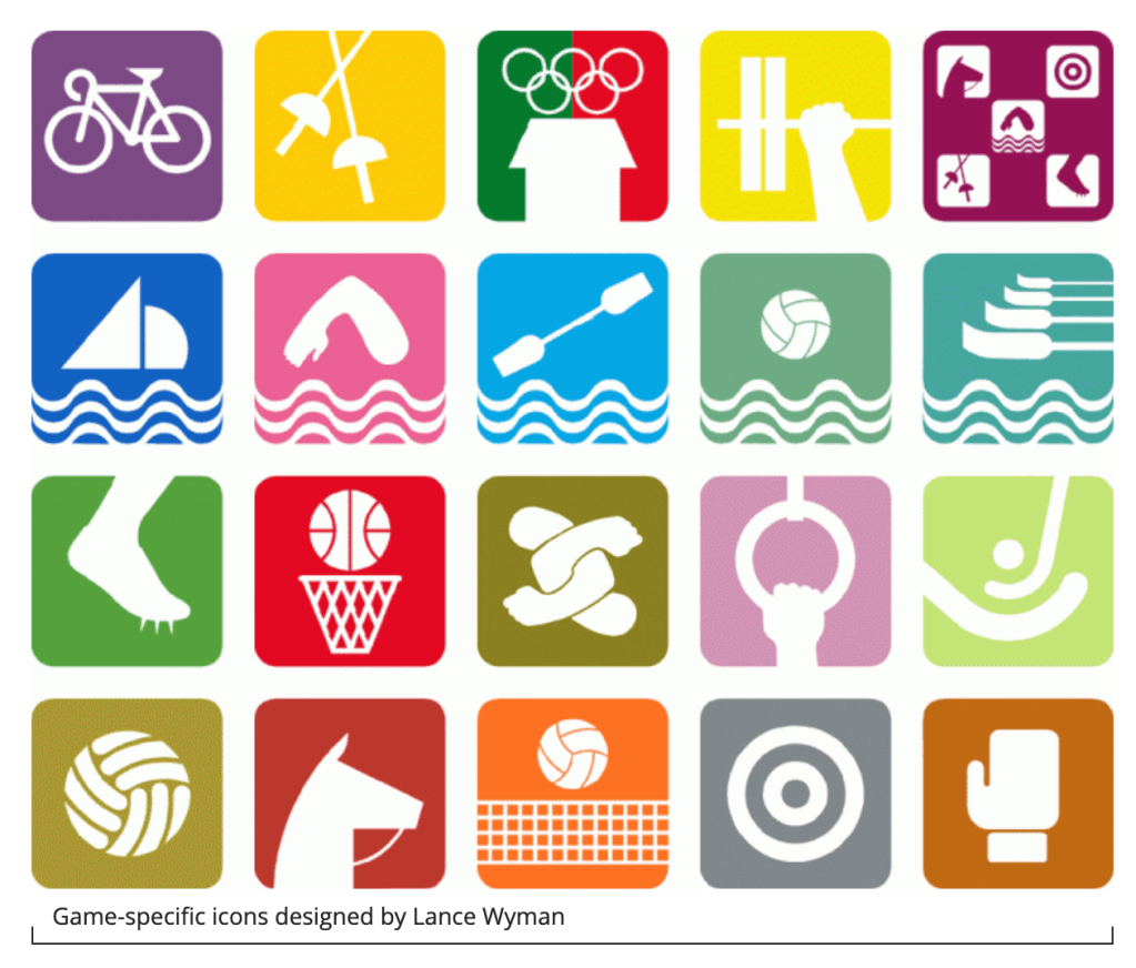
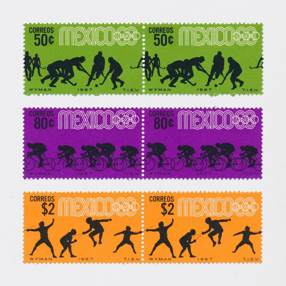
• Silhouettes of figures for stamps; repeated pattern when placed together
• The tickets showed the date and icons, silhouettes and what area of stadium to go to for that day. The area would also have the same symbol to match – clever use of way-finding
• Looked to city of Mexico map and made it easy to navigate from a tourist perspective
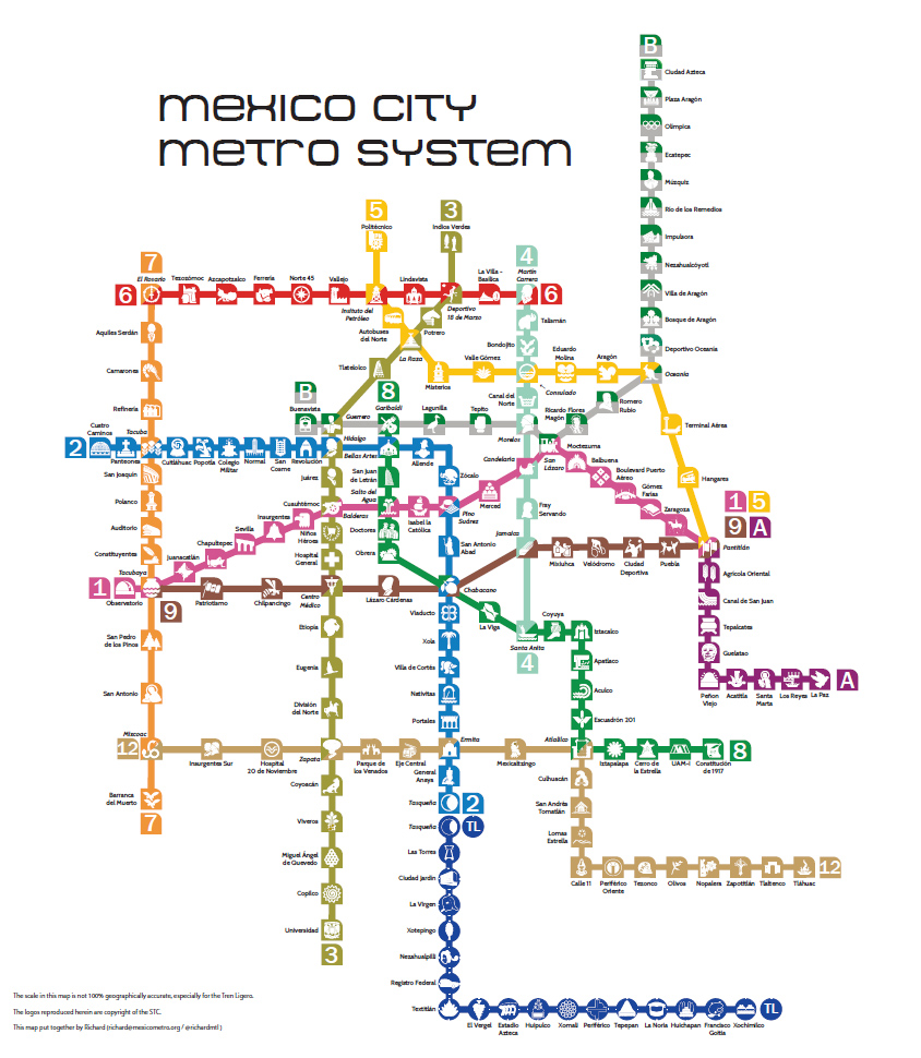
I really enjoyed this lecture and seeing the method behind the madness for Mexico in 1968. My favourite is the map way-finding above because I personally love the simplification of the city in coloured lines, and the logos of are playful and easy to follow. It looks childlike and inviting.
