
Industry today
LECTURE MATERIAL:
Maziar Raein
I found it useful to hear that the beginning of the eighties was described as dull, and that it wasn’t until the end of the decade that there was a shift, and creativity excelled. Design was described as “universal” and “one size fits all”, with a Dutch influence.
I completely agree with typography being a study of history and illustration requiring less knowledge. It certainly doesn’t apply to all art as there will be exceptions, however as a type setter you really have to know typefaces and understand the history behind them. The shapes of the letters represent a particular trend, and even appear easier to read, which is fitting for various types of briefs. It is certainly a talent that I have had to study, and learn as I grow. It’s not something I would be able to sit down and just “do” unlike drawing, it would require far more experiments.
I particularly liked the discussion where Raein explains how roles have evolved, when he was young there were designers, and then the producers of the design. There seems to be a merge nowadays, as a graphic designer it’s a lot easier to print things yourself as we have the affordable technology to allow us to do this.
I really loved that the level and amount of craftsmanship was suggested as being higher in the modern world. This speaks volumes for the evolution of creativity. Is it arguable that designers in the modern day have to be smarter, more adaptable, and constantly learn new updates and processes, as opposed to a designer in the 70’s who drafted the design, and then took the final to a letterpress printers?
Webinar:
Andrew Walsh Lister
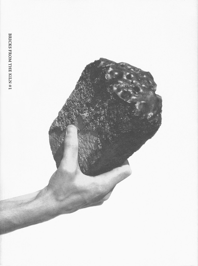
I found it really interesting to hear Lister discuss his recent project. I did not know that bricks were used to test the temperature of ceramic kilns for firing, as ceramic cannot withstand the same high temperature as a melting brick. The fact that a brick can melt is beyond any temperature I can comprehend… 2000℃-4000℃.
Andrew also mentioned how the composition and layout of the editorial project used references from the brick shape, being rectangular in blocks of text and image. This is really inspiring to see how he has taken inspiration from such a basic man-made object. There is a collage influence shining through in these posters, and the overlaying of photographs, screen print, text etc creates a sense of depth.
