
Noticing The Ignored
Lecture material:
Ways of seeing – John Berger:
Changed the way we view art, and make art part of everyday “the art of storytelling” artist, broadcaster, 1962, left Britain and went to France.
“If I am dangerous to those who run the new economic order, I am proud of that” this quote suggests to me he was a brave man who did not care who thought of him badly. Believed in making life exciting. Situationist International wanted to change the world. Surrealists 20th century movement looking at imaginative art/design free from rational “logic”.
It’s interesting how Berger describes standing in front of Leonardo’s painting and explains how we (as viewers) are not getting the same authentic experience as if we were stood where he is. This raises the issue of the online world; there is a massive shift in how creativity is perceived. The environment viewers are surrounded by has a detrimental impact on the way they perceive artwork – when in a gallery it’s usually silent, a time to reflect and think about art. Nowadays we are often scrolling through a busy feed of information whether that be social media or the news articles. This has got me wondering whether that has impacted the value of creativity – creatives have to be innovative and think of how to create the same feeling but in an online, digital environment where for example, people are likely to whizz past your work much quicker than walking to the other side of a gallery room.
Webinar:
Stephen Gill
Photographer. Hackney flowers. Collected flowers, berries, plants. Multi-layered images.
Susannah mentions how some of the base photographs were also buried in Hackney Wick, allowing the subsequent decay to imprint upon the images, stressing this collaboration with place. I find this idea really interesting as it ties well with leaving projects for some time and then revisiting them: something I have done and find a really useful tool to monitor progress. To leave the photographs in soil to decompose creates a sense of the place and adds character.
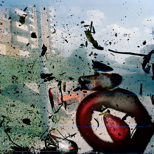
These pictures show me that damage can be turned into something beautiful. Distressed, broken or even pigmented details add character and make projects visually exciting.
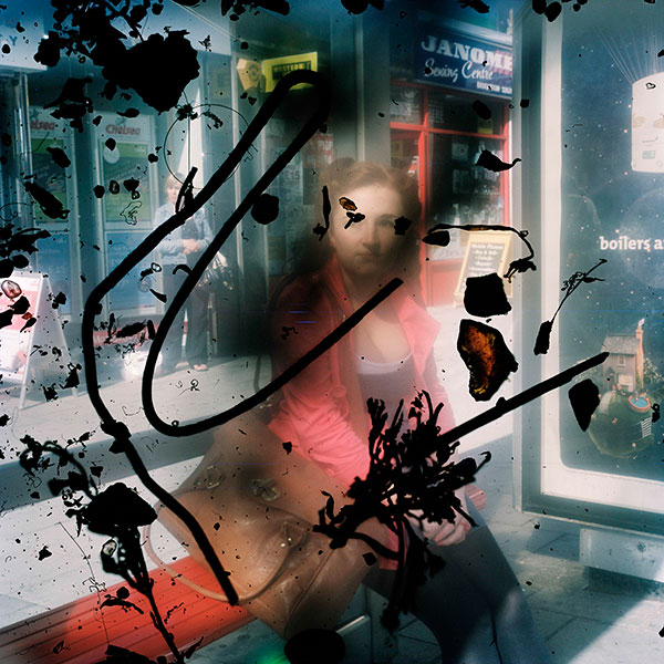
laura Coombs
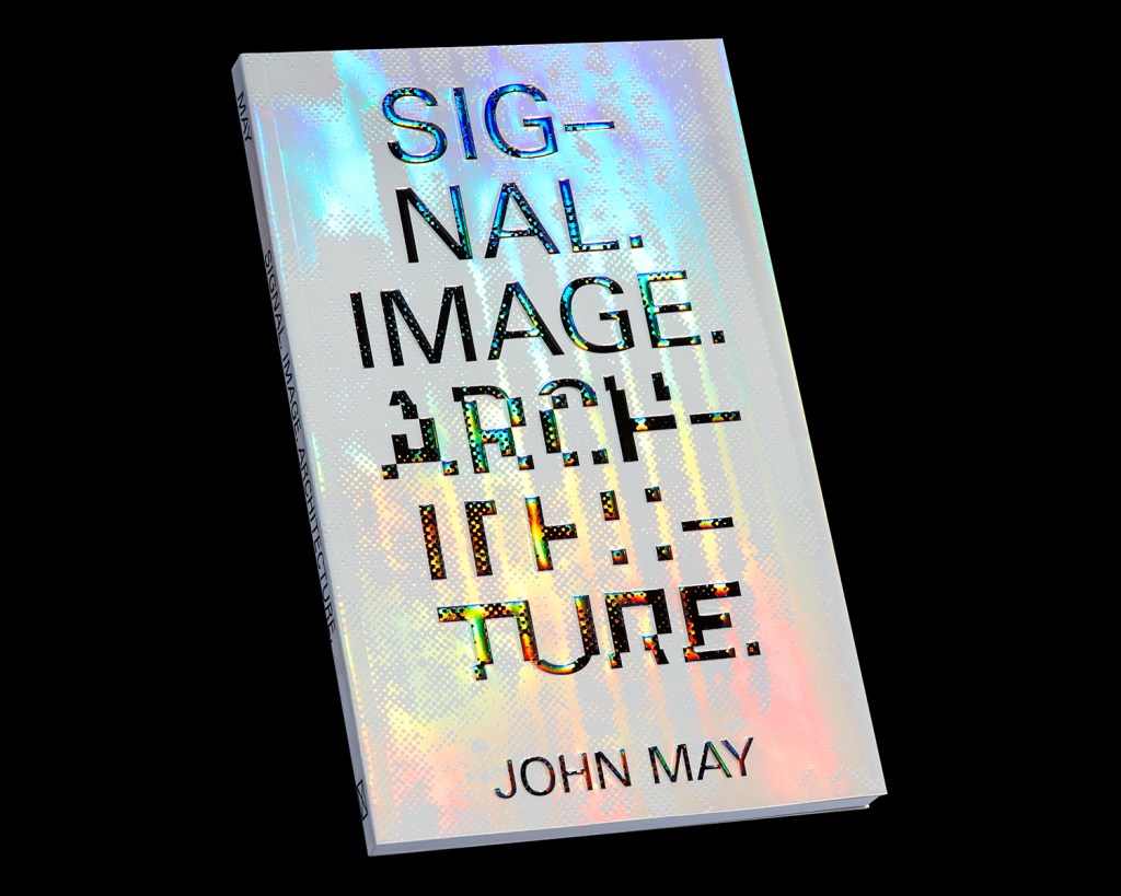
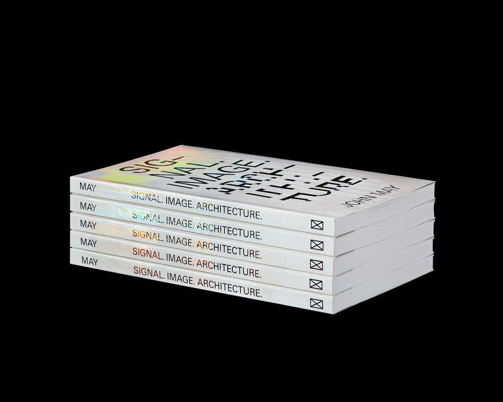
I have a fascination with holograms and holographic rainbow foiling, and really love the typography on Coombs’ “Signal Image Architecture” cover. I just love the way the type is contrasting with the light bouncing off the cover which produces a multicoloured background. The typography layout is also visually interesting as it’s distorted and paired with a sans serif typeface. It’s clear, colourful and intriguing.
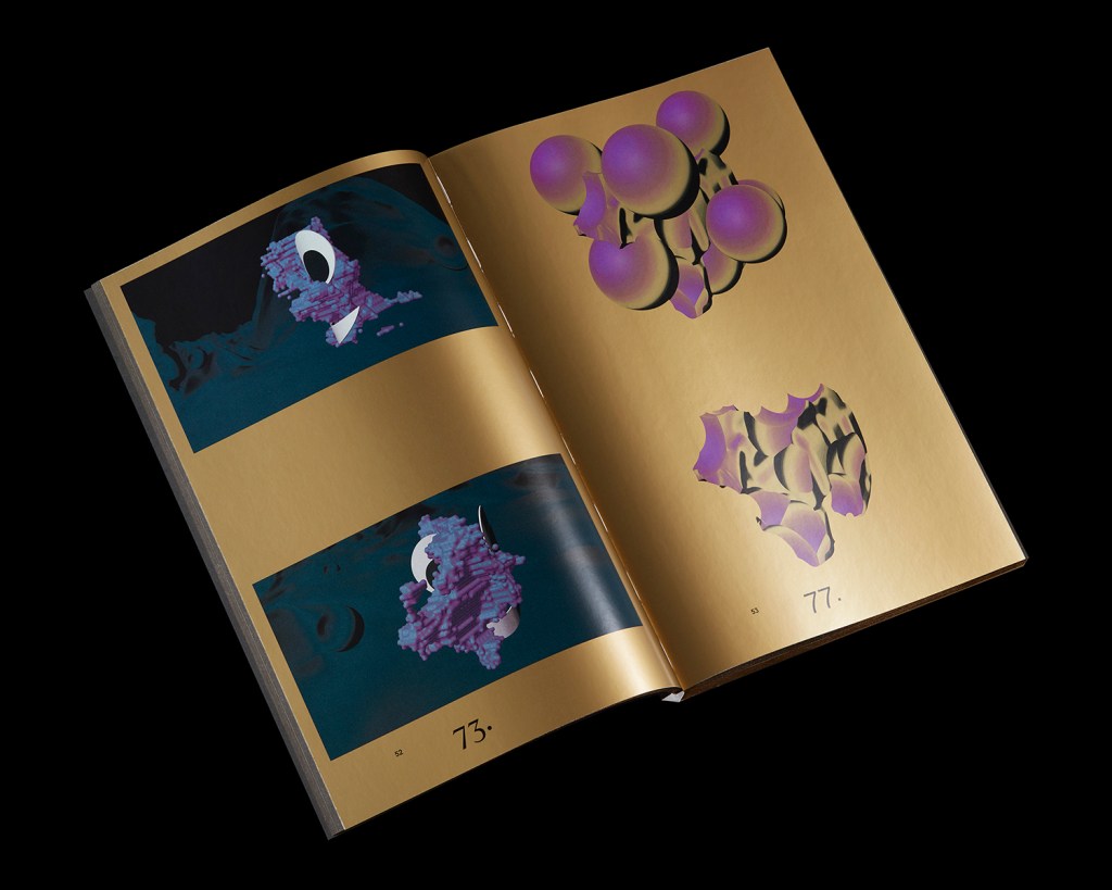
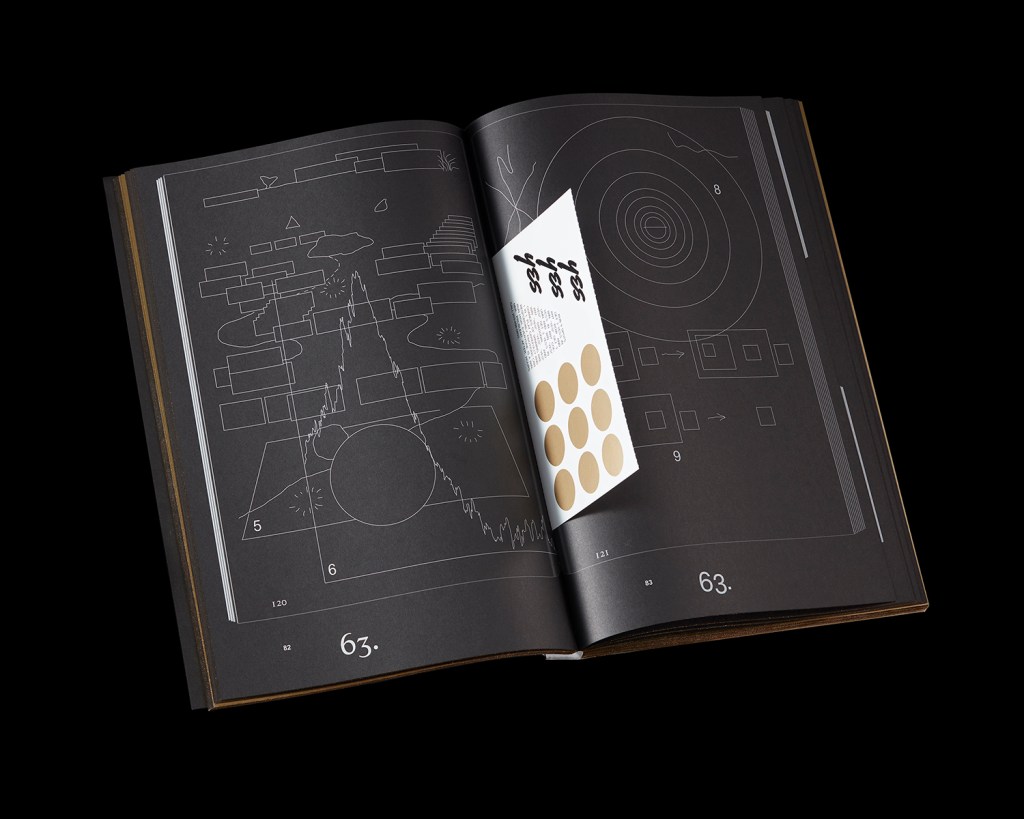
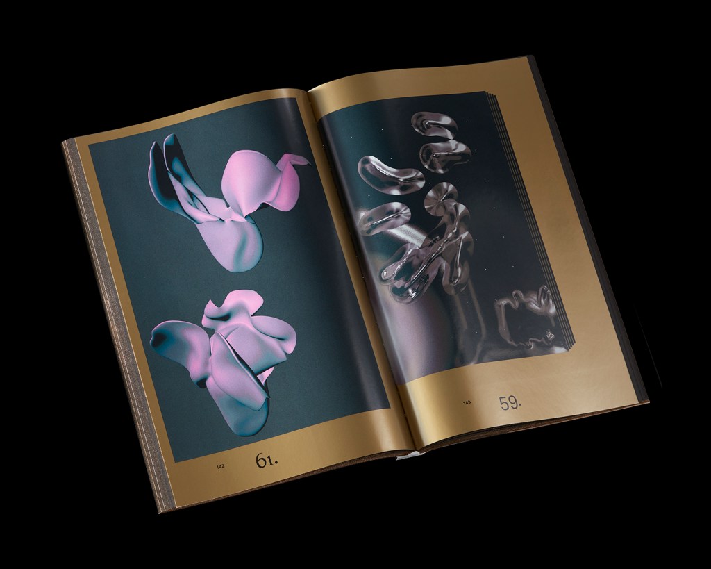
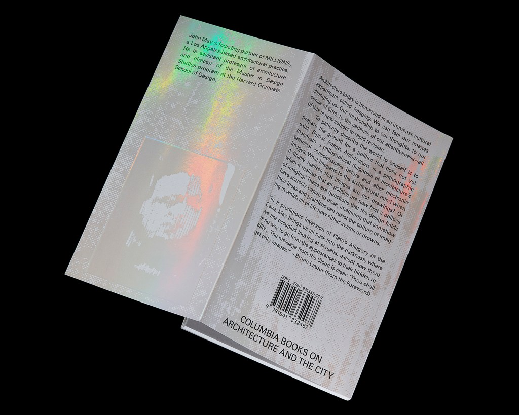
When looking at Coombs’ work there is a sense of experimentation, loose playfulness, which I really love. It’s like there is a combination of ideas all combined and put together, almost as if they are sketchbooks. There is also a heavy use of distorted high contrast images, where colours seem negative and brightly coloured. I am massively inspired by Laura’s work and really want to use elements of her ideas, such as of placing printed paper inside a page in a project.
