
Type and Page
Lecture material:
Regular Practice
Part 1 – Type and Press:
Johannes Gutenberg is known to have been one of the first experimental printers dating from as early as 1452. A 42-line Bible was printed using movable type. Gutenberg was a goldsmith in his lifetime and developed a special printing ink, a method of casting type, and a special kind of press.

The benefits of printing with movable blocks is that printing becomes much more efficient and production costs are lowered. This made books affordable and newspapers revolutionary and reliable.
The last say of hot metal press before computers come in at The New York Times:
July 1, 1978. The last day of hot type mechanical type printing. This video is really surreal to me, the working environment of those typesetters is completely opposite to what work environments are now, and that’s all down to computers. Hot type workers would be working on small cluttered stations, there would be loud equipment and it was messy. The noise itself was overwhelming; and most of the workers were deaf and communicated with sign language. This is really interesting to me as someone who is hard of hearing, and passionate about design – I never knew this! It was really interesting to see the development of hot type to cold type. The transformation of using metal blocks to cutting out sections of paper is fascinating; it’s evident that computers have drastically improved working conditions and cut down the amount of labour.
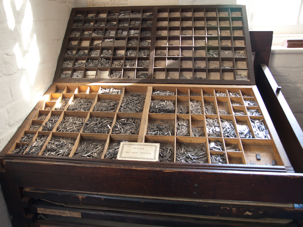
I loved the fact that ‘upper’ and ‘lowercase’ terminology for punctuation dates back from when letters were stored in cases for movable type machines. I remember using these in undergraduate studies for making letterpress work and I did not know this. The largest sections will be for vowels as they’re the ones that will be used the most. Letters like ‘x’ would be used far less and have a smaller section.
OLYMPUS DIGITAL CAMERA
Something else I’ve learnt is that in order to prevent excess ink on the page, letters had incisions called ‘ink traps’ – allowing ink to bleed into them to ensure that letters are clear, with straight edges and not rounded.
Part 2 – Type and Design:

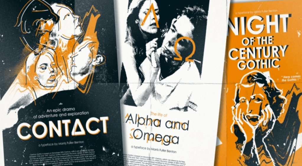
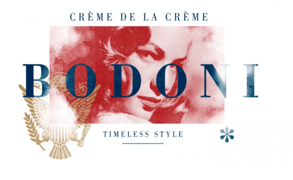
It’s important to recognise previous connotations with particular typefaces i.e. the black letter has associations with the National Socialist Movement in Germany. I don’t have much knowledge of how typefaces can represent history so I did a bit of exploring and discovered the below:
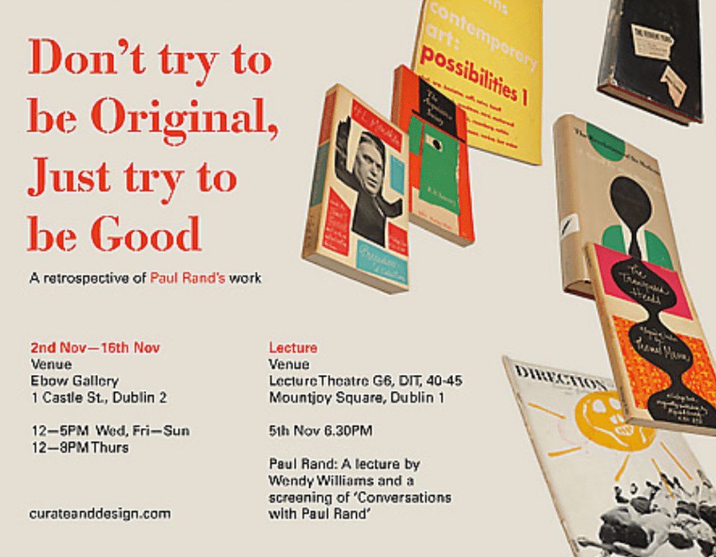
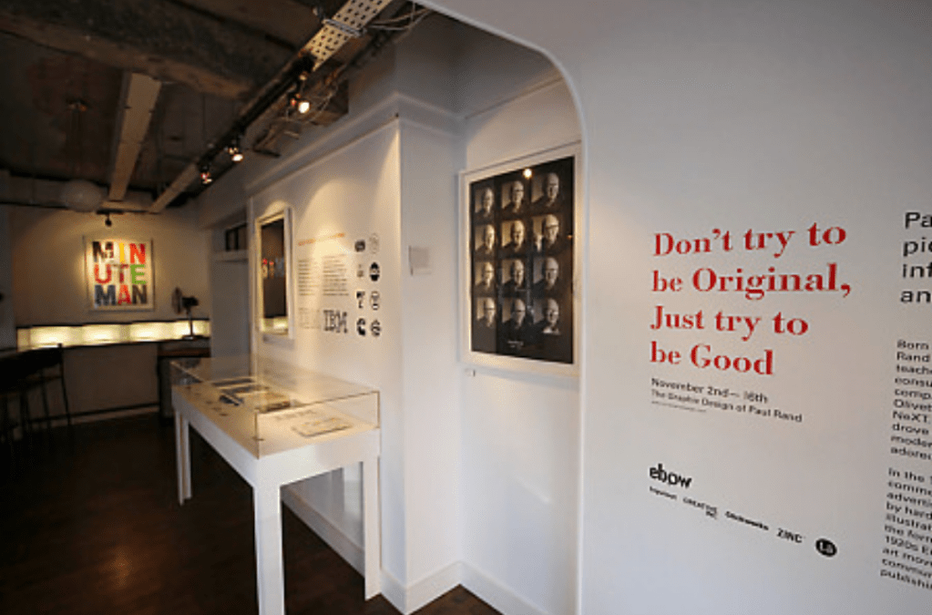
“Don’t try to be original, just try to be good.”
Paul Rand
This quote by Paul Rand was the title of his exhibition in Dublin. There are many examples of why I could disagree on this quote except for one; typography. From experience, you cannot apply the same principles of art to typography. Yes, many experiments are required but I believe there are more rules when it comes to designing/setting out type. If you follow the rules with typography and apply them accordingly, you will be successful as opposed to being ‘original’ and just doing things without thinking about it.
Webinar
Tom Foley
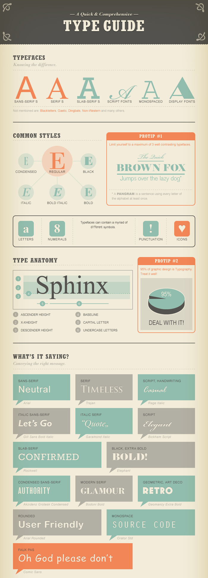
Tom’s lecture was really inspiring and refreshing to see someone with such passion and knowledge about a topic I have very little knowledge on! I really love the monotype catalogue and examples he showed us. There is a great variation of sans-serif and serifs, and even the modernised versions of classic typefaces such as Helvetica.
Monotype:
What I found valuable in this lecture was the understanding of why typefaces are having to evolve to be suitable for digital platforms. I asked Tom why did he decide to make a modernised Helvetica, and he responded that it’s because of legibility on screens and also to keep the typeface compatible with various modern typefaces that are now being made. This is really interesting as it seems although typefaces have classics, they still need to be evolved in ways that support the evolution of software too.
Tom spoke about typefaces having weights and styles; a survey has shown that customers prefer several styles in a font family. New trends – the last four years there have been loads of soft-serve typefaces. They come back into trend and this also evolves the appearance of type.
I was intrigued to know what Tom’s favourite body text is and he responded that they are:
Lexicon typeface – it’s an exceptional serif typeface but super expensive.
Minion typeface – typographic features such as small, swatches etc. A great typeface with so many variable elements.


Reference material:
Type and Typography (Structure):
This article was an interesting read. I feel like this is an article that introduces the basics of graphic design, explaining the benefits of designing effectively.
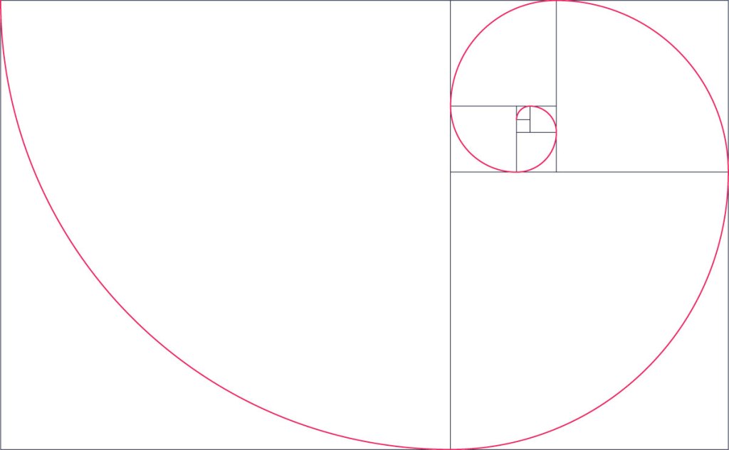
I like how the article references the golden ratio, something I covered at the start of my uni course but didn’t explore further. I have found an interesting article that explains the relevance of the golden ‘spiral’ or ‘ratio’:
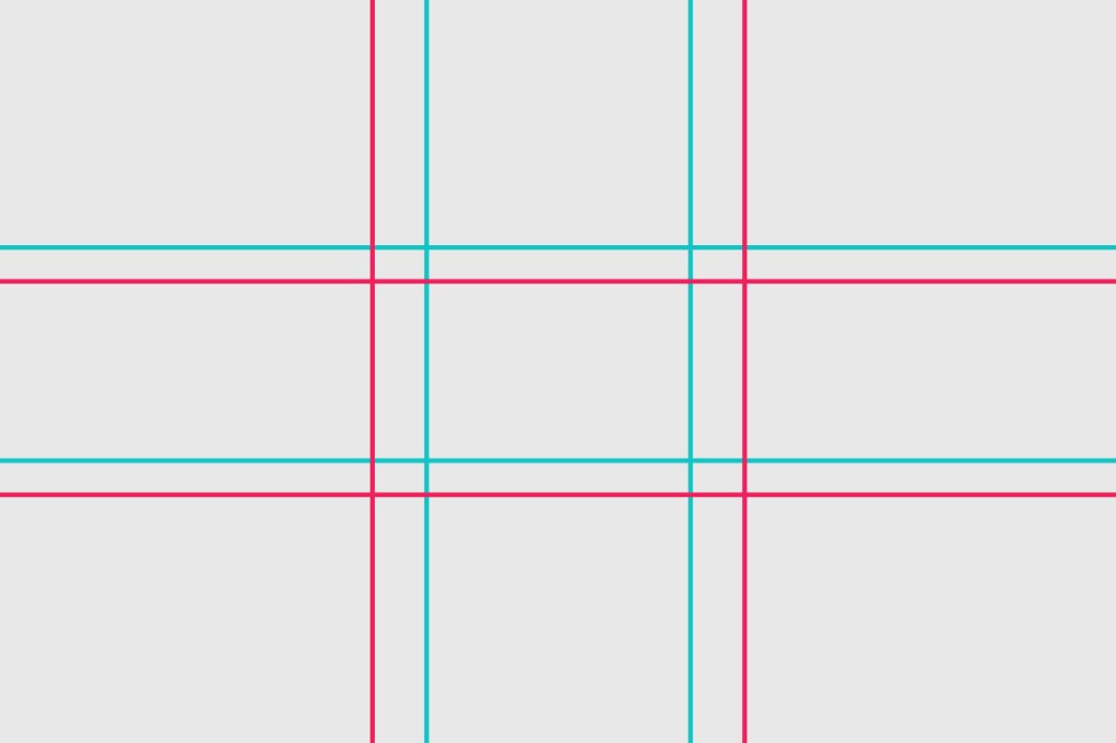
I have come to learn when designing that there is a significant importance of white space and really try to consider it when designing layouts. There is a reason why these layouts work – to build effective contrast between the viewer and the message portrayed.

I need to start using these in my layouts – I’ll admit I’m always using the rule of thirds. However, I’ve been challenged with trying to figure out ‘quirky’ ways of designing editorial layouts. I’m personally setting it as a challenge to create a piece of work that uses this layout.
