
Trends and Environments
Lecture Material
Martin Hosken
“Consider this image. It’s most likely that not only do you associate meaning with the image but that you can also identify associations and implications surrounding its meaning. Imagine my surprise, while walking with my family, when my son bent down to pick up an old bottle stop with a swastika symbol embossed on the top. Upon subsequent research we learned that in the 1930s the St. Austell Brewery, here in Cornwall, had had to destroy 30,000 of these bottle tops when the national socialist party came to power in Germany and adopted the insignia as their own. Up until this point, the swastika had been used by many 3 brands, including Coca Cola, to symbolise purity and strength. This is our second problem: images carry meaning that is dependent on context and this meaning can change.”
Wow – I did not know this. This suddenly makes sense why Hitler chose that symbol to represent the Nazi Party. This is evident to me how brand meanings can change, and also how brands can change a meaning.
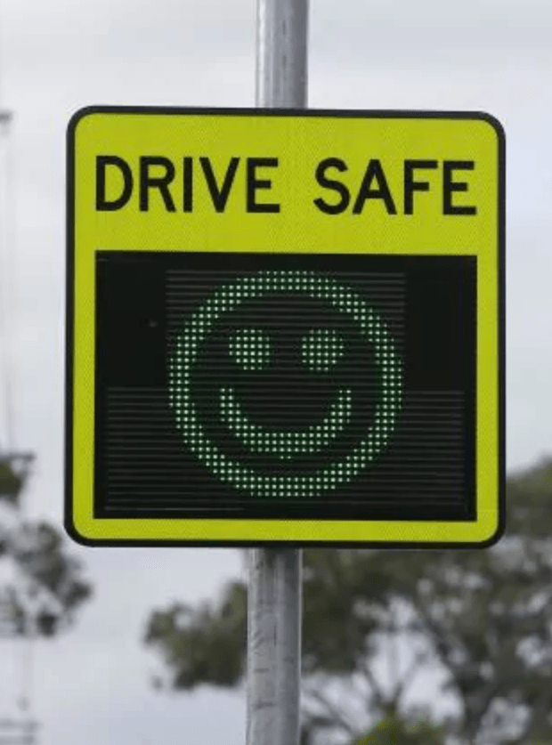
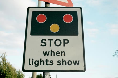
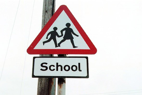
Thinking about signs on my way to the shop up the road, I encounter a few. Here are some examples:

Case Study – Tom (Regular Practice)
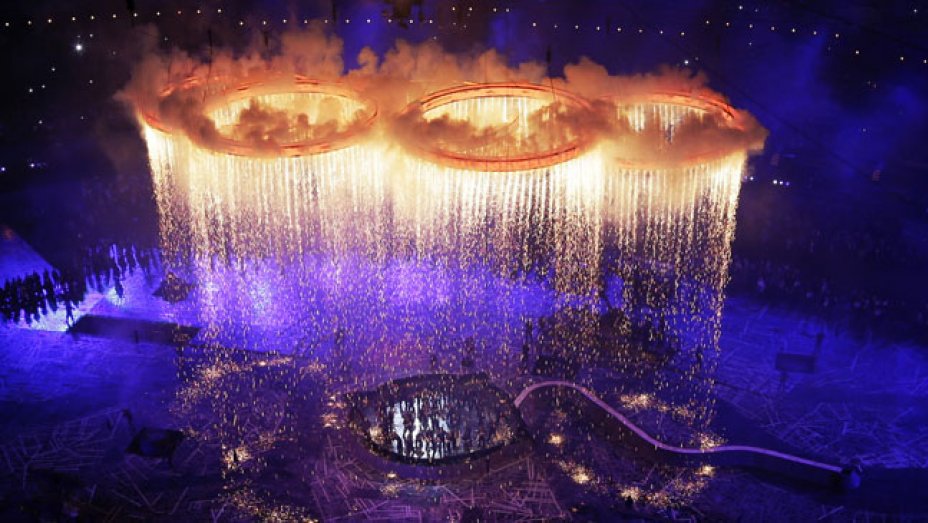
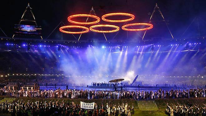
How brands evolve with global distribution, how they design with that in mind. Tom used the Olympics as an example, how it is run every four years, and how each time the logo has been influenced with the country that it’s been hosted in.
I personally love how designers have introduced parts of the countries history into the branding and identity of the Olympics. My least favourite has to be London’s identity. I personally feel as though it’s extremely abstract and detached from what London is all about. The London Olympics open ceremony was mindblowing and I’m still fascinated when I watch it to this day.
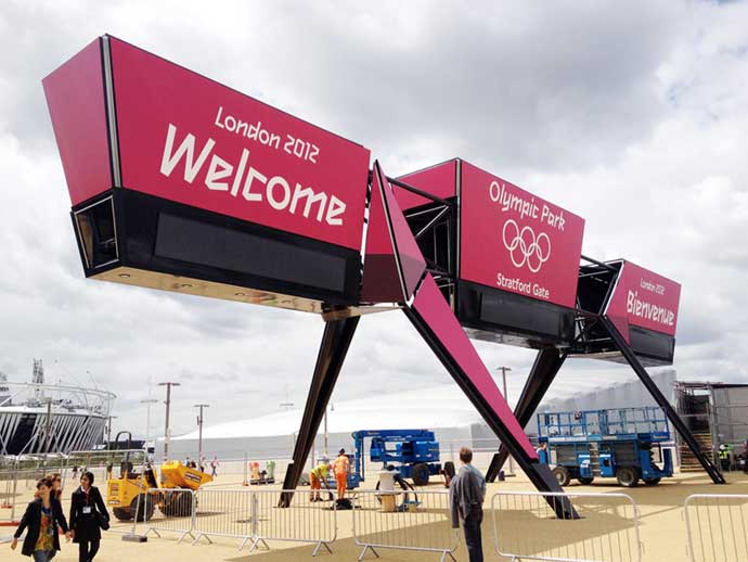
The London logo identity:
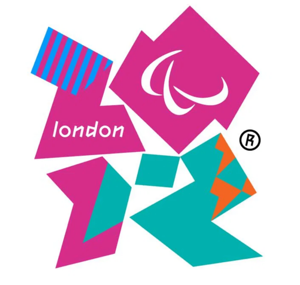
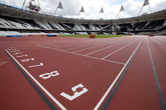
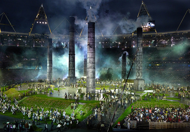
For me, the connection isn’t there with the incredible opening ceremony… And the identity. The identity seems modern, geometric, abstract. Whereas the theme for the ceremony hit the nail on the head for capturing the history of Britain and industrial revolution. I think it would have been amazing to use that in the identity somehow, using influences from coal mines such as the coal wagons and tracks, canaries that used to be able to detect toxic gas, the oil-lamps, or the machines, or even the mineshaft.
In South Wales, school trips to Big Pit coal museum were the norm – when I was in primary school, I think I went three times. I always remember going down into the mineshaft and seeing the pit pony stables, and seeing how claustrophobic space that miners would have worked – especially behind the track doors where tiny spaces were made for children to squeeze in as wagons went past. This is instantly the image I would have painted when creating the London Olympics identity.
Lance Wyman:
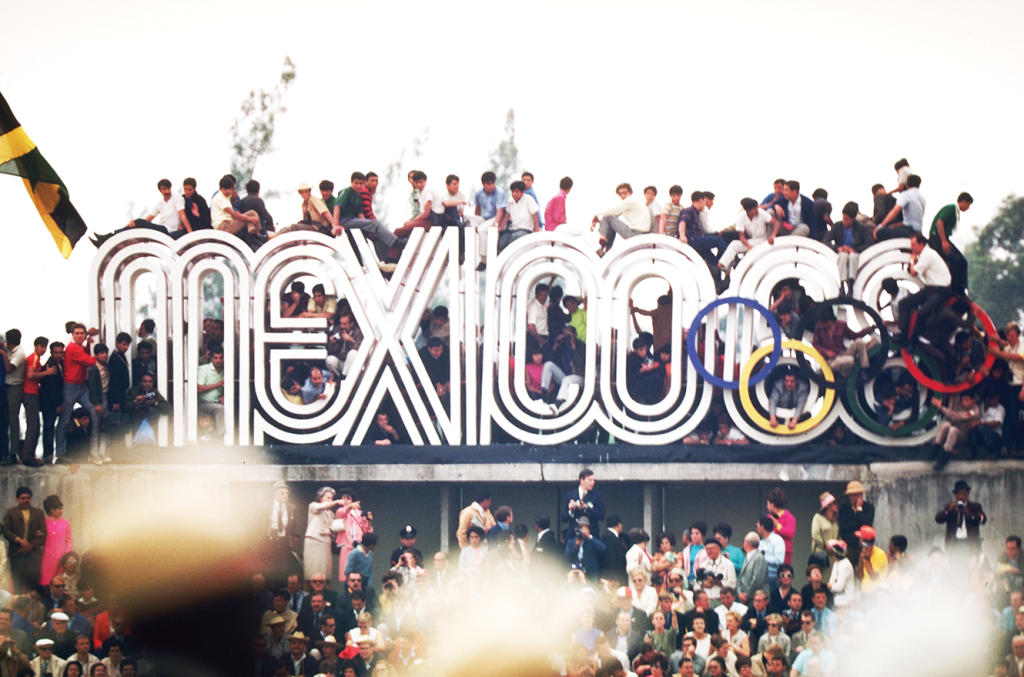
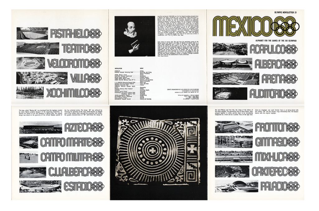
This is exactly the route I would have gone down – Mexico’s identity was so experimental and provided an insight into the history using traditional forms.
Patrick Thomas Breaking News 2.0 Installation:
Interactive installation with people sending in their own message – this is a lovely concept that people can interact with the exhibition in their own way. It also makes the exhibition unpredictable as anybody can post anything each day.
I think this is really effective and engaging with the viewer for these reasons above. The ironic use of using censorship graphics over freedom of expression contrasts so effectively; to me I interpret this as the modern day world is now vastly different from say, the 1940’s. It was definitely frowned upon to say such bold statements and therefore there was a huge element of censorship. Now, we are freely able to say what we like, to who we like through many ways of social media and technology – so much so that Patrick Thomas is brave enough to let people post anything on a massive screen!
I also really loved the fact that Chinese students have been visiting the exhibition and inputting their own language into the text box. This creates a wonderful sense of diversity and cultural freedom, and shows just how far we have come in the modern day where that’s accepted and the ‘norm’ for everyday life. It also provides a beautiful graphic element having alternative languages in the exhibit.
