COVID-19 Government posters:
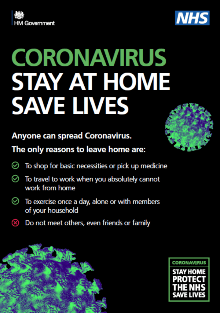
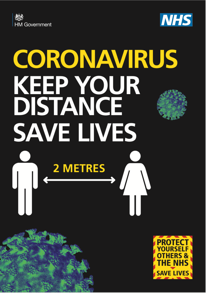
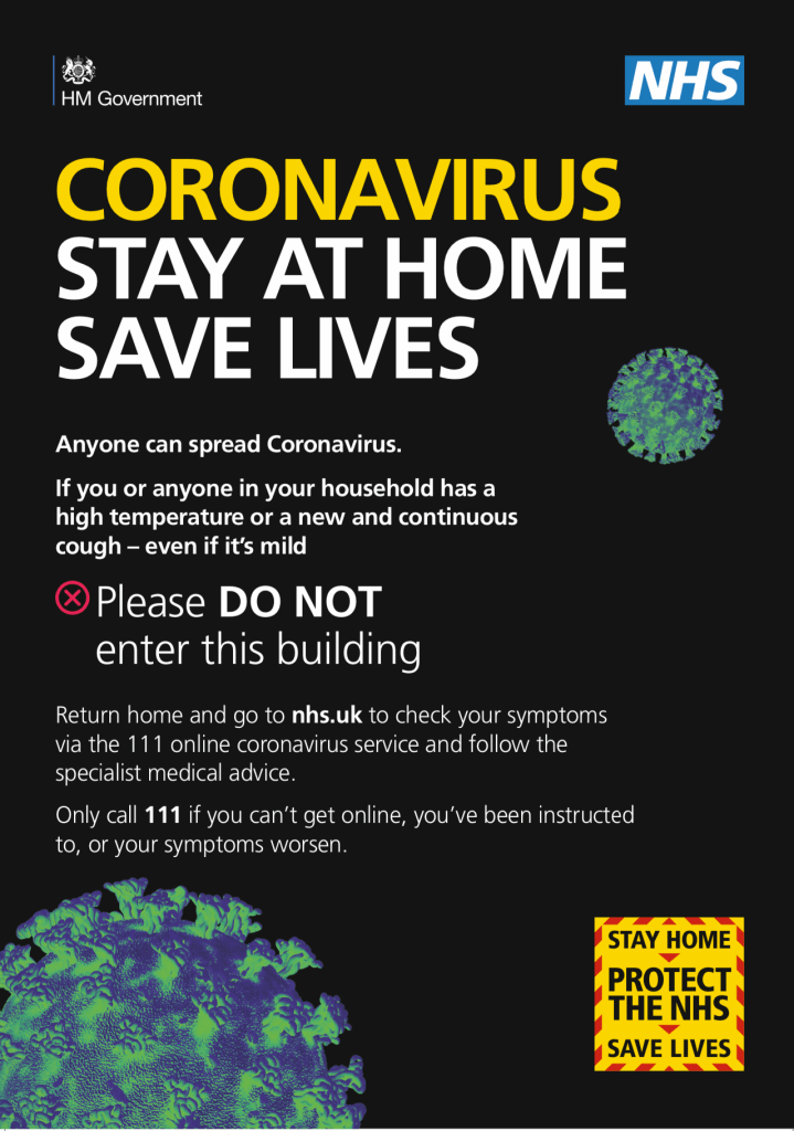
Just from looking at these posters I have come to the conclusion I am desperately wanting to re-design them from a creative, NHS friendly, stay-at-home design perspective. What strikes me most about these posters is that the only recognisable splash of blue we have on them is the NHS logo. Why? Surely these posters need to be celebrating the NHS during this time and blue is instantly recognisable as a healthcare colour. Black is daunting, like a plague. Yellow screams danger, and there is not one sense of the whole community behind coronavirus – the self-isolation, the home-schooling, the social-distancing, healthcare workers, supermarket workers, the way people are becoming creative, gardening/crafting/painting/redecorating. There is something wonderful that is coming out of this – a community.
NHS identity is blue; a symbol of healthcare in the UK 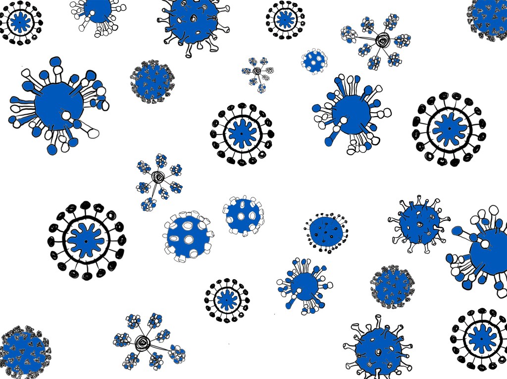
Using the same colour I experimented with colouring in the blue illustrations 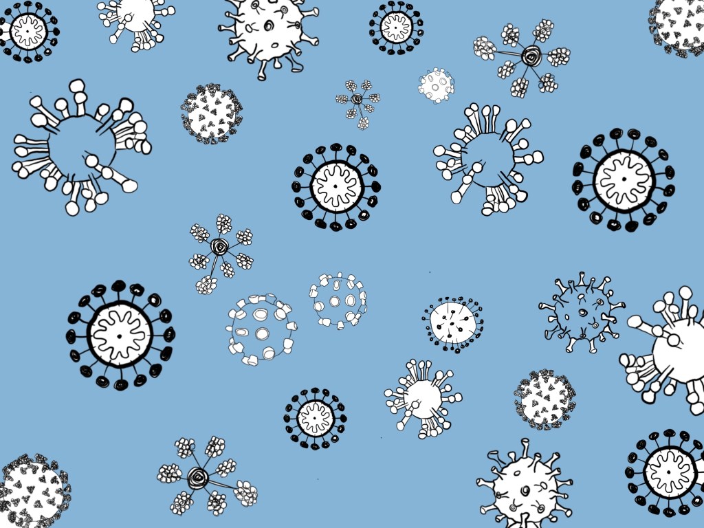
I experimented with using a paler blue background; almost to represent the body of the NHS and its community.
Above, I have taken a blue from the NHS logo and experimented with colouring in the cells. I didn’t think this was very effective as the cells themselves aren’t blue. I then made the blue a pastel based blue and coloured in the background. This works better and I think it looks effective – there’s something about the way the cells are floating around on a blue background that makes it seem quite calming, and safe. This could represent the NHS itself – these little covid-19 bubbles could be people all floating around in this community of self-isolation.
experimenting with different mediums:
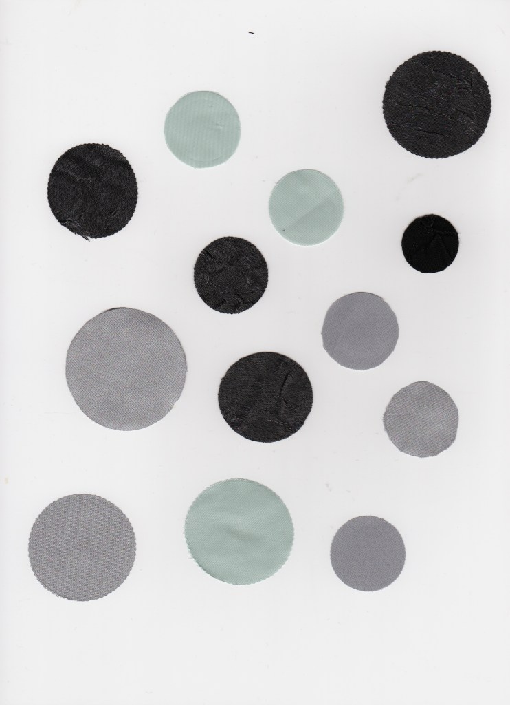
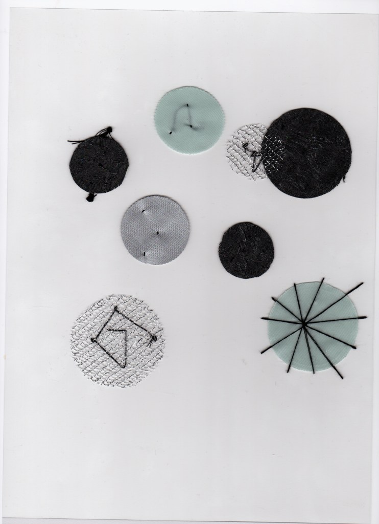
fabric:
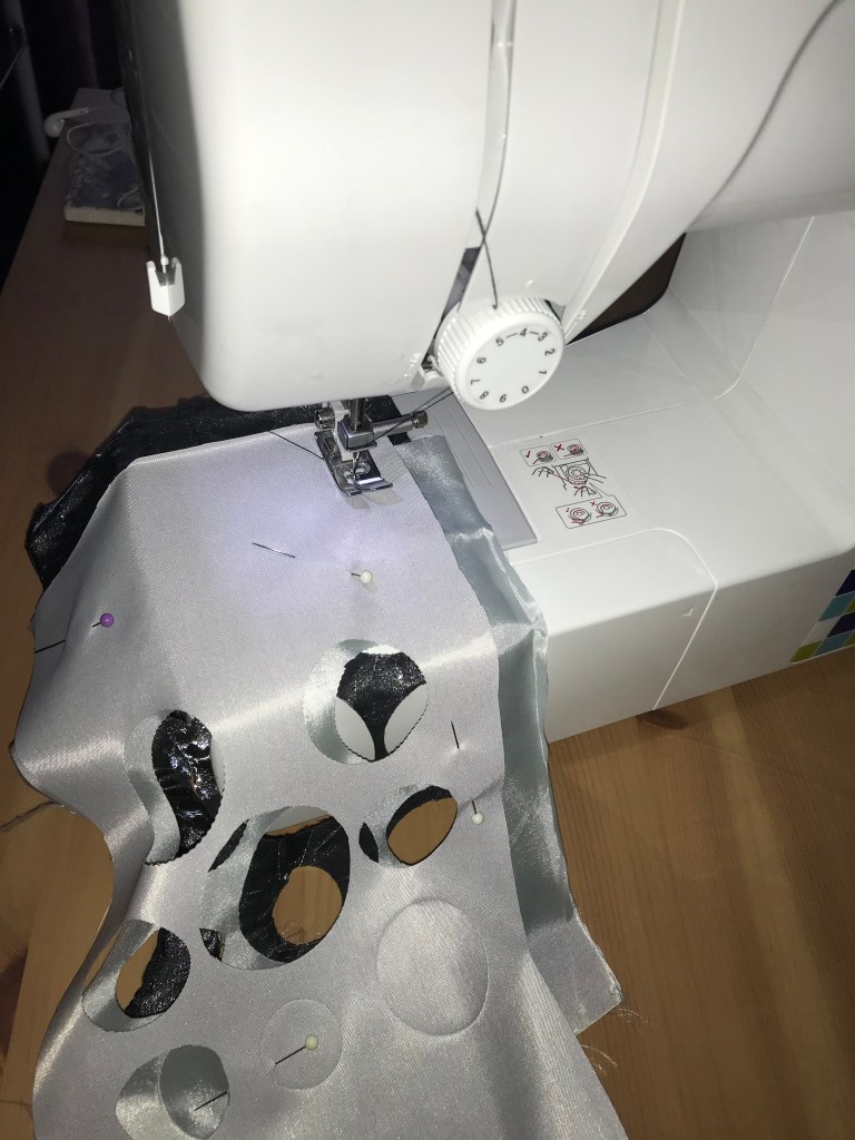
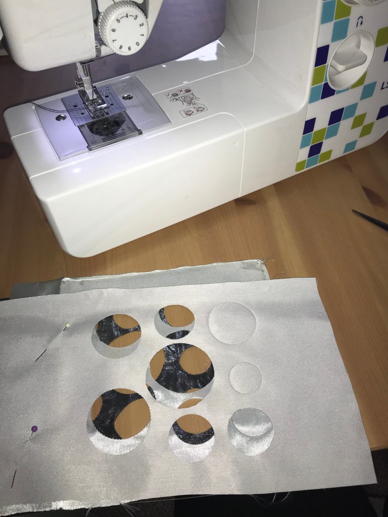
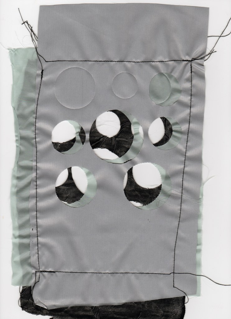
Above, I have selected grey/pale blue material to represent what I have discovered so far in my research – that the covid-19 cells would be grey/invisible and taking the colour blue from the NHS identity.
I have cut out circles from fabric to represent the bubbles. I really liked the cut-out fabric that I used and layered them over each other to see what effect that would make. With the circles, I have sewn some to acetate and made them attached to a clear background, as I wanted the lines to be coming off the fabric to appear spiked.
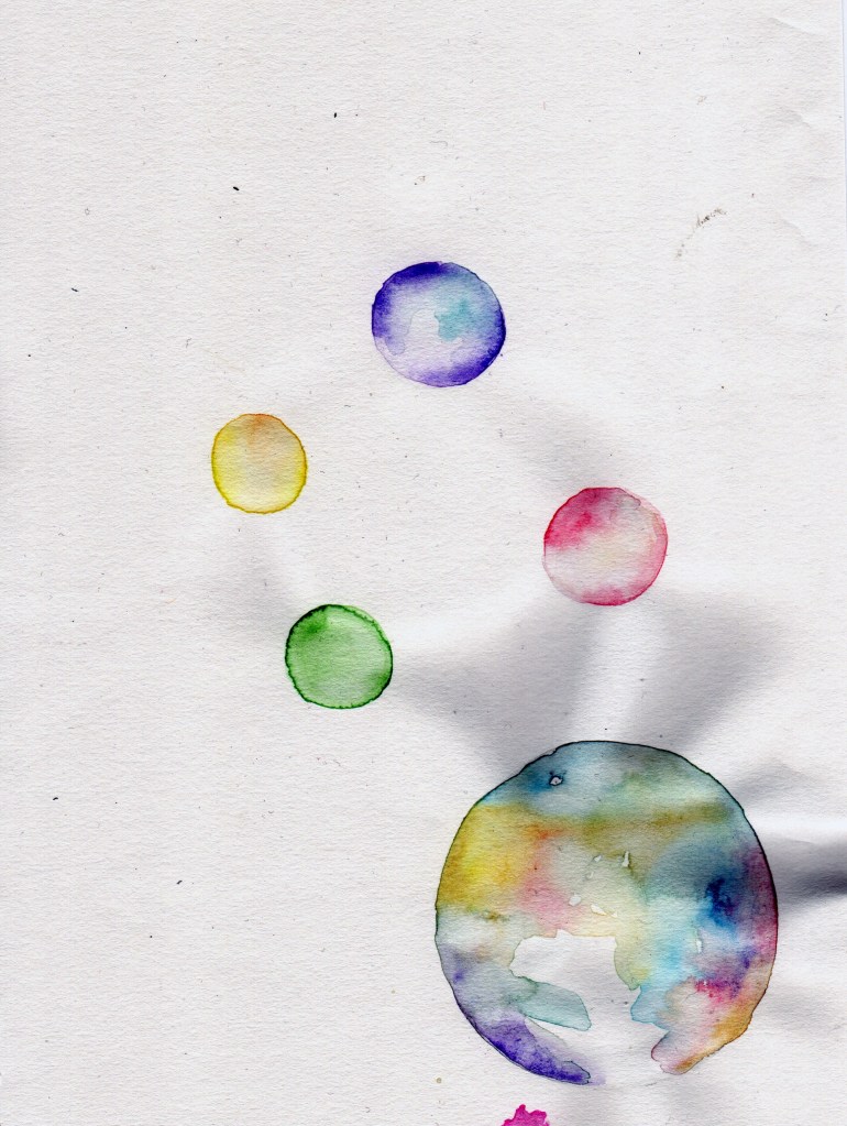
This has inspired me to use colour. I really want to make the posters colourful and as I was originally so inspired by my dishwater soap bubbles – due to the iridescence – I feel it would be so much fun to incorporate that into the final piece.
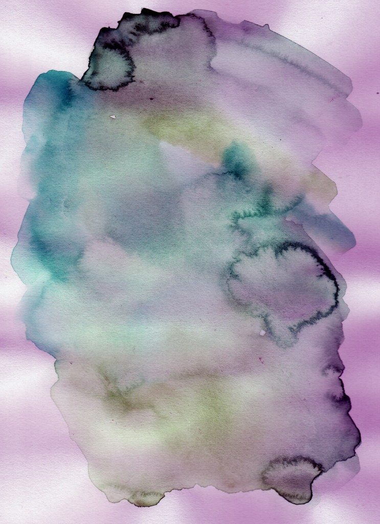
watercolour:
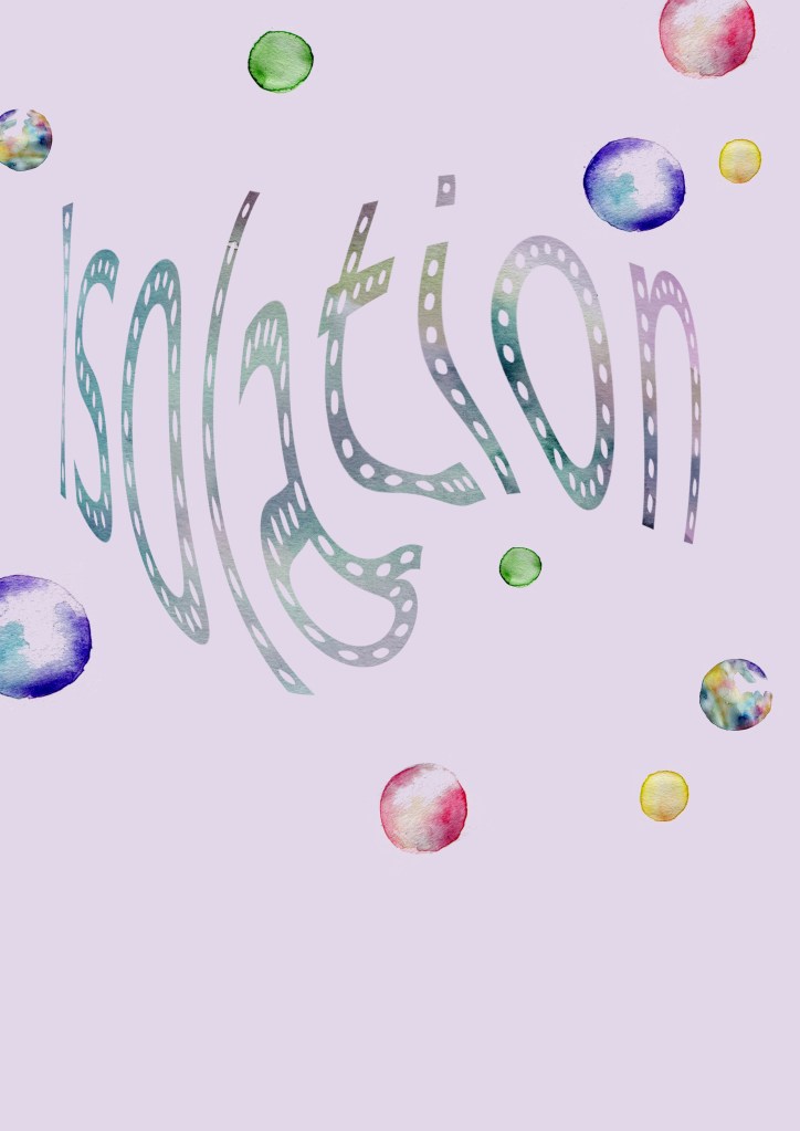
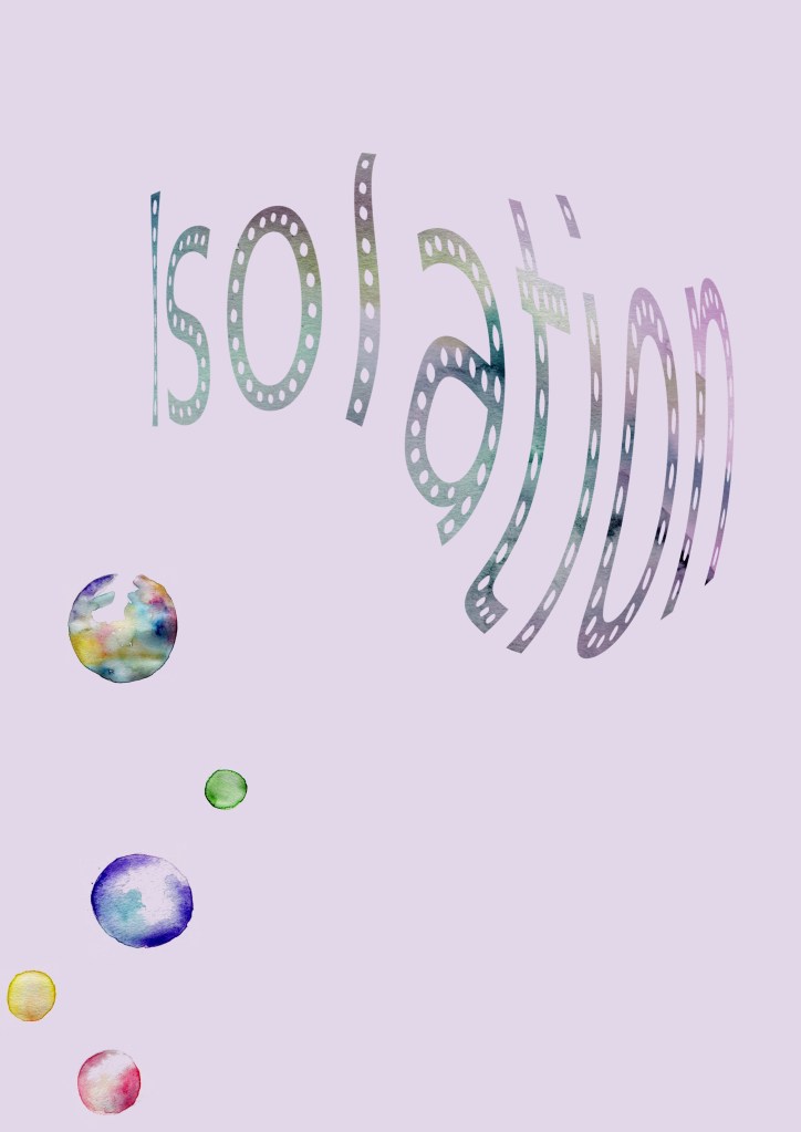
Communicate an emotion you perceive your city or location is about.
Take the word and use an appropriate material, form or medium – 2D, digital, 3D or immersive.
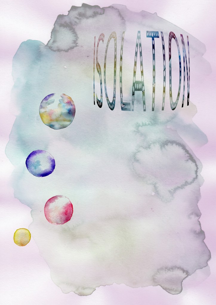
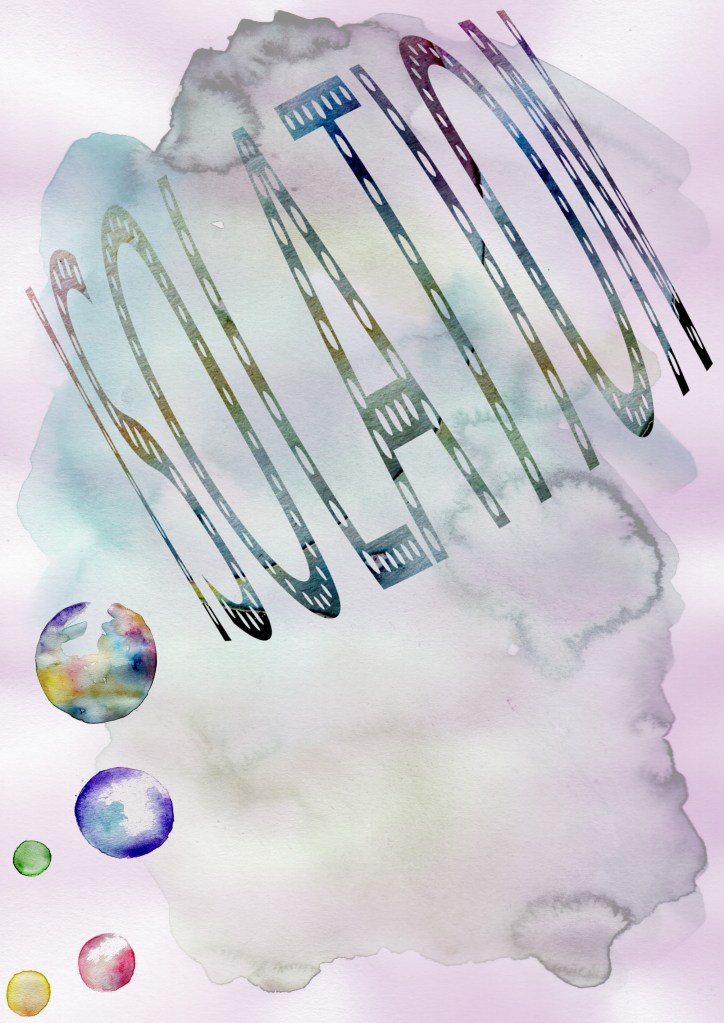
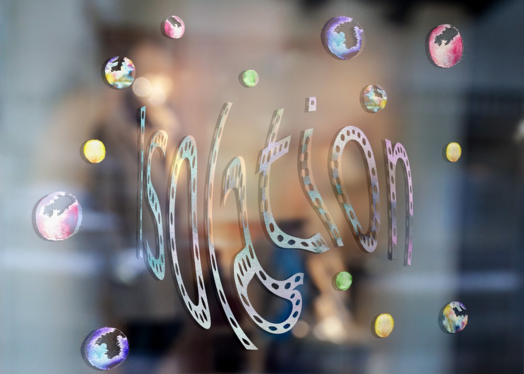
milton keynes – isolation
I have decided to use watercolour as the expansion of the watercolour also represents my city. It is rapidly expanding with industrial areas and housing. Therefore I have experimented with creating watercolour bubbles: