COVID-19 Research:
I watched a documentary on Netflix called “Coronavirus, Explained”:
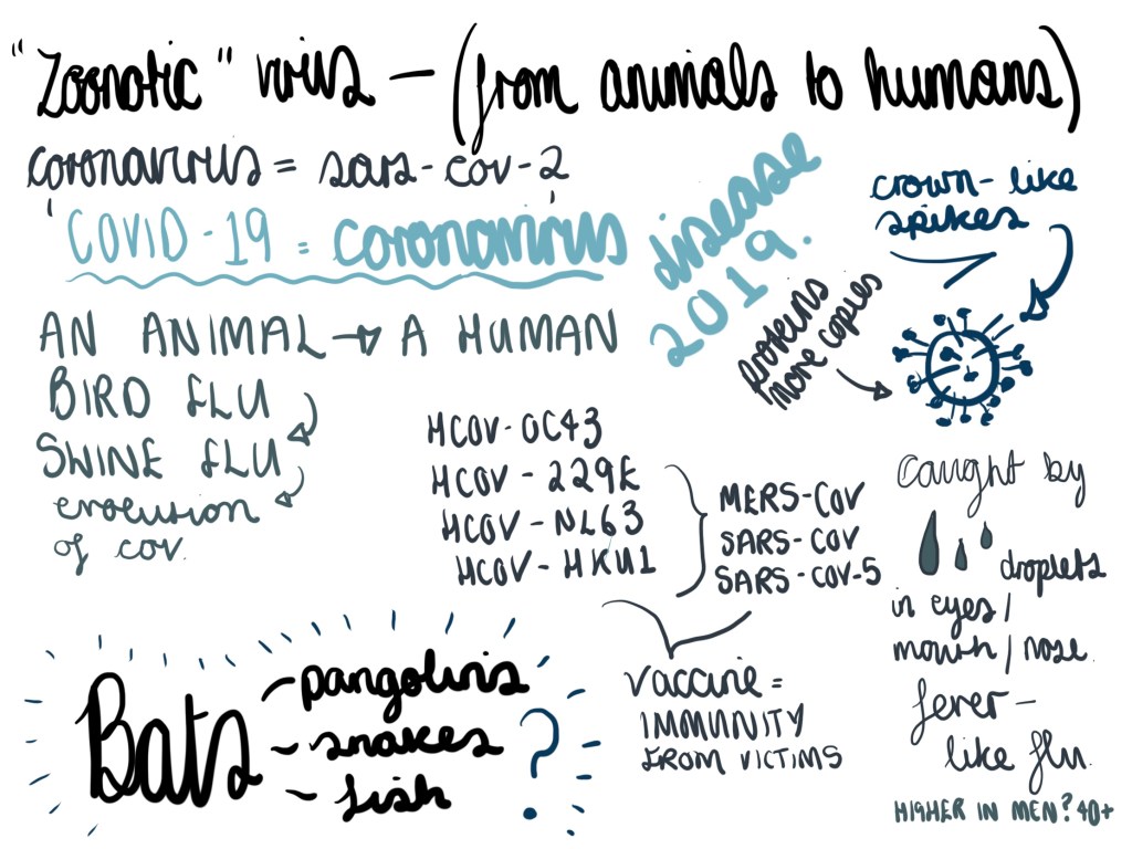
I wanted to be better educated about the virus for this project, and I used my iPad to take notes during the documentary:

I discovered a few things here:
• Covid-19 is a zoonotic virus, which means that the virus has evolved from an animal to a human. Interestingly, there cannot be a direct link from the origin of the virus (the animal) to humans, there must be an animal that hosts the evolved virus (in this instance, bats, pangolins, snakes or fish) which both animals and humans can be victims of.
• There are many types of coronavirus’ which vary from the common cold to extreme illness such as Middle East Respiratory Syndrome (MERS) and Severe Acute Respiratory Syndrome (SARS).
• Coronavirus is a cell that makes duplicate copies of itself and therefore rapidly consumes the immune system of a living animal or human.
• I learnt that the coronavirus has “spike proteins” and visually, I wanted to draw some illustrations that present these spikes, to represent Covid-19:

Black and white original procreate drawing
After drawing the outlines I was desperate to know what colour these cells actually are; after all the range of illustrations in the news, in articles, online all vary – some are red, some are green. From further research I have discovered that the cells are actually invisible (obviously they are invisible to the human eye without immense magnification). What better way is there to present this than using grey? I have coloured in the illustration with varying hues of grey:
“Stripping the coronavirus of the distracting vibrancy of vivid colour – and seeing it consistently as an inert grey particle – could help reduce community fear and better allow us to continue the enormous collective task of managing its biological and social impact.” – The conversation
I found this quote to be very honest, and in fact it’s the only quote on several articles I’ve read that seems to encourage the coronavirus being grey in illustrations globally. It’s clear why the illustrations are red and green; to cause urgency, panic and ultimately sell.

