
Brochure version #2
In week 8 I began my concepts with orange, yellow and violet (combination of blue and purple). I am happy with these colours as my research in colour psychology fits well with my project purpose:
Orange: energetic, enthusiasm, stimulation
Yellow: liveliness, optimism, happiness, attention
Violet (qualities from both blue and purple): wisdom, truth, prosperity, sophistication
I have made the conscious decision to drop pink out of the branding, as I think 3 colours works just as well. Pink also doesn’t represent the motivational creative properties that the above three colours do.
I have amended the feedback given to myself above and done the following:
• introduced colour scheme
• heading titles removed, and placed on the activity pages instead
• changed a few activities to be more tailored to design.
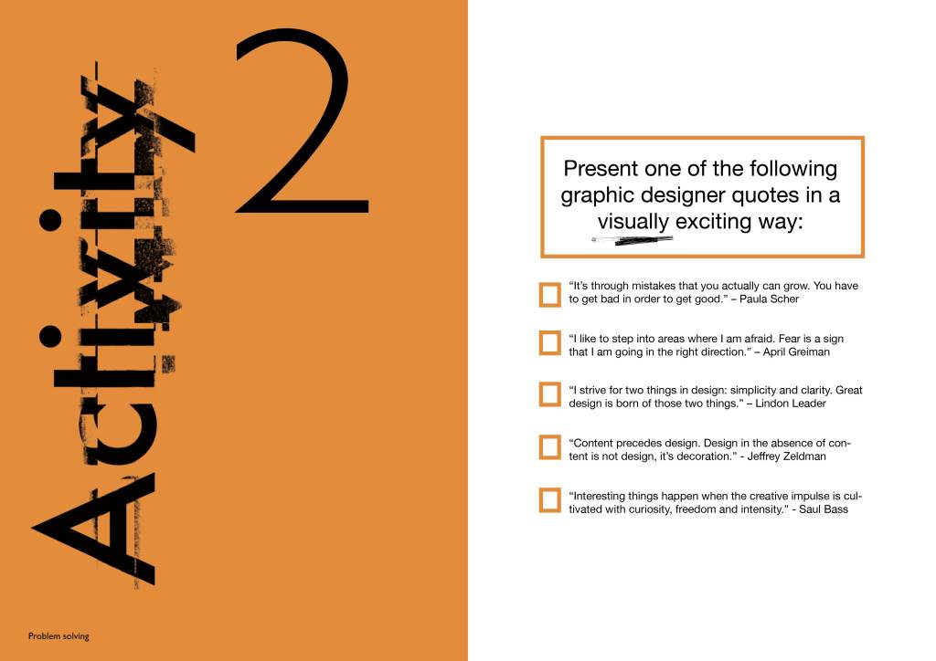
1. instead of create a newspaper cover/article, choose one of the following famous graphic designer quotes (and Saul Bass as he is one of my favourite designers)
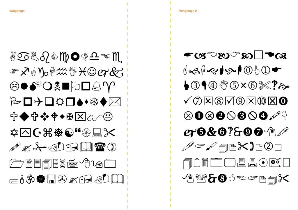
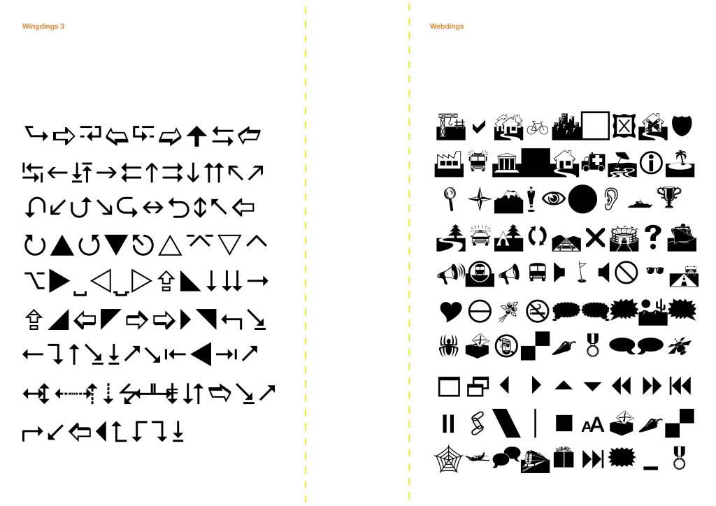
2. instead of the very vague ‘create a team poster using shapes’ I have introduced wingdings typefaces as I feel this is a really good way to introduce icons in the design world – also the variation between Windings, Wingdings 1, 2 and Webdings

Contents page currently blank as needs developing 


I sourced the graph from this website and applied as PDF 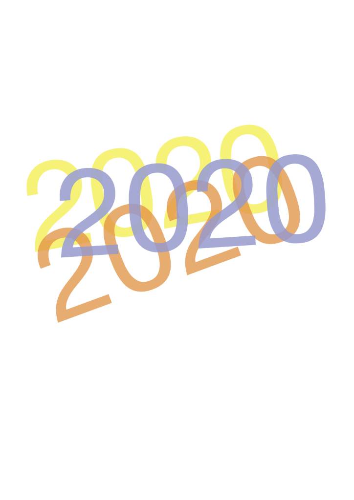
Feedback #2
What works:
• Really like the colour scheme, it’s energetic, cheerful and playful
• Love the element of tear out pages; this also reduces amount of ink wasted as I’m only printing on the tear-out area instead of whole page (this is an element of my sustainable typeface research coming in!)
• Having additional pages of blank, lined and graph paper is useful and more environmentally friendly as if delegates need more then they can scan them in, as opposed to throwing half a booklet of paper away
To consider:
• A huge part of my research is about the whole ‘hands on’ playful element, scribbled notes in journals, smudged ink, ripped paper, cutting up paper and sticking with glue on the page. My brochure as it is looks very ‘digital’ and although the activities would be encouraging designers to ‘craft’, I feel it could be tied in to the branding in some way. I now want to reconsider the front cover, maybe this could be ripped up letters like my experiments where I scanned them in?
• Consider the ‘activity’ wording also; maybe this is stuck on letters and scanned in too?
• Contents page – the lines. Consider; are they necessary?
• Could I do some of the activities and incorporate this into the design somehow?
Reference to further develop my feedback for my brochure
I have discovered an article “Malleable Thought: The Role of Craft Thinking in Practice-Led Graphic Design” – Welby Ings which has been a thoroughly interested read. In relation to my research it is evident that craft had fallen ‘out’ of creative roles since the introduction of computers in the 90’s and instead, computers are actually considered a craft. These two screenshots are areas of text I found informative:
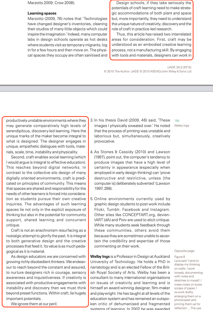
Paragraphs 1 and 2 
Paragraphs 3 and 4
“Craft is not an anachronism resurfacing as a nostalgic attempt to glorify the past. It is integral to both generative design and the creative processes that feed it. Its value is as much peda-gogical as it is material”
Welby Ings
I particularly liked the first and second paragraphs which highlighted how beneficial craft is to the classroom environment, and even the mention of ‘social’ learning. Ings highlights the importance of craft for fundamental learning and understanding of graphic design. My workshop brochure is fully supportive of this theory as it will encourage experimentation, with hands-on research. This will produce better outcomes for projects and more importantly, ensure they are innovative and have learnt how to produce design with craft.
