
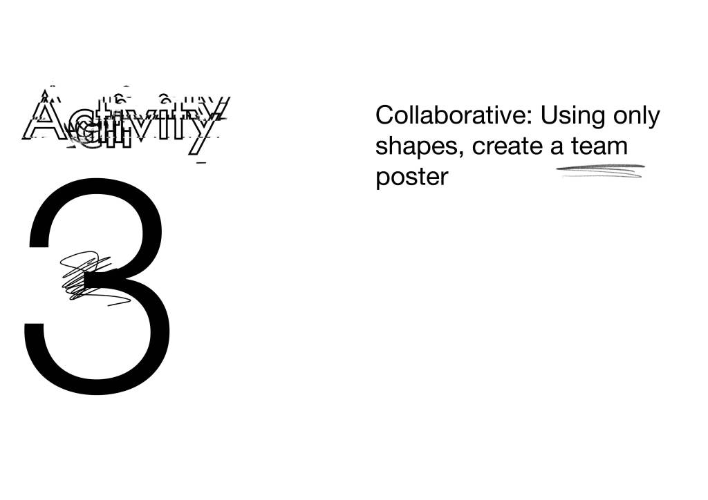
Brochure development version #1
To start the mock-up I am choosing one activity from each of my three workshop activities:
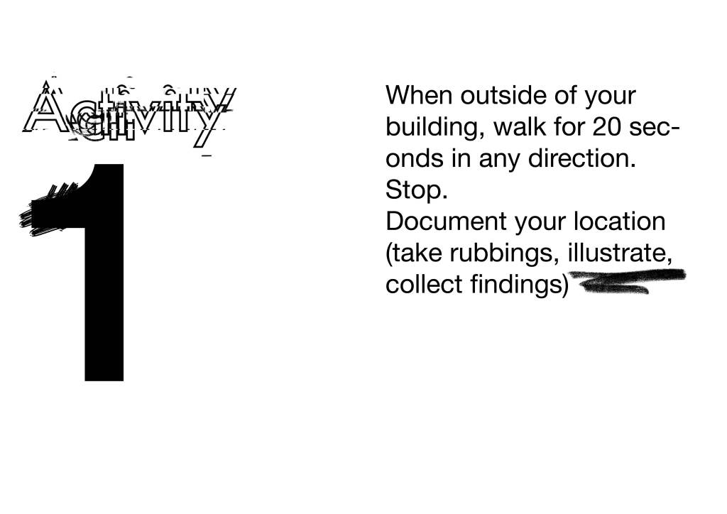
• Interactive: When outside of your building, walk for 20 seconds in any direction. Stop. Document your location (take rubbings, illustrate, collect findings)
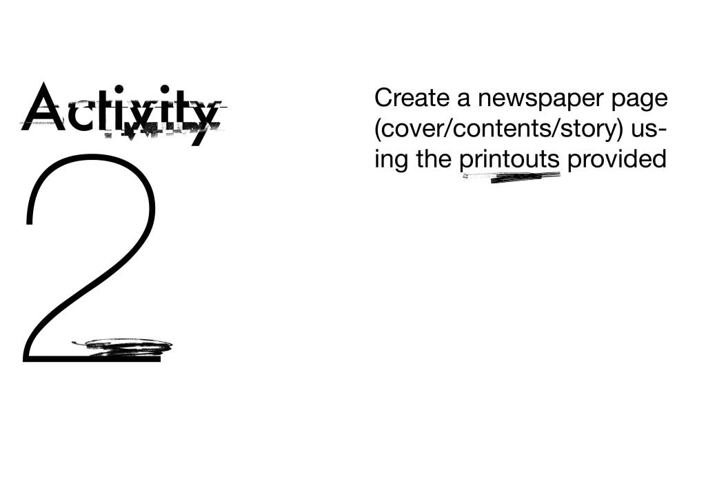
• Problem solving: Create a newspaper page (cover, contents, story) using the printouts provided
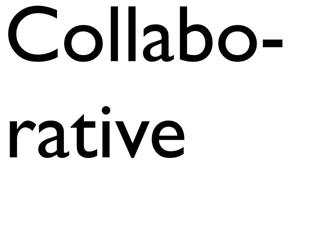
• Collaborative: Using only shapes, create a team poster

Feedback version #1
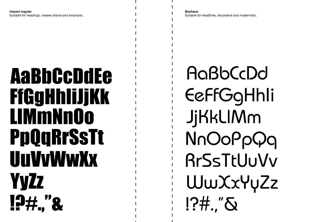
I have deliberately done it really random with lots of clashing typography and shapes, I wanted to see what works on a spread. The elements I like most are:
• the ‘activity’ distorted text and written activity on opposite page
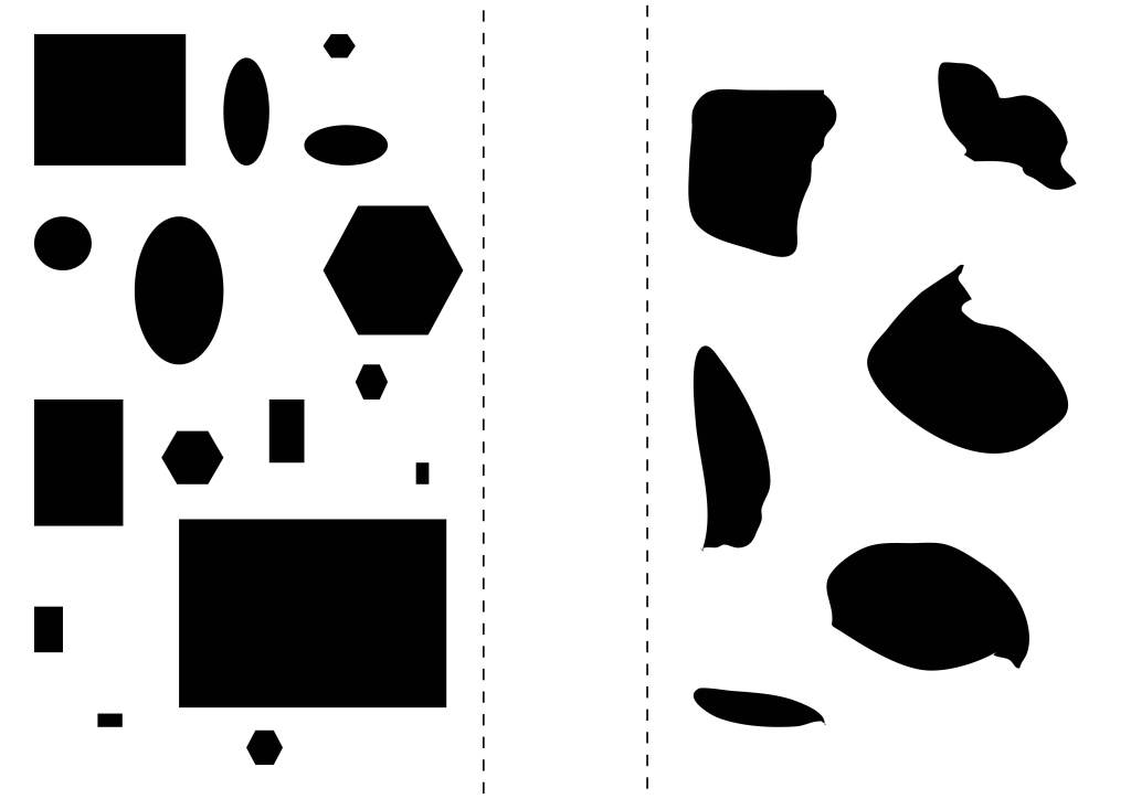
• the squares, rectangles and hexagon shapes scattered across the page
• the tear out pages of type for delegates to scan in, cut up etc during the workshop (or after)
• the scribbles distributed throughout to give that ‘imperfection’ element
The elements I want to improve are:
• colour scheme
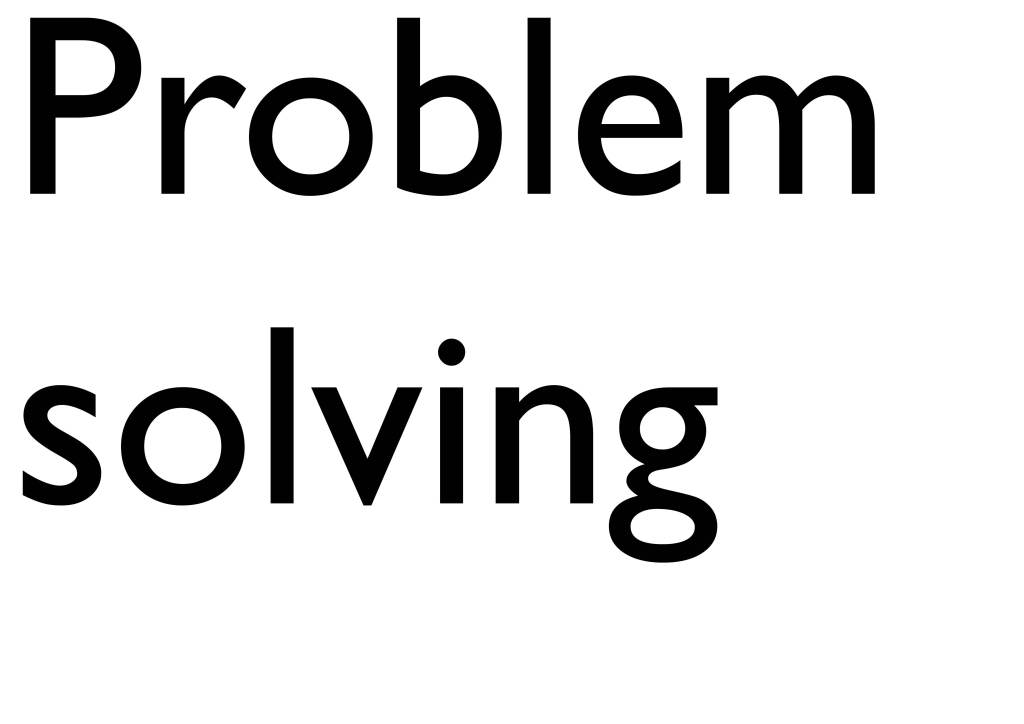
• the header titles i.e. ‘problem solving’, ‘interactive’, ‘collaborative’ (can I introduce this on the activity page instead of numbering? maybe the pages have a header, footer or pattern? consider colour?
• shapes – does this work? consider the activity also; is it specific enough?
