Chosen concept development
Individual brochure experiments
Branding and identity
All of the research this week and since week 5 has left me wanting to just play with print-outs, scanning, and different ways of warping lettering. Some have been more effective than others, which I detail below:
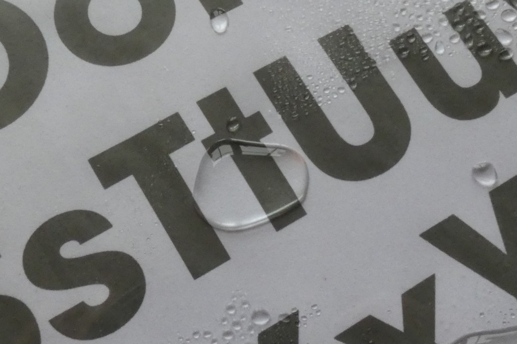
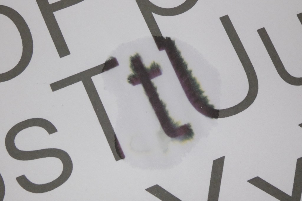
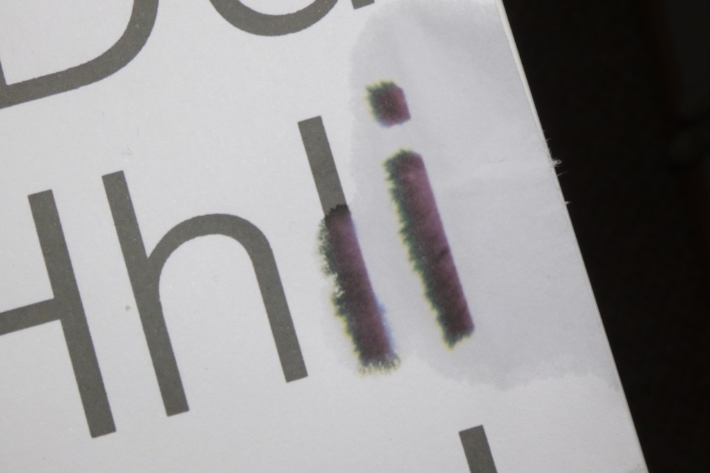
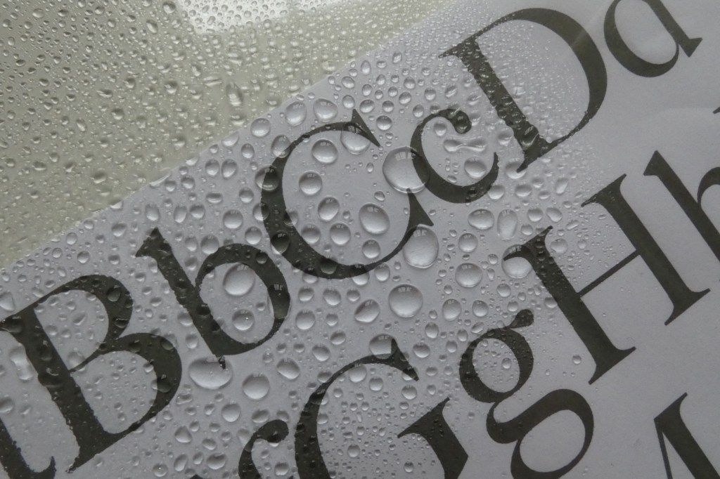
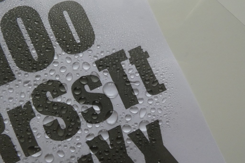
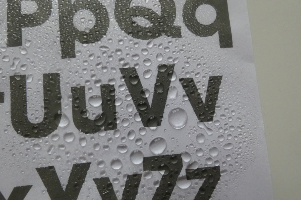
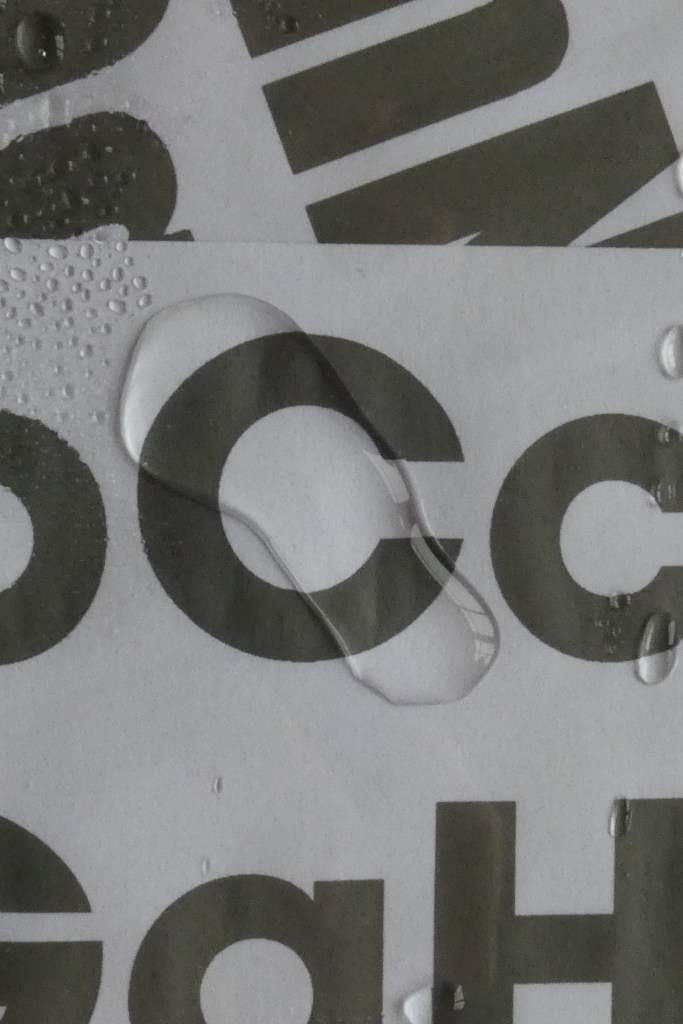
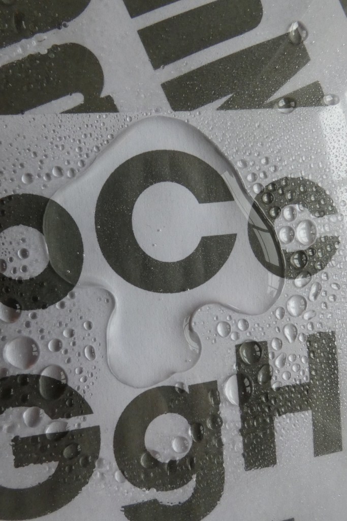
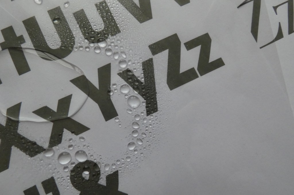
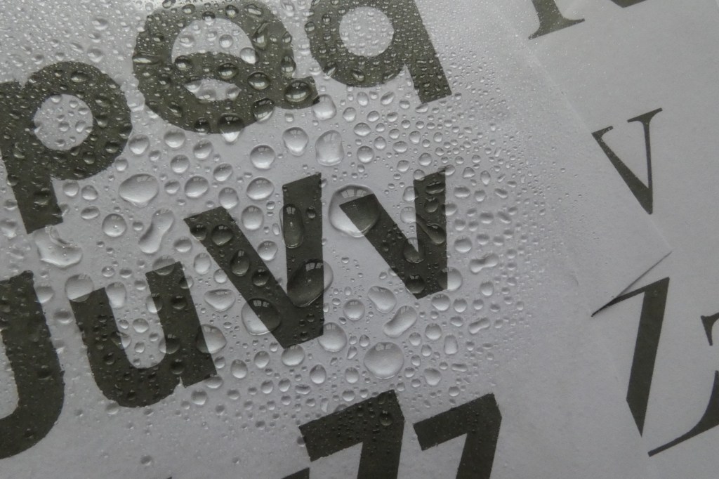
Spraying water on print outs, and layering over acetate
To begin with I printed out four different alphabets; Impact, Helvetica, Didot and ITC Garamond. I took acetate and sprayed water over the typeface; more so the letters needed to spell ‘activity’ as a starting point. There’s some really interesting bleeding with the ink and water dispersing on the paper which I captured; the colours have split revealing what black ink consists of. Droplets in various sizes also create an interesting magnification effect. I am glad I experimented with this first as it does look playful.
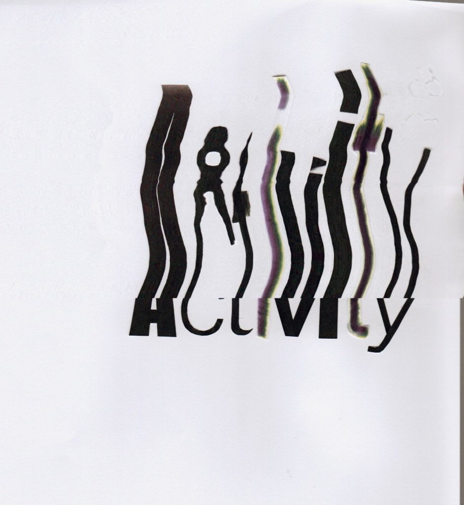
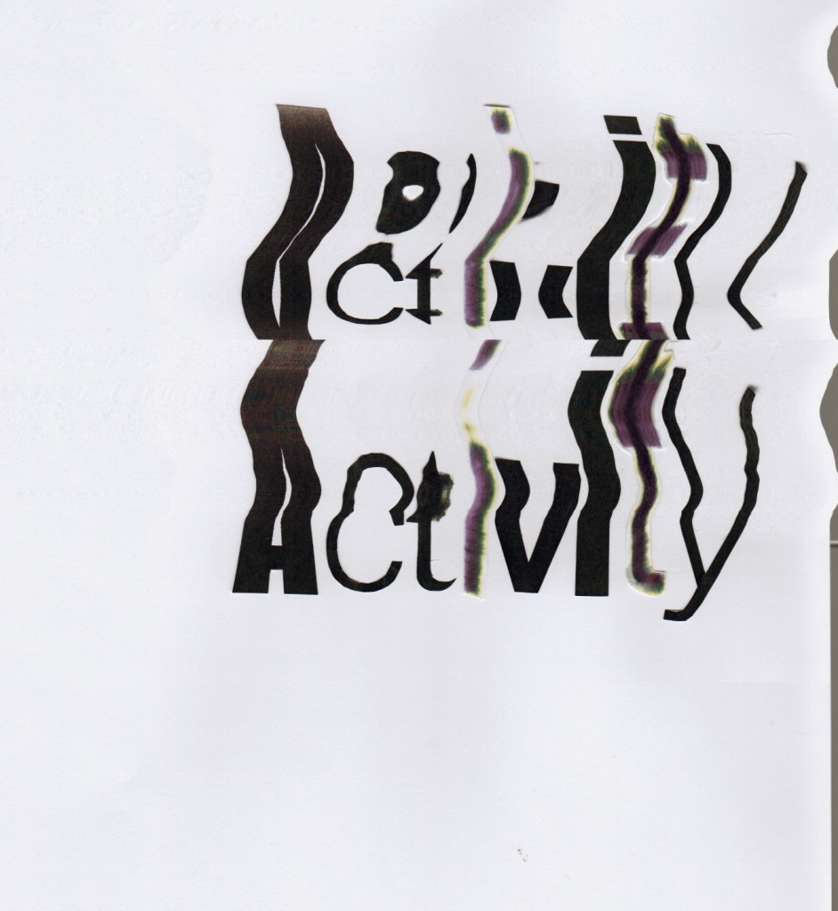
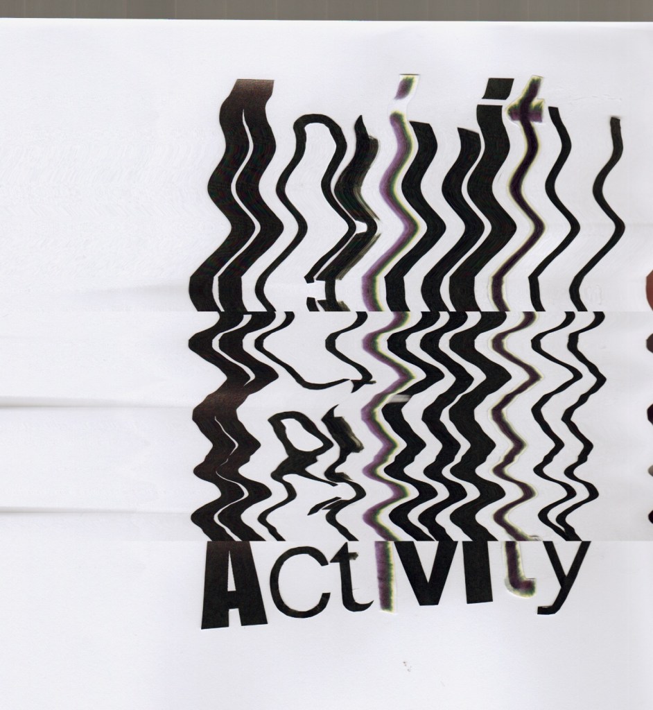
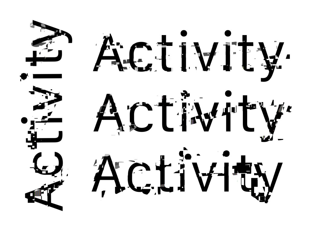
Moving the print outs when scanning
I have cut the previous letters up to make the word ‘activity’ and scanned it in, but moved when scanning. Each scan is unique as I didn’t know what it would look like until I scanned it in. There’s some really lovely movements; and the fact there are different textures really works in the final distorted image.
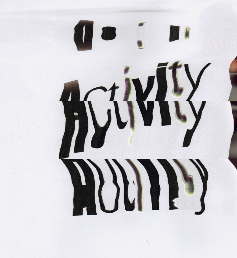

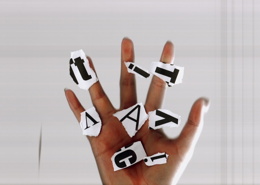
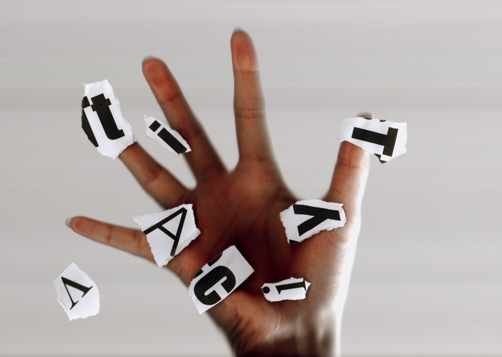
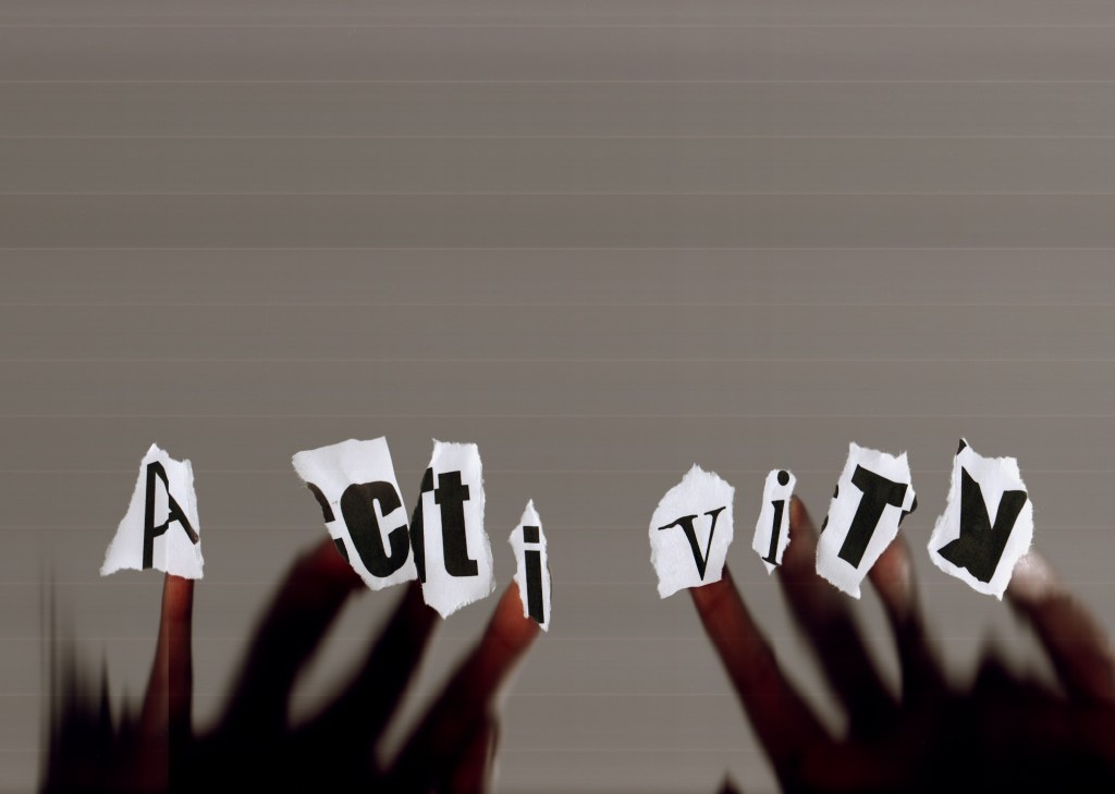
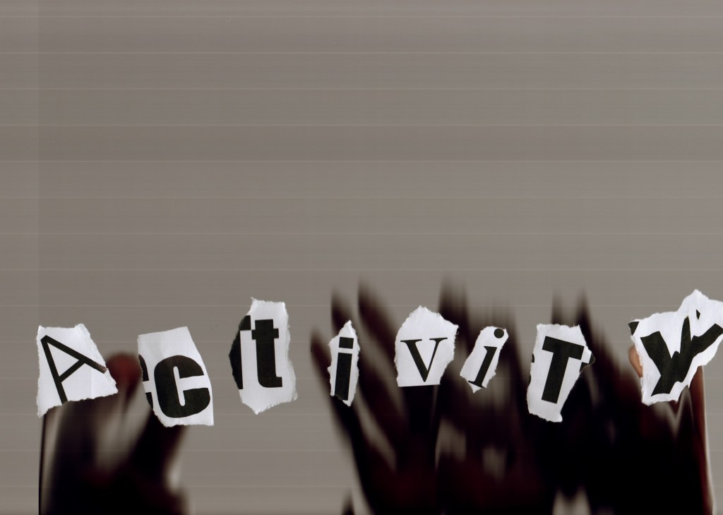
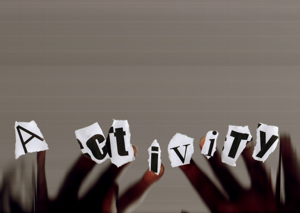
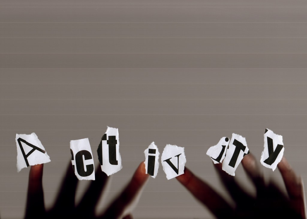
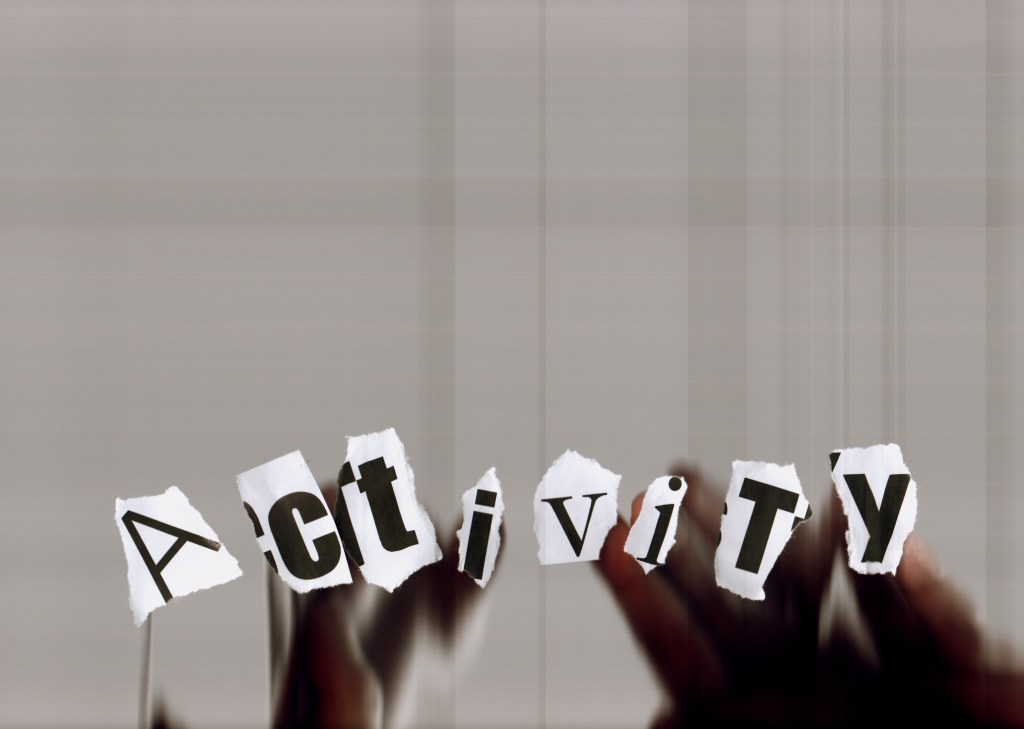
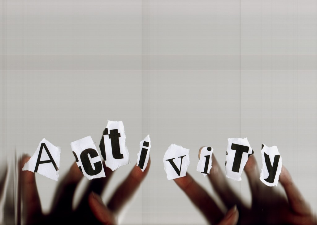
I then ripped up the paper and tried to scan in and accidentally scanned in my hand, and then thought what if this made a great cover? I experimented with different arrangement of jumbled letters:
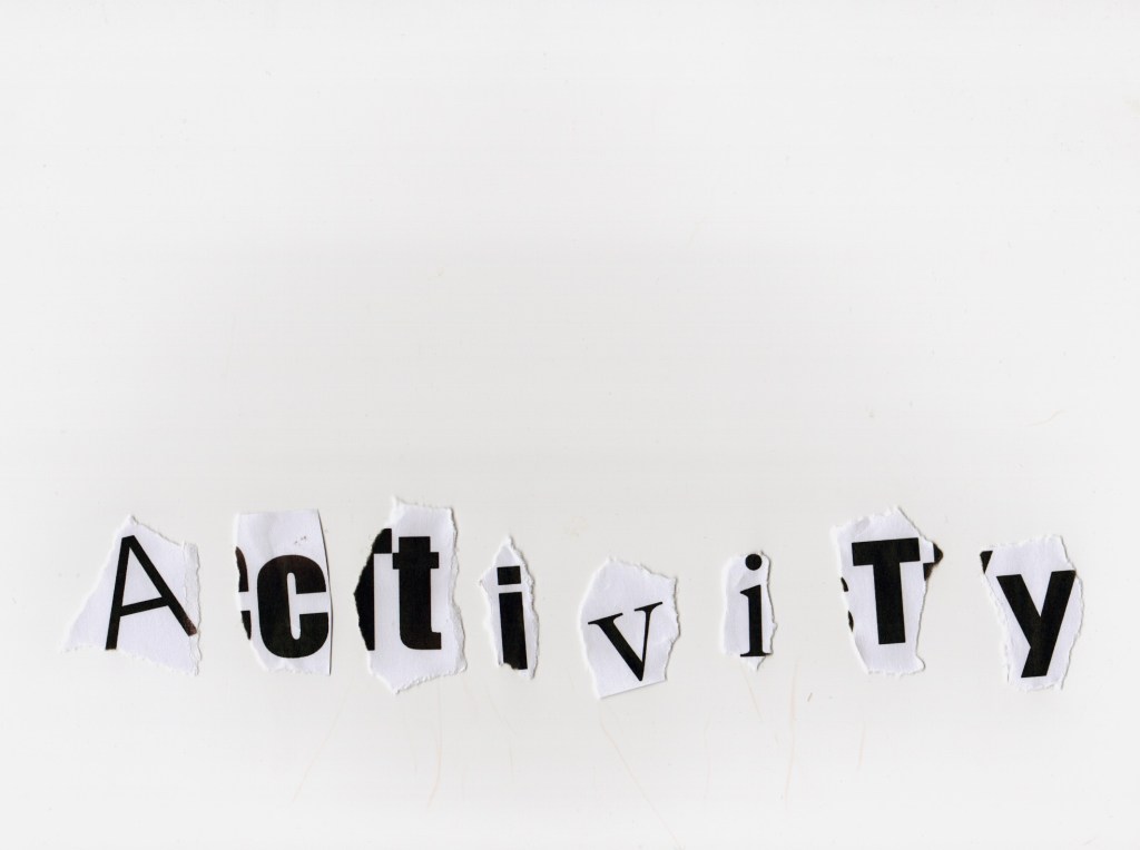
Ripping up the print outs

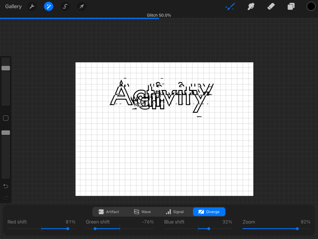
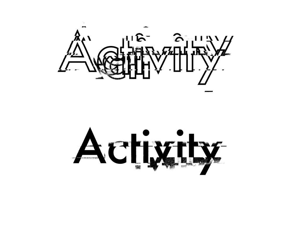
Glitch mode Procreate
Working digitally next, playing around with settings on Procreate with my iPad/iPencil to distort type. I found the ‘glitch’ mode which has various settings – I have never used them before so enjoyed exploring the effects. Changing the sliders in the ‘diverge’ setting turned out to reveal the most interesting outcome. I really love the layering effect here; almost as if it is in motion.
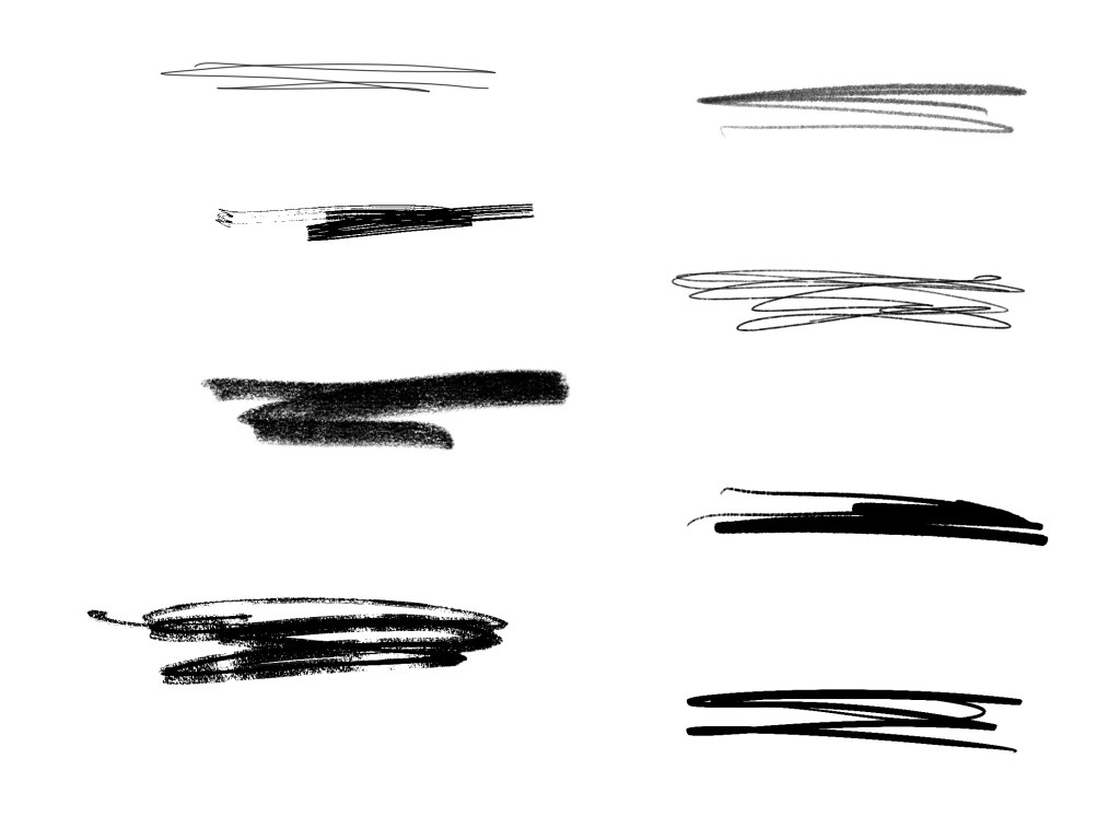
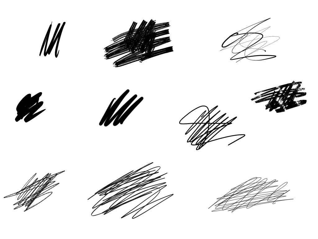
Scribbles
I thought these would make great layering details just here and there as if I have scribbled on the page. These are all different brushes with different pressures and textures. I have used an assortment of ‘pen’, ‘calligraphy’, ‘paint’ and ‘sketch’ brushes. I will experiment with these in my layout.