Distorted typography inspiration
Continuing to explore the element of playful typography and layout on the page, I feel looking at distorted, experimental type would be another great starting point in addition to looking at journals. It’s interesting in my research to capture different methods of distortion whether that be writing with a pen, industrial lettering or digital artwork. I have found a few designers who specialise in this area:
Chris Ashworth
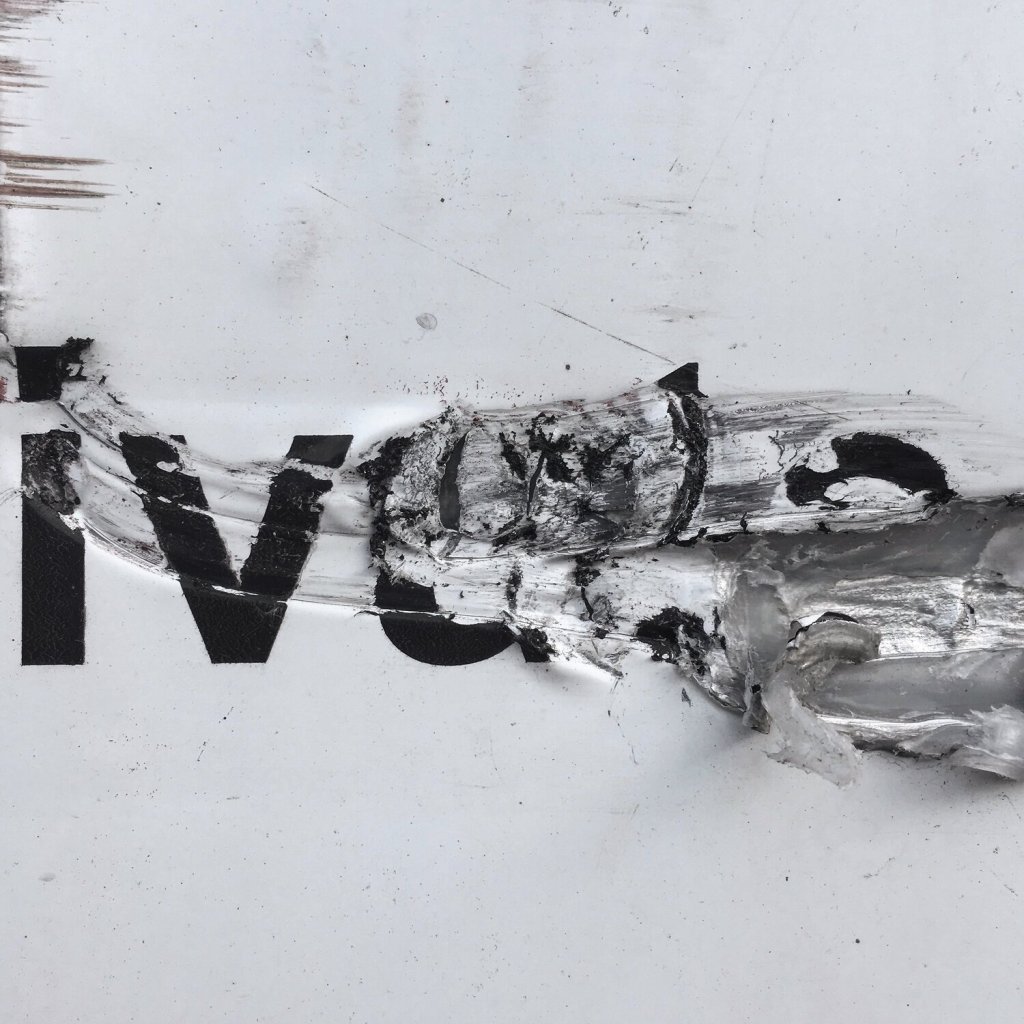
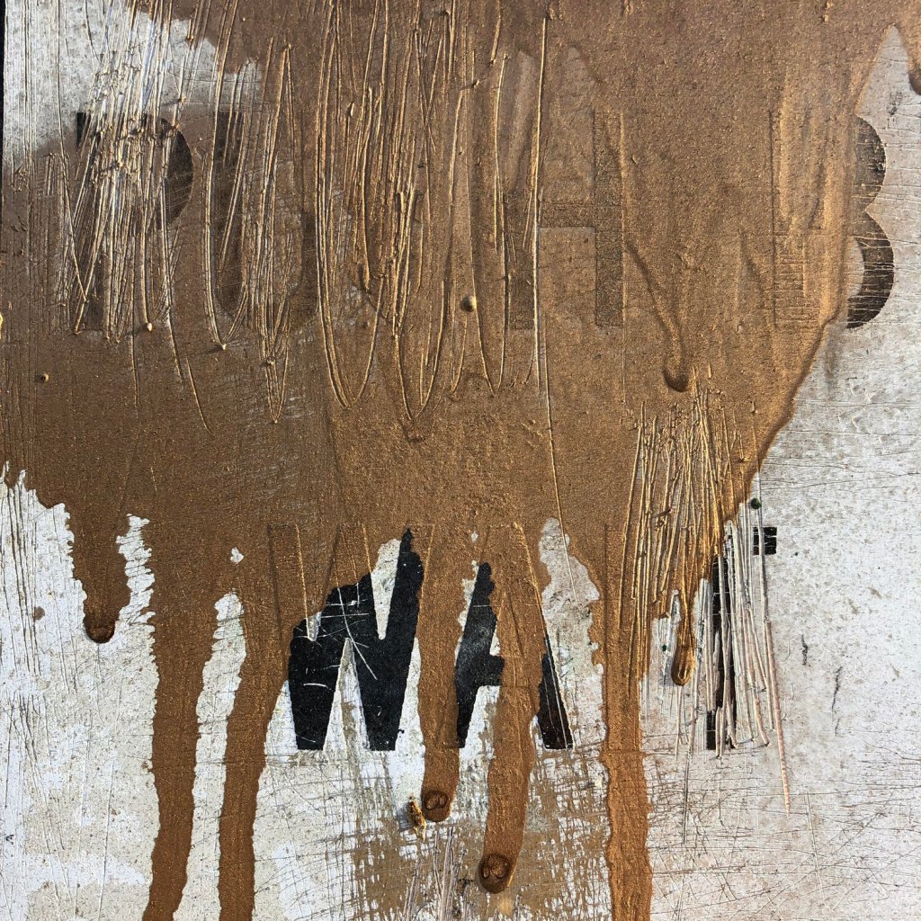
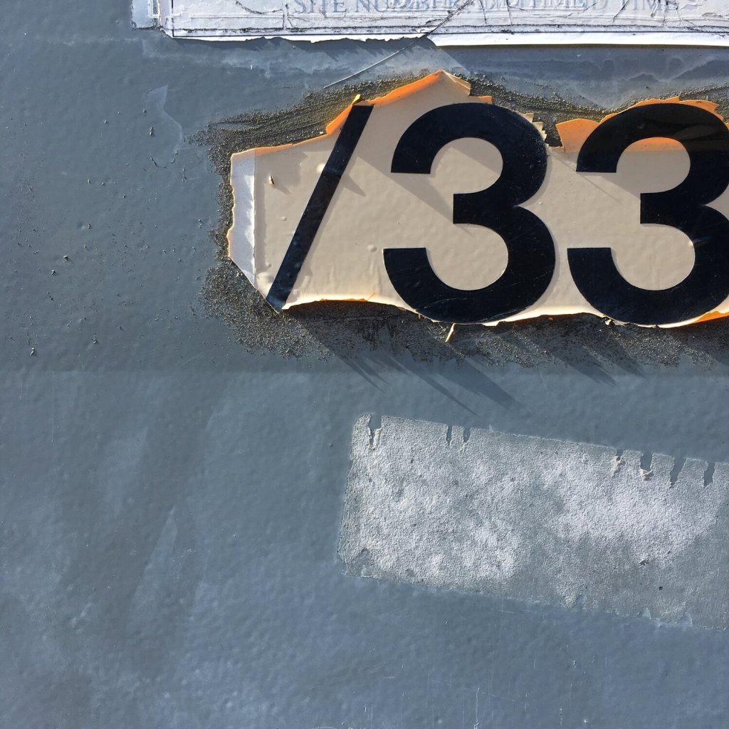
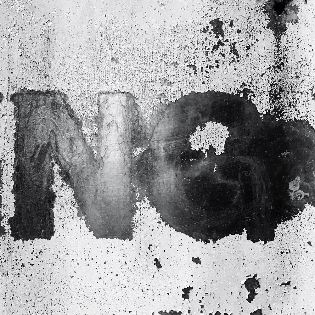
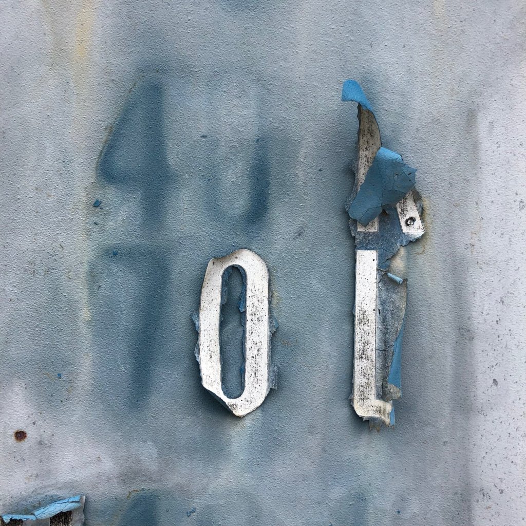
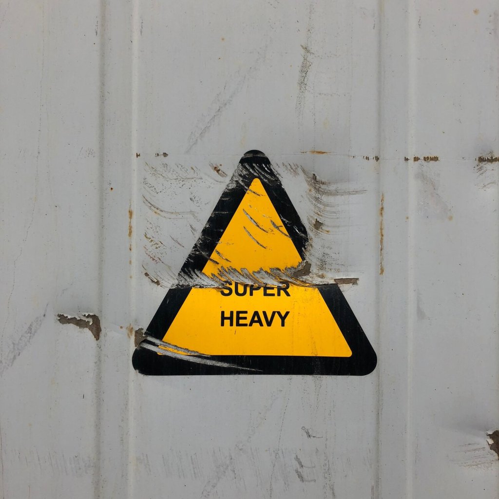
Found Type – Photographs taken by Ashworth
These intrigue me. The mixed media element here in the industrial form is full of beauty (the photography taken in this way accentuates the beauty in the details, which helps!). However, seeing how the type is wearing away, damaged accidentally through daily exposure, or disintegrating tells a story. It tells more about the location and the purpose than an ordinary sign would and it’s thought provoking. How did gold paint end up there, or how did the warning sign get scratched? Maybe it was by something heavy… Irony?
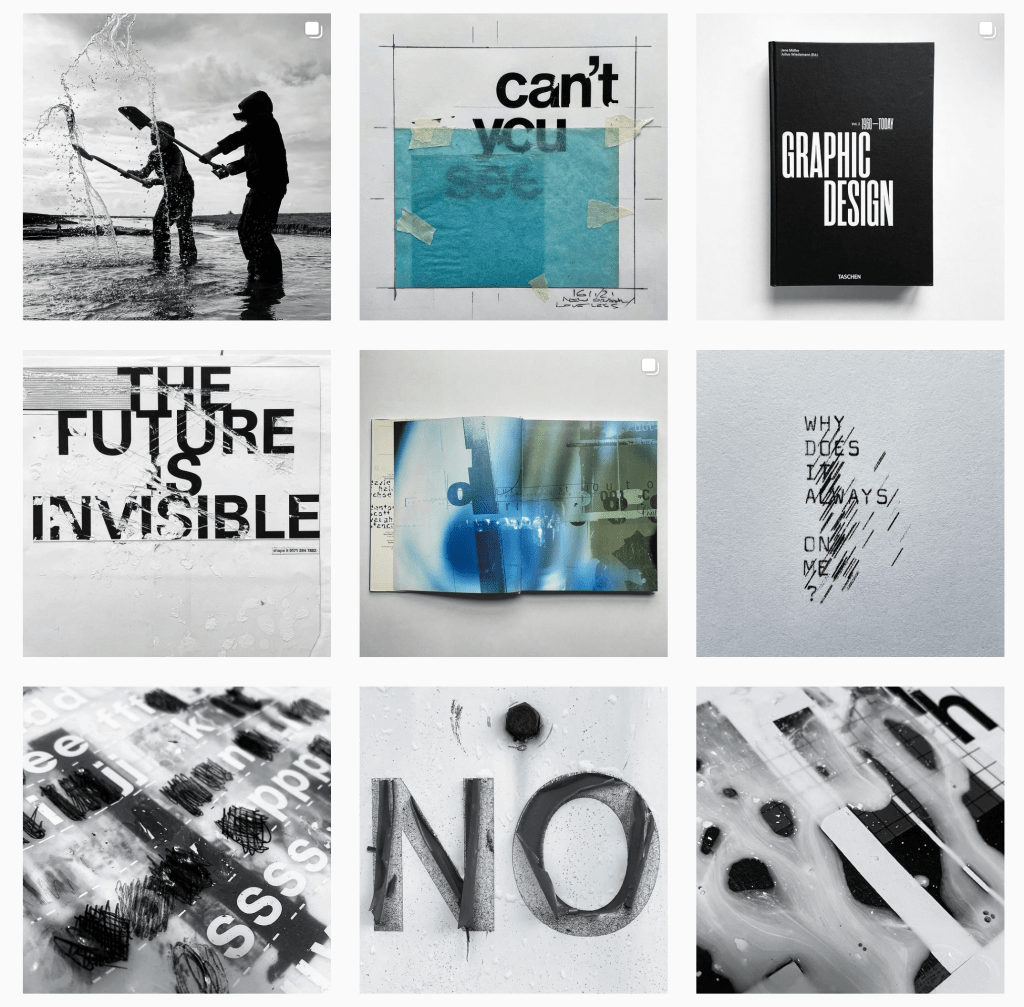
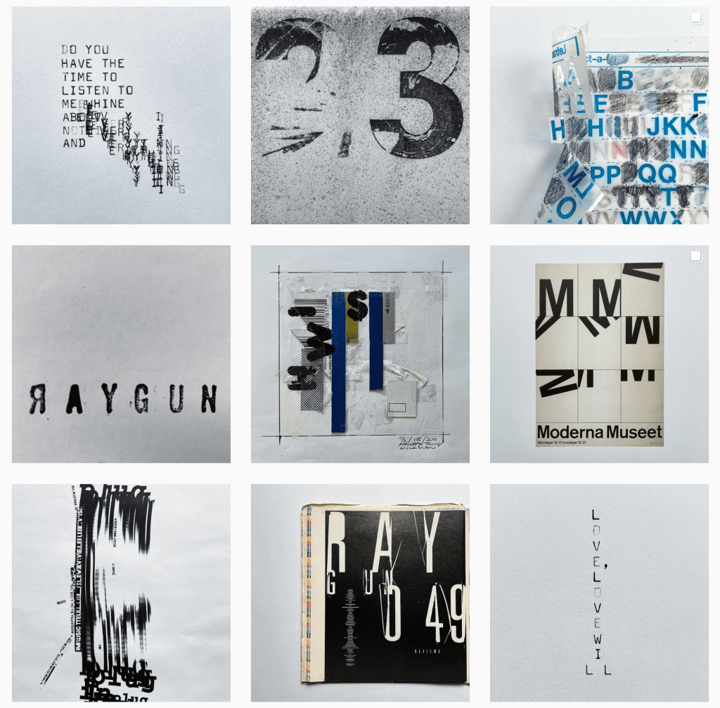
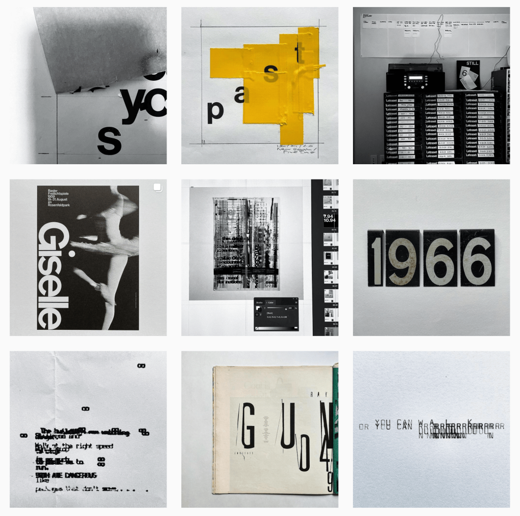
Instagram posts by Ashworth
Ashworth’s Instagram is so inspirational to look through; I just instantly can see his eye for quirky distressed typography. There are some posts that remind me of week 6’s ‘pleasedonotbend’ – “have you printed it out?” project, which explores the detailed scribbles made during writing or designing that make for very visually interesting details.
Pentagram
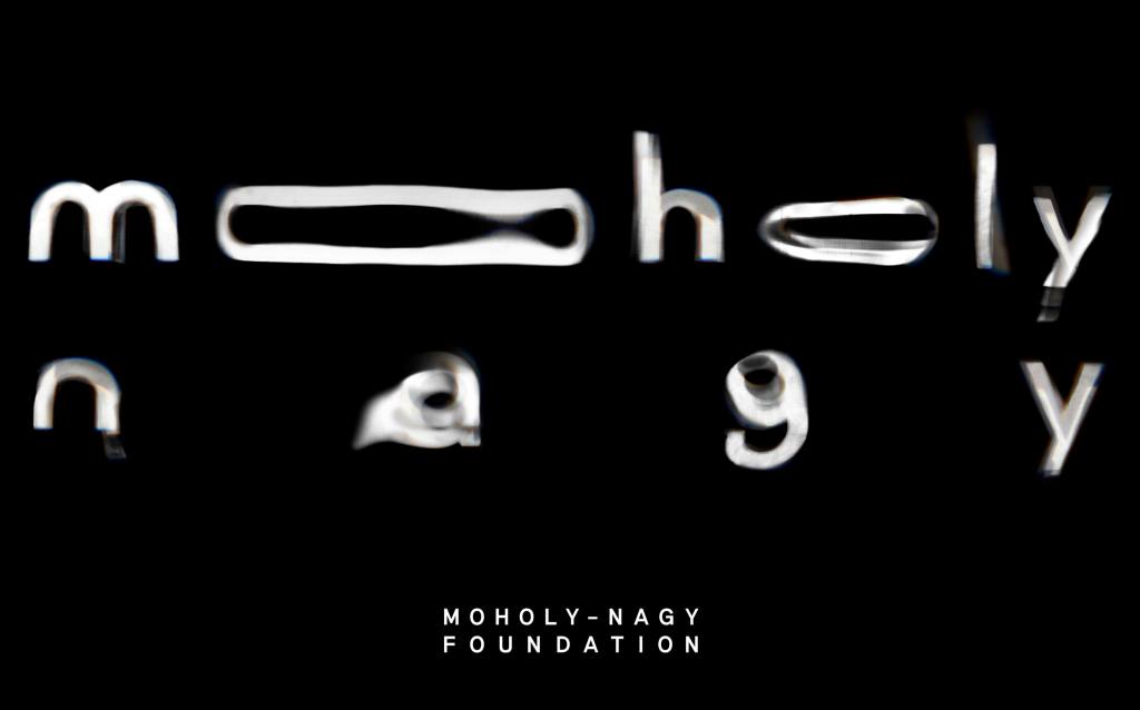
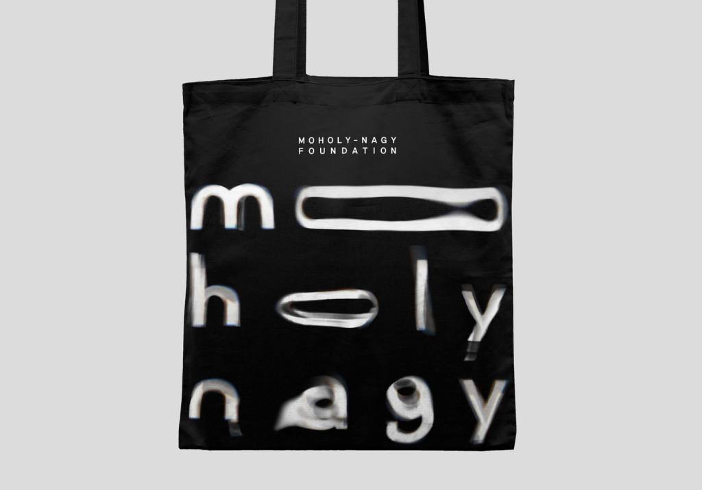
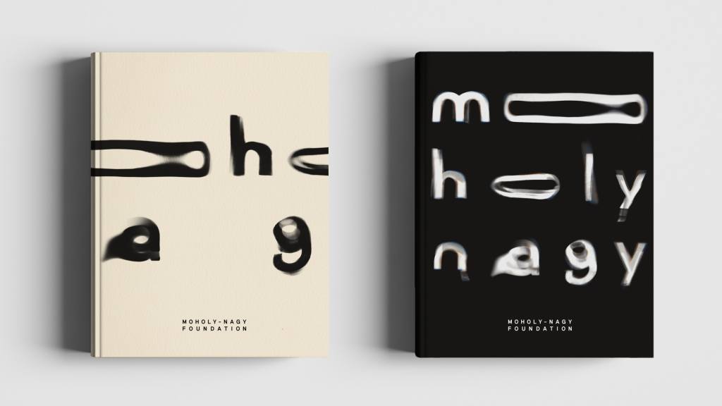
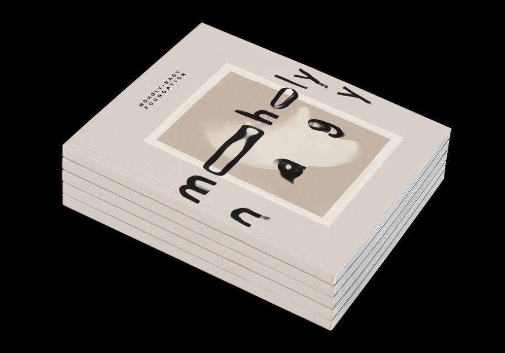
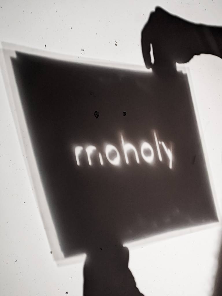
Moholy-Nagy Foundation
I absolutely love this typography as it reminds me of dark room photography and how photos develop in the solution, gradually appearing in the red darkroom lighting. The use of water is really clever and effective in this final typeface, it looks elegant when used on multiple branded items. It’s transparent in more ways than just appearance; it’s versatile and blends in with the branded artefacts.
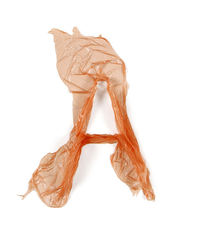
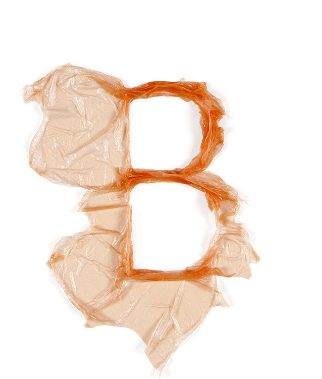
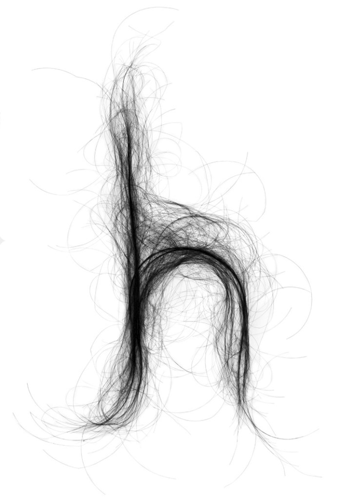
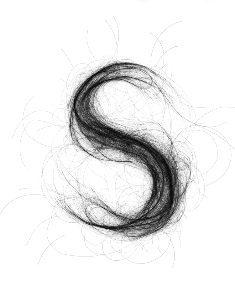
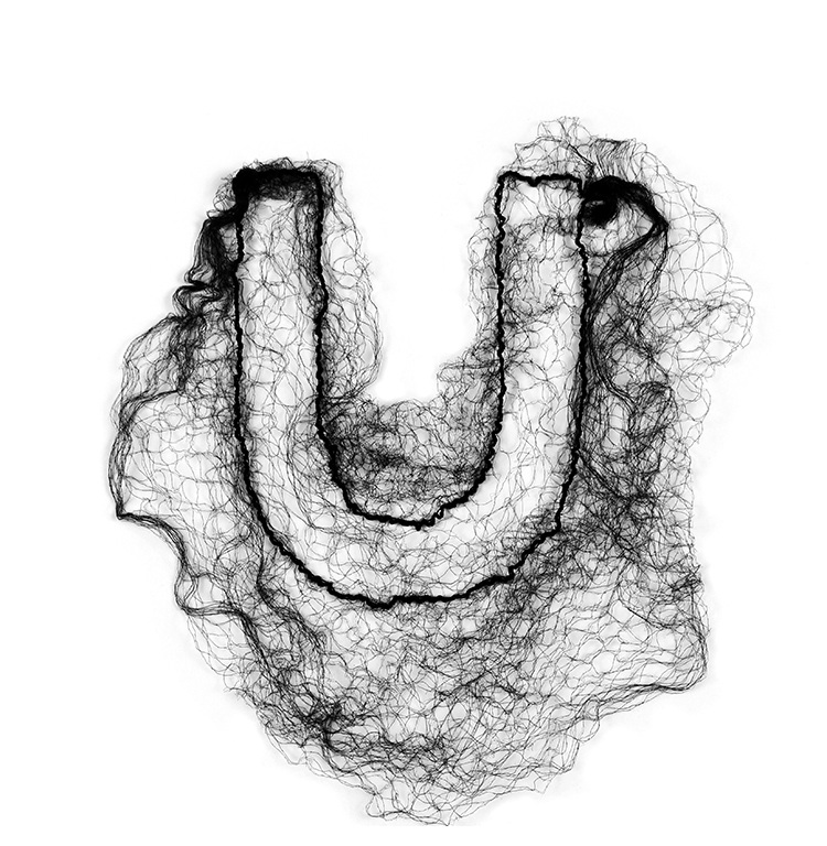
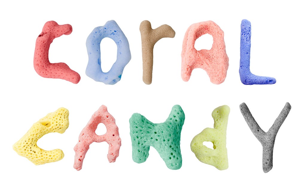
Monique Goossens
Typography
Goossens’ work is a wonderful mixture of mediums and displays an aurora of playfulness. These are some of my favourites – the styles of lettering are all uniquely wonderful; some made with manmade materials (like plastic) and some made with natural (such as hair, fish and coral). These letters are more decorative than useful which is something to consider – suited best for large scale perhaps. They do sit right on the border of design / art and this is why I adore them. Are they functional design? No, but do they tell a story? Definitely.

