
Reference Material
Michael Bierut: How to use graphic design to sell things
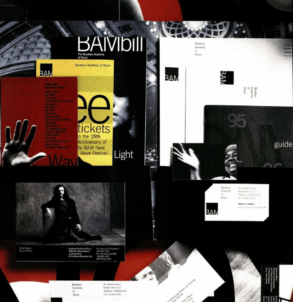
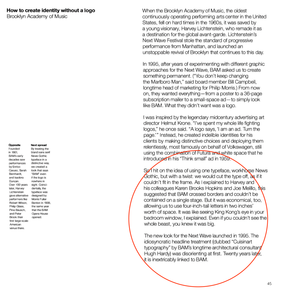
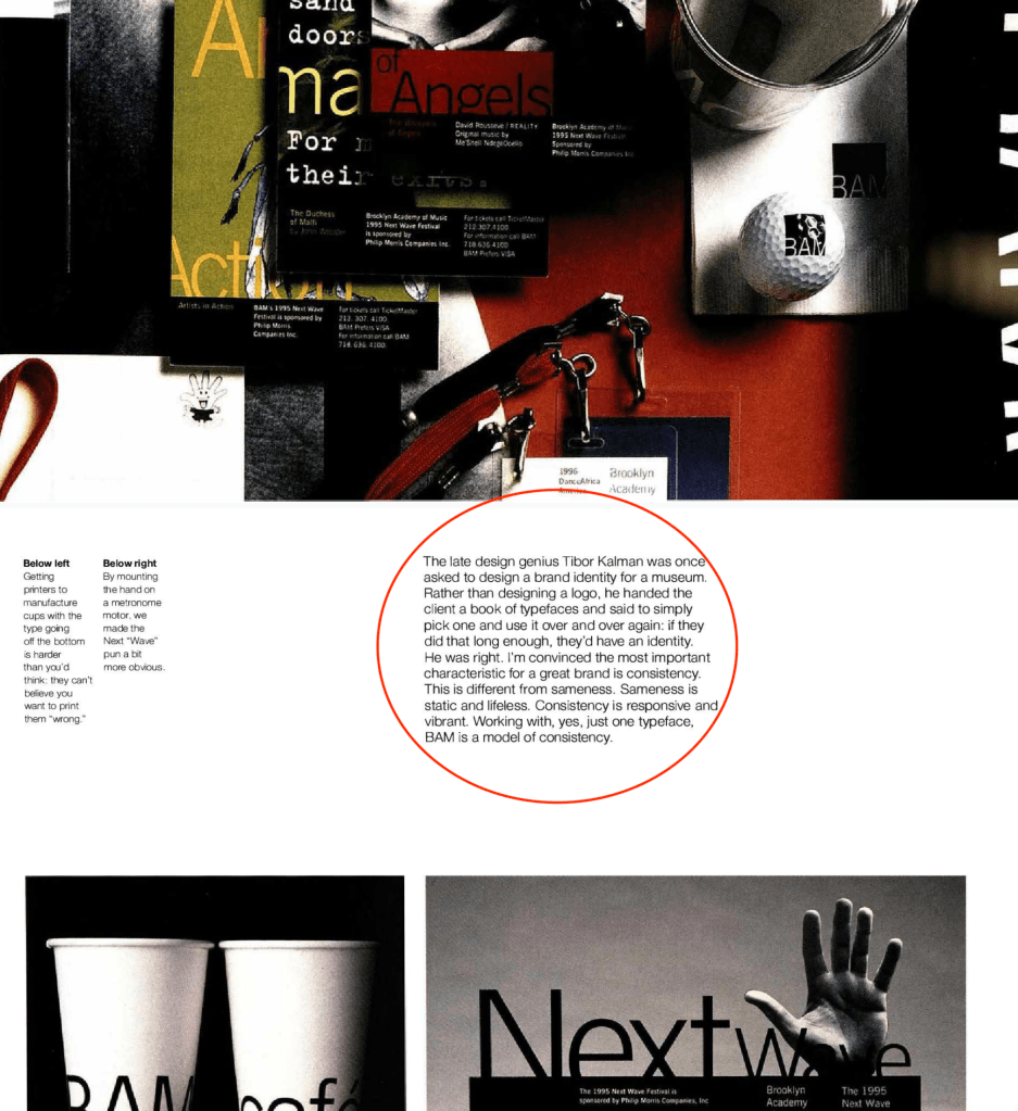
“The most important characteristic for a great brand is consistency”.
Brooklyn Academy of Music (BAM)
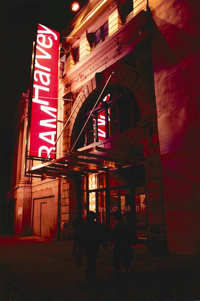
I particularly love the architecture! 
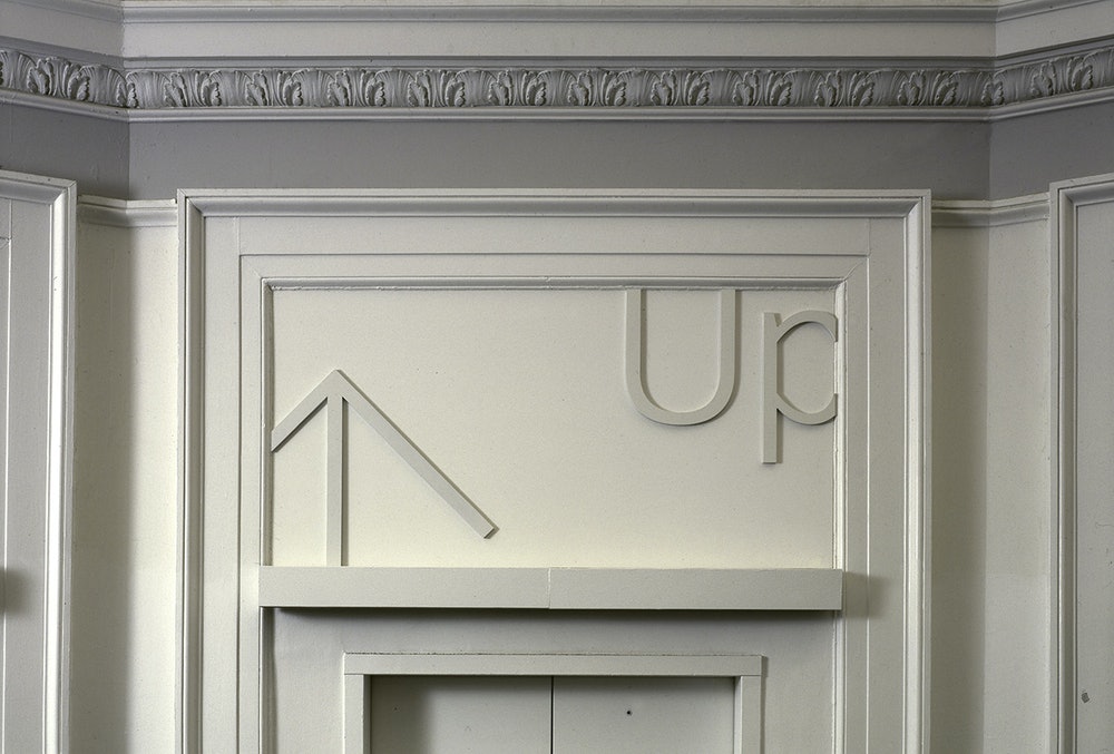
I think the lettering is subtle on the building itself 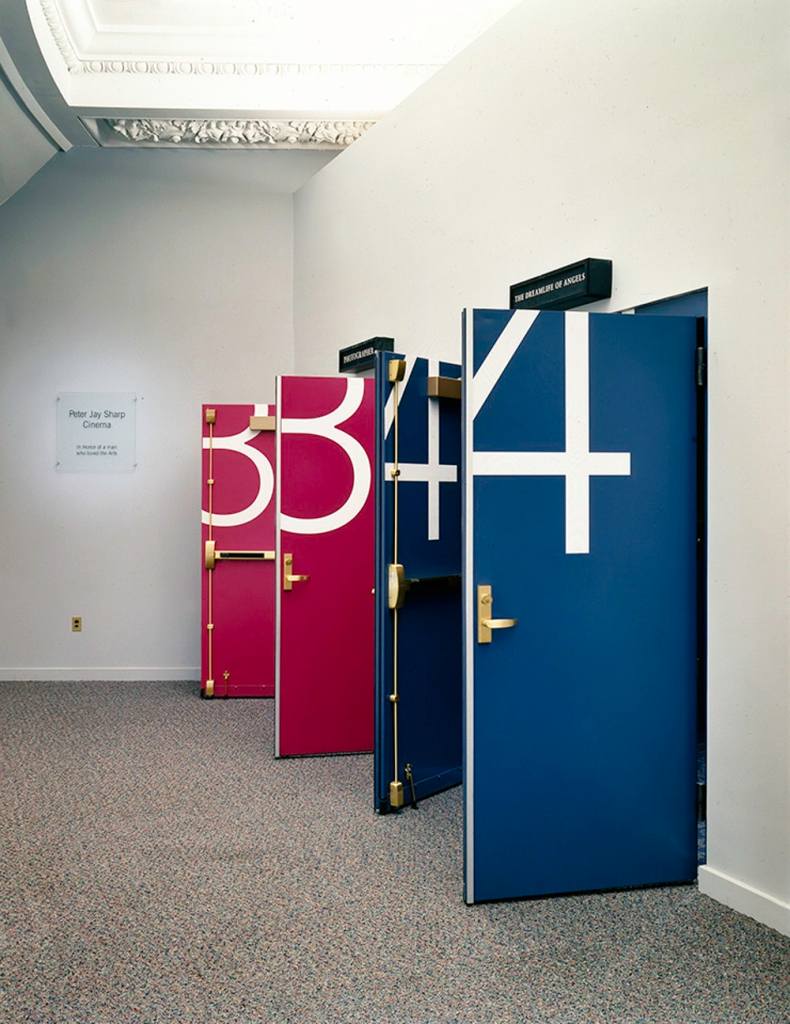
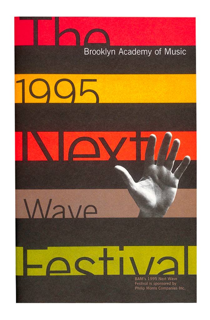
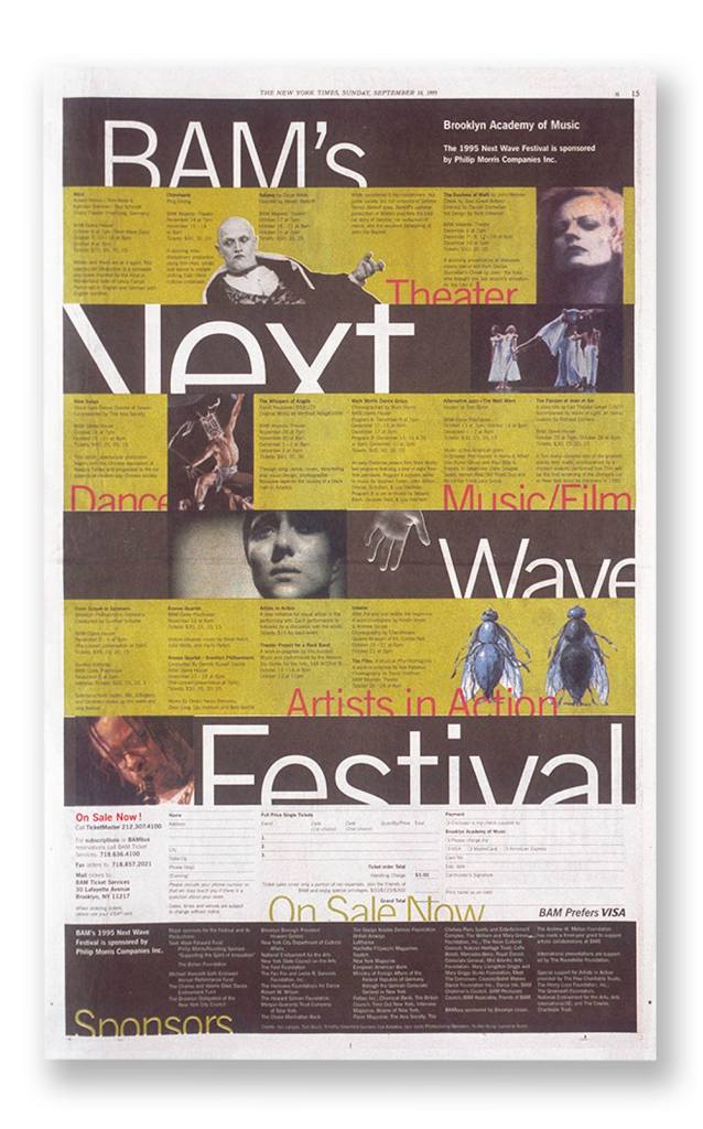
I really love how subtle this branding is – the lettering in the architecture plastered/brick wall is a really nice touch to its environment where the exhibition would be held. The design on the doors is also enough to give an identity to the theatre but not overpower its environment. The sans-serif lettering is contemporary, but quirky in appearance with different weights used in the posters and advertisements.
I am hugely inspired by this branding as I can see a lovely connection to playfulness and experimentation with type. The type encompasses play and this is what I want to capture in the brand identity of my workshop; so I may decide to experiment with this style.
Glug London
• Naivety and invincibility
• Bringing together a mixture of people with different backgrounds to create an idea
• Art and technology
• Google lab N-synth super: turning touch into sound
• Draw to art by Google (below)
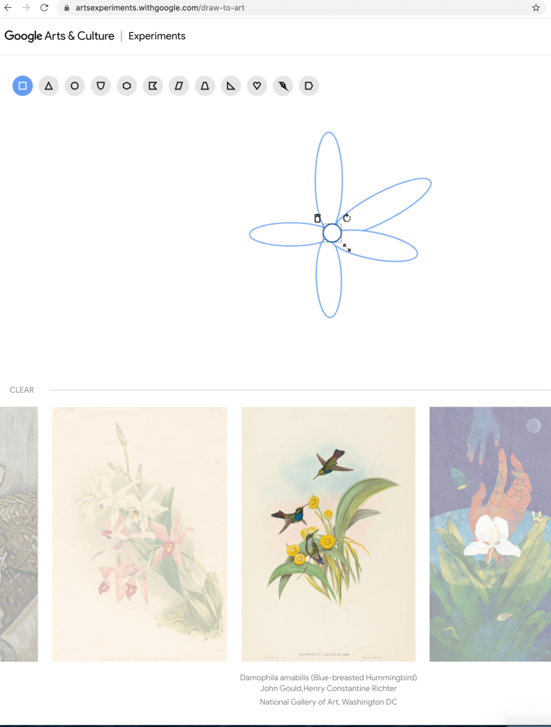
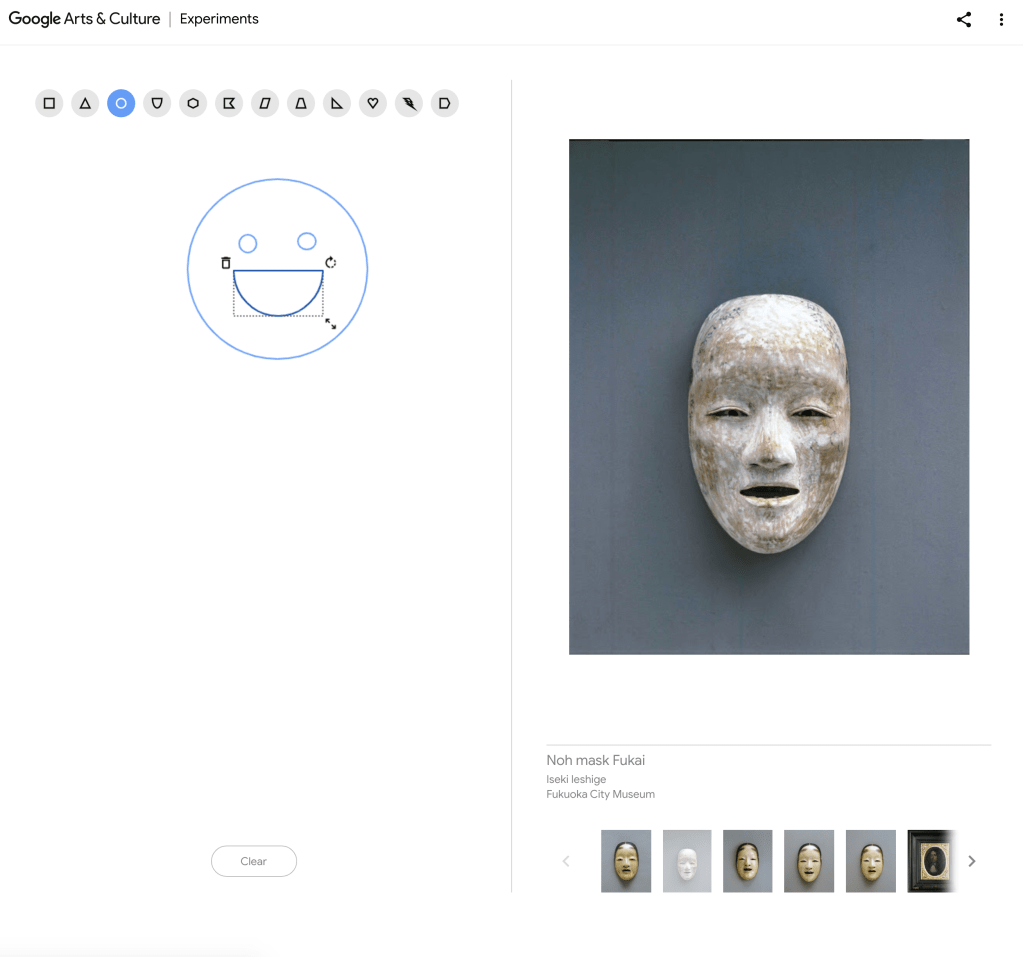
As the screenshots show, I drew the flower and it brought up botanical prints, along with a smiley face bringing up a mask. I think this would be a brilliant research tool if you wanted to study a certain topic and bring up interesting information/artefacts relating to that.
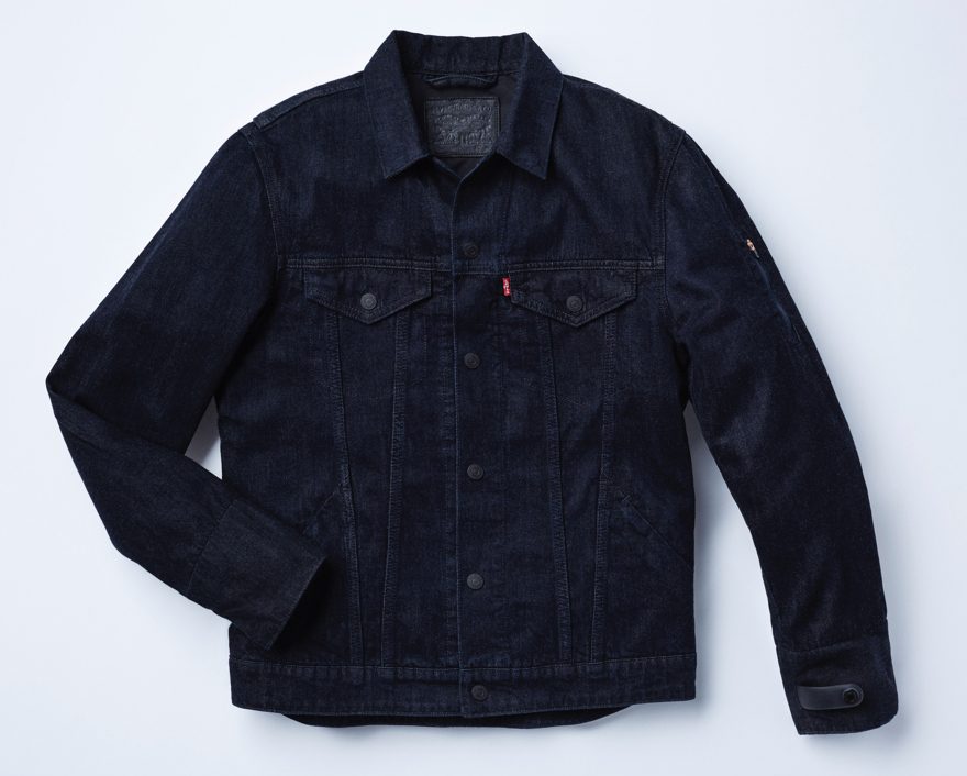
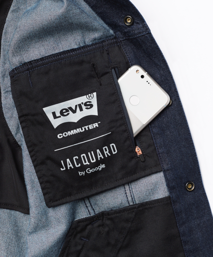
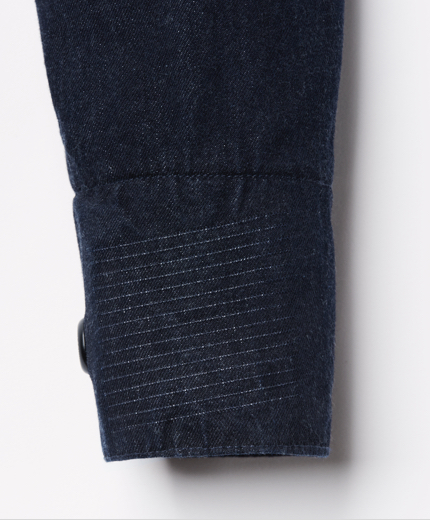
• Levi’s commuter: technology designed to be suitable for commuters and cyclists. Woven technology onto fabric in a way you can respond to with touch to improve safety and minimise distraction (below)
• Waymo uses a 360 degree radar to detect objects/people and their speed, also lights such as traffic lights to drive around safely
• Really appreciate Steve explaining that Google lab have experimented in projects – they have had to fix bad ideas and consider things that weren’t thought of but this isn’t what the public see. As designers and myself as a student I find it a) very inspiring seeing all of these wonderful projects and creativity in the industry but b) also find it very intimidating as it seems like these projects were just created by genius creators with no flaws. Of course it is not like this behind the scenes and I think processes and experiments should be displayed more to raise awareness
• Knowing about the impact of a project can be a drive as it can change lives/influence those who would not think twice otherwise
Timelines
Timelines is a really fascinating project and eye-opening in regards to the impact of climate change, particularly in the last century. Oefner illustrates white layered lines beautifully over the gloomy, dark iceberg landscape which contrasts so well. What I particularly love about this is that the lines are able to present the amount of icebergs which have melted over the last century, heightening the impact of global warming in a really minimalistic awareness video.
