
My Final outcome:
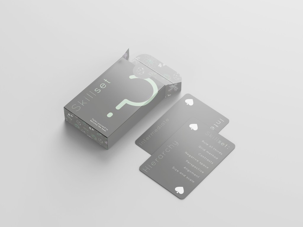
Mock-up layout of my Skillset front and back cards with the open box.
I have incorporated the design into my box as I wanted suggest creativity and playfulness. The symbols also represent growth, comparatively pairing with the slogan of ‘tailor yourself to become the best’.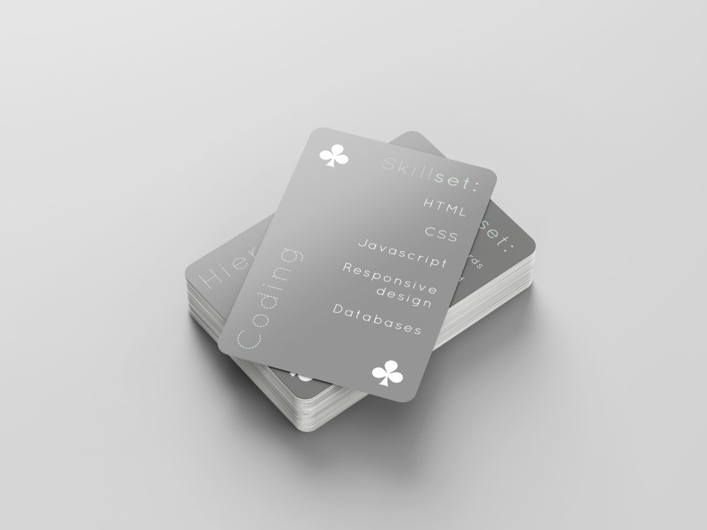
I wanted a clean, concise design with white space focus on the text on the page. The focus is on the skills themselves and what jobs would fall into those skills i.e. coding involves HTML/CSS, Javascript etc. These are two examples of the Skillset front cards. 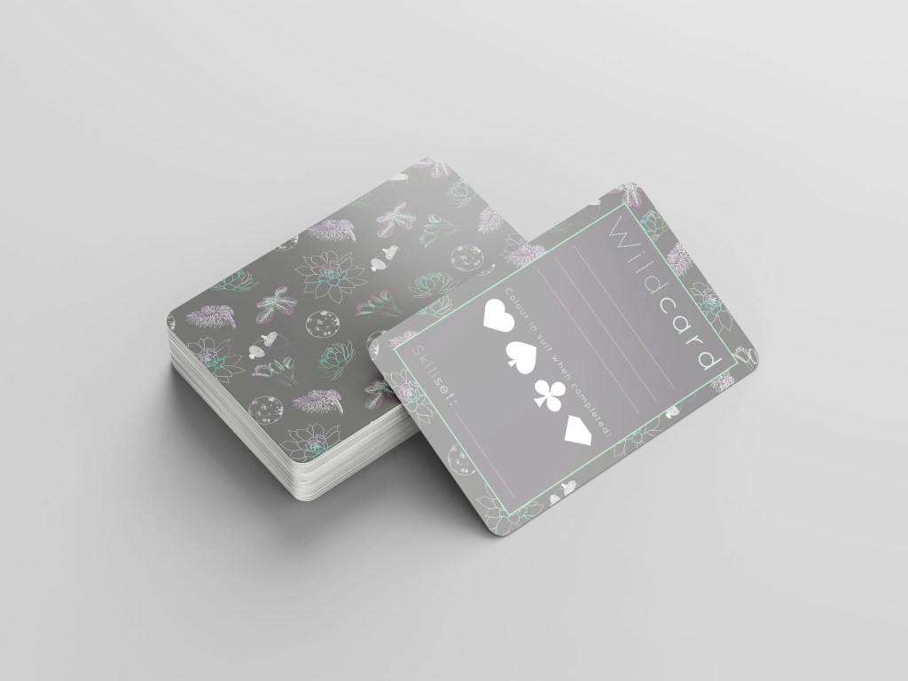
This is an example of the reverse and front of a wildcard – these have been designed to be customised, be additions to Skillset cards, or even replace the Skillset cards entirely as I learn new skills and evolve as a designer. 
These are two examples of the reverse of Skillset cards – the suits of hearts and diamonds representing the beginner and expert categories.
How could I improve?
I would consider using more colour in the Skillset cards, as the wildcards display a really effective use of colour. There is a contrast between the backgrounds and the white space which compliments each other. Another way to improve, is to take the Skillset cards and be more bold with the typeface. I’m pleased with the reasoning behind my typeface; that the cut away type has a suggestion of ‘cut along the dotted lines’ – indication of cutting up, cutting out old skills and replacing them with the new.
