Reference Material
David Carson/Design and Discovery:
- How emotion and the colour, size and type of writing influences the viewer (i.e. the no parking sign!) this relates directly to my project development as I need to consider introducing playful typography into my branding as it’s a ‘graphic design workshop’ and therefore should hint at this in the branding.
- Not only exploring his work, but encouraging to go out and use findings in work as it validates the piece (or even look at other art/design work)
- The main thing from this is perception and composition; how design is all about placement and meaning. You cannot place powerful, distressing articles on the same page as a model advertising goods. It’s insensitive and poor graphic design!
Nine Inch Nails
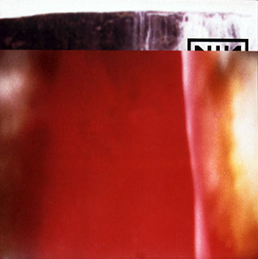
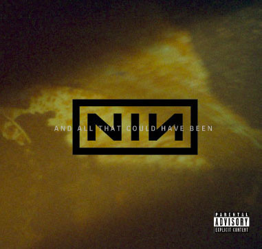

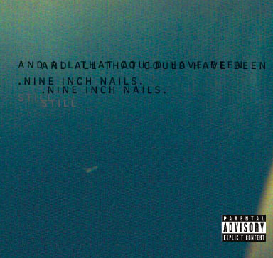
I have picked some of the examples for this project above (nine inch nails album artwork) as I’m really interested in the distortion of type in these pieces of work. I love the contrast of the typewriter, traditional style lettering versus the bold, bordered abbreviated band title. The colours instantly remind me of polaroid camera photography and set the scene for the album.
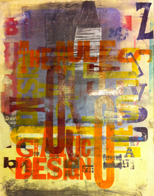
The end of print
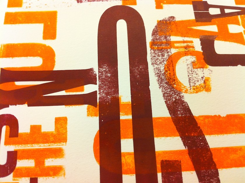
Back Camera 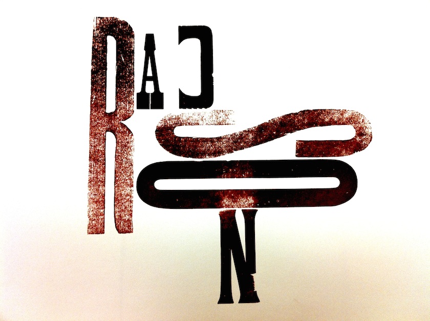
Back Camera
I have looked into David Carson’s ‘the end of print’ book which has some beautiful prints inside. I am a huge fan of Alan Kitching and these are very similar in style; the overlayed, distressed ink and alternate sized lettering. I find this style of playful typography really inspiring; it captures the same path of process and development that a project in a sketchbook would display. It tells a story!
As I have already done quite a bit of research on the other two resources this week, in the last module (Myerscough and Fletcher) I have decided to research some articles of my own. I want to explore concept development in different techniques and look at how to inform a final piece with background information.
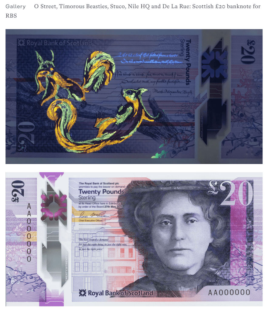
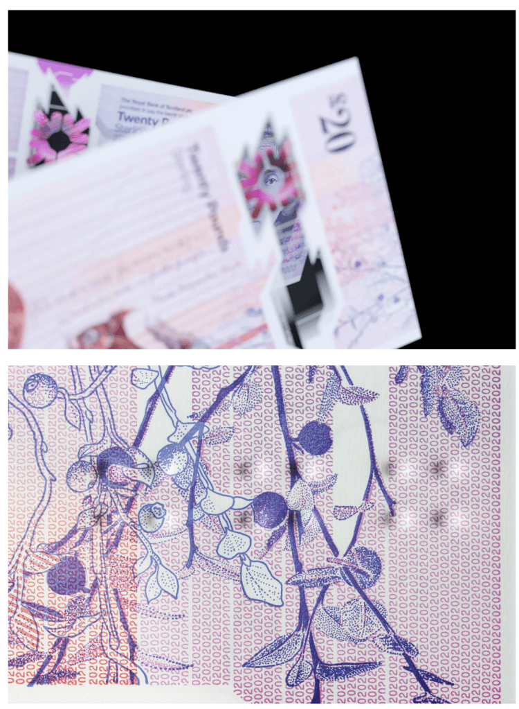
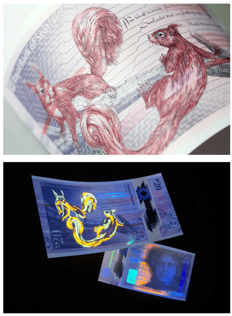
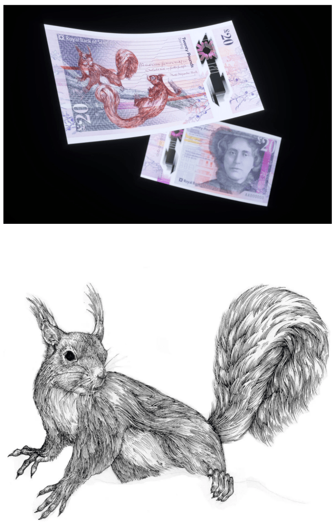
Scotland’s £20 note:
As I am looking into typography more for this project I decided to explore how important lettering really is on items, particularly on a bank note. The numbers, letters and symbols are strategically placed in coordination with images (illustration in the below instance). I am really impressed with the level of collaboration involved to create a new banknote design as this is something I didn’t have any knowledge of. I was surprised to read that graphic designers collaborated with colour and calligraphy experts. From the last module I realised that graphic designers are evolving to wear multiple hats; however this bank note development contradicts this process. Maybe because monetary design is an old, traditional process… Or because it’s extremely important to be correct:
“Design and branding studio O Street was enlisted by the Royal Bank of Scotland to lead the graphic design process, which in turn collaborated with Nile HQ on service design, Stuco and Timorous Beasties on illustration, and dozens of other experts in colour, textile design, photography and calligraphy, to bring the complex combination of imagery together, not to mention currency printers De La Rue which oversaw the design process and printed the final notes.”
Jenny Brewer