
Further development:
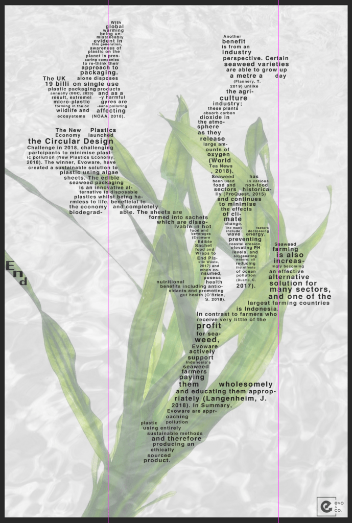
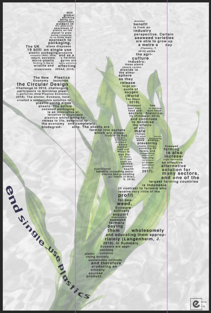
From speaking with Sarah in tutorial, I mentioned how I was unhappy with the positioning of the text in the title “end single-use plastics”. I felt the text clashed with the image, but I wanted it to be the first piece of text that the viewer would read when viewing the poster. I began thinking about the text potentially “floating” and acting as though it is in water.
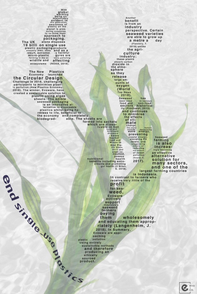
Using the bottom left of the image, with the singular seaweed leaf as a base for the typography, I have played about with many (many!) experiments with this text and remembered to take screenshots along the way:
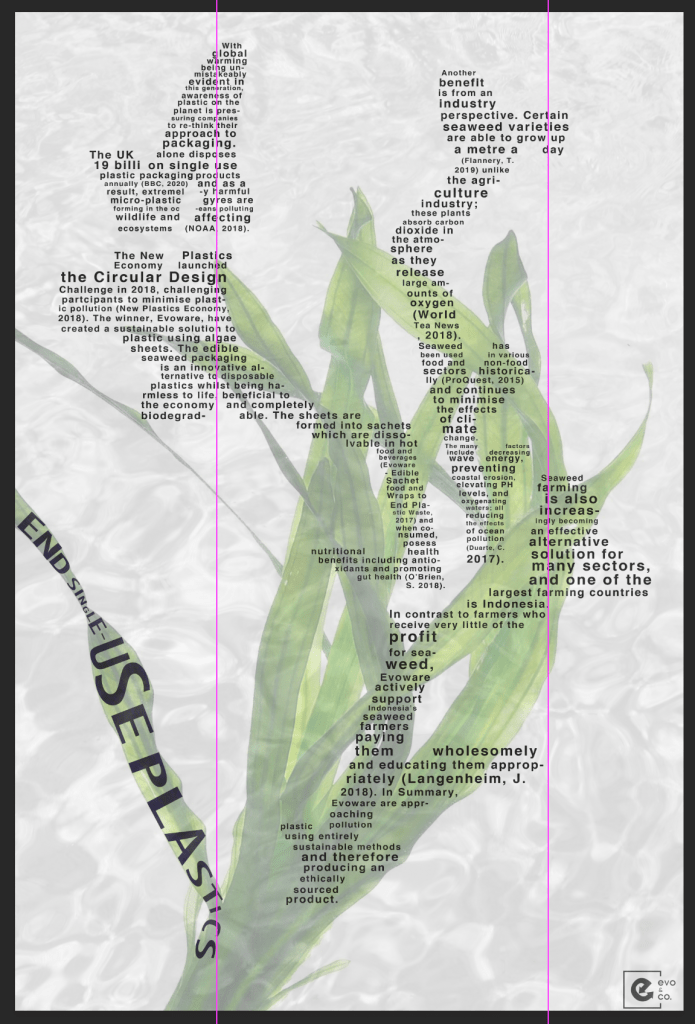
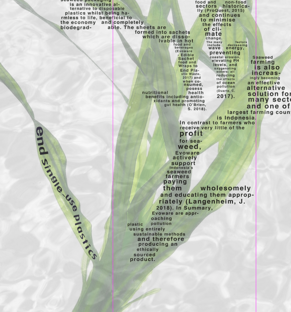
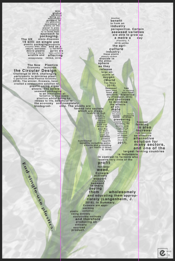
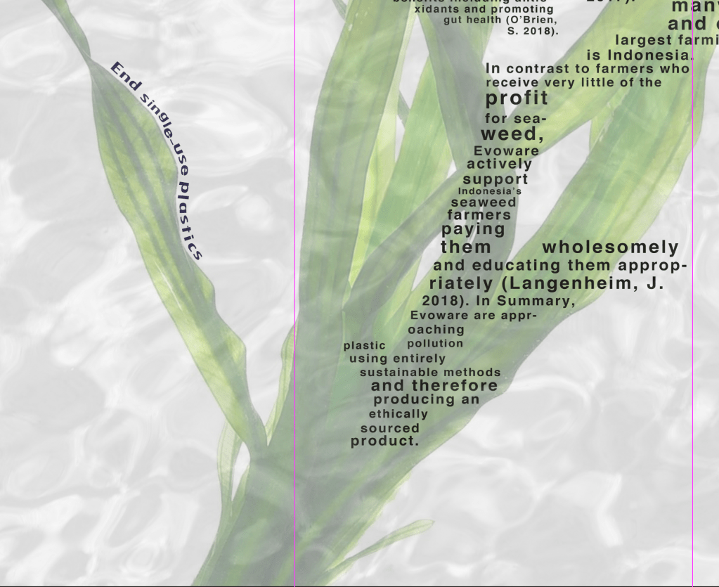
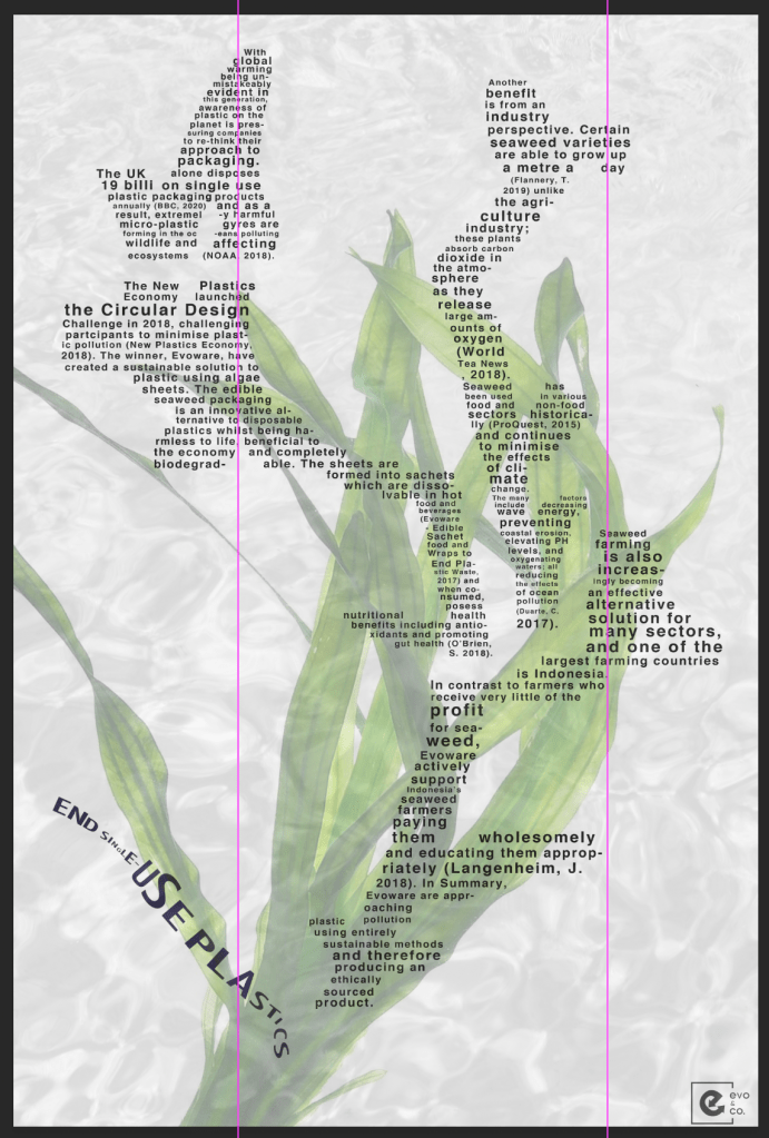
I have finally positioned the text in a way that I feel is clear to the audience but does not clash with the remainder of the poster. I have produced the final mock-ups below:
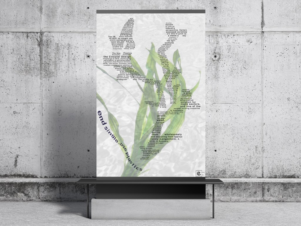
Images: “end single use plastics” is now ‘floating’ in appearance as opposed to being awkwardly placed at the bottom of the poster.
How could I develop further?
I really like the feeling the final poster portrays and I feel it represents sustainability well, with the natural habitat of seaweed shining through the poster. The flowing nature of the seaweed in water is conveyed through the text and I think it’s effective in that sense. To further develop this, I would potentially consider exploring how I could make the logo larger, so the poster is associated with the rethink-plastics brand, because at the moment it’s almost part of the background and it’s very subtle. It could be easily missed.
