
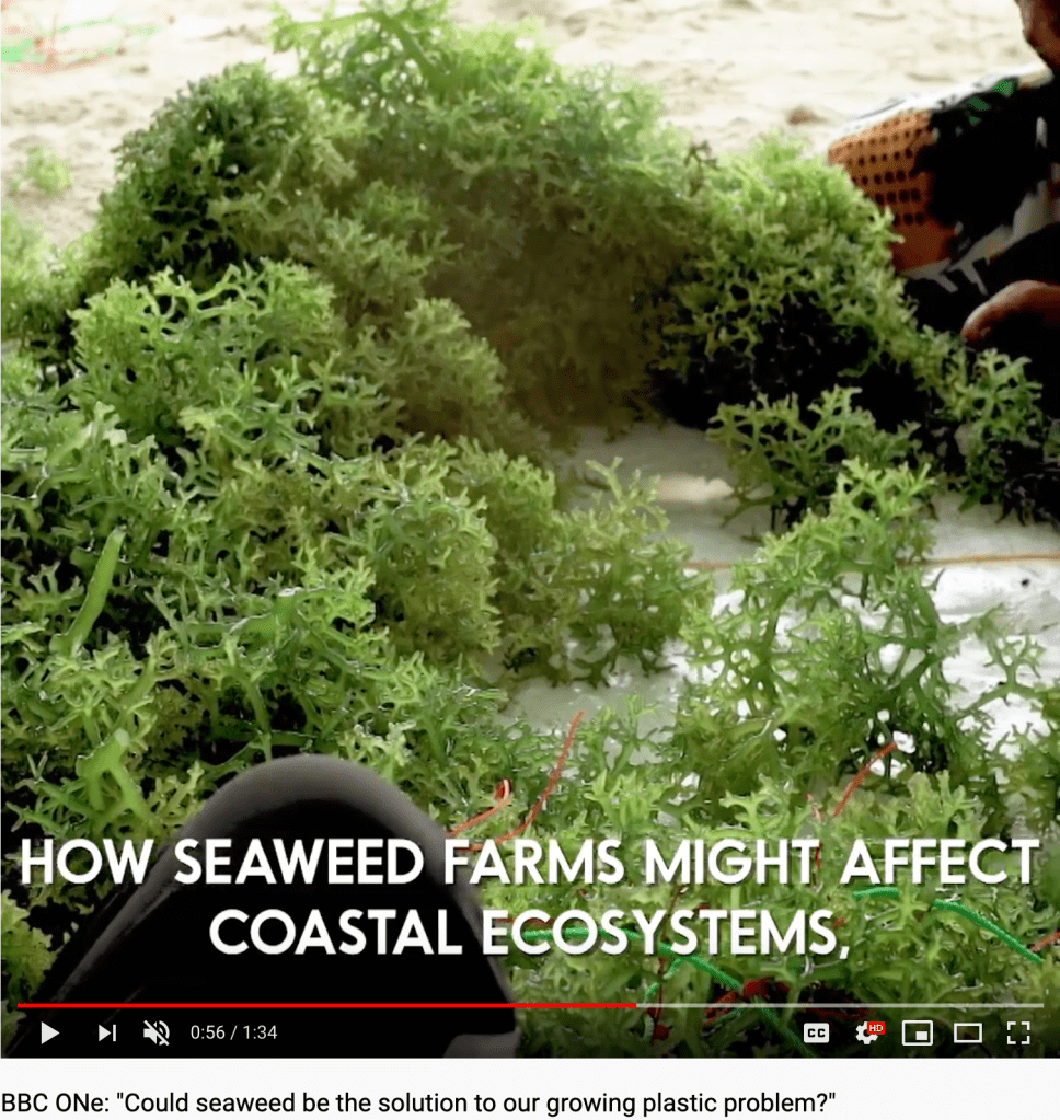
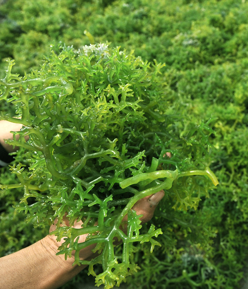
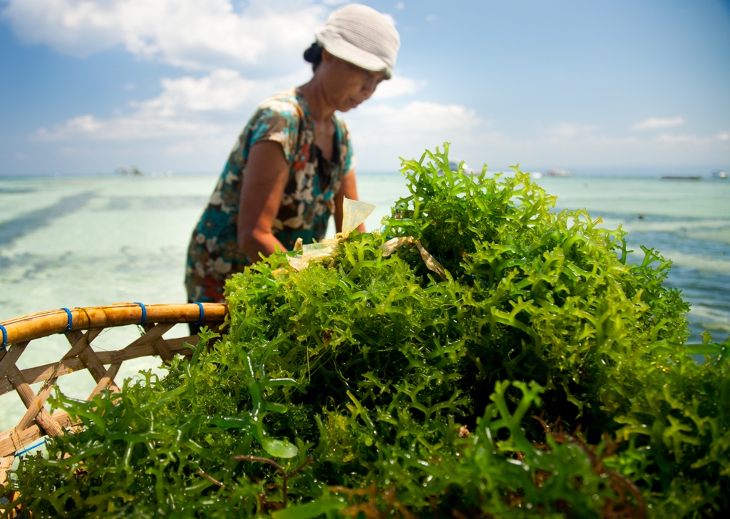
Carrageenan: Identifying the variety used by Evoware
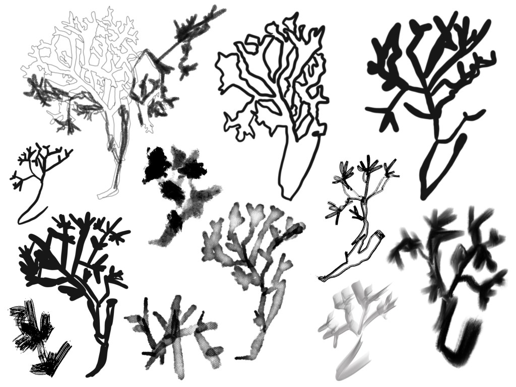
Concrete poetry shaped like Carrageenan seaweed:
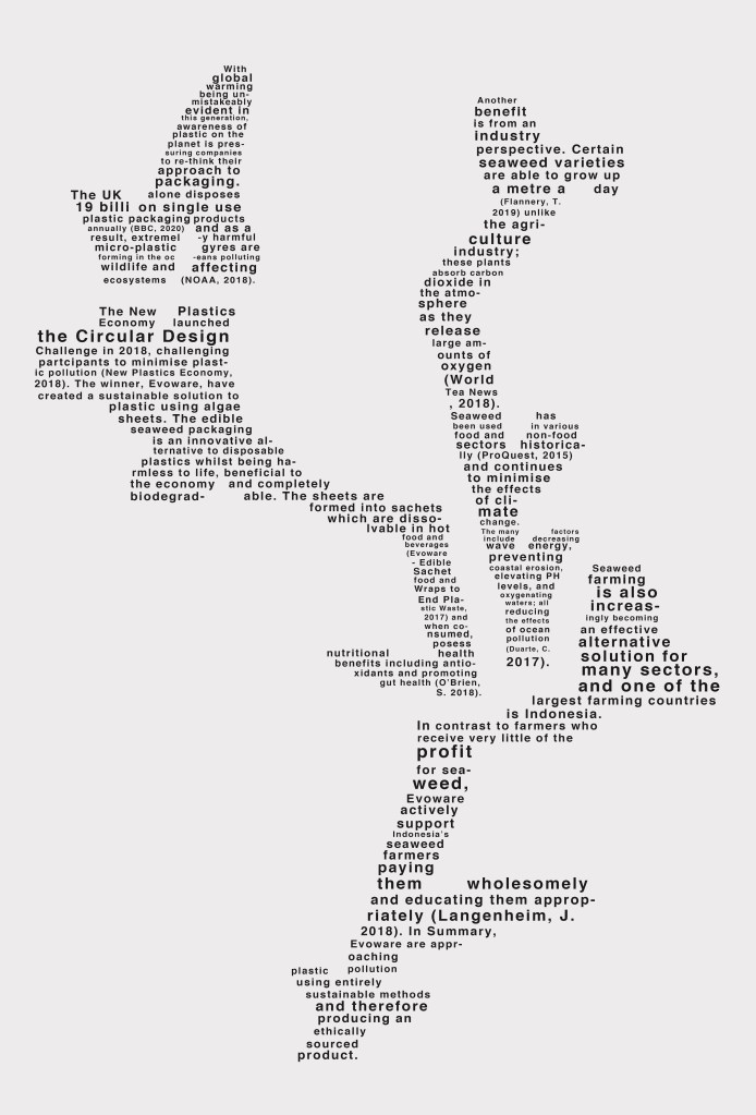
Final composition of 300 words 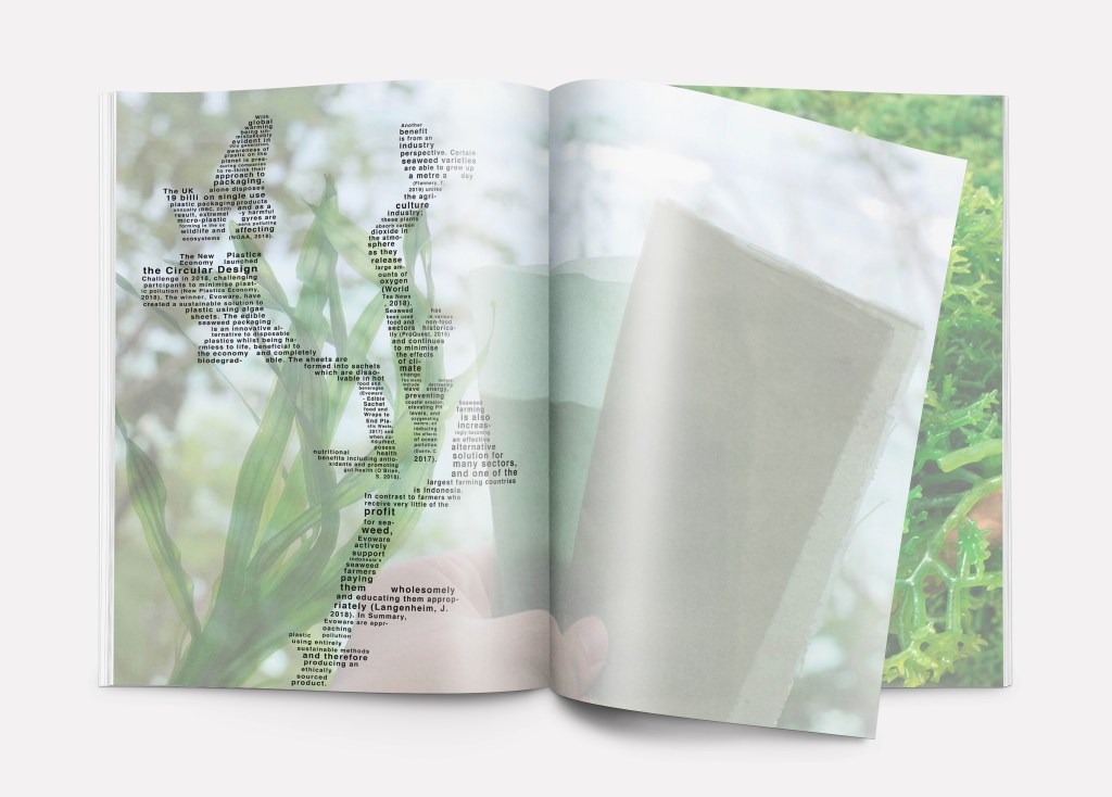
Image composition of editorial object and text 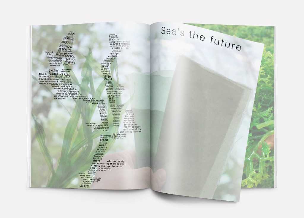
Title added in final – play on words
Feedback:
Look at how the format could be presented in a different way, i.e. a poster. I also felt that the background of the image could be portrayed better, and that I should somehow incorporate texture or even the natural habitat of where sea-weed grows.
Here are some logo positioning experiments I made to get to the first poster layout:
Evoware logo bottom left 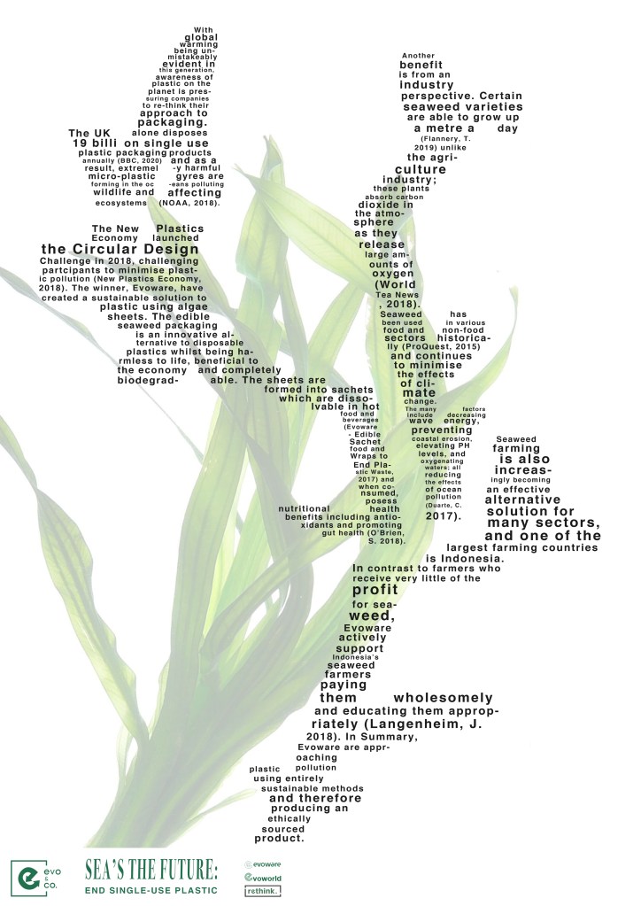
Logo and slogan with white background, bottom left 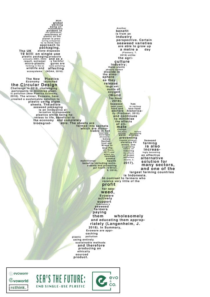
Separating the image with a border, this didn’t look effective with the main image/text
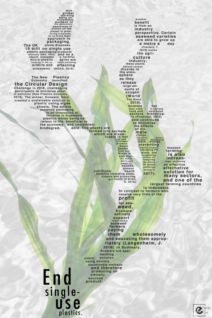
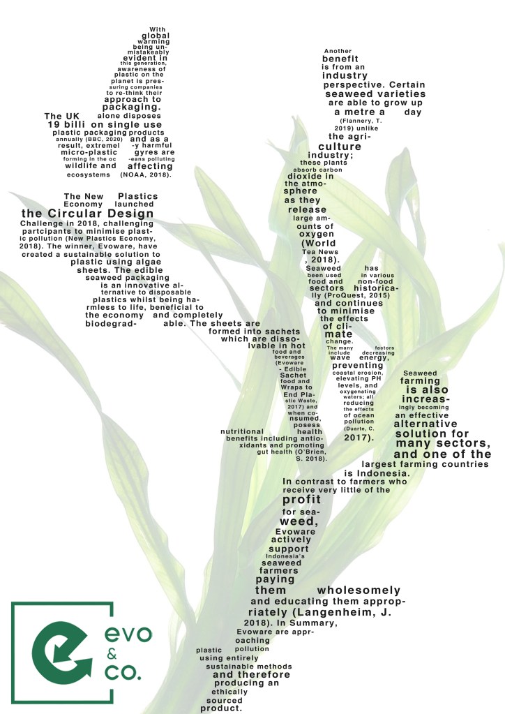
I have now presented the Evoware product as seaweed itself and got rid of the images which I feel don’t send a strong message – for instance it’s not clear straight away what the sheets are that someone was holding (in the editorial mockup). As my item is derived from seaweed, and I want the viewer to instantly see that connection I have decided to just highlight this. I think an overlay of seawater in grey looks really effective against the green and highlights the seaweed whilst providing a sense of habitat and texture.
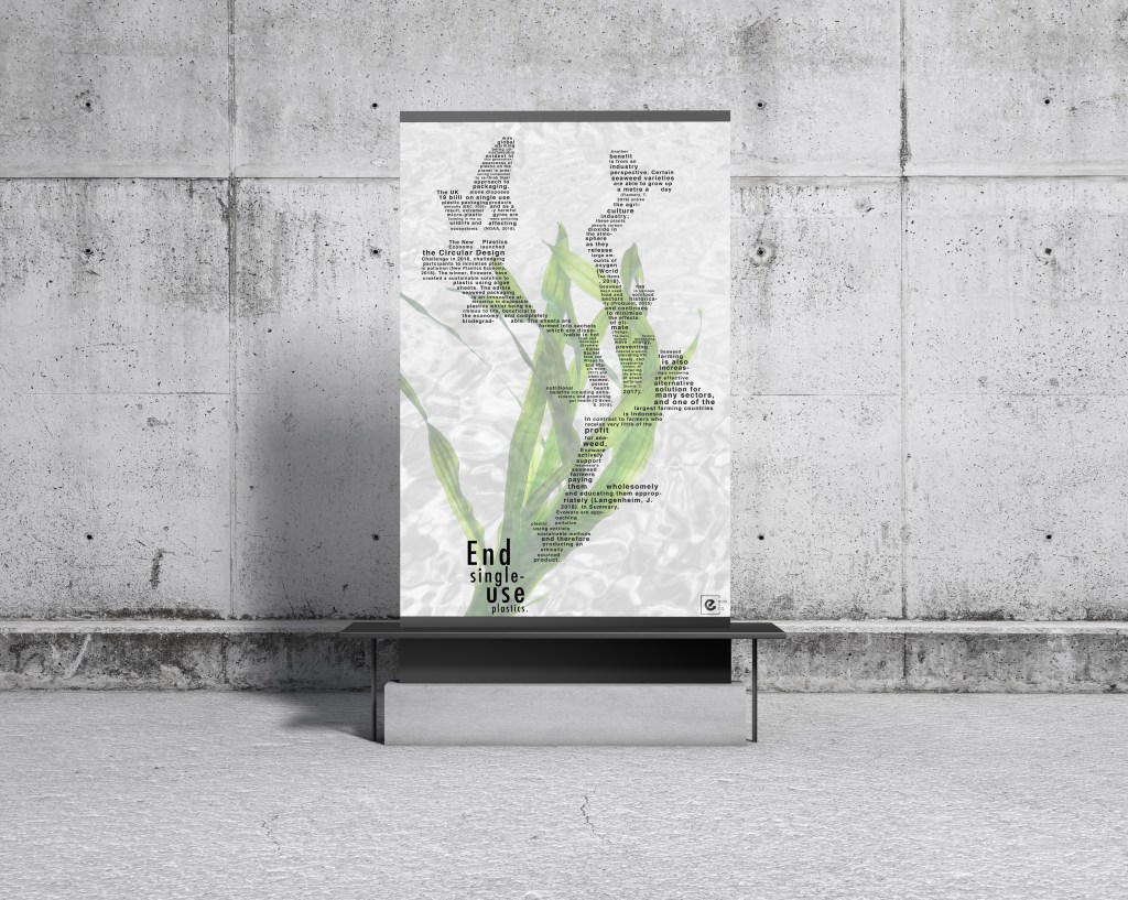
The text is now large enough on a billboard poster that a viewer could read it and understand what Evoware are all about. I have included the company logo (bottom right) and turned this in greyscale as I wanted the seaweed to be the only item in colour as it is essentially my object (the sheets are just in pulp and pressed form!).
