Further development:
From speaking with Sarah for further feedback, I have decided to explore how I can further develop these stamp mock-ups. We discussed there needs to be more contrast in these mock-ups, i.e. definition of text against the image. I have noticed that the Victorian stamps often used oval framing for the Queen’s portrait. The more I think about it, the stamps are essentially cameos. This is a very resourceful reference as cameos traditionally possess a rich history.
If I explore cameos further:
“Cameo is a method of carving an object such as an engraved gem, item of jewellery or vessel. It nearly always features a raised (positive) image; contrast with intaglio, which has a negative image. Originally, and still in discussing historical work, cameo only referred to works where the relief image was of a contrasting colour to the background; this was achieved by carefully carving a piece of material with a flat plane where two contrasting colours met, removing all the first colour except for the image to leave a contrasting background.“
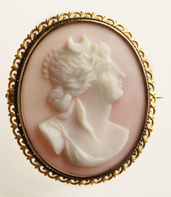
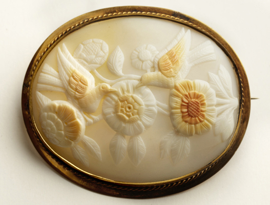
Cameos were a symbol of wealth and luxury, and women began collecting cameos to prove cultural status during the Elizabethan period. At the same time, tourist travels to the ruins of Pompeii were on the rise and women began collecting shell and lava cameos as souvenirs to remember their travel. The most popular cameos today are carved in sea shells, a tradition that began in the fifteenth or sixteenth century and was popularised by Queen Victoria of England.
Taking the blue stamp mockup using the post office as a distorted image on the stamp, I have further developed this by framing the image.
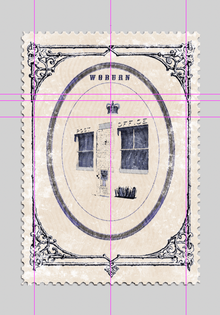
Using cameo inspired frame 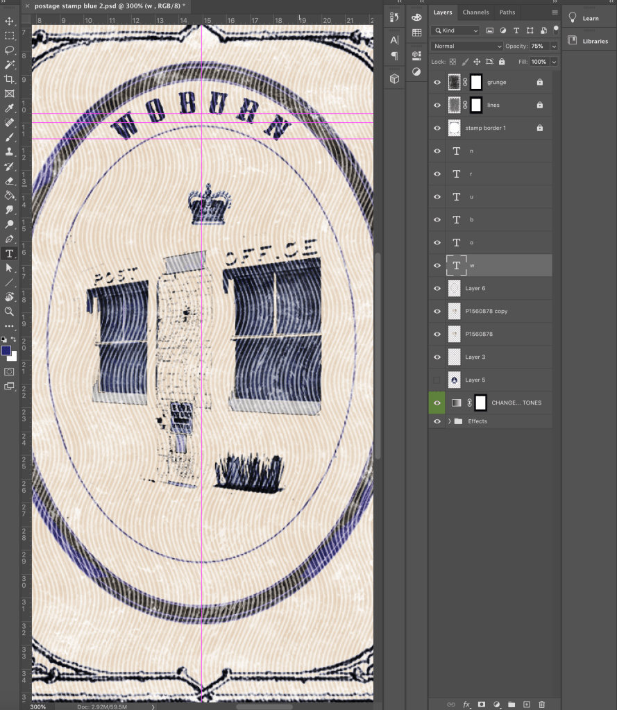
Arranging arched text inside frame 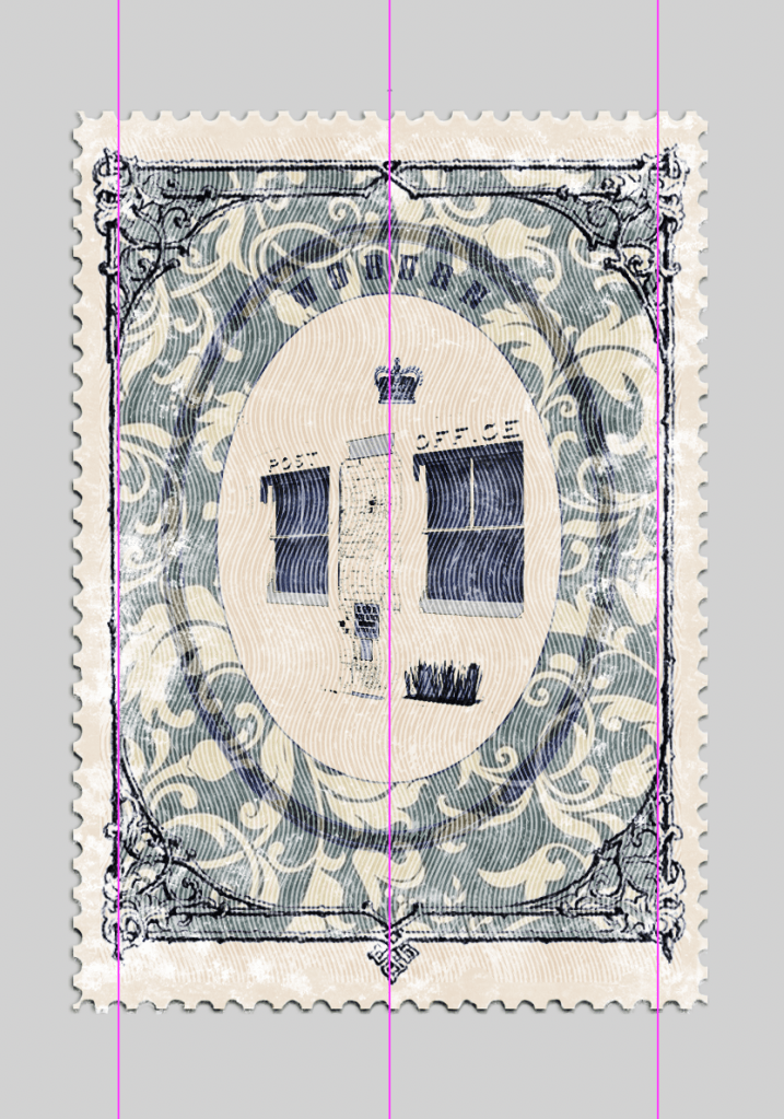
Inserting Victorian inspired pattern 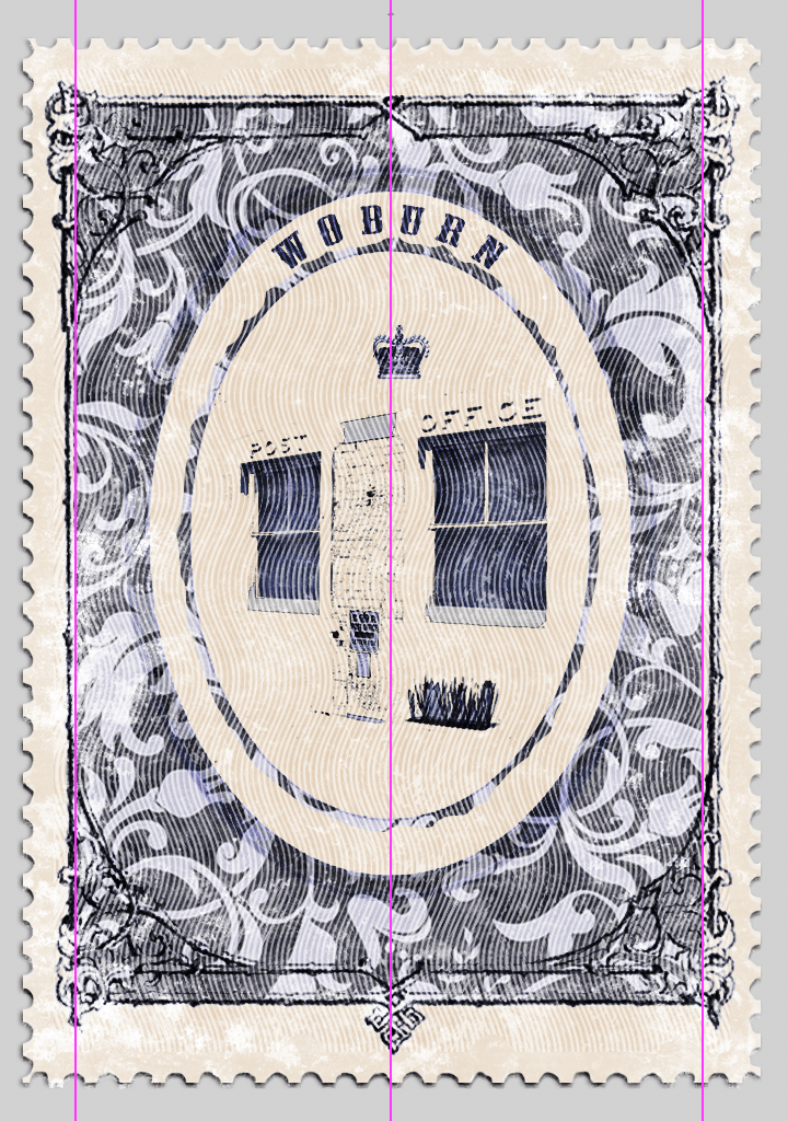
Figuring out which elements work with pattern 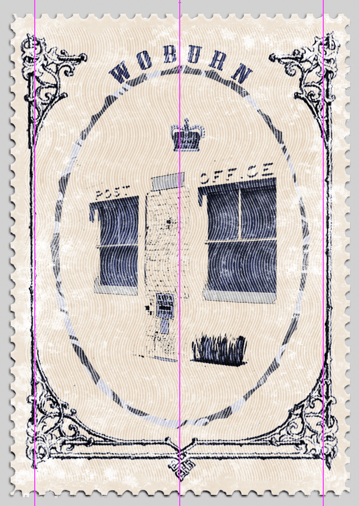
Subtracting upper and lower lines of rectangle border 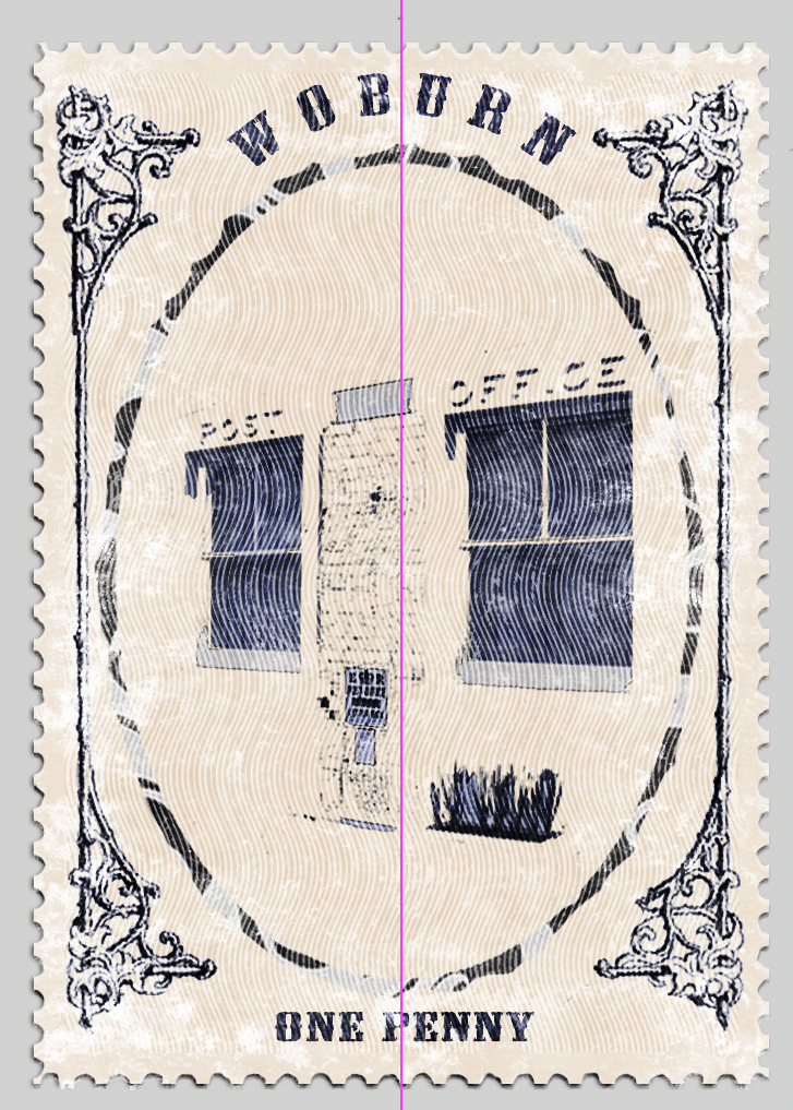
Addition of “one penny”
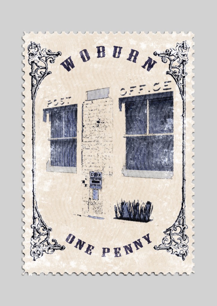
This is now my final development of the Woburn stamp, inspired by the history of Woburn’s first post office.