
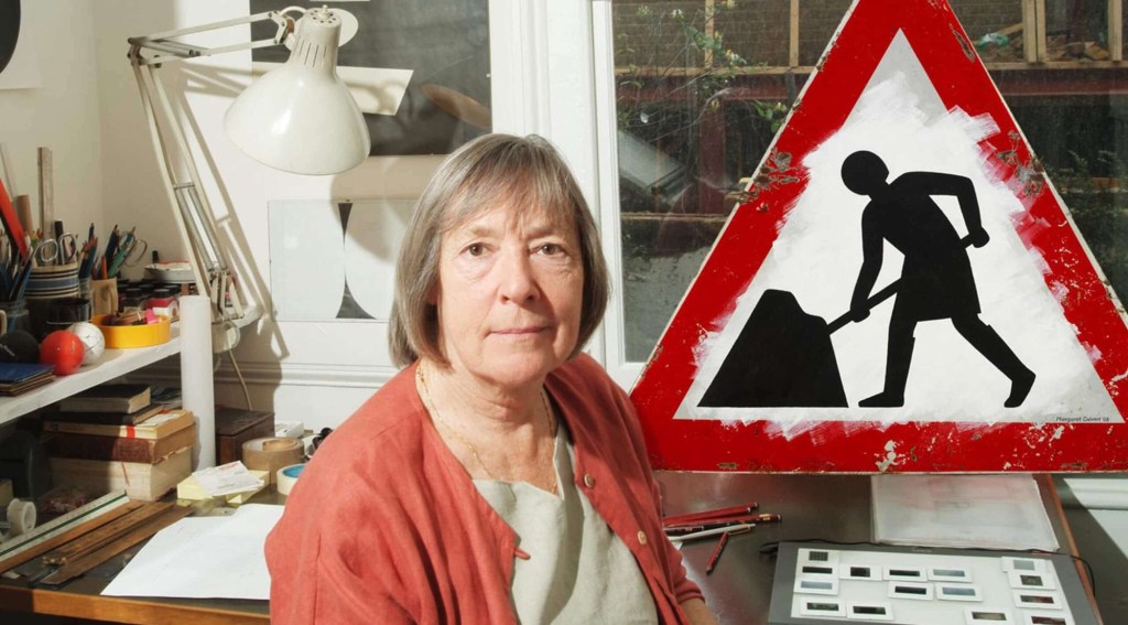
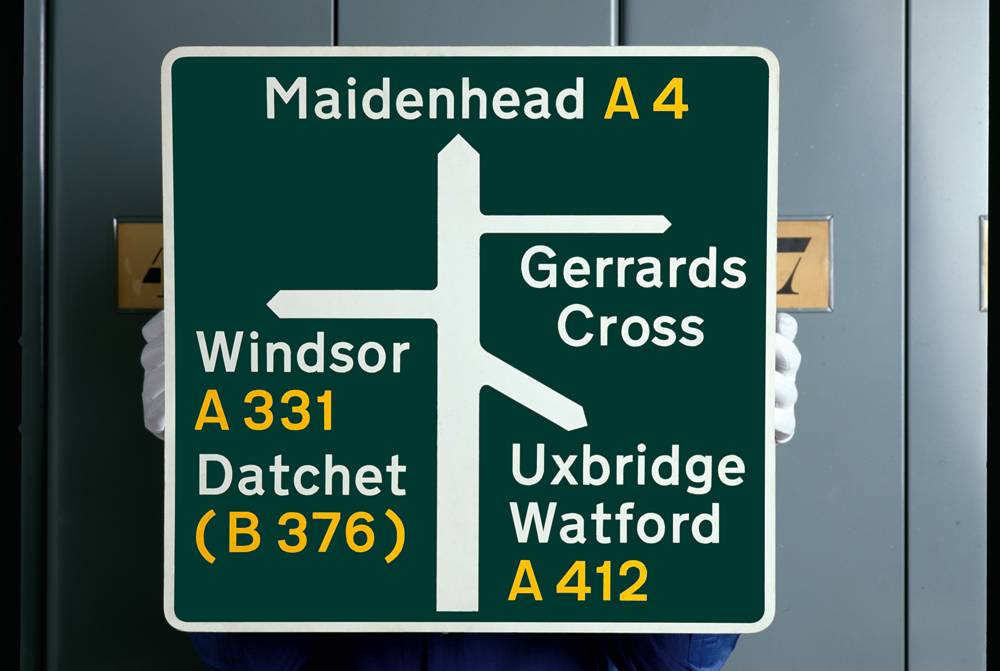
Margaret calvert
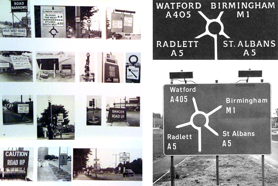
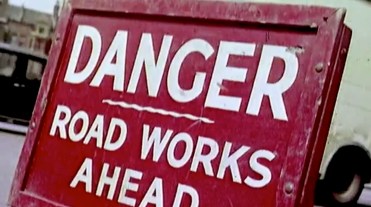
“It is sad but true to say that most of us take our surroundings for granted,” Kinneir observed in 1965. “Direction signs and street names, for instance, are as vital as a drop of oil in an engine, without which the moving parts would seize up; one can picture the effect of the removal of this category of information on drivers in a busy city or on pedestrians trying to find their way in a large building complex. It is a need which has bred a sub-division of graphic design with more influence on the appearance of our surroundings than any other.” – Jock Kinneir
Discovered on the BBC “Secrets of the Museum” series, Margaret Calvert donates a sign she has designed to the V&A in London here at 25.20.
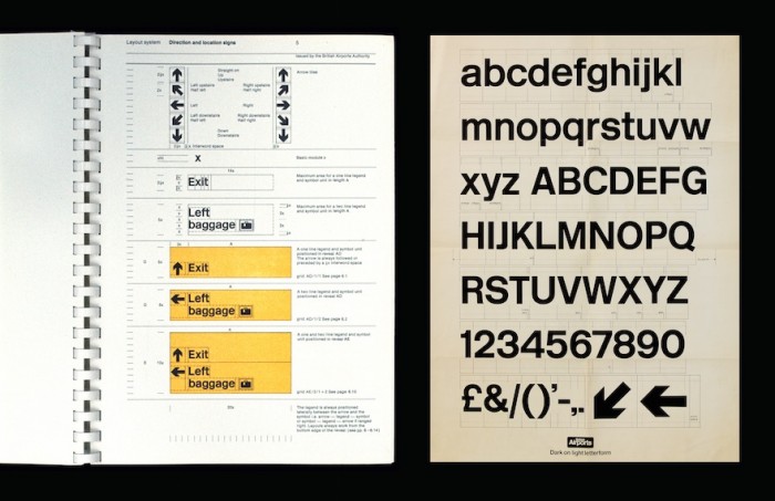
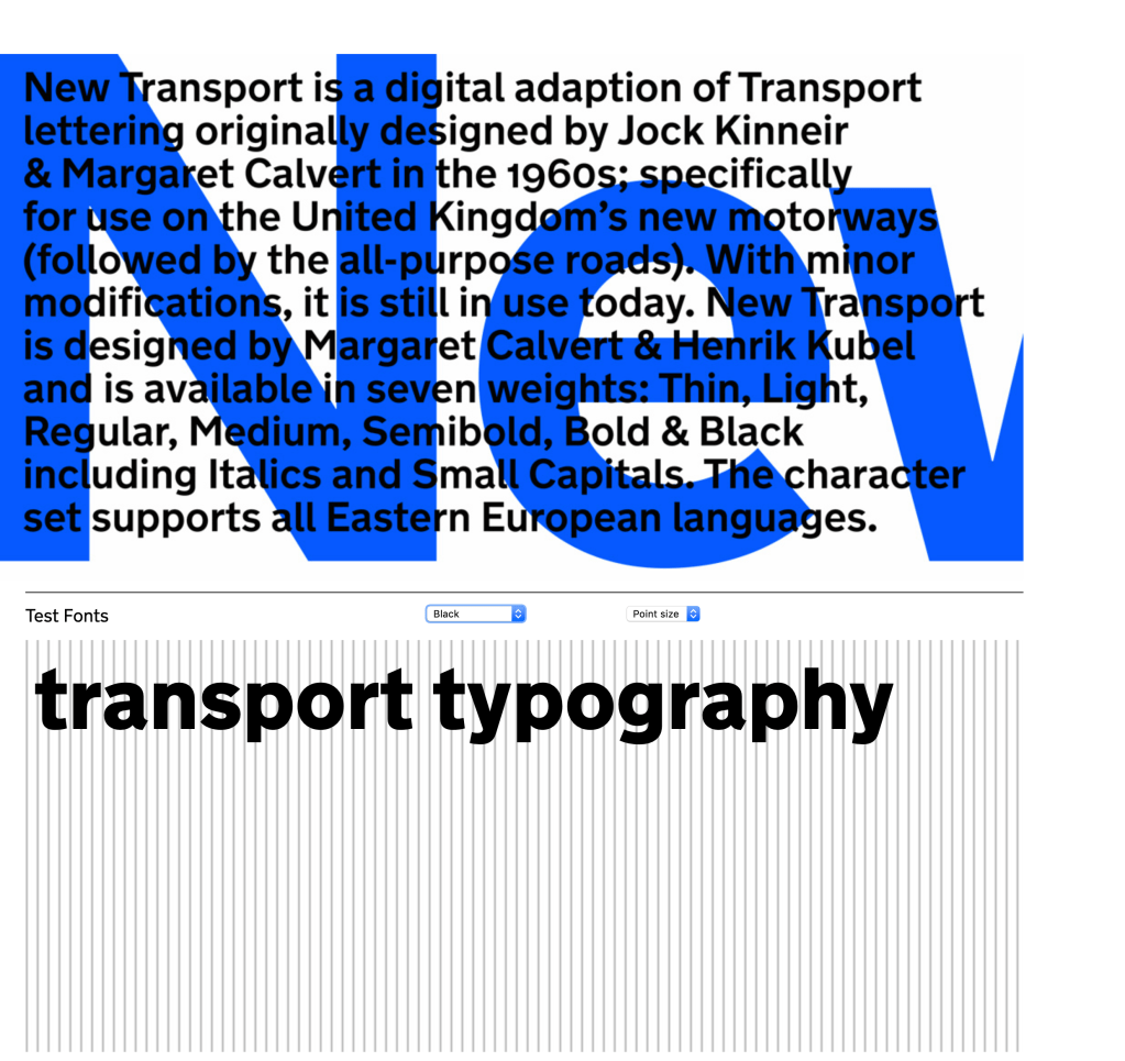
I have begun to explore Margarets work as I instantly felt I did not pay much attention to the signs that are local. I challenged myself to think of the signs in the town and could not remember what they all said or even looked like (images, symbols, placement etc.). There is so much to be appreciated by signage, especially Margarets work. The typeface that has been used, ‘Transport’ is a sans-serif typeface that has been designed specifically to be easily read and distinguished at a distance, with features such as extended kerning.
Interestingly, there have been modern versions created designed to be adapted to digital platforms:
Max Ernst
frottage/ˈfrɒtɑːʒ/noun
- 1. ART: the technique or process of taking a rubbing from an uneven surface to form the basis of a work of art
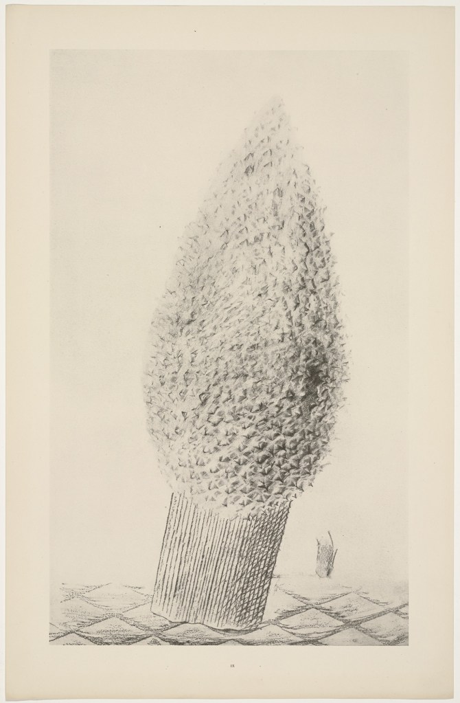
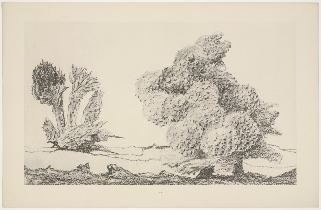
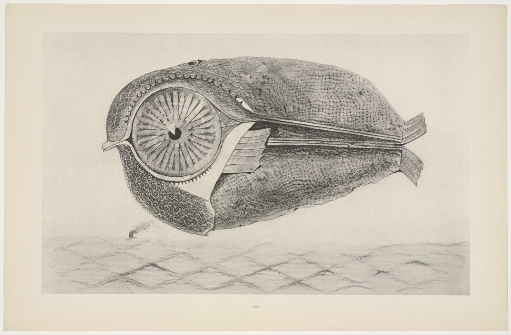
Max Ernst has inspired me to approach this week’s task slightly differently and I really want to experiment using Frottage. I love the texture that is presented through the uneven surfaces, and Ernst’s work is very detailed and visually interesting.
Sven Pfrommer
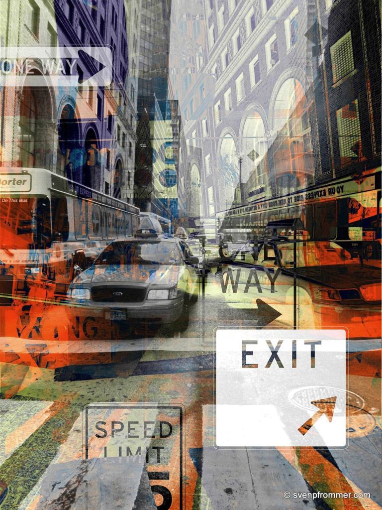
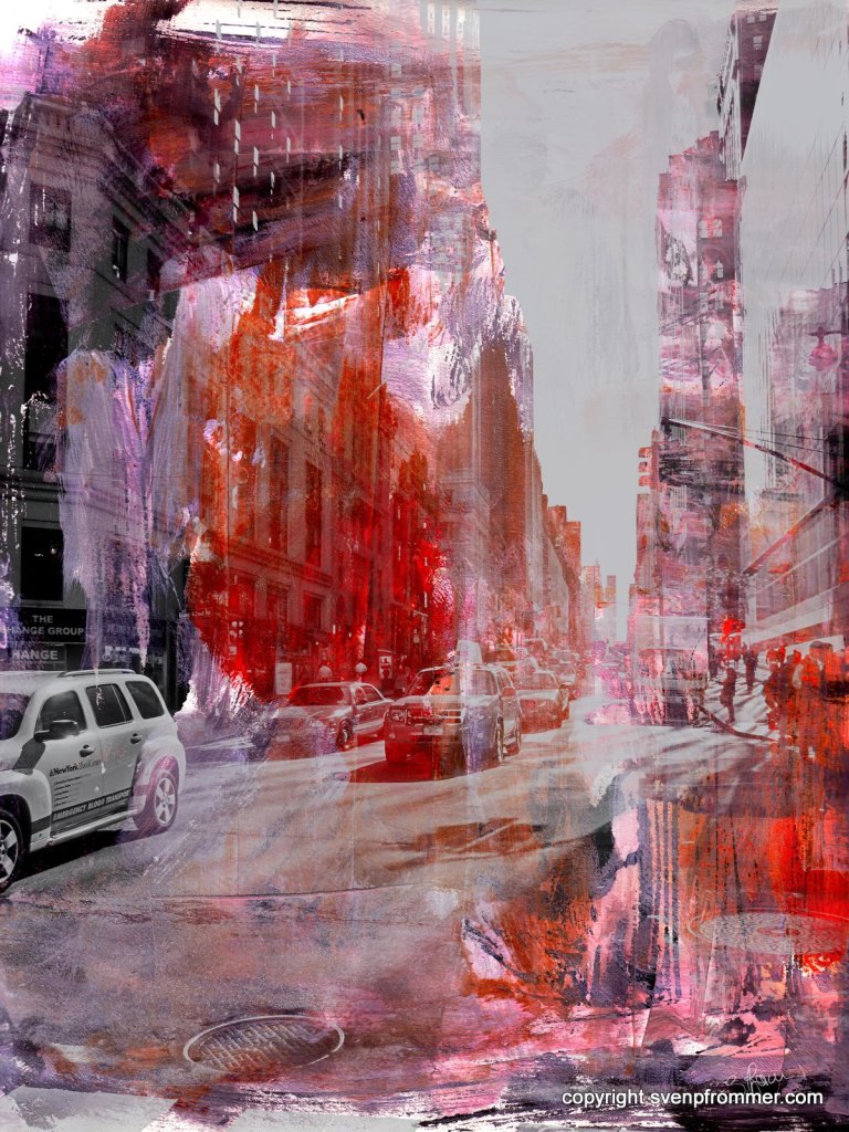
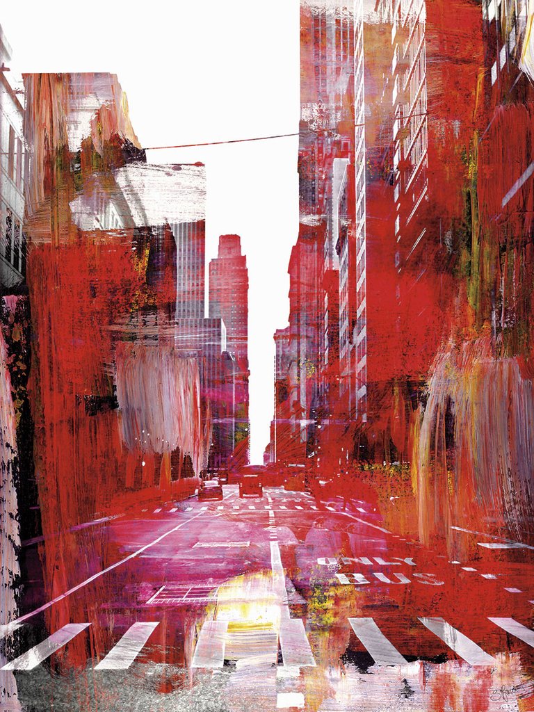
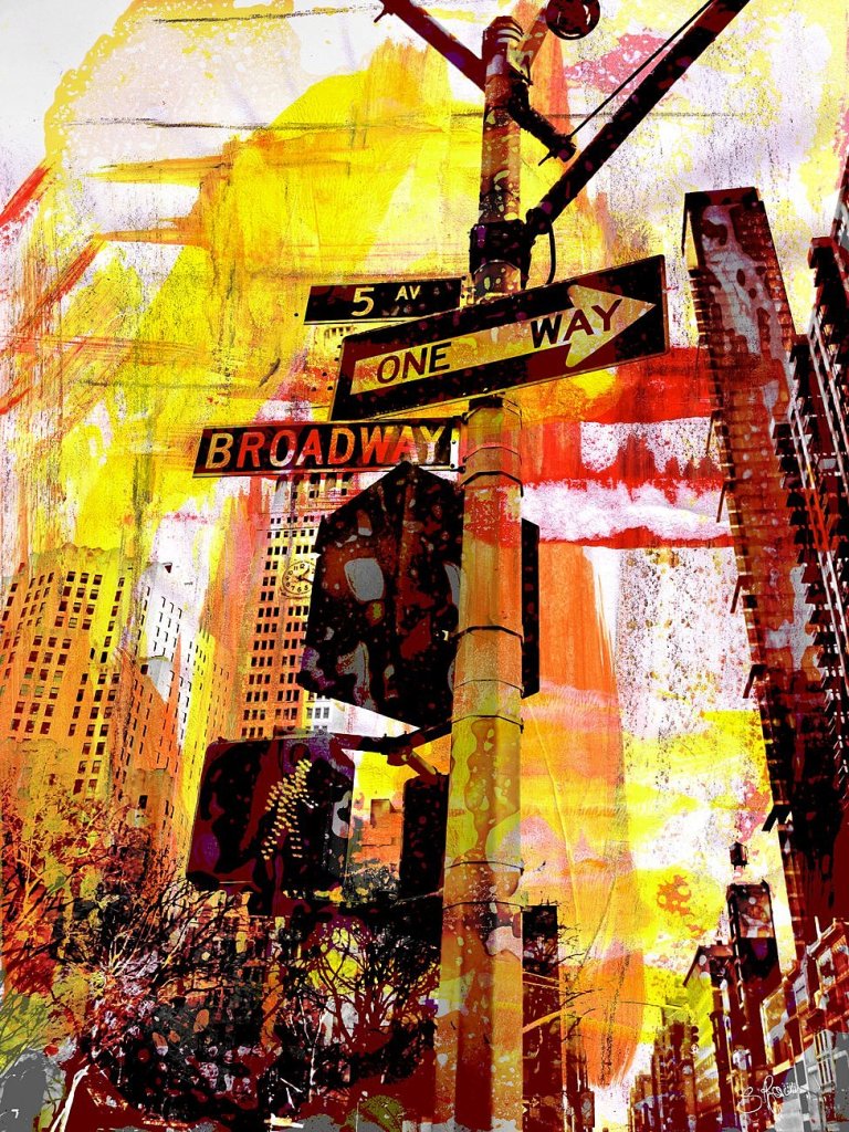
Pfrommer’s work is primarily cityscape photography that has been overlaid with various layers with varying degrees of contrast and highlight. The outcomes are very artistic in appearance and I love that there is a sense of motion captured in these photographs. I have chosen this set titled New York Mixed Media as there are signs which are highlighted in these photographs. For me, they stand out and provide a great contrast and provide a strong sense of busy city life.
