Reference Material
Design, Writing, Research, Writing on Graphic Design
1. 
2. 
3. 
4. 
5.
2. Punctuation and composition is what enables a reader to have a dialogue of speech in their head, pausing or stopping where necessary for breaks. In poetry there are invisible frames where sentences cut off at certain points to drop to the next line. Without this, extracts of text would become difficult to read. Typography also experiments with this concept and bends the rules, generating often exciting alternatives to punctuation (such as concrete poetry for instance).
3. Jan Tschichold’s “Penguin Composition Rules (1947)” below have provided some inside knowledge regarding poetry as this is something I love to look through in relation to typography and its boundaries. I also thought the books criteria is valuable information as I may consider creating a book with my 3000 word essay this module:
The Printing of Poetry
“For printing poetry use type of a smaller size than would be used for prose. All composition should be leaded and the words evenly spaced with middle spaces. The titles should be centred on the measure, not on the first line. The beginning of each poem may be treated as a chapter opening, with small capitals, etc.
Extra leading, especially between verses of irregular length, may often be misleading, as it is impossible to see whether the verse ends at the bottom of the page or not. The safest way of recognizing the poet’s intention is to indent the first line of every new verse, after which leading is not really necessary. Therefore, the first line of the second and following verses should be indented, unless the poet has indicated a shape not allowing for indentations.“
Make-up
“Books should, with certain exceptions, be made up in the following order:
I. Preliminary pages: 1, half title; 2, frontispiece; 3, title; 4, Imprint or date of publication; 5, dedication; 6, acknowledgments; 7, contents; 8, list of illustrations; 9, list of abbreviations; 10, preface; 11, introduction; 12, errata.
II. The text of the book.
III. Additional matter: 1. appendix; 2. author’s notes; 3. glossary; 4. bibliography; 5. index.
The above should each begin on a right-hand page, imprint and frontispiece excepted. As a rule, chapter headings should be dropped a few lines.
The preliminary pages should be set in the same face and style as the book itself. Avoid bold faces.
The index should be set in two or more columns and in type two points smaller than the text. The first word of each letter of the alphabet should be set in small capitals with capitals.“
–Jan Tschichold (1947)
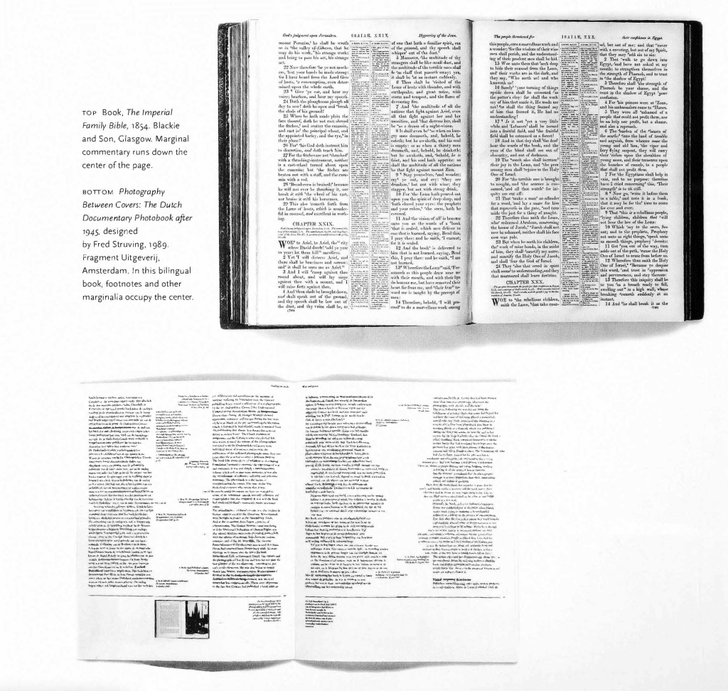
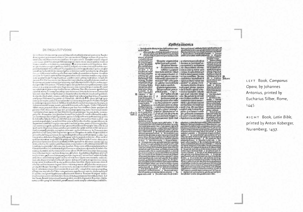
4 & 5. A reminder to look to old sources and books like bibles and illuminated manuscripts for inspiration regarding layout and typography; these examples are visually inspiring and very different to today’s formatting for print.
Illuminated manuscript examples from V&A museum:
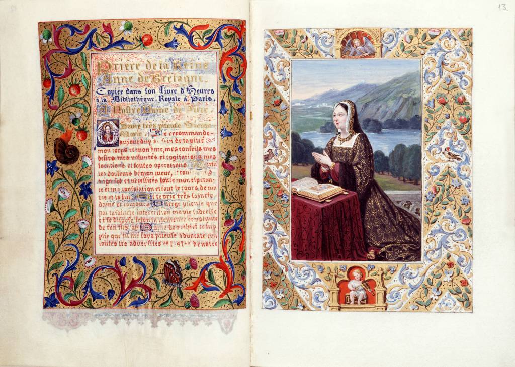
Heures françoises et latines pour Madame L. Gallois, so-called Naives Hours, 1839 – 42, Paris. 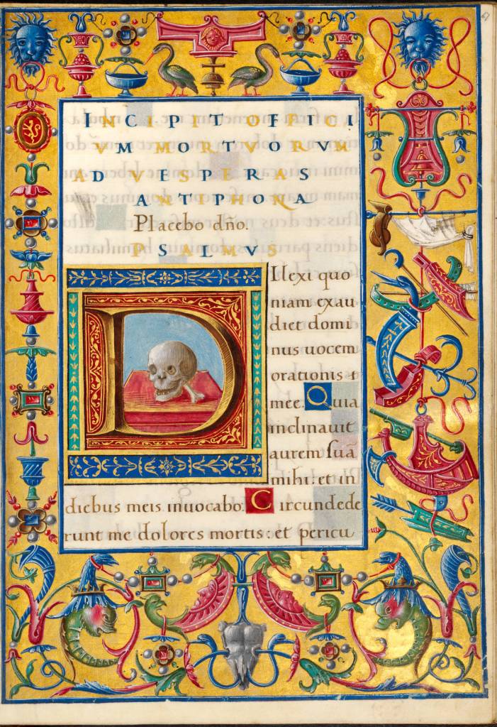
Bentivoglio Hours, about 1494 – 1503, Bologna, Italy 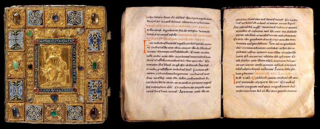
Sion Gospels, about 1025 – 50 (manuscript) and about 1200 (binding), Switzerland.
Real world research: A resource for social scientists and practitioner researchers
Ethnographic studies:
• Cultural and social structure of social groups.
Anthropology:
• The study of human societies and cultures and their development.
• The study of human biological and physiological characteristics and their evolution.
There are four main types of anthropology according to this source:
- Archaeology – analysis of objects people have made, collecting remains of buildings, animals, people and plants
- Biological Anthropology – looking at humans and how they adapt to their environment, evolution
- Cultural Anthropology – exploring societies and cultures
- Linguistic Anthropology – communication around the world and language
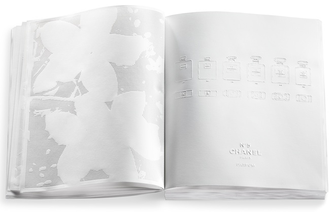
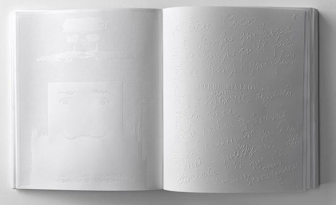
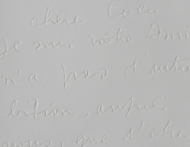
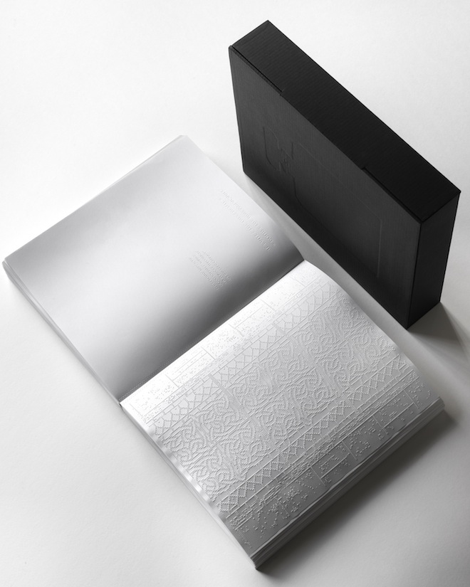
Irma Boom: A Tribute to Coco Chanel
I have found a better video which shows the pages as the one provided isn’t capturing the embossing at all:
• Embossed white pages tell the story behind Coco Chanel
• The book is white and unscented in similarities to the fashion world; fashion and fragrance should always compliment the wearer and not the other way around. You don’t see it, it’s there
• Key words; poetry, abstract, invisible, simplicity, ephemeral
• The comment about paper becoming textiles relates to the brand! Very clever link there with texture which I really admire
• The book was considered in width due to the dimensions of the Chanel perfume bottles being inspiration
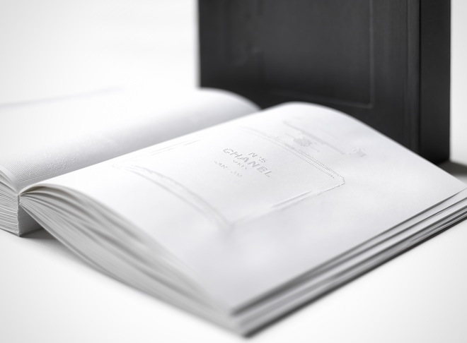
CHANEL: LIVRE DYARTISTES
The mix of handwriting and printed typography contrast throughout the book. The handwriting gives a soft personalised touch to the book, as though it is Coco Chanel’s autobiography. The commitment to no ink throughout the whole book has resulted in the book becoming a piece of art – and a collector’s item.
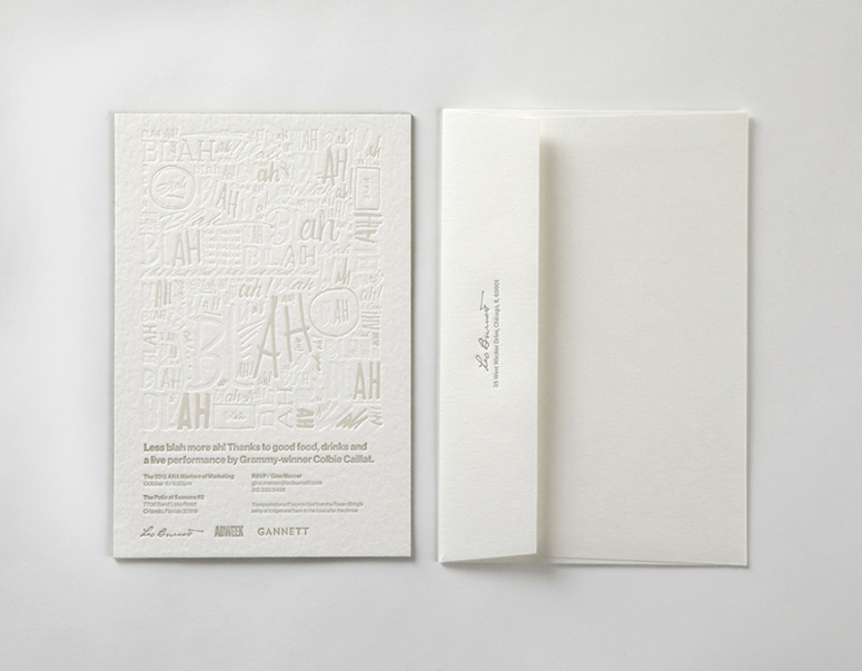
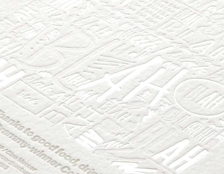
Leo Burnett – ANA invitation
Another beautiful example of embossing on white paper would be the invitations designed for a marketing dinner. The minimalist approach with varying shades of white and grey create some depth in the page in contrast to the above Irma Boom project.