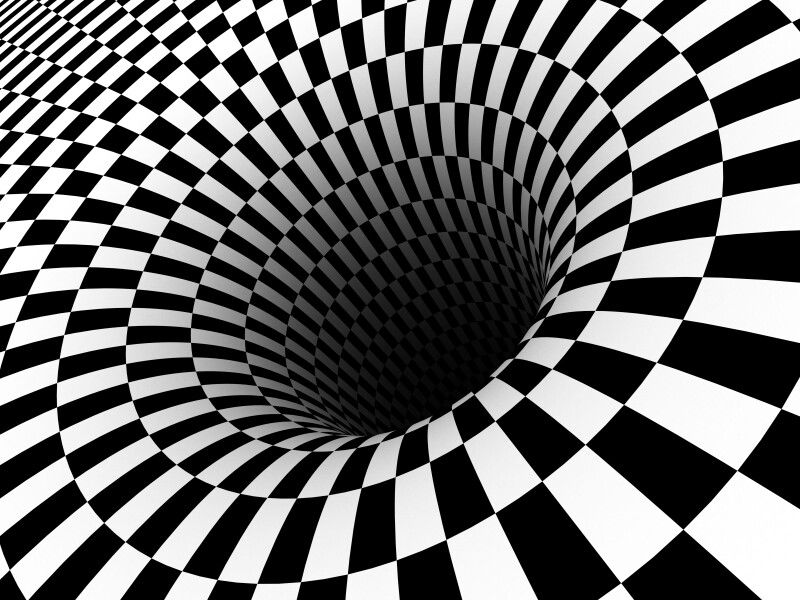
The Von restorff effect
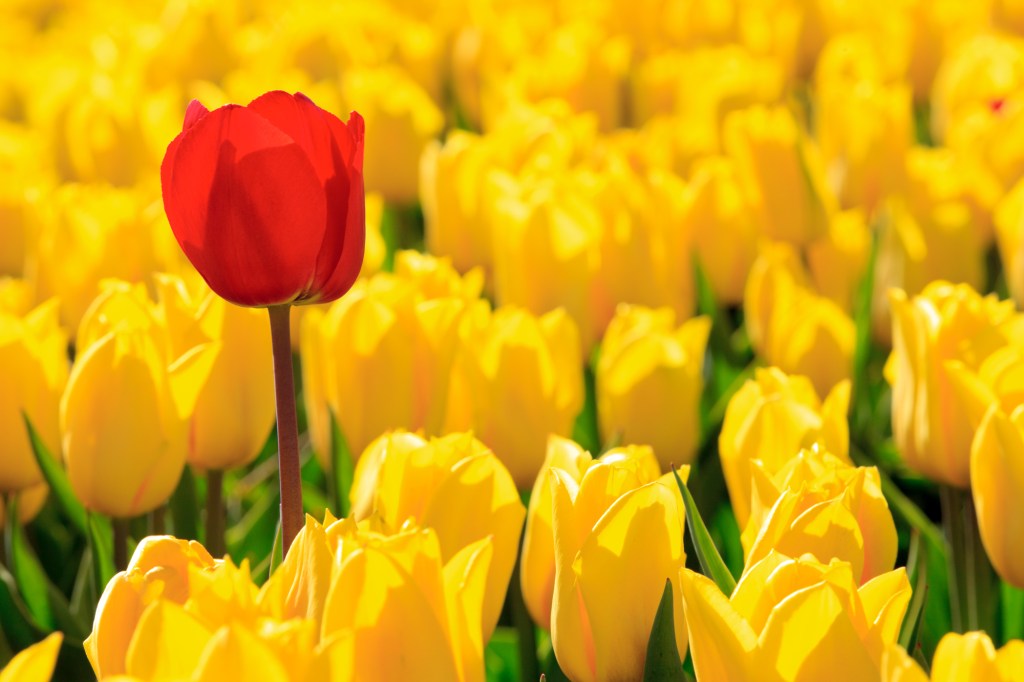
After visually looking at colour theory as a process this week, considering my final is a black line drawing I need to explore not just how I would present the piece in black, but also layout. There is something which has stuck with me that I stumbled across in my research; the Von Restorff effect. A process of naturally leaning towards the ‘odd one out’.
“Many
Vile
Earthlings
Munch
Jam
Sandwiches
Under
Newspaper
Piles”
1. The viewer is instantly drawn to the word that is bold. It automatically presents this word as being important and of significant value, it suggests that this is what the topic is about, or plants an image in the viewers mind. This can also be the largest word.
2. The next word that would stand out is the italic, which has emphasis; it sounds different when read. The viewer would be most likely to remember the words Many and Earthlings out of the whole mnemonic phrase (the order of the planets). This could also be the second largest word.
I find this effect really compelling – that naturally humans are swayed to investigate the ‘abnormal’ and sometimes exploring or presenting the ‘odd one out’ can actually benefit a scenario as it’s an entirely different way of thinking. Thinking outside the box.
I have began looking at various techniques behind layout/composition of design and how this can communicate to a viewer in subtle ways. For instance: small/large text, bold, underlined, italic, colour, different typefaces, textures.
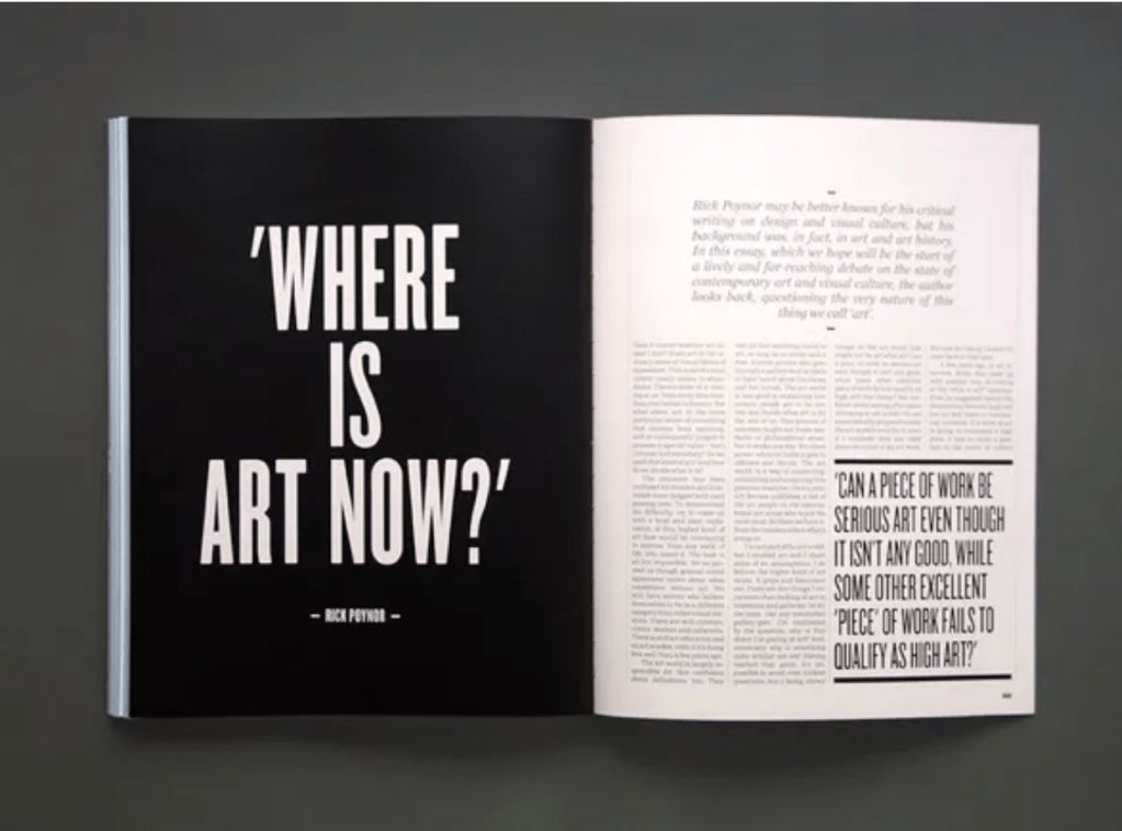
The use of large typography ensures we as viewers look at the left page first, then the bottom right text, then the italic, and finally the body text. Design is all about the Von Restorff effect and I want to portray this in my final black line drawing.
Experimentation:
I have created various sized and textures lines to create a deeper insight into colour theory:

1. Using a paintbrush style brush to present a creative line 
2. Starting to think about how the line can be presented, disjointed and include more lines 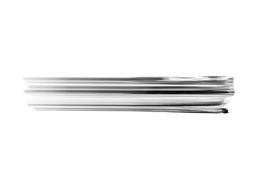
3. Separating the lines to become several 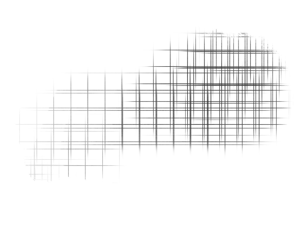
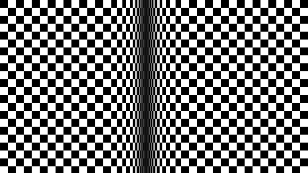
4. Exploring the geometric forms of grids
I really like playing with the layout and thickness of lines, and also the gradients. The challenge for this week was to create a “black” line drawing which represented colour. At first I found this challenging, and after researching; realised colour holds significance in ways other than appearance. Psychologically, colour is often used to describe emotions and that can be very powerful i.e. “seeing red”, although the colour may not even be seen. From looking at analytical articles (in research) I’ve discovered mostly that darker colours are associated with bad, and lighter colours are associated with good. I want to portray my final piece as a gradient of white to black, representing the good and the bad thinking process that one may encounter during design.
To reinforce this idea, I looked at the Von Restorff effect and how I can make the design attract the viewer, to which I have made the left side of the design seem less noticeable than the right, which is in bold. The viewer will be drawn to look at the right design first.
Can I further develop this?
Interestingly, feedback in the webinar when showing my thought process for this week was that the final image I’ve produced (above) almost looks like it’s moving.
This has got me thinking about the power of perspective.
Optical illusions:
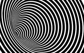
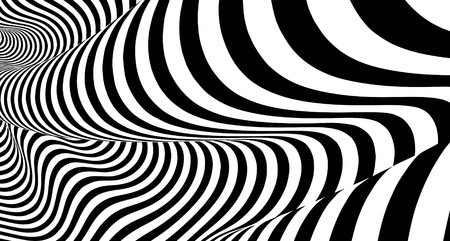
To further develop my line drawing to convey a sense of movement, I have started looking at optical illusions. I remember being so mesmerised by a book full of them when I was younger and they still fascinate me now. Interestingly enough, optical illusions are drawing the viewer in… Very similar to the Von Restorff effect where certain elements grab a viewer on a page, packaging, or poster. I have chosen the illusions where the central focus seems like a hole, or a pathway… Almost like Alice in Wonderland’s “down the rabbit hole”. I have begun to experiment with this concept as a final idea:

This reminds me of an eye 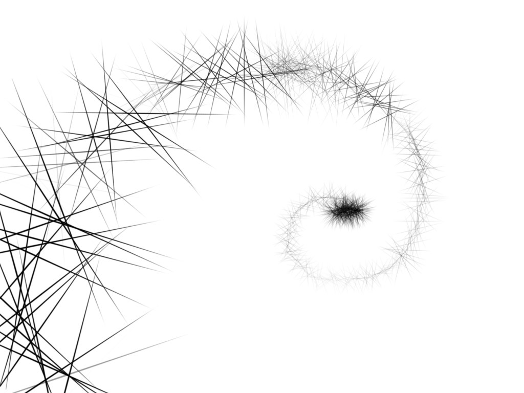
A spiral, like space 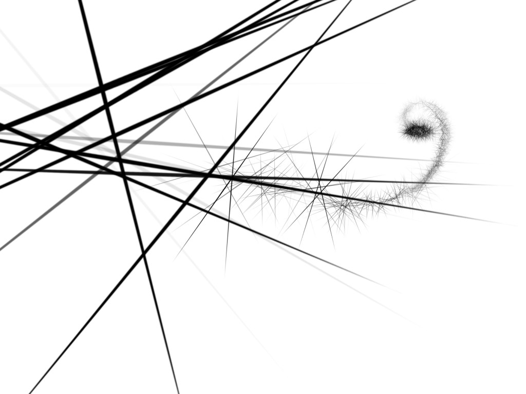
A sense of movement; from far away to closer
As I like the last experiment the best in terms of what message trying to convey, I have further developed it below:
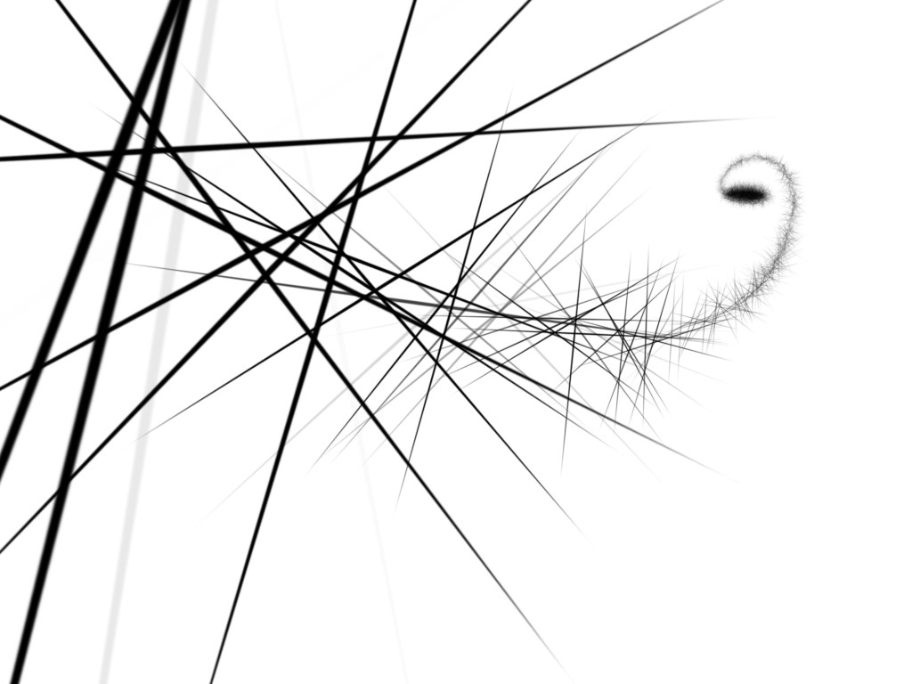
The final outcome.
I have chosen white to black gradient to represent colour theory.
I have chosen the positioning of the lines so the viewer is first drawn to the darker areas of the image; first the black hole and then the lines which convey a feeling of movement, that the lines are really close to the viewer.
I have been inspired by optical illusions, colour, and the Von Restorff effect for this black line drawing. Overall, I’ve realised that design is a careful combination of specifics such as form, shape and scale, and design cannot be effective with just one element; it’s a combination which draws in the viewer and keeps them intrigued.
How could I further develop?
To further develop this final idea of a black line drawing for week 6, I would look into simplifying the image; or even creating a series. I think a series of these textures could look visually striking. Maybe I could continue the line from the left side of the image and extend it to another page, potentially like a quadriptych which we have already explored.

