
My 400 word analysis
Seuss’ collection of children’s books have become recognisable world-wide, through effective marketing strategies and advertising. One tactic was not to use the author’s real name Ted Geisel, and alternatively use the name Dr. Seuss. Seuss, rhyming with ‘goose’ instantly associated his work with children’s literature (Mother Goose). Combined with talent for creating illustrations his work became a revolutionary, memorable brand.
Dr Seuss writes in anapaestic tetrameter, which is consisting of 5-12 syllables in each sentence allowing the second person narrative to be broken into paused speech. This structure gives the poetry a narrative when read and readers are likely to hear the poem internally with different voices; the most dominant voice being the author himself who advises from his own experience to date of the world.Rhyming is prevalent throughout his work and clever use of punctuation keeps the readers engaged on an emotional rollercoaster. Capital letters and exclamation marks alert the reader; whilst question marks encourage creative thoughts and questions about self-worth. The humorous language that Seuss uses in all of his books is similar to a small child’s vocabulary and this is fundamental in establishing the relationship with the reader; made-up verbs such as ‘footsy’, ‘prickle-ly’ and ‘mind-maker-upper’ appear when least expected – appearing silly, randomised, and amiable.
Initially, I would suggest this poem is aimed at children or those who are young and graduating from school, college, or university. The audience is ideally inexperienced as to what the world will bring in their futures, as this poem demonstrates the unexpected highs and lows of life in general. However what is evident is that Oh The Places You’ll Go! is relevant to adults too; we all need some motivation and a purpose and this is what makes the book so successful.Dr. Seuss recognises his audience is not limited to one age group. What I particularly enjoy is how the poem is structured into motivating the reader but then suddenly switches tone into the reality of how life isn’t always idealistic, and ‘un-slumping yourself is not easily done’. Seuss reminds the reader that although life is difficult, it’s possible to not let it get to you and almost offers support like that of a parental figure. I think young audiences could look up to Dr. Seuss’ work as influential and logical, writing that seems like the fundamental next steps following graduation.
Editorial
It’s been a great insight to understand the illustrations behind the Dr. Seuss Oh The Places You’ll Go! book and I would not have realised it was inspiration from a dartboard. I have considered how I can present the editorial for the text and I have two options:
- Present text in shapes (concrete poetry as this has appeared in my work throughout this course) as a tool that enables precision, focus, excellence etc. like this poem would enable the reader to eventually achieve high standards
- My interpretation of the poem; for me it’s all about direction and taking steps to get to the final destination. I really like the idea of footprints, or stairs or something to show a journey – showing the literal steps I have taken to get to where I am now. I have decided to go with this option. Also the reference to ‘footsy’ in the poem… I really like this link and think it’s the best suited example to follow through with.
Inspiration for footsteps as a foundation:
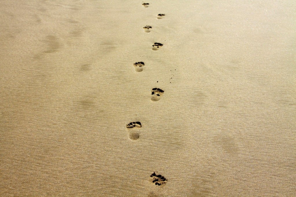

The above images are evidence of someone or something’s path and trail to where it once was. Considering this in my final output, I also need to show how life is full of ‘ups and downs’; by demonstrating this in the word arrangement somehow whether this is through wide to thin, large to small, or vertical zig-zagging formats.
Development
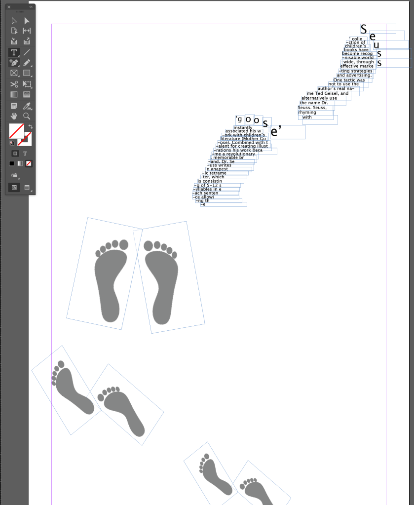
1. 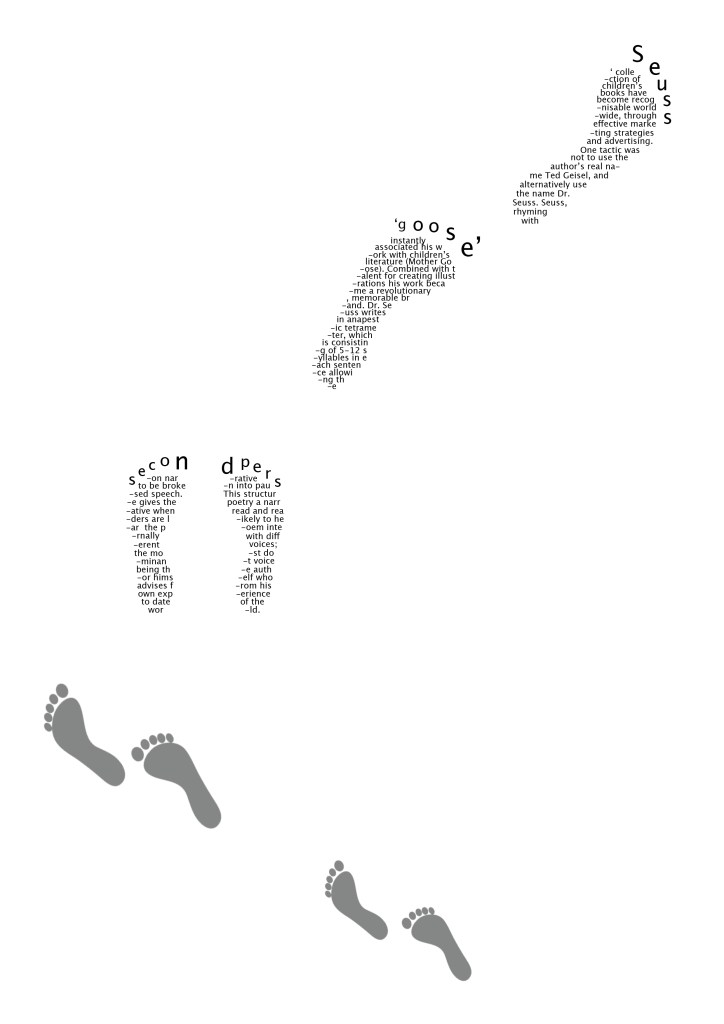
2. 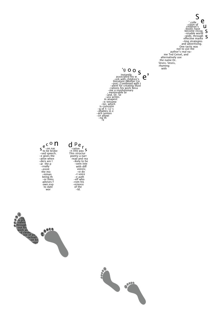
3. I didn’t like this layout so re-arranged at this point 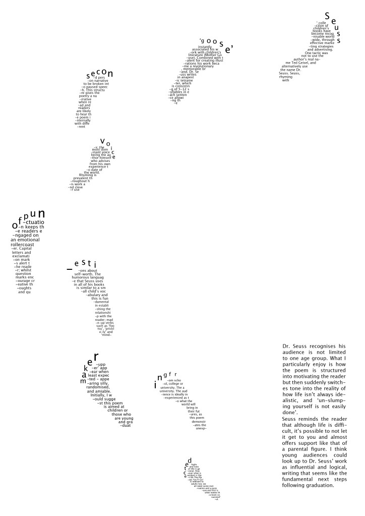
4. 
5. Enlarged for better reading 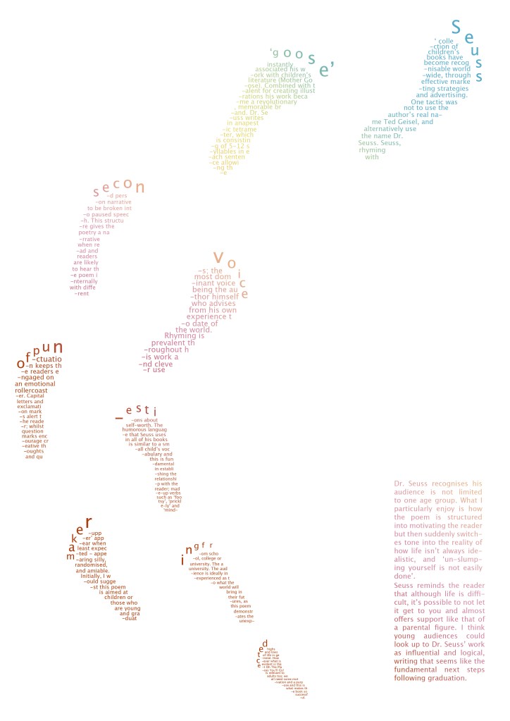
6. Oh the Places You’ll Go! colour palette
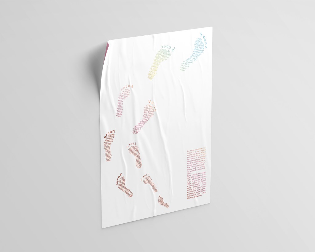
Final format
Critical feedback
I think the message of this poster upon first impressions relates well to the idea of walking to better places just like Dr. Seuss’ poem discusses. To further improve this poster I could reconsider the composition of the footprints. I decided to make the format as a large poster so these footprints could be properly read from a distance by a viewer; this format wouldn’t work so well in an A4 sized magazine as the text would be difficult to read.
The colour palette makes it playful which I really like; it uses the same colour scheme as Dr. Seuss’ book illustration colour scheme so I took that for inspiration. To further develop, I would test out changing the colours of the background and see what looks most effective.
