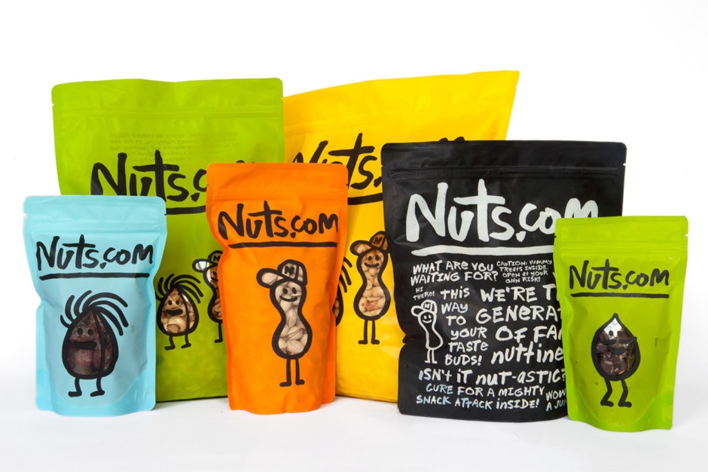
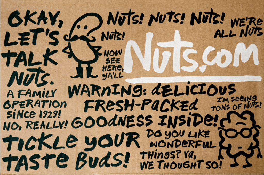
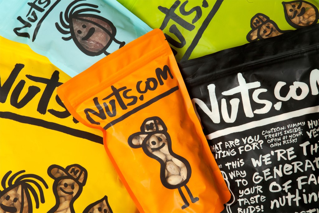
What strikes me the most about this rebrand is the colour and very ‘raw’ appearance of the typeface used. It’s really casual, comfortable and not a ‘try hard’ brand. It’s targeting anyone in a relaxed fashion and that speaks volumes.
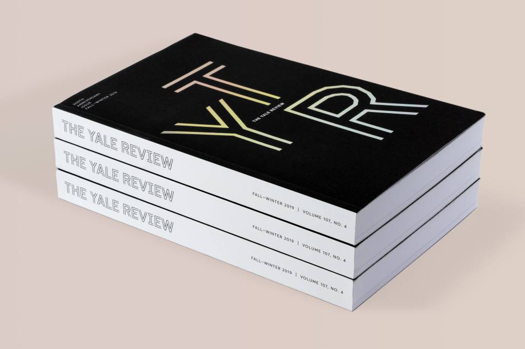
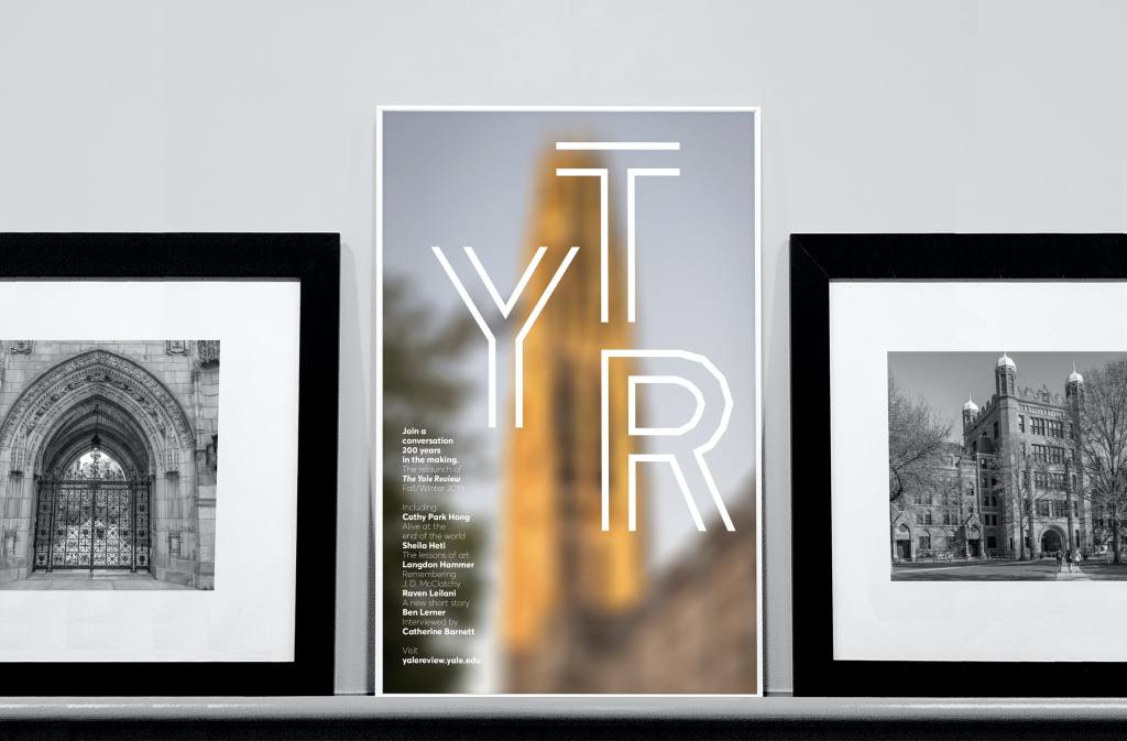
Looking at Nuts.com project I was led to Pentagram (once again). I have looked at their work on their website before, however I’ve not spotted TYR project. The typography on this project stood out to me as it’s also very simplistic, however it’s modern and straight to the point. There’s a really nice contrast between the above (nuts.com) typeface and YTR, they both feel modern but one is playful (nuts typeface) and the other is stylish (YTR typeface). Visualising these together is interesting and I want to experiment with a playful typeface and a stylish typeface…
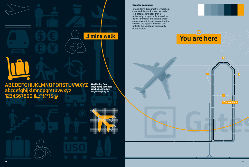
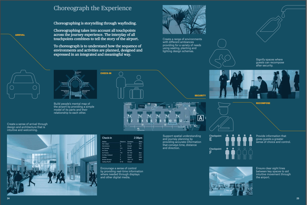
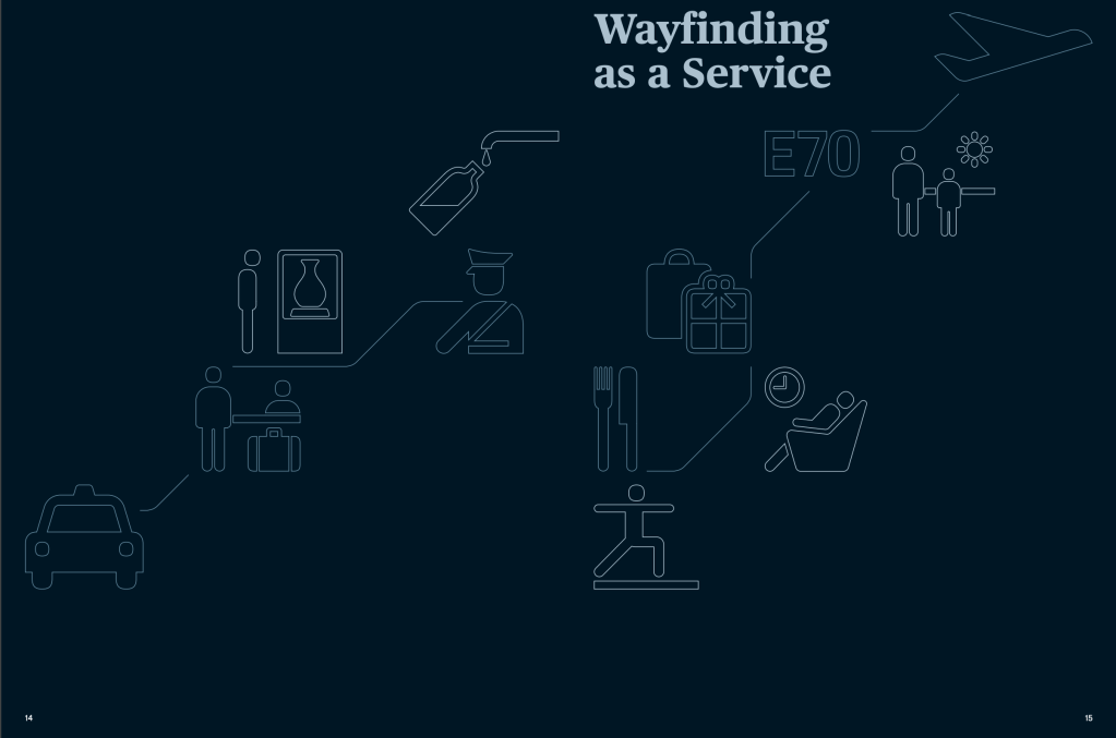
I looked into wayfinding in the last module (for my design museum concept) and Airport – City ID is a really nicely designed wayfinding document that I found on their publications page. I thought it was important to keep it as a reference as the symbols and lines on the page guide the viewer along a journey, but the colour theme is keeping the document sleek and minimal.
This was an insightful talk. I really appreciate the different routes both designers took in their career. Bantjas seemed to be solo right from the get-go whereas Hische built her reputation through her clients and people she knew. This highlights the benefits of networking and building clientele through events/social media.
Bantjes:
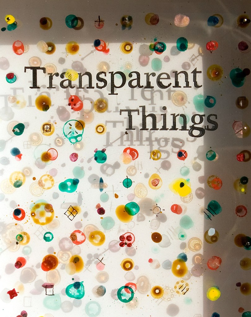
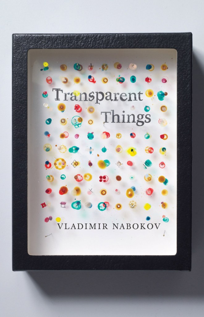
This is such a simple but effective idea for a specimen box. Transparent things was created using layers of acetate and transparent ink. This is inspiring me hugely this week – I have always loved acetate and printing on it for its transparent properties. There’s something about the shadow that is visually adding to the final outcome and although it’s subtle, it’s there and noticeable. It’s complimenting the overall idea really well. (Note to myself to play with lighting and angles to achieve different results in projects).
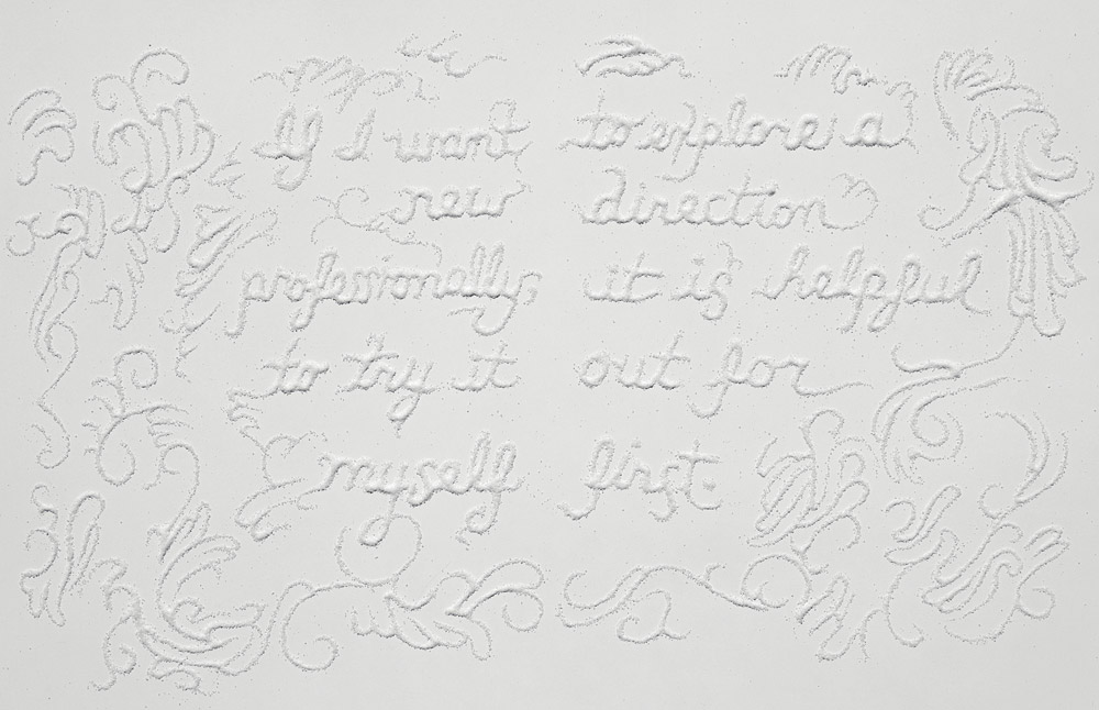
White on white breaks the rules, but the texture works. I actually really want to try this myself, using the same colour on a background and only using textures to create contrast. It’s subtle but effective.
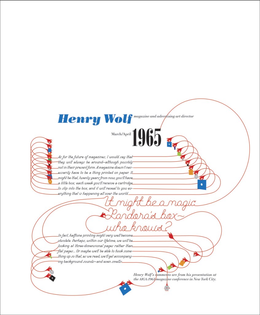
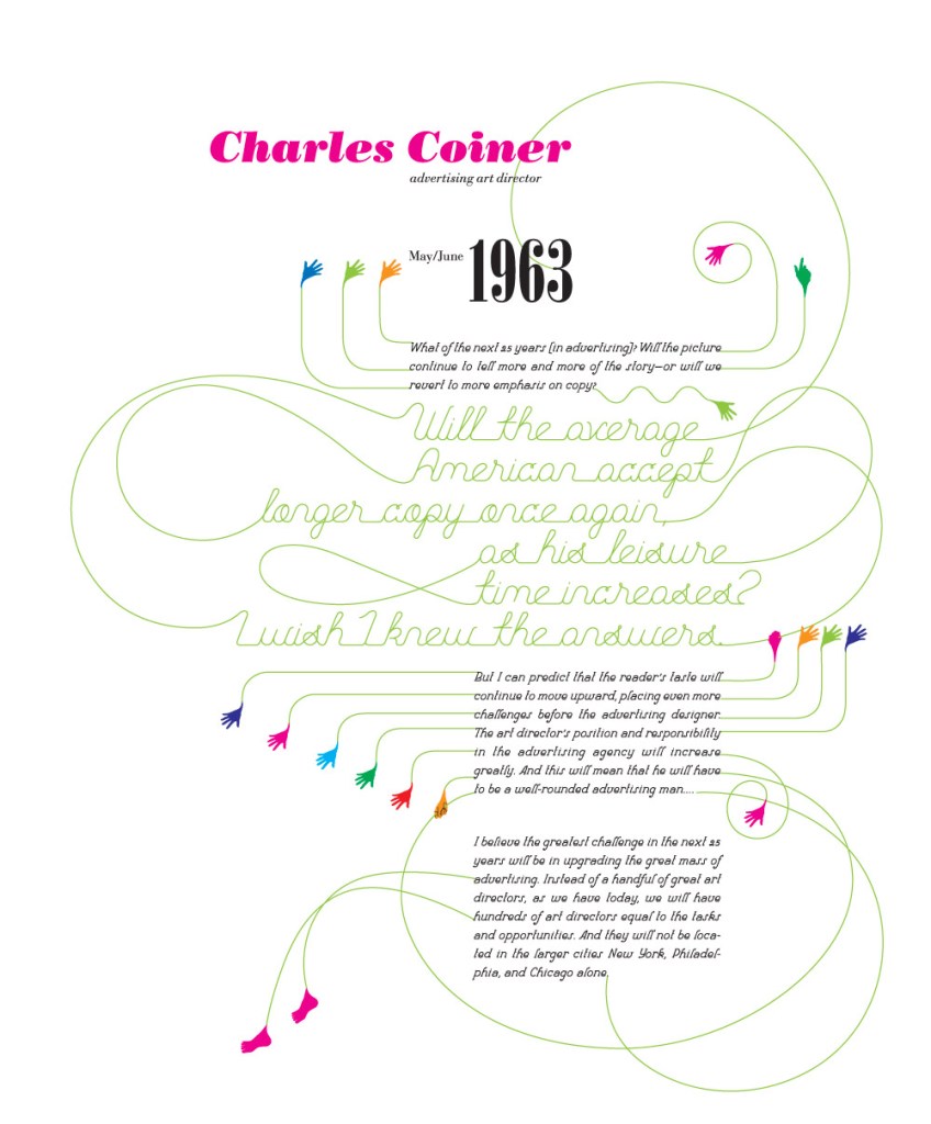
Really love the decorative typeface and the excessive swirly lines throughout the pages for ‘the vivid word’. The colours look really great on a white background too as they speak for themselves, also space is really important on this piece as it gives room for the text and lines to breathe.
Hische:
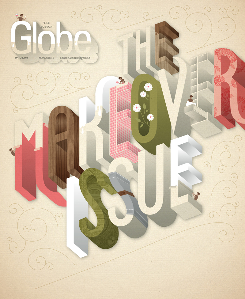
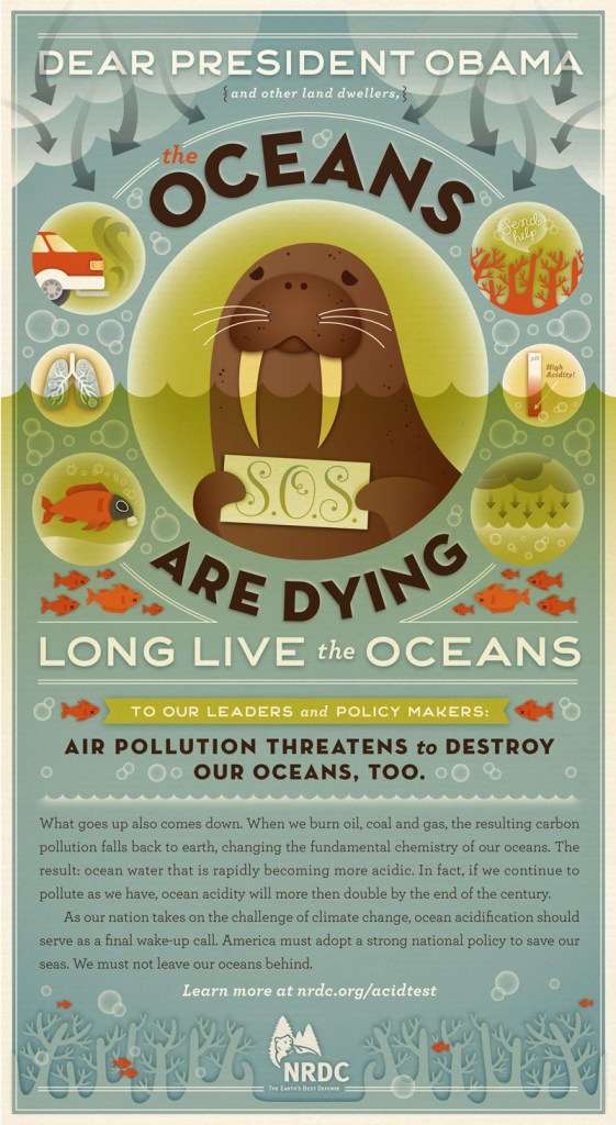
Left: The Makeover Issue – I love the colour palette here and the mini people literally doing the makeover to the letters. The 3D typeface works so well for this idea. Right: Long Live the Oceans! – so great to see Hische also designs for environmental awareness. This is an inspiring piece to me as there’s a large combination of image and text; a really detailed piece yet the message is clear and concise.