
Collaboration in album artwork:
An album cover designer not only designs and/or illustrates the art that’s on an album cover but more often than not, does the entire layout, including the back cover, insert or booklet, lyric sheet, CD face print, etc.
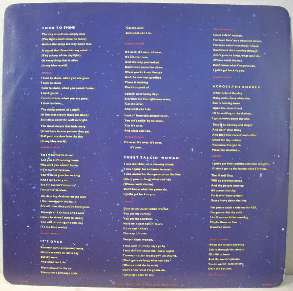
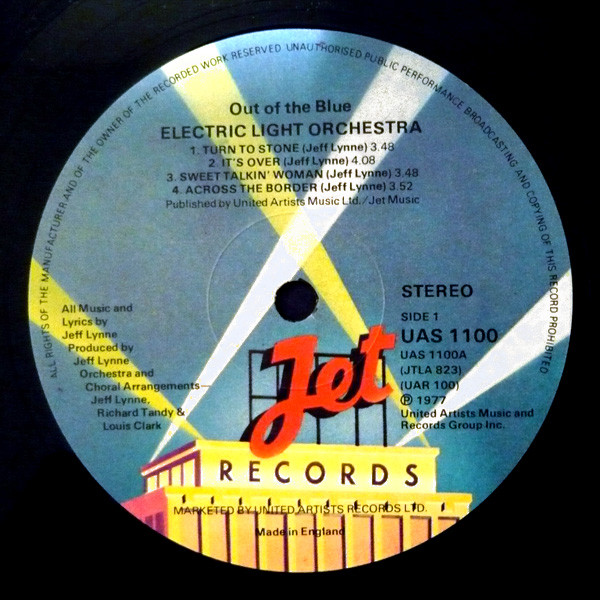
Electric Light Orchestra – Out of the Blue album.
Selling 50 million copies worldwide and released in October 1977, the artwork is influenced by science fiction:

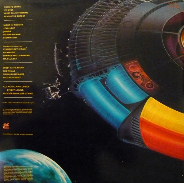
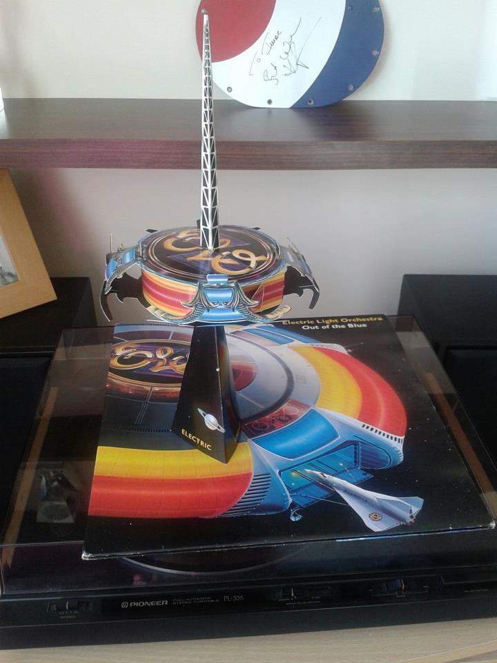
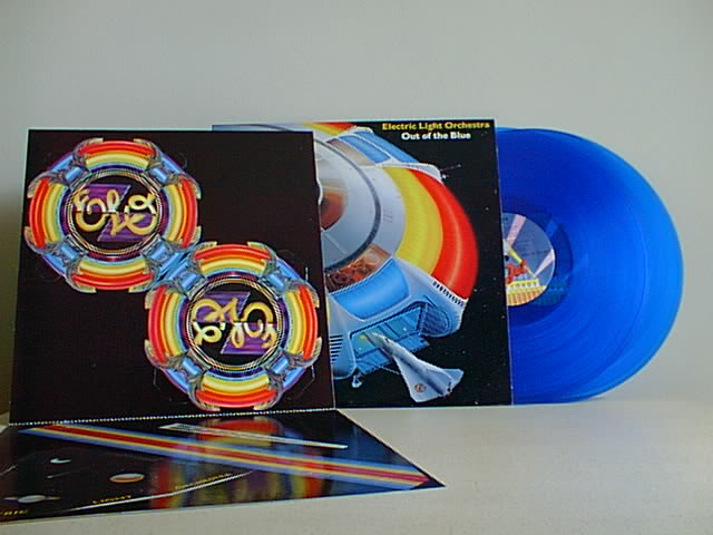
Album artwork by Shusei Nagoaka:
1976 
1977
Why was Sci-Fi prominent during the 1970’s?
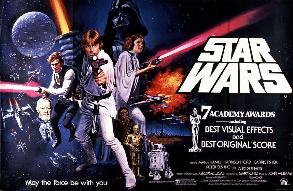

• Landing on the moon in 1969
• Sci-Fi films were released
Spaceship Earth in the Environmental Age – 1960-1999:
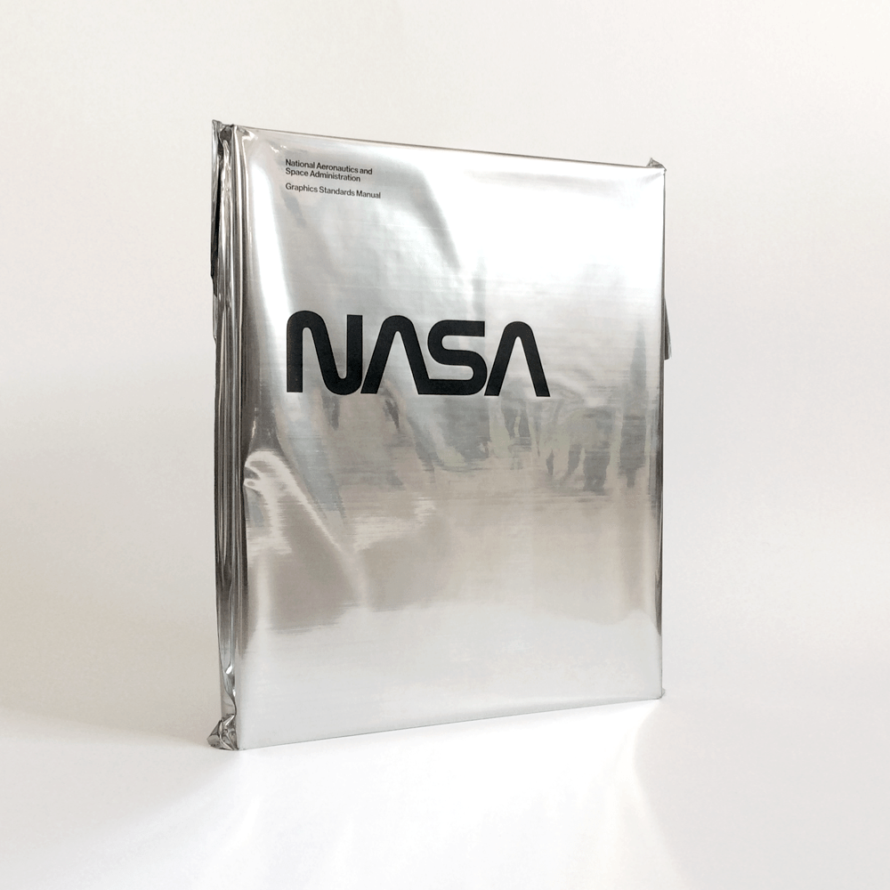
NASA
Stemming from my research, I have decided to look at the NASA branding.
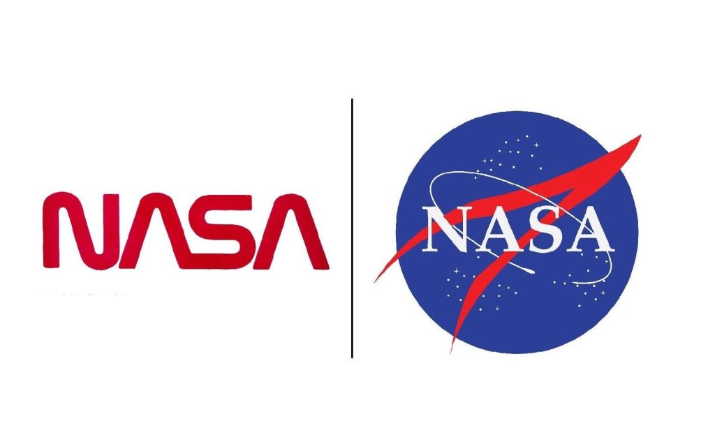
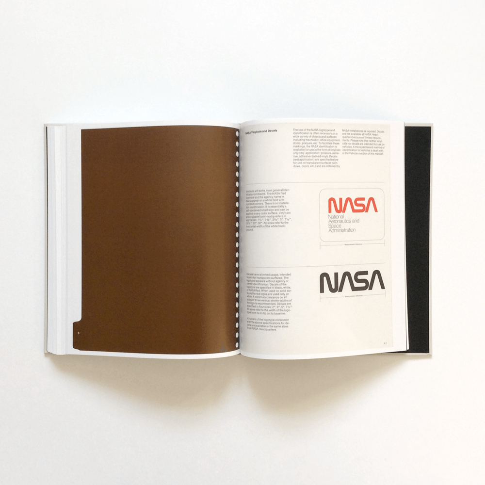
Danne and Blackburn: The “worm”
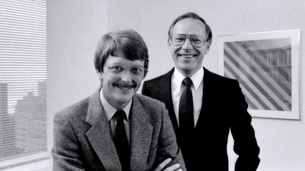
The modernisation of NASA in the 70s was part of the US Federal Design Improvement Program – an initiative instigated by the NEA (National Endowment for the Arts) at the behest of President Richard Nixon. Under this scheme, more than 45 federal agencies, including The Department of Agriculture and The National Zoo, had their graphics critiqued and redesigned: New York design studio Danne & Blackburn was tasked with the job of modernising NASA’s logo:
“One of the reasons why the Nixon administration wanted to change NASA’s logo was that they wanted to change NASA’s mission itself, to make it a generalized problem solving agency and contribute more to the economy — which would mean less space exploration,” Barry said. “The worm was intentionally designed without any stars or any aircraft in it, but just letters, because NASA could then be anything you wanted it to be, including not a space agency. That simplicity was at odds with the explicit symbolism of the meatball, with its blue planet and stars. It also suggested, perhaps unwittingly, a political agenda.”
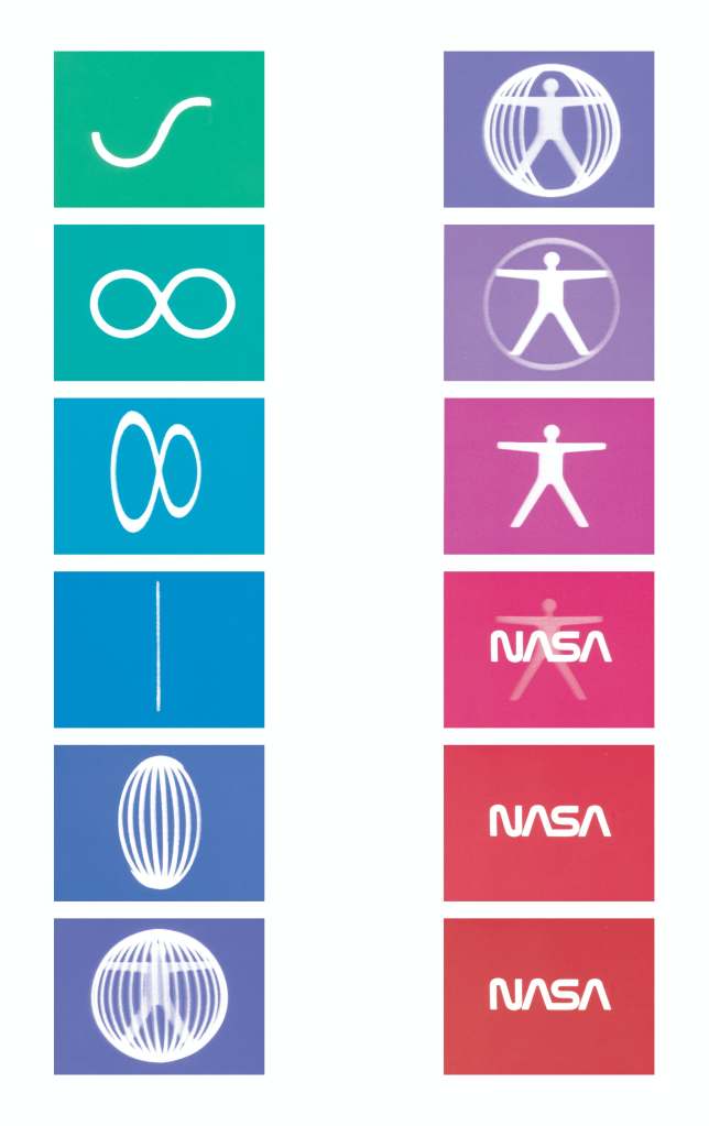
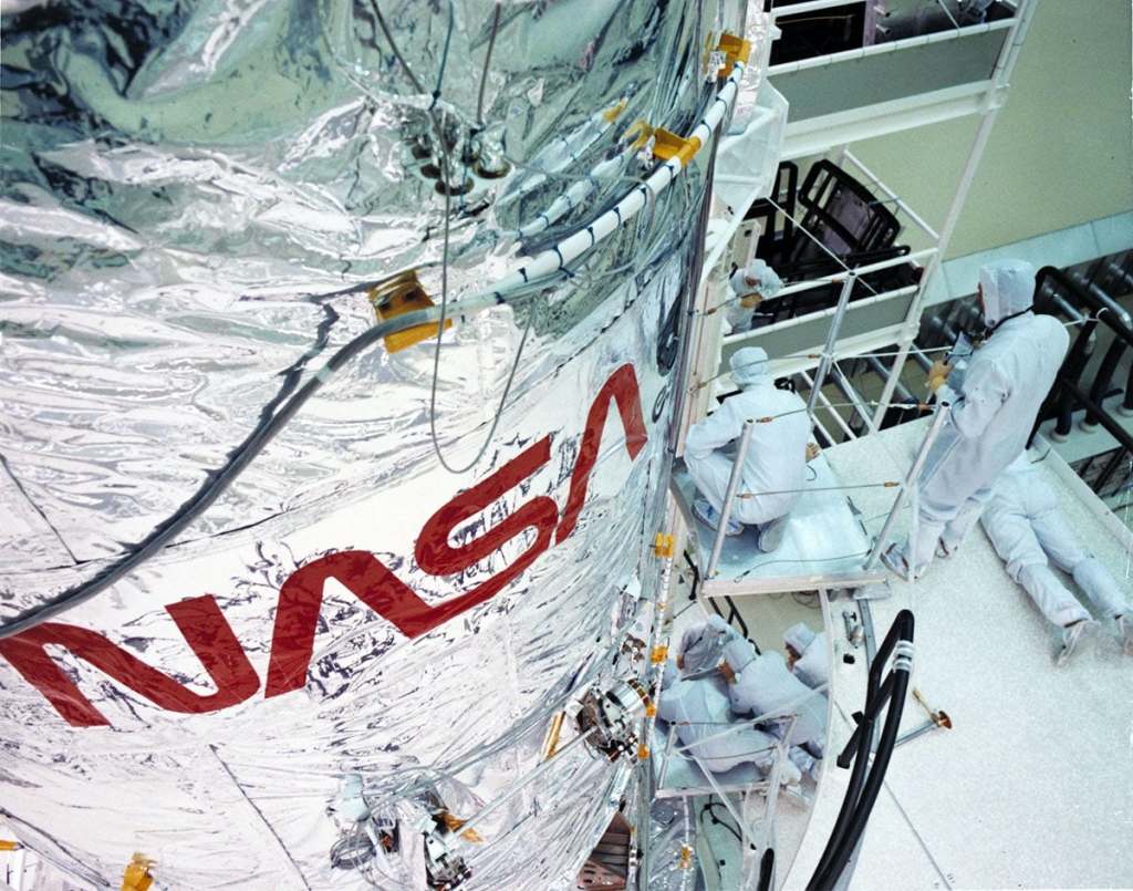
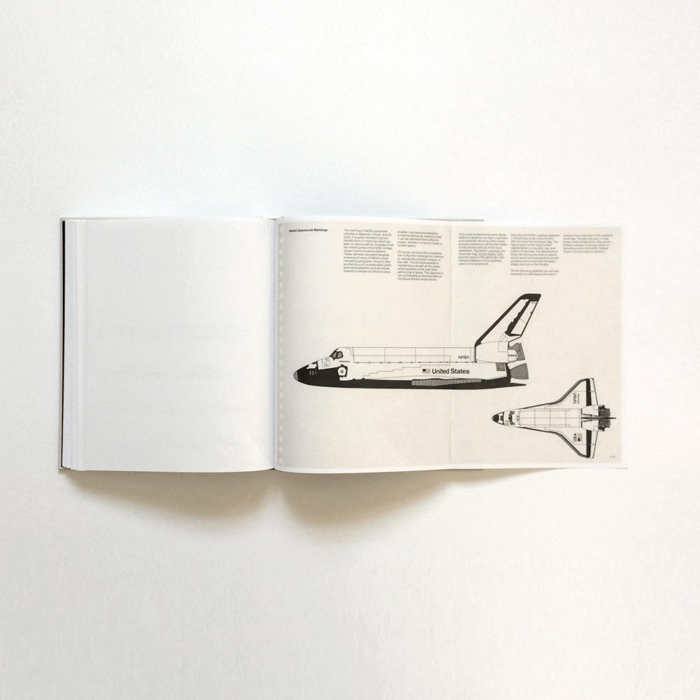
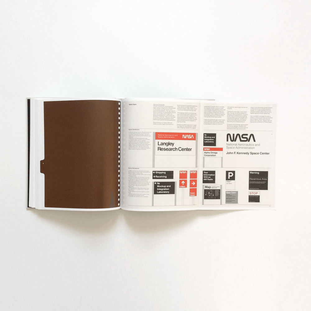
The worm logo worked on small scale and large scale; unlike the meatball logo where details became lost when displayed in small dimensions. Danne & Blackburn didn’t merely create a new logo for NASA, they worked up illustrations to show how it envisaged the logo being used in a host of applications, demonstrating a well thought-out brand identity system.
For all its modern appeal and design rigour, the logotype was retired from official use in 1992. According to NASA’s new administrator at that time, Dan Goldin, the worm was disliked by the agency’s employees and complaints had been received about the logo’s “incompetence and lack of projection” – basically the employees were attached to the history associated with the meatball logo and didn’t want to accept a new identity for the company.

NASA used the “worm” logo from 1975 until 1992. As of 2020, the worm logo has returned. The logo has not retired, it was simply put on the bookshelf. Ultimately it was a controversial debate between designers and internal employees of NASA. NASA hated the worm, and were deeply rooted to the meatball insignia logo due to its associations with NASA’s moon landings and success.
NASA ultimately now have four logos:
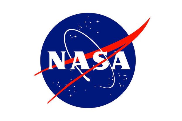
insignia aka meatball 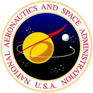
seal 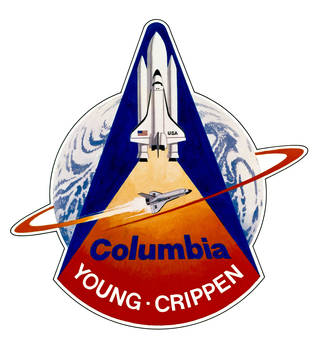
shuttle crews 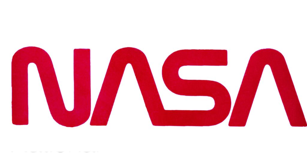
worm
Dr. James Fletcher was NASA administrator and his deputy was Dr. George Low. I really loved the dialogue that employees witnessed from Fletcher and Low’s discussion in regards to the rebrand:
Fletcher: “I’m simply not comfortable with those letters. Something is missing.”
Low: “Well, yes, the cross stroke is gone from the letter A.”
Fletcher: “Yes, and that bothers me.
Low: “Why?”
Fletcher: (long pause) “I just don’t feel we are getting our money’s worth!”
Fletcher: “And this color, red, it doesn’t make much sense to me.”
Low: “What would be better?”
Fletcher: “Blue makes more sense … space is blue.”
Low: “No, Dr. Fletcher, space is black!”
This dialogue is evidence that there was a clear divide between society with personal preference on each logo; so much so that in 2020 NASA now understand the significance and history in both, and therefore have incorporated both logos into their identity.
Re-issue of the 1975 manual in 2015 was made in collaboration with:
• Richard Danne
• Jesse Reed
• Chris Bonanos
• Brian Kelley
• Hamish Smyth


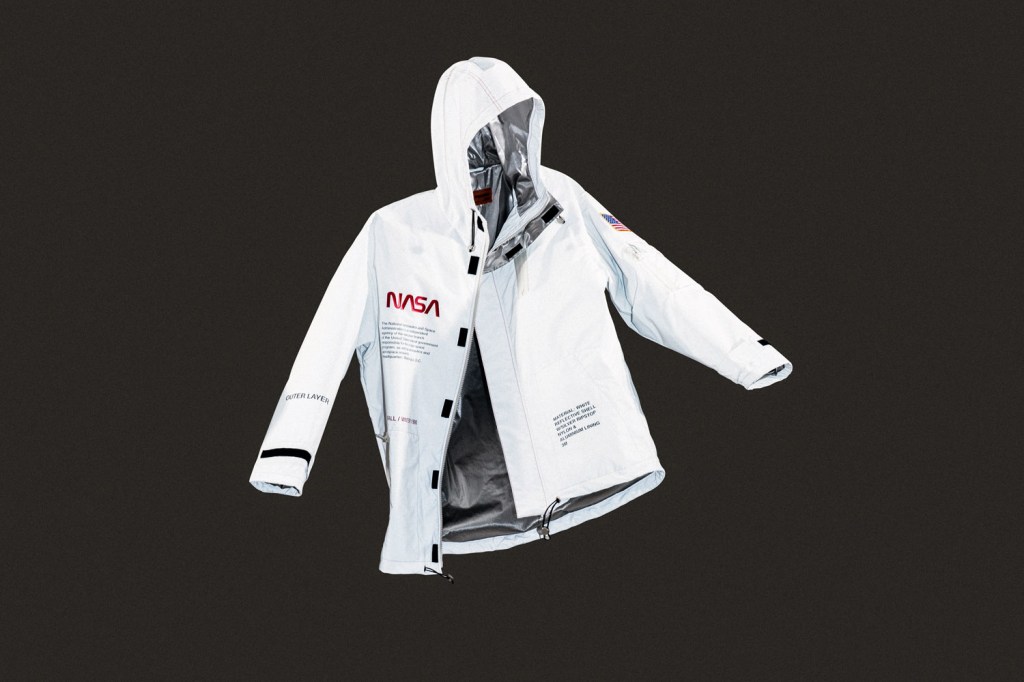
I also looked at how designers have used the worm logo in their clothing lines – interestingly to use either NASA logo on merchandise, companies submit designs to the agency for approval – for example below:
Research summary:
Although I have learnt a lot from all of my research above – especially NASA and how the identity was formed, I don’t feel like this completely pushes the boundaries of ‘collaborations’ for this week – this is ultimately only about NASA displaying their branding through various outlets (design/fashion).
I therefore want to see what I can find where people from different companies would have to collab – possibly even two completely different multi-million companies.
