
Ideas Wall
Trajectory of the Self thoughts 
Trajectory of the Self responses 
Trajectory of the Self responses continued 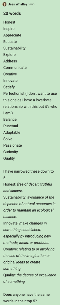
Final 20 words
Research on Sarah’s recommended links:
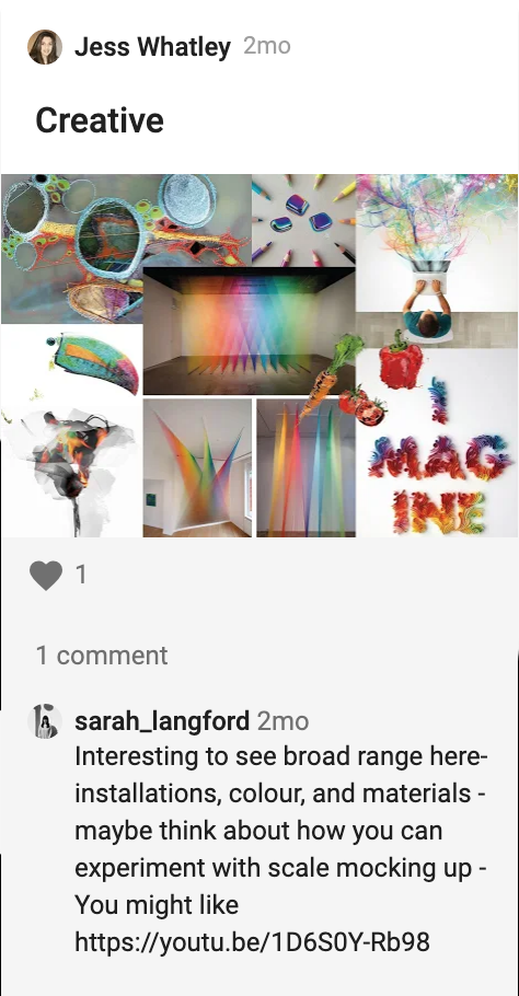
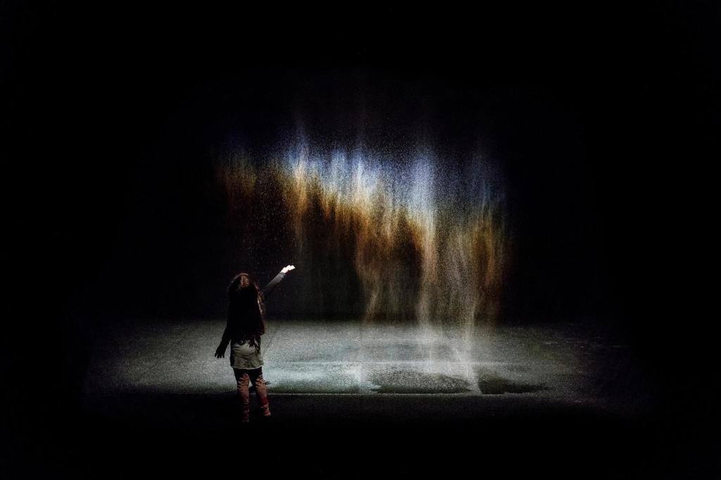
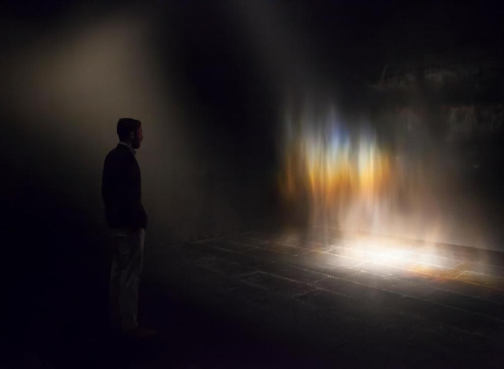
Olafur Eliasson:
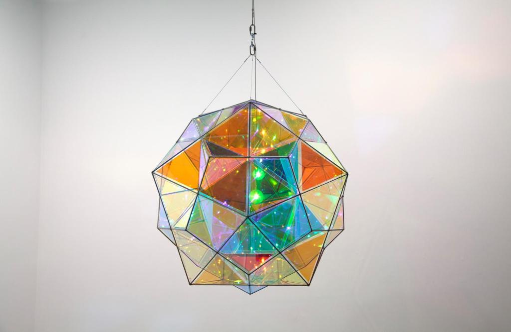
Olafur Eliasson’s lamp created in 2011 is a great geometric use of colour. I love that the light will reflect colour on to its surroundings. The exhibition also presents a variety of colours which fit nicely with my “creative” moodboard.
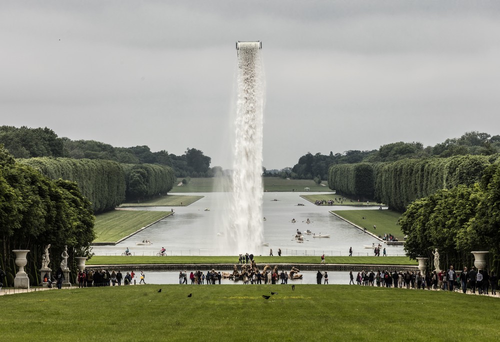
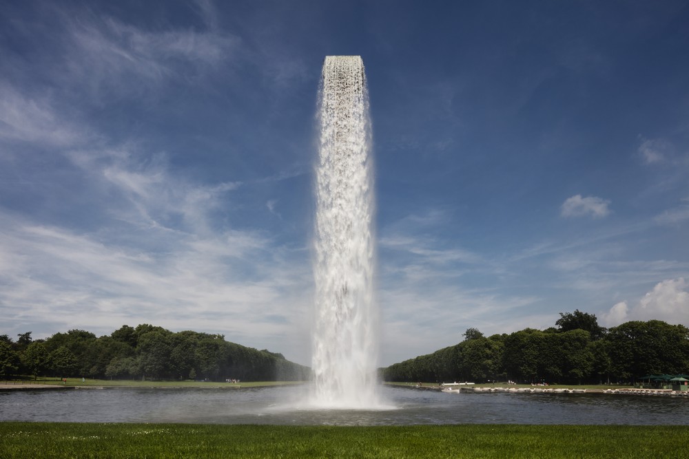
I also watched the “Abstract: The Art of Design, Olafur Eliasson” documentary on Netflix which explored Olafur’s projects as I wanted to learn more about how his thought processes behind his work creations. I watched him explore and narrate:
Beauty, a rainbow from water reflecting light:
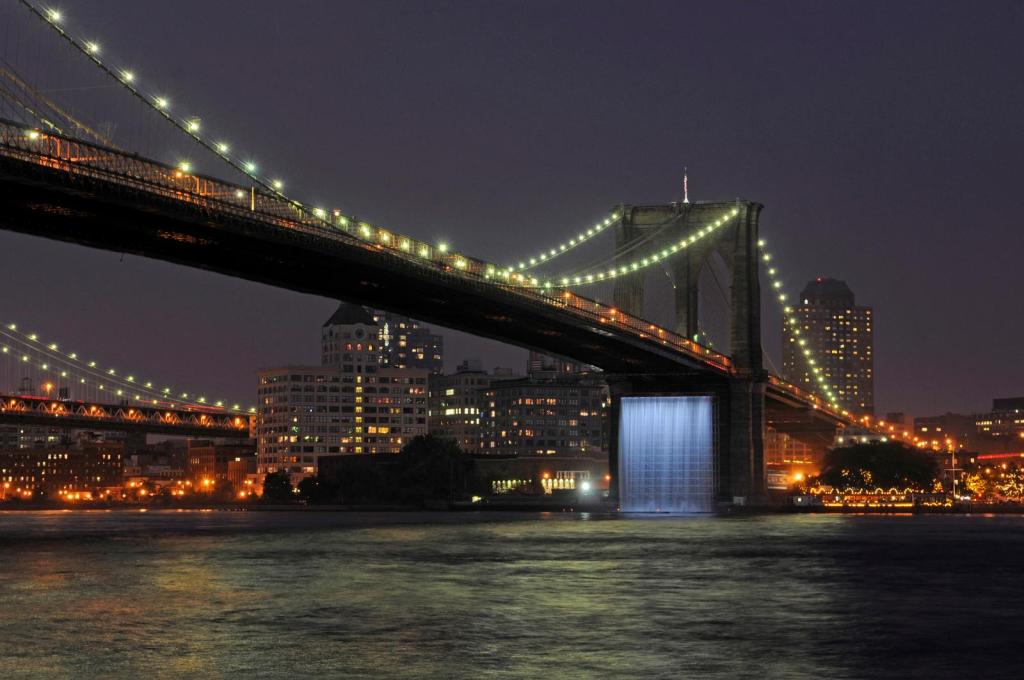
Large scale waterfalls in Versailles and New York:

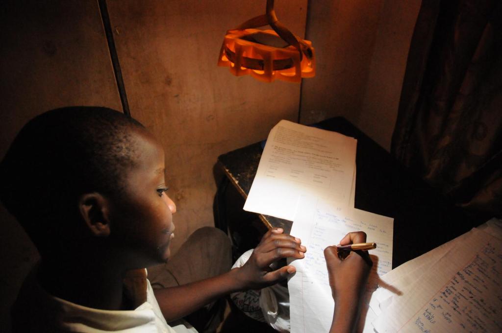
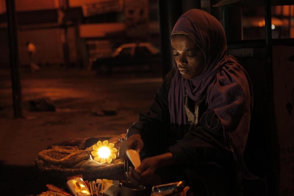
A solar powered light called Little Sun for those who have no access to light:
I have found all of these really interesting as it’s clear Eliasson has a fascination with light and how that can be used in various ways. I also admire how brave his scales are, how large the exhibition spaces are and the size of those waterfalls! His work is dramatic, interacts with the viewer and I would say mostly about making you feel something.
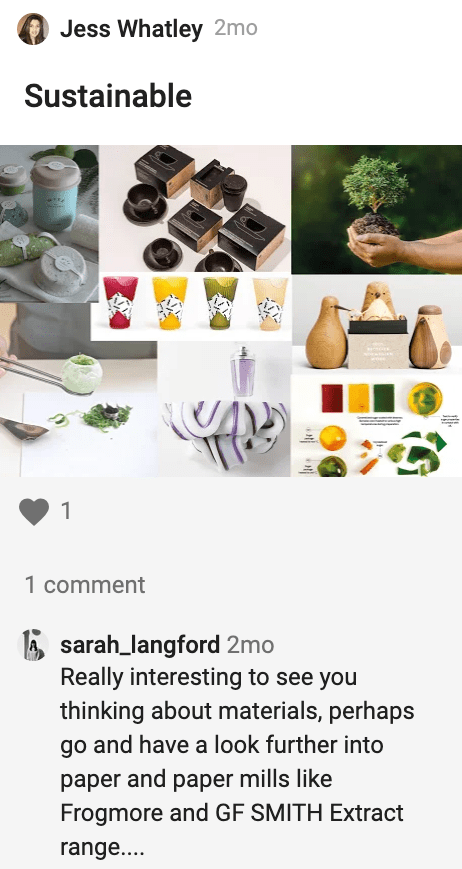
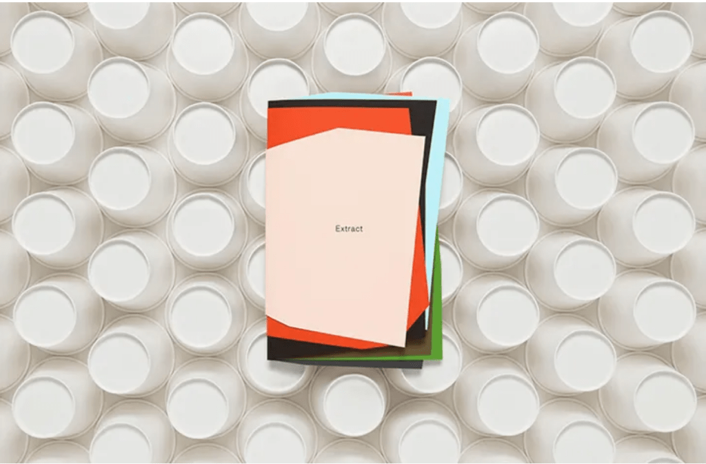
GF Smith Extract Papers:
G F Smith’s website is fluid and smooth in its geometric movement. This makes me really inspired to learn more about HTML, but also as a viewer of the website – it draws me in. There’s something about the movement of the shapes falling to the bottom of the screen that mimics ripped up and torn pieces of paper.
I have researched the G F Smith paper that has been made from disposable paper cups:
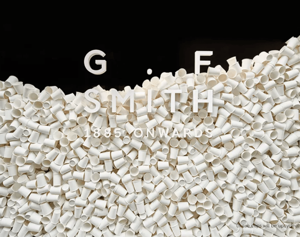
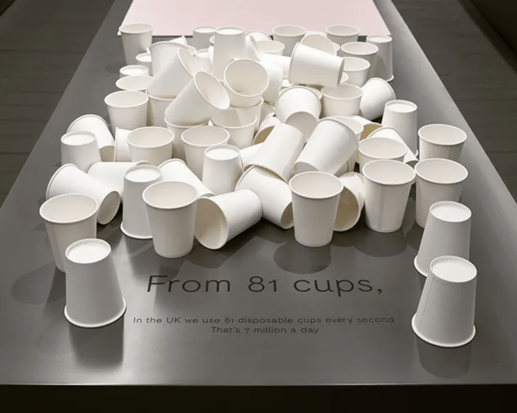
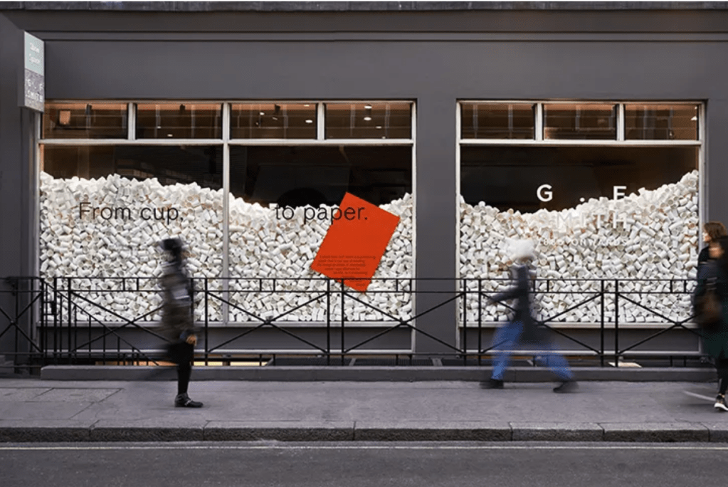
“In the UK it is said we use 4,861 disposable paper cups a minute, which is over seven million a day and right now, less than one in 400 cups are recycled.” I did not realise the numbers were that high for disposable paper cups, and that figure is shocking. It is time brands really looked to use alternative materials that are biodegradable or at least recyclable, and for designers to consider re-using materials that other brands have created.
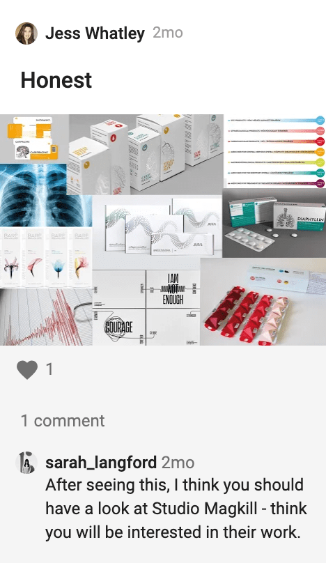
Studio Makgill
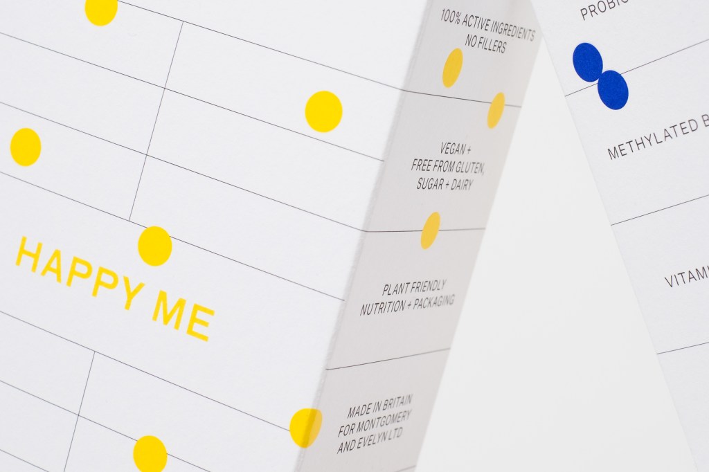
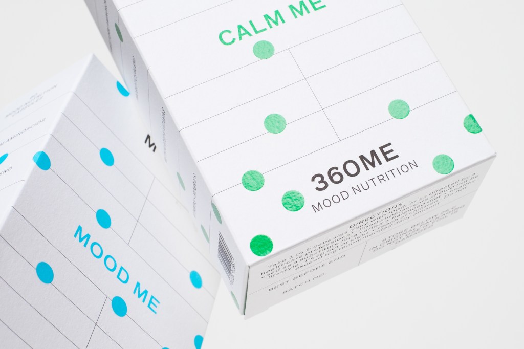
Supplement packaging; simple, minimal, effective. A new brand for the nutritional market – and the packaging only presents the information a consumer needs/wants to read. There are no images, just a basic decoration to recognise the boxes on the shelf; in this case dots, which do look recognisable.
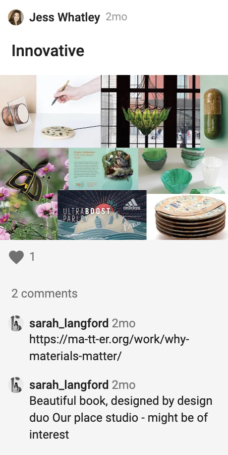
our place studio
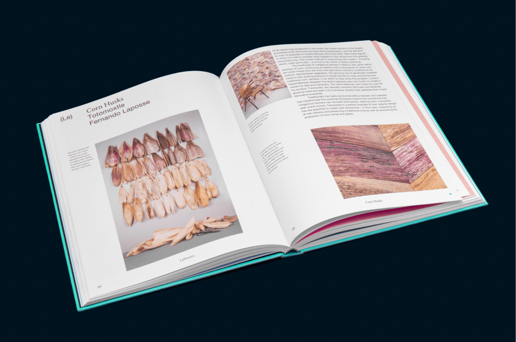
I have researched Our Place Studio’s “Why Materials Matter” book as recommended on the ideas wall, I can’t access it online but I managed to get a picture of two pages inside – materials are really visually interesting when considered for a project. The way materials are presented and can be transformed (heated, cut up, layered) to convey meaning in a brand is so clever. It very much links back to my sustainability interests and how considering the correct organic materials matter when being ethical.
