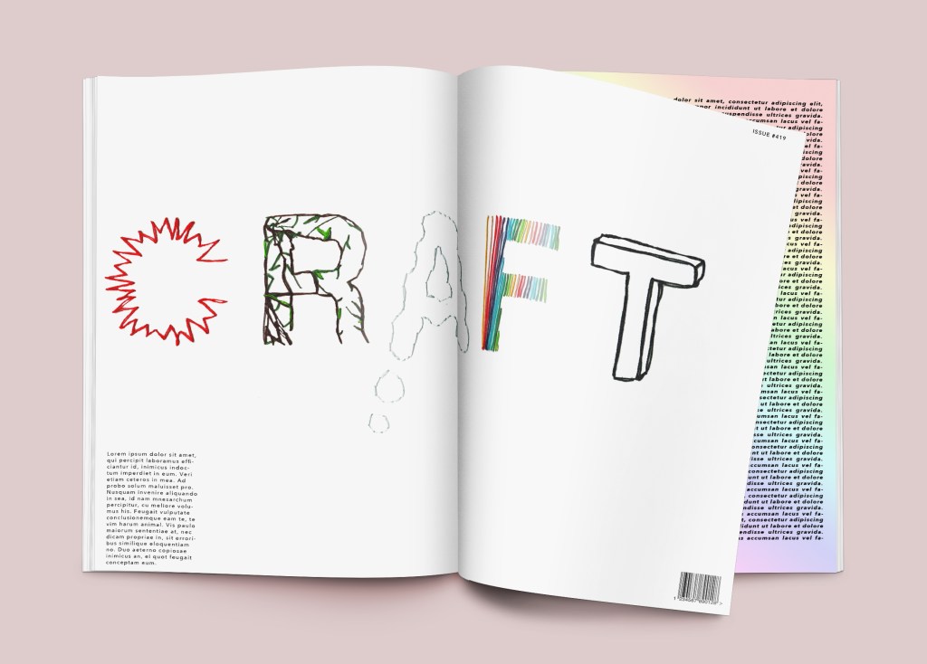
FINAL VISUAL:
Looking at the five words and all of the work I have explored, I have decided I want to create a typography outcome which reflects all of the five mood boards. I think the best way to do this would be to choose a five letter word and do each individual letter to represent each mood board. Some words I have thought about using are:
Maker
Solve
Think
Dream
Speak
Craft
The word I am choosing is going to be “Craft” as I feel this summarises me as a person, how I approach work and how my mind/thought processes work. I am hands-on and love to explore and experiment.
Before I sewed the final I was thinking of ways to present the letters:

CRAFT…
I was trying to figure out a way I could try and portray all of my mood board content, combined with my personality/creativity. Initially I began looking into the five mood boards being represented in an individual letter. I then chose a selection of five letter words and narrowed that down to the one that I felt represented “me” the most: craft.
I was initially looking at textures, and how I could present something like “sustainable” with leaves… However, the creative piece of coloured rainbow thread was the first letter I started with as I just loved Gabriel Dawe’s 60 miles of thread exhibition of the visible spectrum of light.
I then realised that I could portray each mood board but in sewing form, as this is something I find therapeutic and enjoy. It’s also a great way to present that I am a very crafty, hands-on creative, and also have attention to detail.
C = Honest, where I looked at how honest Design could be categorised as medical, x-rays, and heart beat monitors. So I have made a red heart beat design.
R = Sustainable. Here I have sewn an ivy-like letter to represent the environment.
A = Innovative. Here is a thought bubble in the form of the letter A.
F = Creative. Inspired by Gabriel’s work and also a reminder of myself to not be afraid to use colour, and that I am still learning.
T = Quality. Thinking about the structure and strength, and the outcome of a product, so I have done the letter T as box packaging.
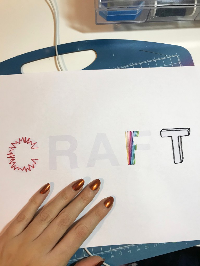


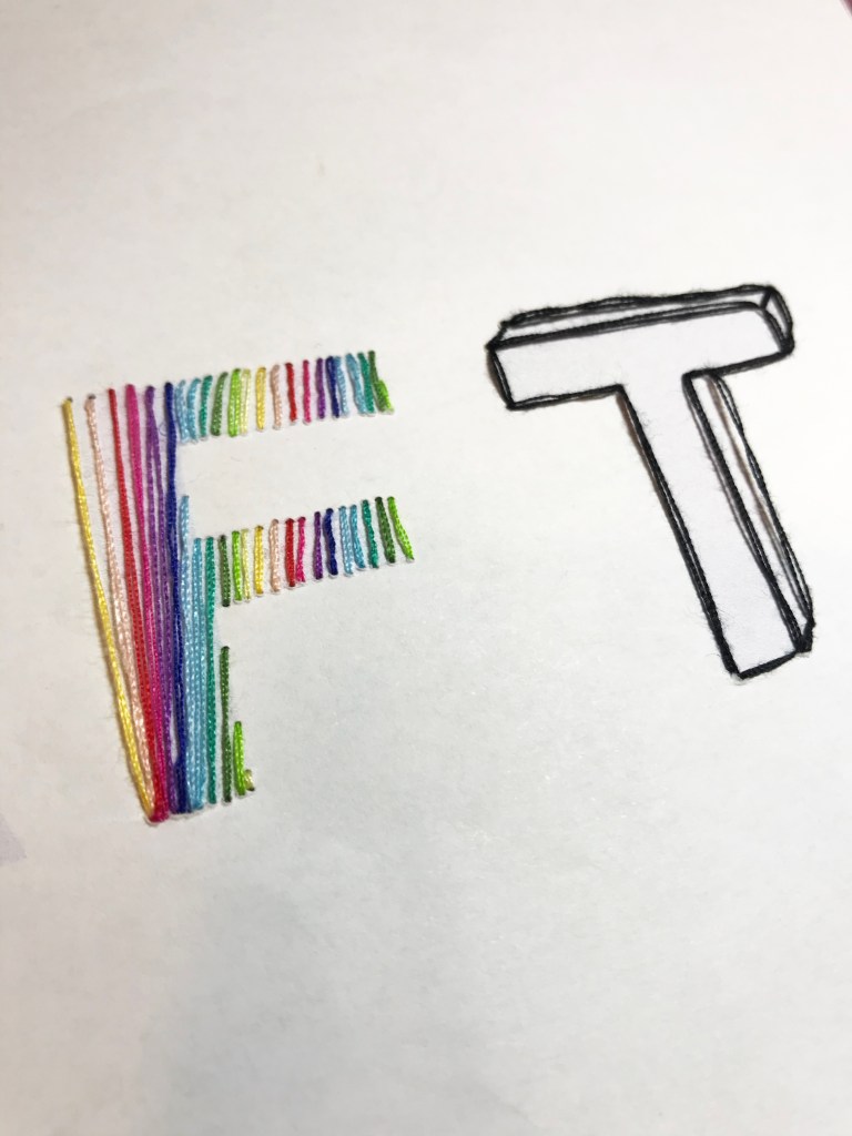
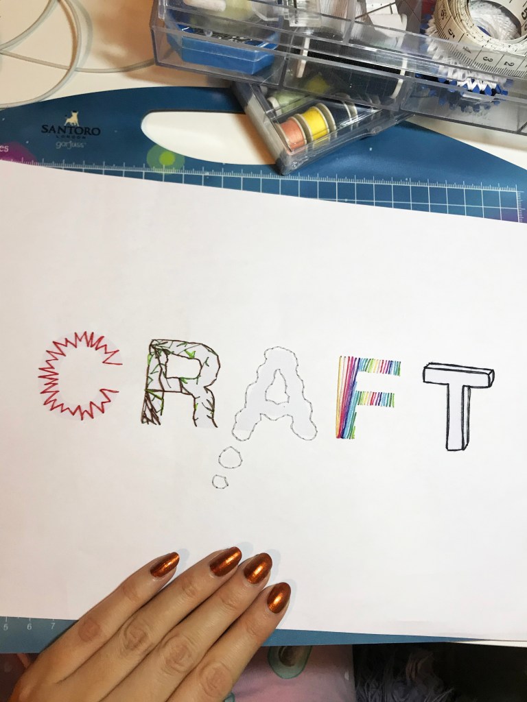
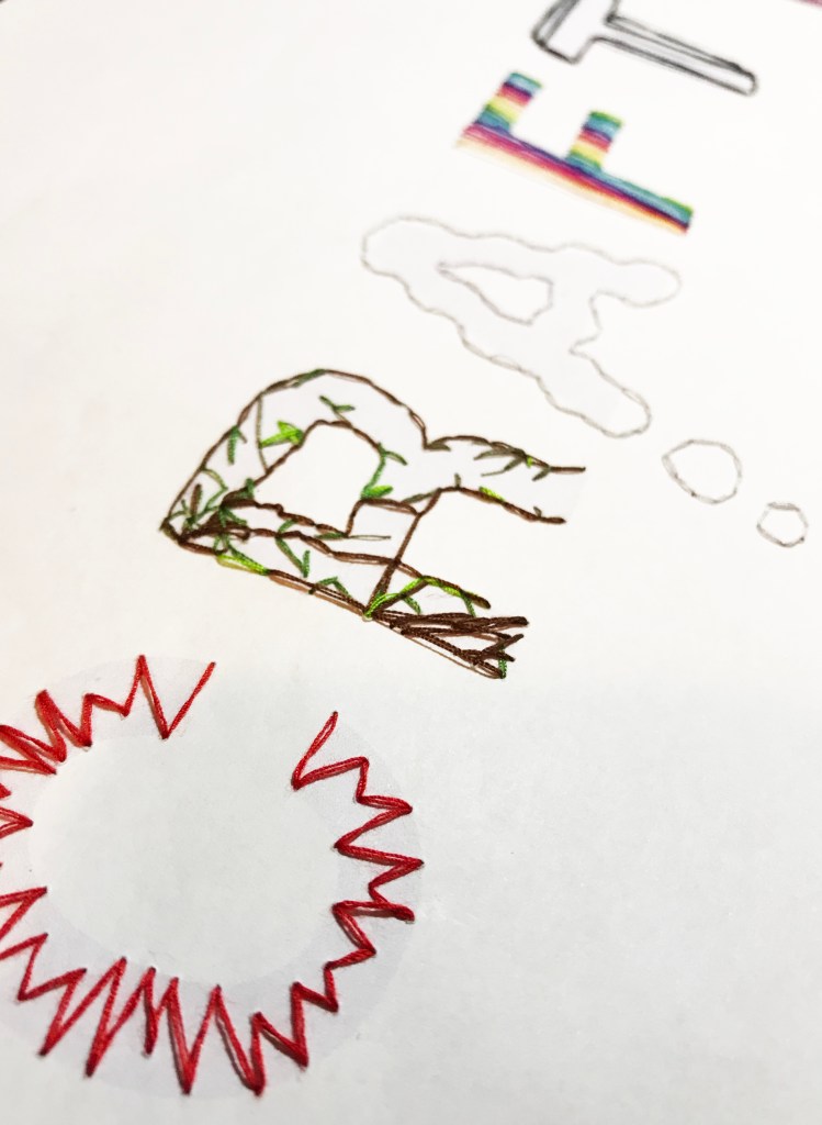
Using Helvetica as an outline for sewing to keep my final piece contemporary as I feel my work is contemporary (technology) and craft combined.
To improve this piece, I think an editorial spread of this would work really effectively. Or, as a much larger project I could consider doing the whole alphabet in sewn form and creating a typeface. That would be very visually interesting whilst combining typography with craft.