
Source a scientific, cultural or environmental story that matters to you
There were a few options I wanted to explore regarding the environment as that is the topic I read most about in the news purely as that’s what I’m interested in. A few articles I have read recently that I thought about using for this week are:
High elevation birds sport thicker down
– I could present the data between bird down feather size in lower elevation, with the bird down feather size in higher elevation areas. This would highlight the evolution of birds and their survival methods
How icebergs really melt and what this could mean for climate change
– Data could be presented that depending on the shape of the iceberg, the speed of the melting varies. Also the location is a factor such as access to freshwater and variants of temperature from Ocean circulation will speed up or reduce melting of ice
I have decided to choose:
The mystery of the blue flower: nature’s rare colour owes its existence to bee vision
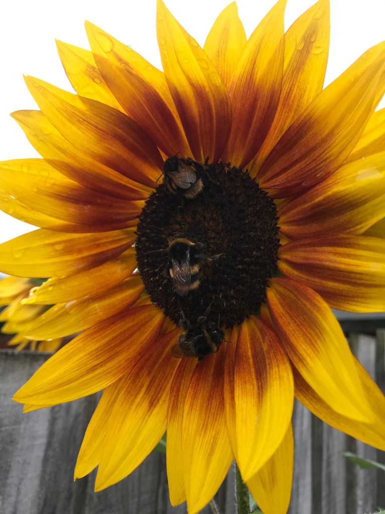
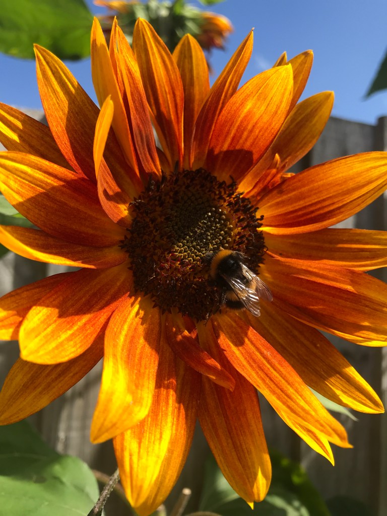
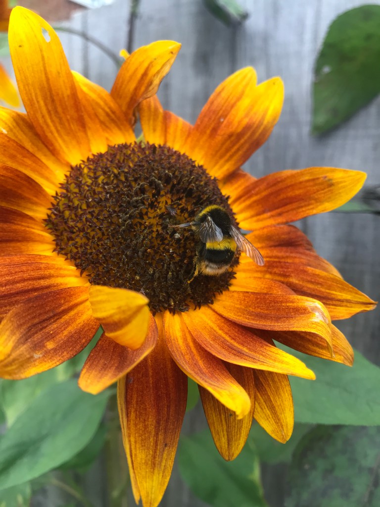
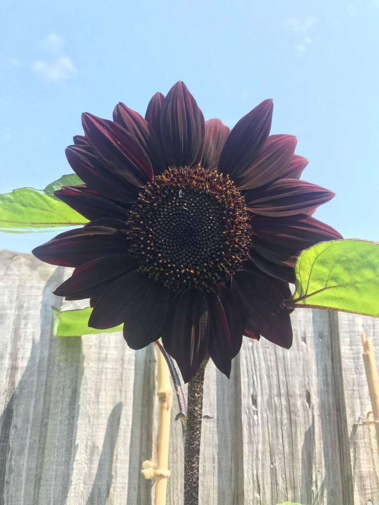
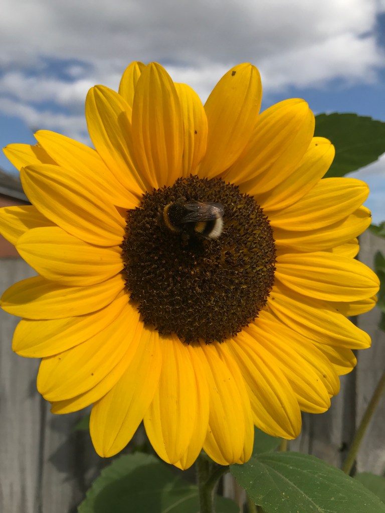
I love bees and I have tried to help them in my garden; I have purchased many purple plants including Lavender and Salvia varieties. I also grow sunflowers and they love those too so I wanted to explore this. Interestingly, I have grown a dark purple variety of sunflower named ‘Black Magic’ and bees loved that just as much as the orange and yellow varieties. I find though that bees use sunflowers to sleep on as I would find groups of 3-6 sleeping on the really big sunflower heads in early mornings.
Just like us humans, bees have trichromatic vision, ie they have three different photoreceptors in the retina. These distinguish three certain primary colours, which form the basis for colour combinations seen. The primary colours for humans are red, blue and green and for bees, blue, green and ultraviolet light.“
Source
So why do bees love the red/orange sunflowers AND the purple plants? This is down to the blue halo reflecting through light shining on the plant, according to Nature article ‘How flowers get the blues to lure bees’:
“Moyroud et al. hypothesized that, rather than being an imperfection, disorder is associated with a clear visual output and function. Indeed, they went on to demonstrate that the disordered nanostructures generate a blue ‘halo’ of light when rays of sunlight hit the flower at certain angles. The halo (which can best be seen by the human eye against dark-coloured petals) appears as though mixed with the base colour of the flower” Source
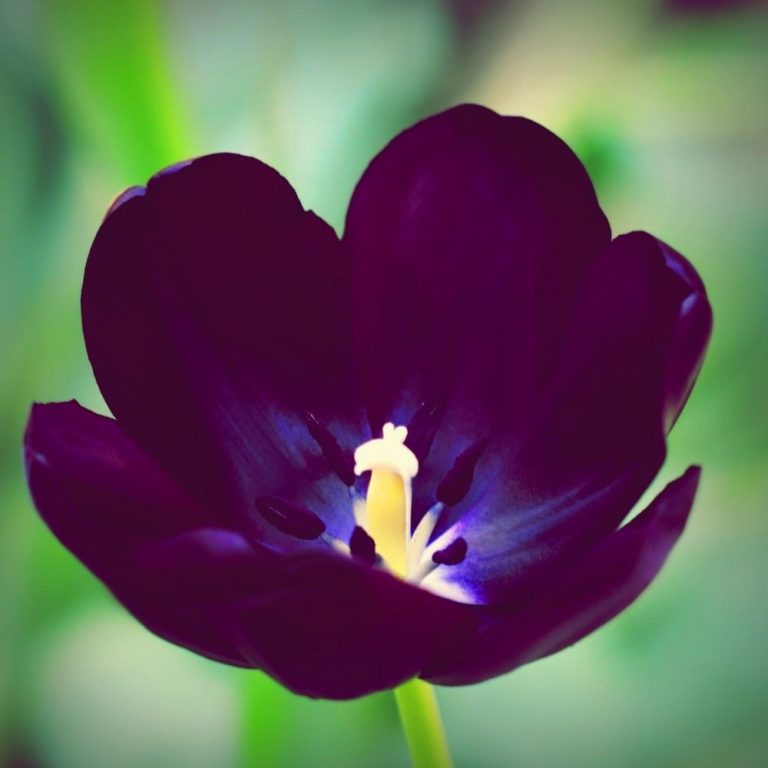
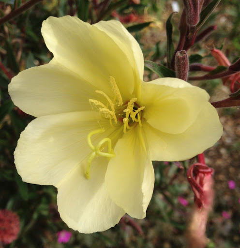
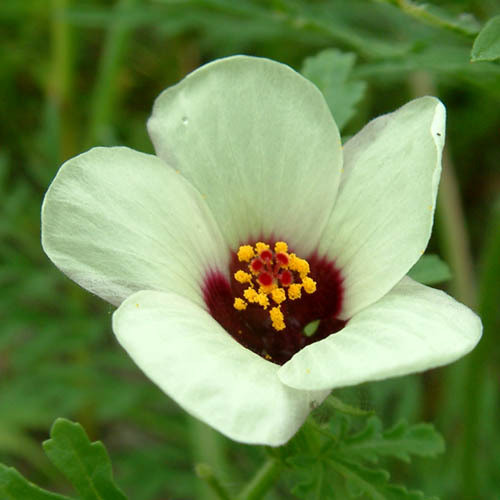
However, not all flowers will emit a ‘blue halo’, but some do and bees can tell the difference between two plants of the same colour, where one does emit a halo and the other does not. Humans would not be able to differentiate this. Examples of this in some coloured plants (pictured in order left to right below):
• Ursinia speciosa
• Tulips
• Evening primrose
• Hibiscus trionum
“The team tested this by creating artificial ridges of their own, with varying degrees of disorder built in. If the ridges are massively disordered and very different from each other, they don’t produce any interesting optical effects. If they’re all the same, they’re iridescent, but there’s no blue scattering. But in the Goldilocks zone, where the ridges are disordered but not too disordered, they create a blue halo. “It’s a different way of making blue,” Glover says.
If the halo lies over a black, purple, or red base, it’s possible for humans to see it. If it lies over white or yellow, we can’t. But Glover’s team showed that bumblebees can see the pattern no matter the background, and in lab conditions, they find flowers more quickly if they have a blue halo.”
The Atlantic “Flowers have secret blue halos that bumblebees can see”
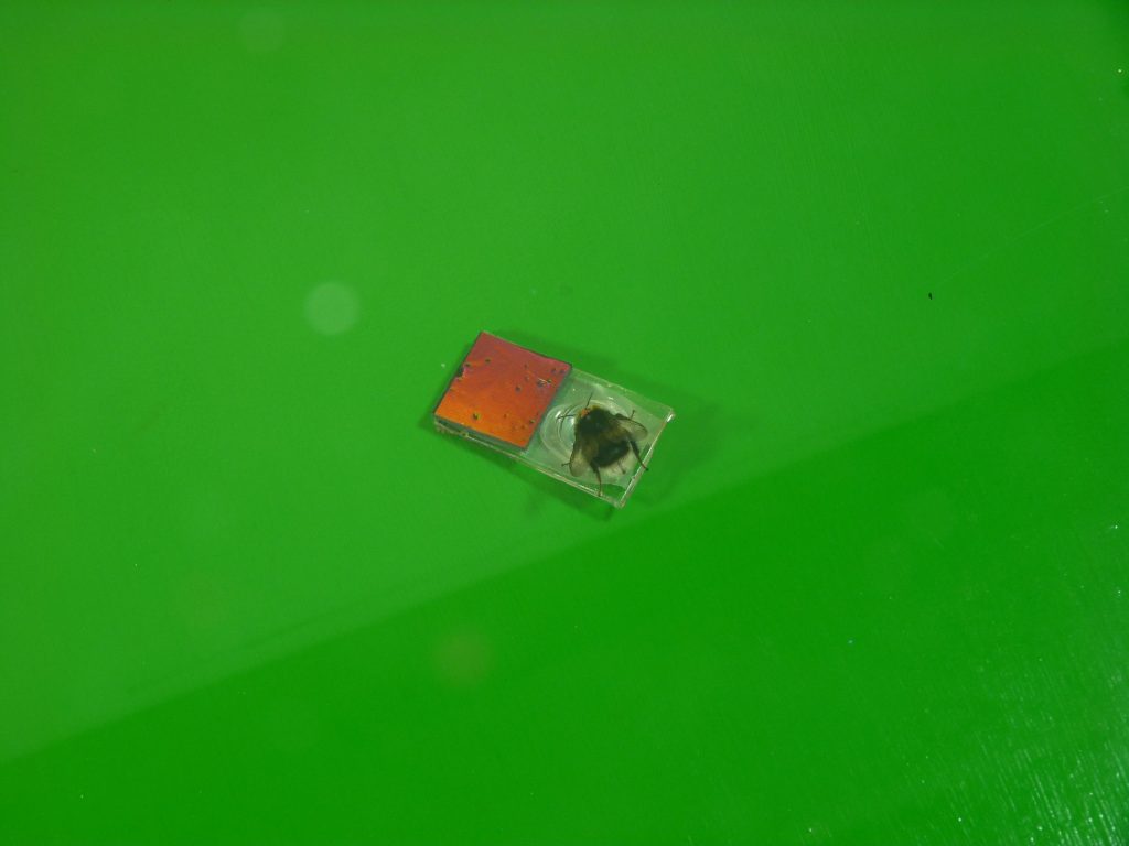
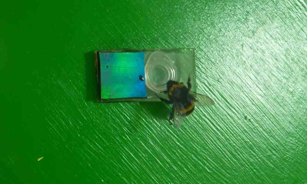
Artificial flower testing:
Visualising this data
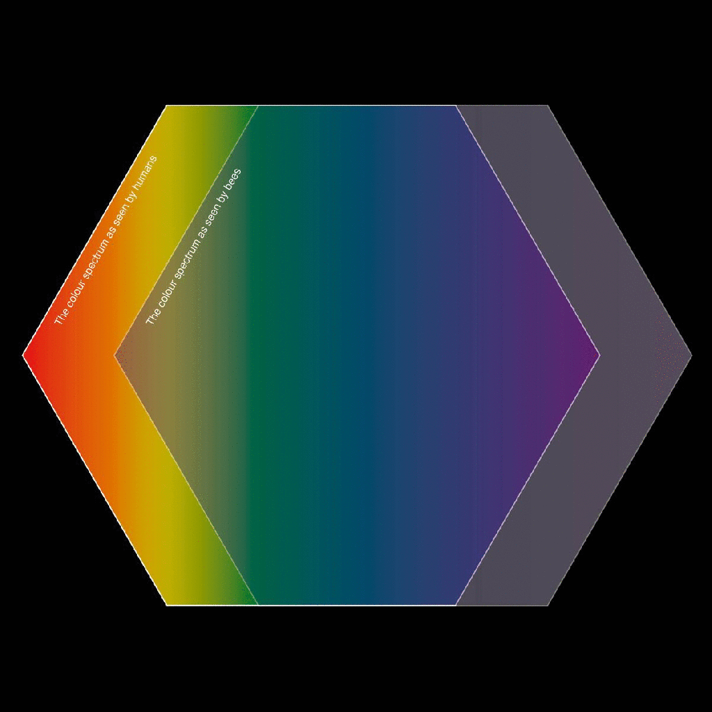
To begin with, I have considered the information I am essentially needing to portray in my data diagram is; the bluer the flower, the more bees that pollenate it. I have begun with hexagons representing the bees (referencing a honeycomb structure) and using the ROYGBIV gradient to represent flower colours in the background:
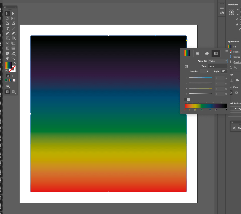
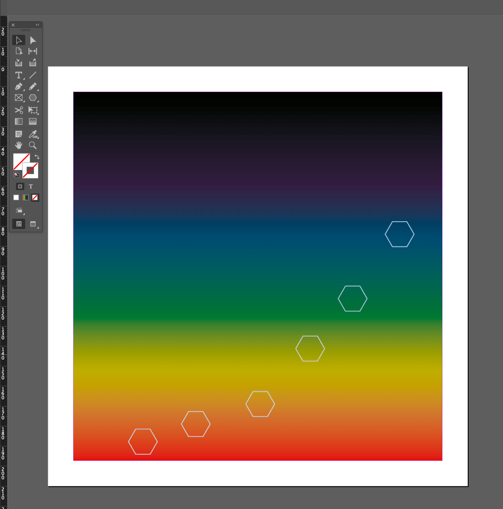
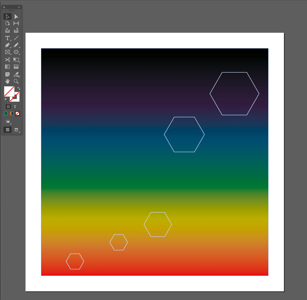
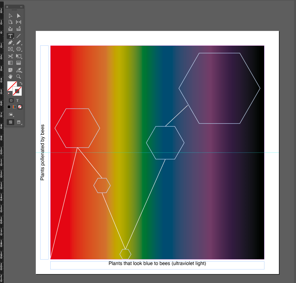
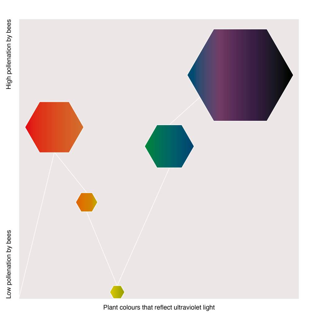
I am happy with this outcome so far in terms of layout, colours and shape, but it’s not quite right.
The yellow in my data diagram is seen as the lowest, but that’s not true because if a plant is yellow and emits UV light (which a bee will see and a human will not) it will go directly to that yellow flower; it’s not really to do with just purple and blue flowers as my incorrect diagram suggests. This is why they love Ursinia yellow flowers with the blue halo, (pictured in research above). I have also found the following research which suggests bees do see yellow.

As my research has developed it has become more than simply bees preferring blue flowers, and actually about bees being tricked into visiting flowers through the effect of ‘blue halo’ (nanostructures otherwise known as ultraviolet light). This would explain why bees love my yellow/orange/purple sunflowers and many other coloured flowers too. I really want to use this data in my diagram so I am now looking at how to represent how bees are attracted to plants through ultraviolet light.
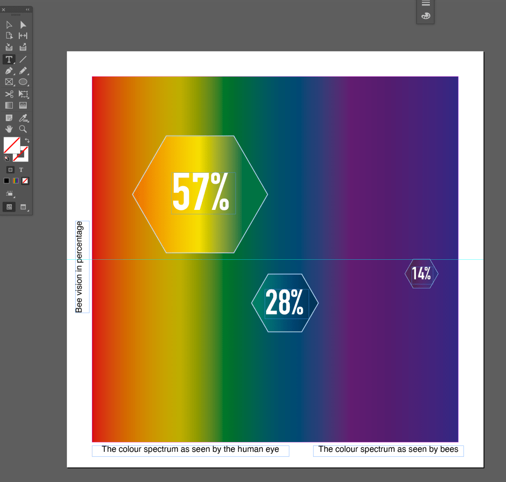
To do this, I went back through my research to an article that explained how exactly bees see with their eyesight, as after all I want my data to represent the “bee journey” and why that bee picks specific flowers to pollenate. This article (that I used the bee vision vs. human vision image from above) claims that in fact bees don’t see red:
“A bee is able to see colour, because each of these tiny tubes contains eight cells that respond to light. Four of these cells respond to yellow-green light, two respond to blue light, and one responds to ultraviolet light.”
This is interesting and I feel I could present this somehow in numbers. I now know that bees have seven photoreceptor’s – four detecting yellow/green, two detecting blue and one detecting UV light. I have calculated the percentages for each:
4/7 = 57%
2/7 = 28%
1/7 = 14%
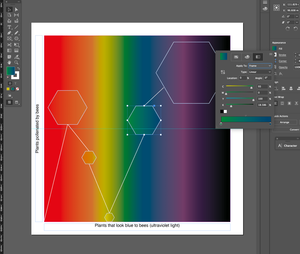
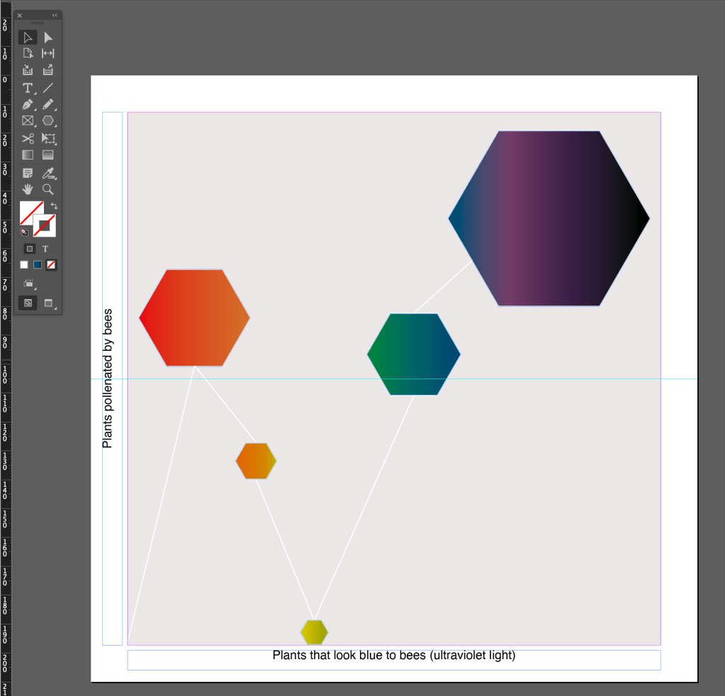
I have updated the data to reflect this change and made more experiments with arranging the data in different ways:
Playing around with the outer diagram text, and numbering % 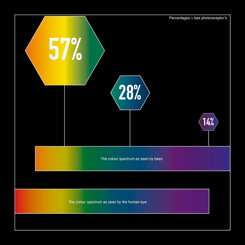
Comparing human vision to bee vision directly on diagram 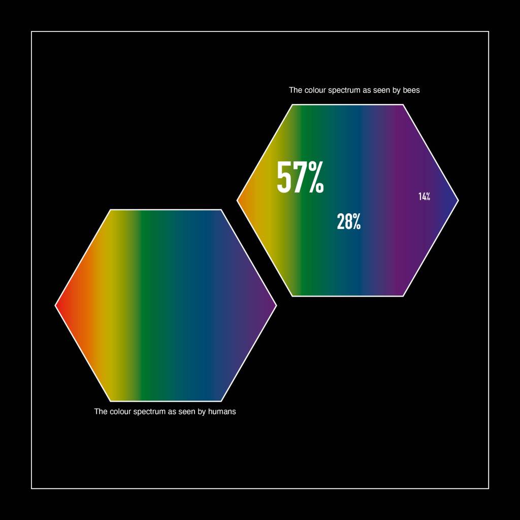
Deducting the details that aren’t needed, I have tried to condense further. However, it’s not clear here what the numbers are…
Finally, through deducting elements in each development, I have left what I feel is the most important information in this data visualisation. The article I have chosen is simply claiming how bees prefer blue flowers; but does not throughly evidence this (so I went and did the research). I have learnt the reason why bees prefer blue flowers is because they have ultraviolet light vision, which we as humans do not and are able to detect colours this way. A great way to present this information I thought, was to show an overlay of what the bee sees with ultraviolet light, as it tints all colours the human eye can see:
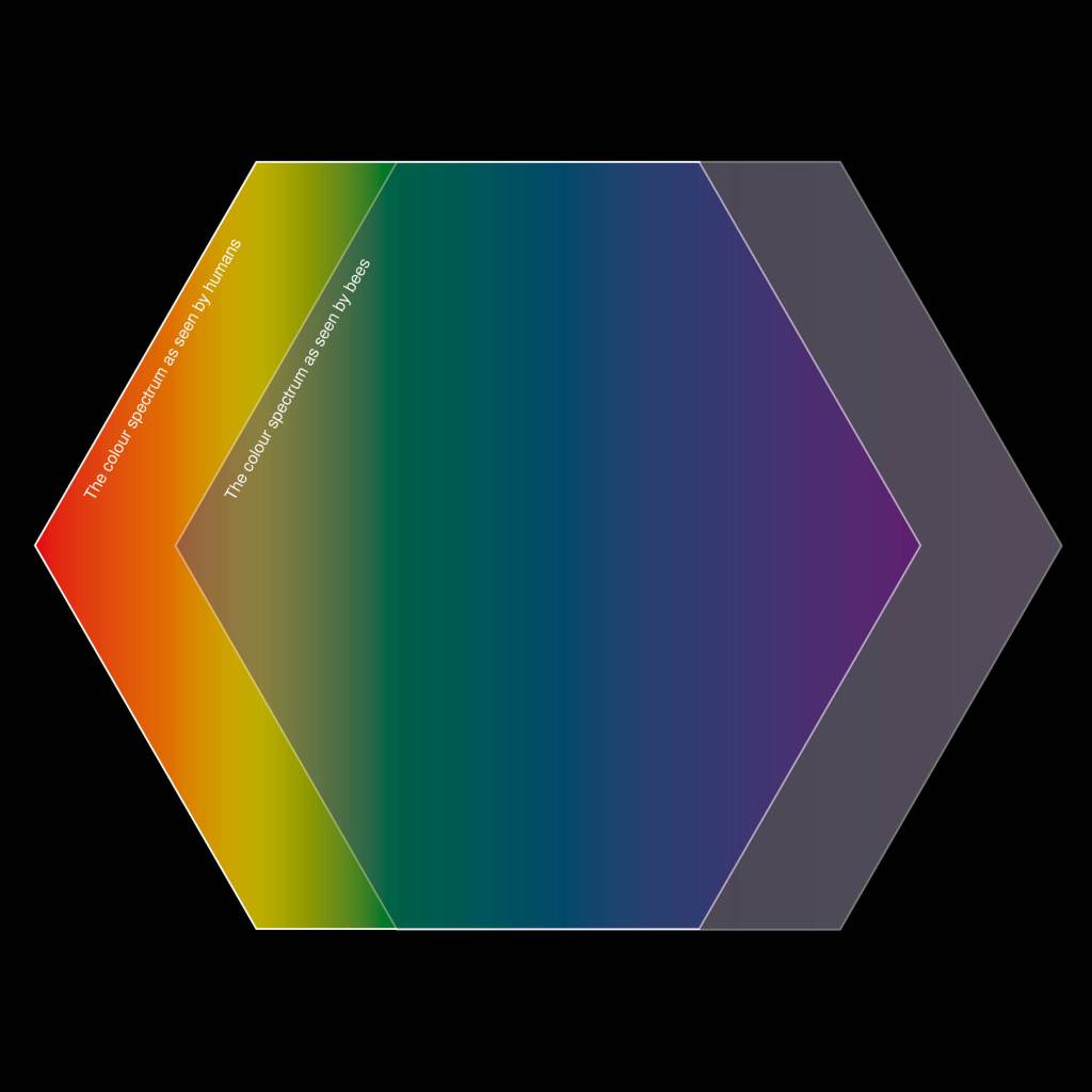
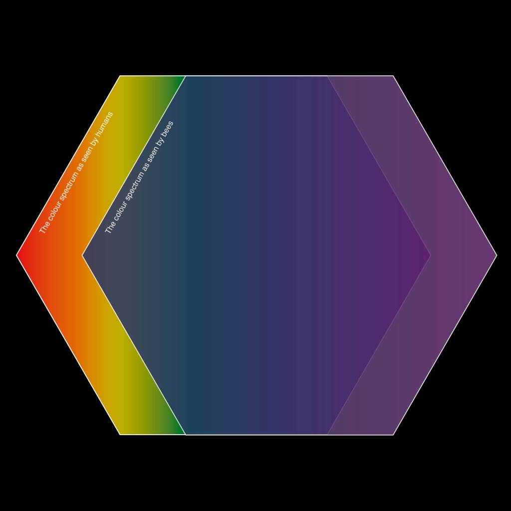
Different opacities were interesting also as it shows how the blue tints effect the original orange/yellow/green/blue/indigo/violet spectrum we see.
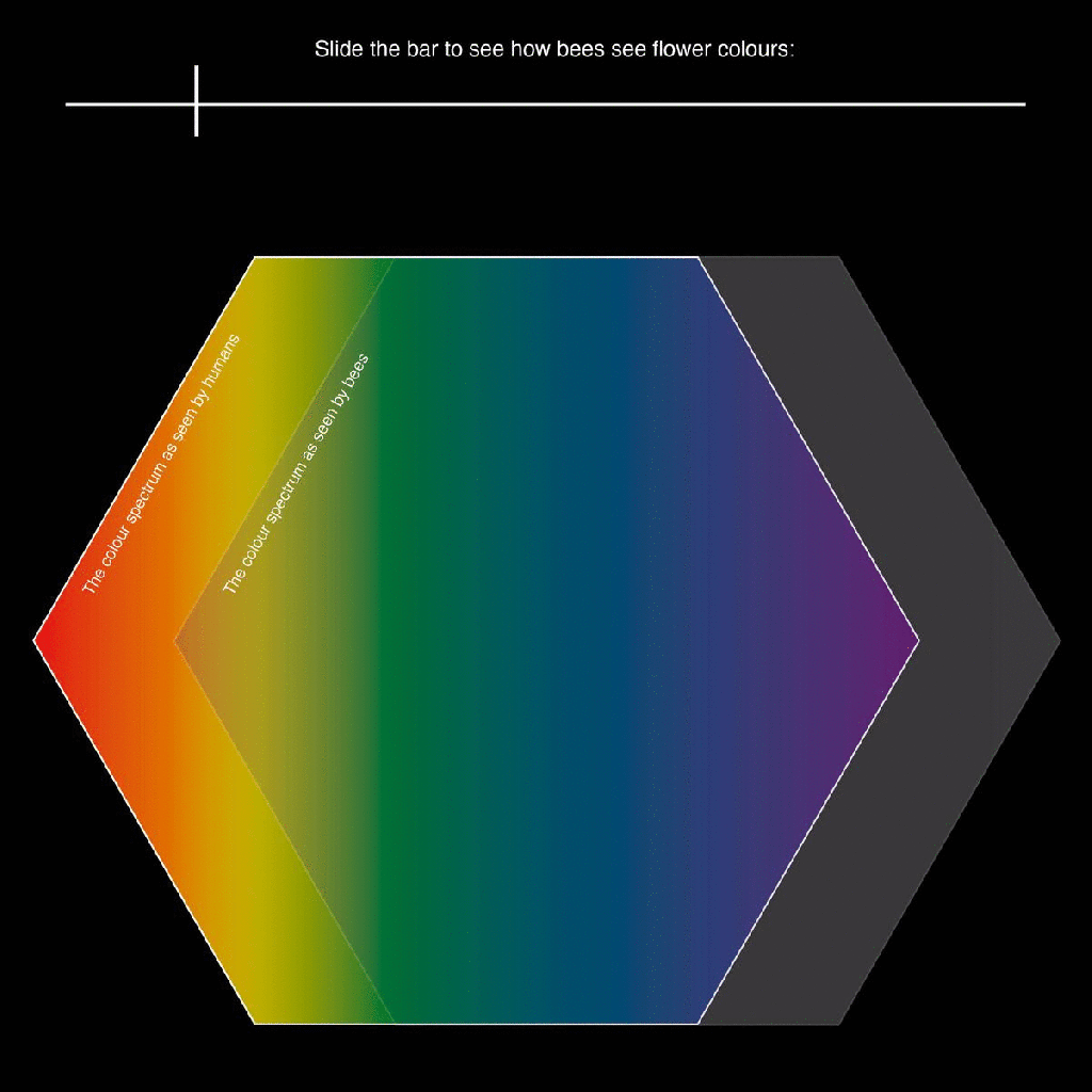
To further develop, I think this would be effective as a moving image:
I have added in a slider as I could see this being an interactive website or image on the article itself to back up the information. I think being able to bring in interaction with the reader would be a fantastic learning tool.
Summary
I have been able to play with several compositions using the bee inspired shape of a hexagon, and applying a colour gradient to represent our coloured vision in comparison to bee vision. I have enjoyed seeing how I can visually portray this and my final result involved motion graphics. However I do feel I can further develop this as I have made it quite abstract… For instance, why am I still using shapes? For a project that is all about nature and flowers themselves they are completely absent! I am sure I could introduce them in some way, so I’m going to look at some further research and see how I can push my outcome further.
