
Task 2: 10 types of design
I have picked the top ten types that I personally most visually enjoy:
Sustainable
Environmental
Editorial
Packaging
Label
Production
Visual Effects
Typographic
Promotional
Moving Image
I am now going on to explore all of these above, and provide an example of research I have found that I feel fits into each category:
Sustainable:
This Too Shall Pass
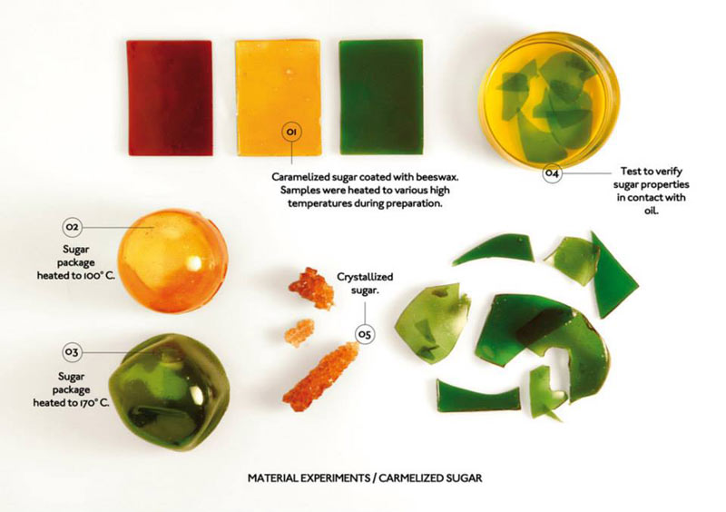
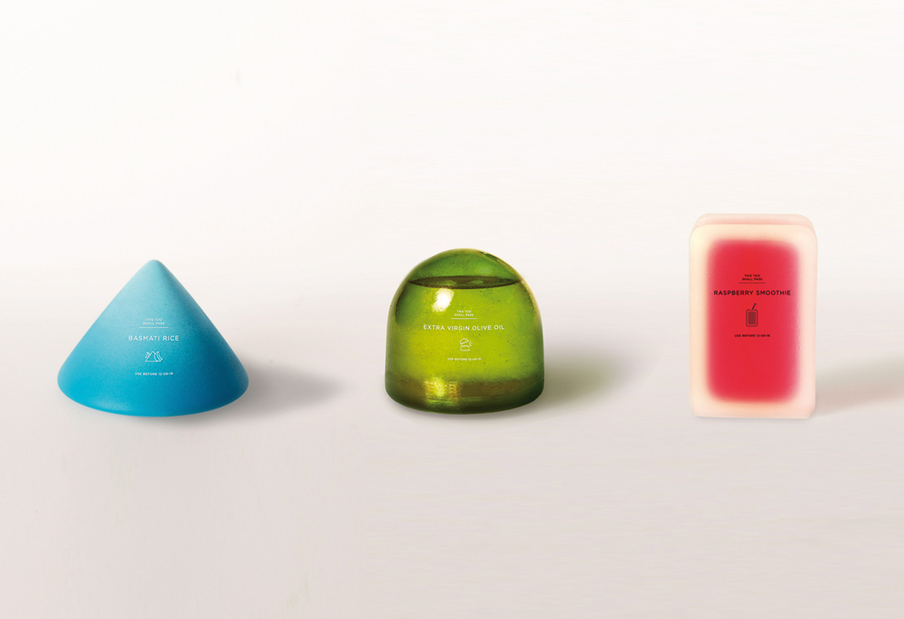
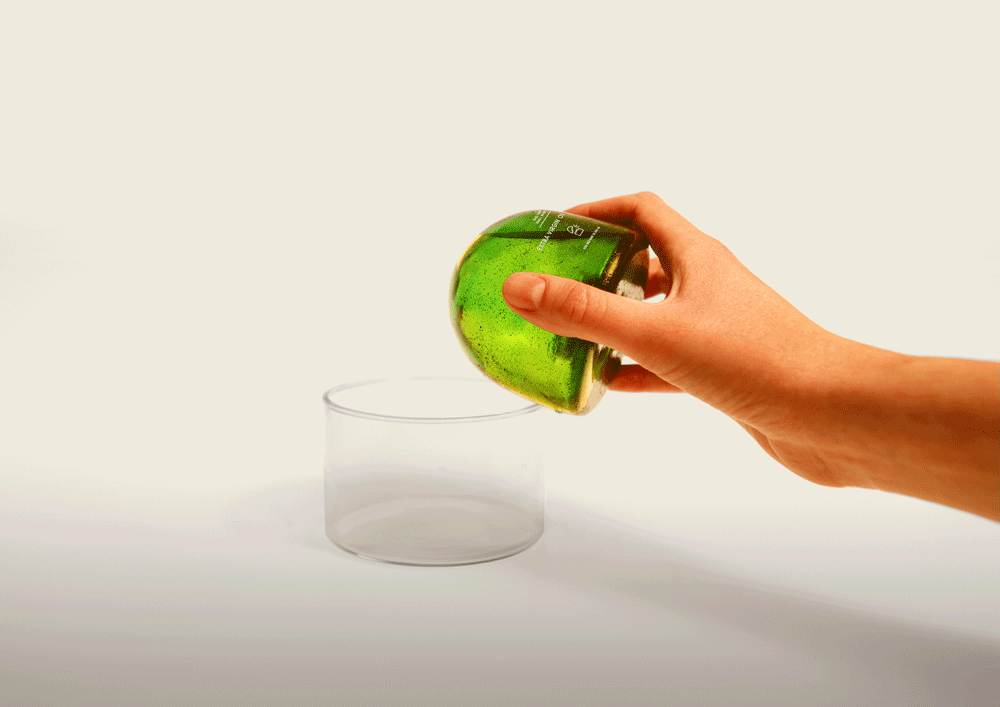
Sustainable design is a category that I find really exciting, and is my number one to look to for inspiration and innovative ideas. I just love the idea of everything in this world being created from essentially nothing, and then dissolving back into the planet in a giant life cycle. Of course, with brands being aware that consumers will be opting for a friendlier-to-the-planet alternative there is a giant problem of greenwashing. A great example is Coca-Cola for instance, who claimed their plant based bottles are sustainable, but upon further research (for my dissertation) I discovered they were cutting down sugarcane forests to use to replace PET plastic in the production process.
I have chosen the above example as it’s an entirely new project and company I discovered in my research, who design multiple sustainable projects. This Too Shall Pass is a project that I find combines sustainability with packaging and branding, yet falls into the sustainable category overall due to its origin of materials and consideration of the environment in the production process.
Environmental:
DESIGN MUSEUM, LONDON
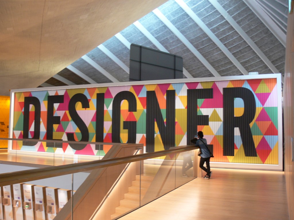
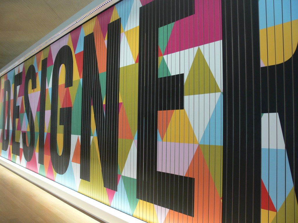
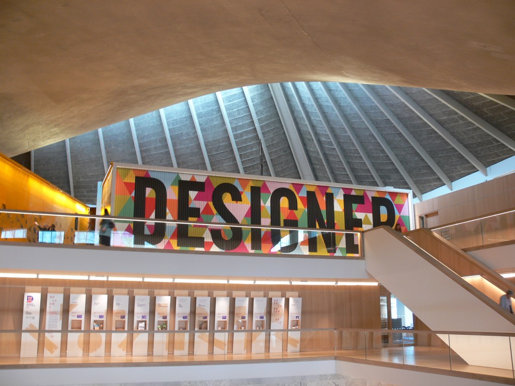
Whilst I was exploring sustainable design above, I went down the route of sub-categories such as eco-design, and then environmental design. I was surprised to discover that environmental wasn’t what I thought it would be. Initially I thought it would be projects that were created from sitting in an outside environment i.e. parks and farmlands; but I discovered it can also be indoors. It quite literally is the environment around the viewer, showcasing the space and utilising it.
I took the above photograph over 2 years ago when I last visited the Design Museum in London, as I found it to be a visually striking piece, in size, colour and perspective. It’s the first thing you saw when you It’s interesting how I didn’t even realise what type of category that would fall in to; for instance I thought it would just be a large typography sign. This has changed my outlook on different categories in the design world, as I will now be intrigued what the purpose of a project is rather than thinking it’s purely aesthetics. It’s about numerous factors i.e. the environment that the creation is surrounded by, who the target audience is, size and perspective etc.
Packaging:
CS LIGHTBULBS
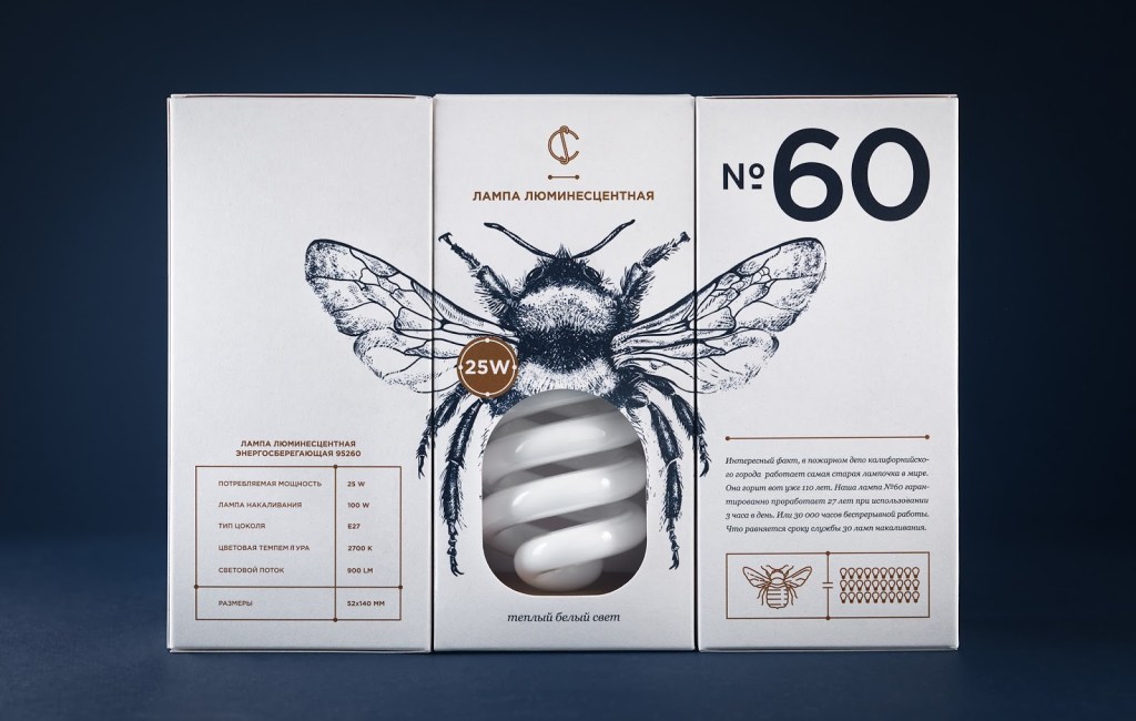
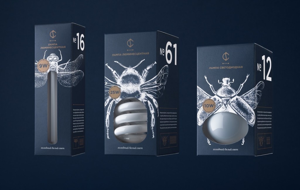
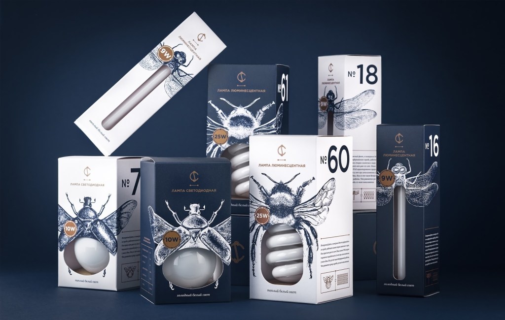
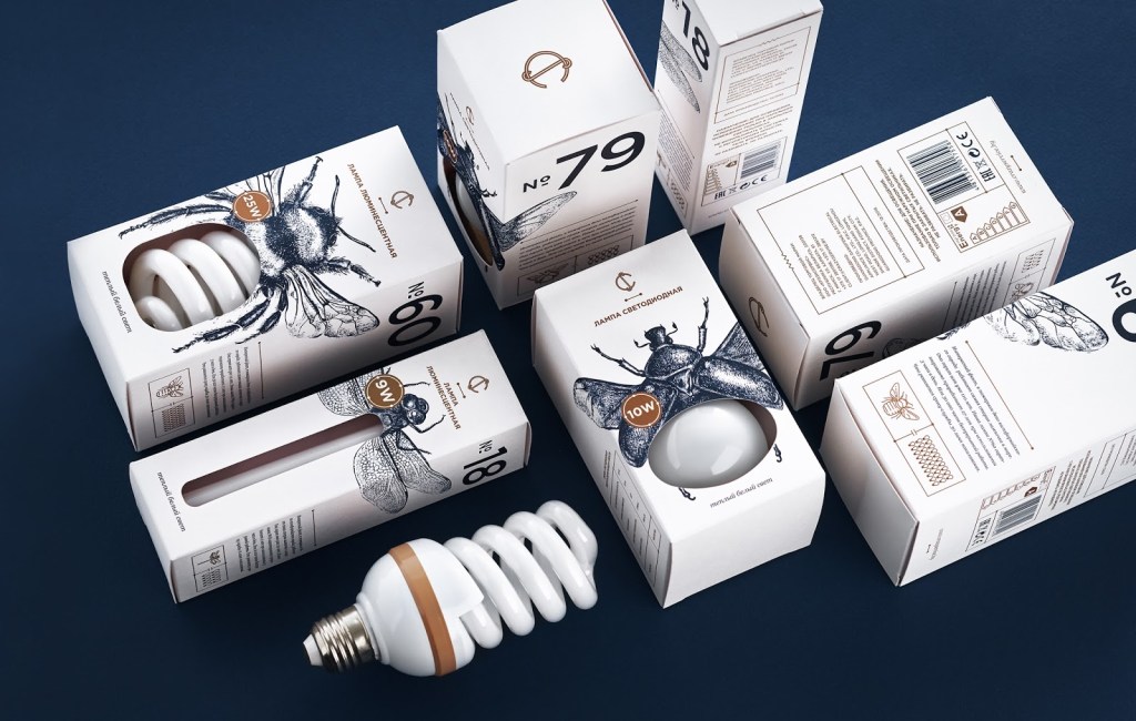
Branding is one of my favourite categories and I would go as far to say it’s number two (after sustainable design). This is because I find it incredible in a world with such high levels of consumerism, companies need effective design to attract customers to their “unique” but “the same as ten other variants on the same shelf” products. Designing for a brand is a competitive industry, and it’s the background knowledge of the product that brings a package to life.
CS Lightbulbs is a piece I find really clever, both the bulbs and the packaging have been considered as one. The arrangement of the illustrations with cut outs to reveal a type of bulb communicates very quickly to a customer. Instantly they know what type of bulb they need, and are able to visually inspect the item without removing it from the package. I also love the typography and colour scheme – contrasts work brilliantly here as the product is white.
Editorial:
SALT AND WOOD ZINE
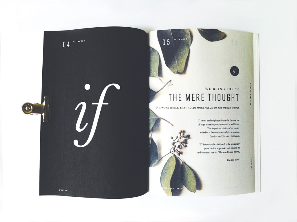
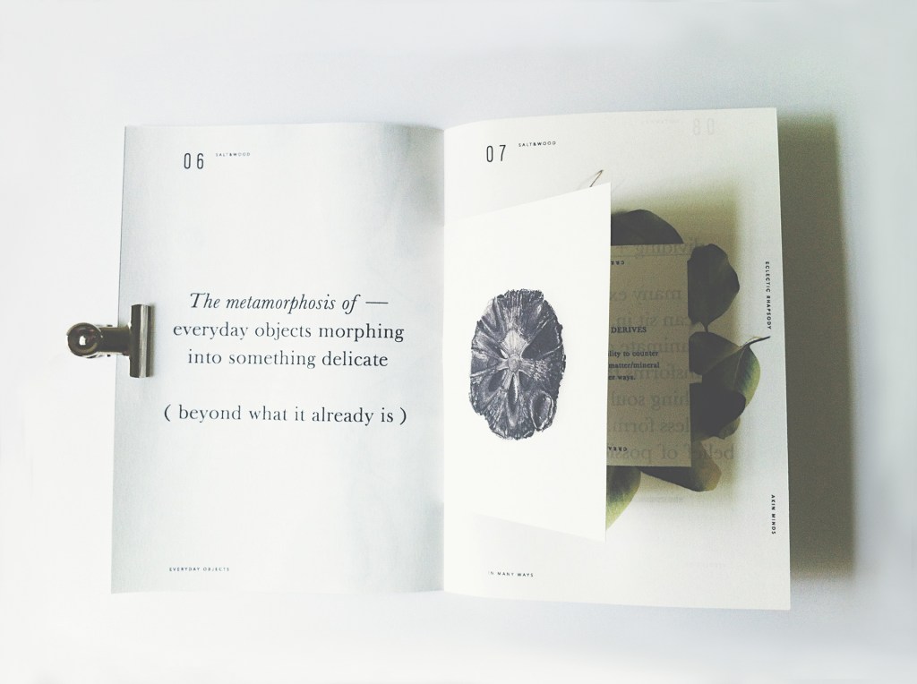
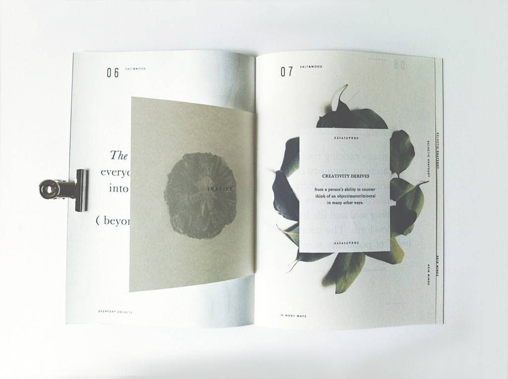
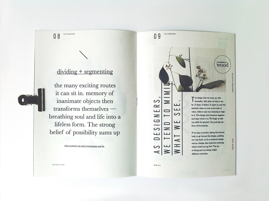
Editorial as a category is extremely broad. Generally, research has shown me that most books, magazines, newspapers and brochures fall into this category, and I didn’t really understand the difference between generic graphic design and editorial design. I have now learnt that editorial is more about the content than the overall composition of the final outcome, for example materials aren’t necessarily considered in an editorial piece as opposed to a graphic design piece.
Salt and Wood editorial zine has beautiful elements such as different sized text, image and paper to present a playful layout of content. Despite there being so many different things to look at, it works and engages the viewer without being too busy or overwhelming. The use of white space is important within busy pages and these pictures of the zine reflects that.
Label:
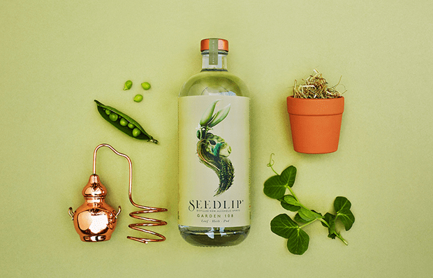
SEEDLIP NON-ALCOHOLIC BEVERAGE
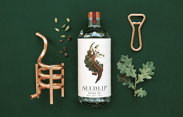
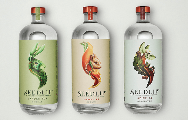
Label design is an interesting category for me to explore as I feel this is very similar to branding. Labels that are designed are usually more creative and appealing to a consumer as opposed to generic labels that are placed on packaging, without the background of the contents considered.
Seedlip is a gorgeous combination of illustration alongside typography, and is presented on a label that factors in the very origins of the product. The product feels very natural and that is a result of using organic products in the beverage.
Production:
The Pink Panther, DePatie-Freleng Enterprises
Production design is generally the “behind the scenes” of media related entertainment i.e. set, lighting, sound. Production graphic design is a specific role held by someone who enables designers to release content such as printed materials.
For production, I found it quite difficult to present a production line in an example and therefore have decided to show The Pink Panther’s 1963 film credits. I think the clip presents all of the names and roles behind the scenes of the film that were essentially part of a production process which lead to the final outcome of the film. There is also use of moving image, typography and illustration in these credits which highlights collaboration within various teams to create an effective piece of design.
Visual effects:
AVATAR BEHIND THE SCENES
After researching this category, visual effects seem to be similar as the “graphic design category – very generic and hosts a number of sub-categories such as animation, stop-motion, modelling etc.
Avatar highlights the advancements in technology and the visual effects are breathtakingly detailed. The video above shows how the visual effects were created in the movie and involved actors with green screens for editing backgrounds or even character appearances.
Typographic:
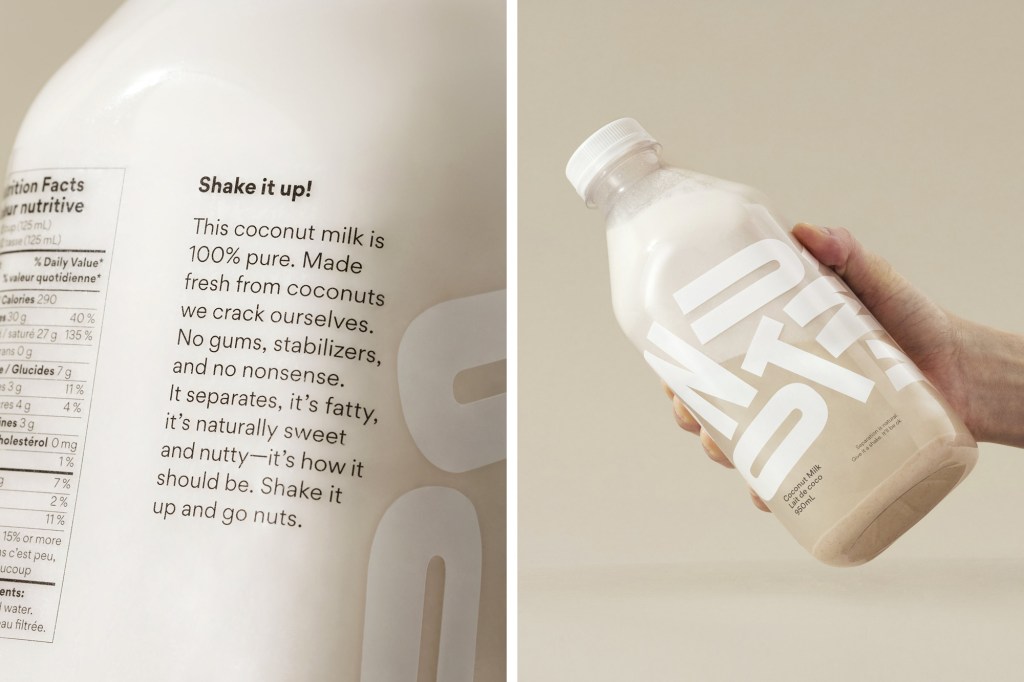
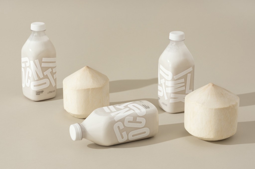
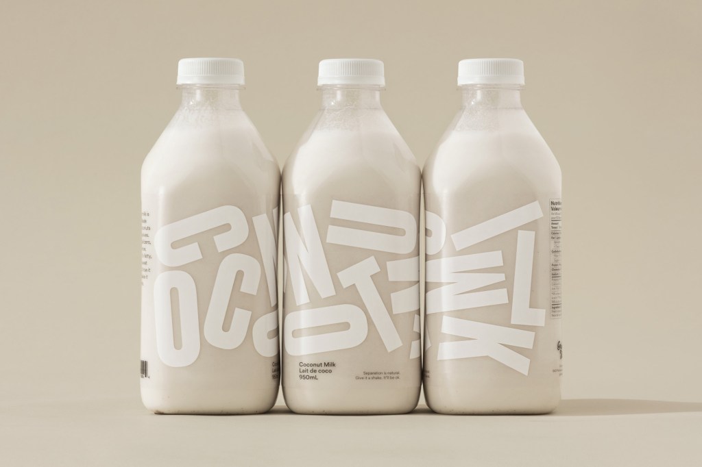
GRINNING FACE COCONUT MILK
When researching information for typography, I have realised that type plays a massive role in the outcome of a product. For example, when I have looked at a product that has foreign language written on the front which I do not understand, I am not persuaded to buy the product. This relates to having unnecessary type on a product – type should be concise, straight to the point and clear to read for the viewer.
Coconut Milk is a bold, clean and minimalist example of typography but does blur the lines between branding, typography and packaging. The typography is dominant in the outcome as it’s simplistic and innovative, drawing in the consumer even though the bottles show muddled letters.
Promotional:
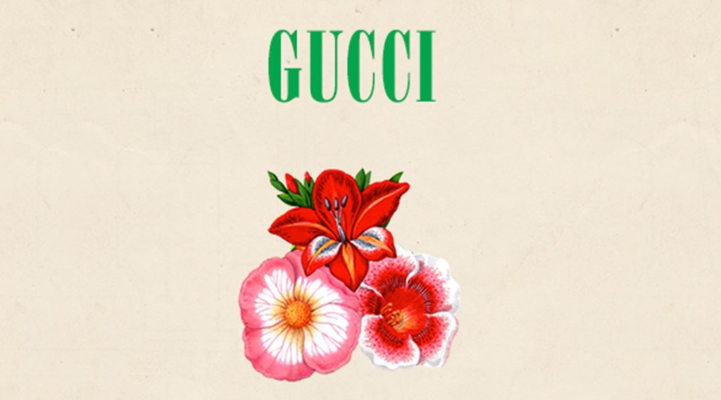
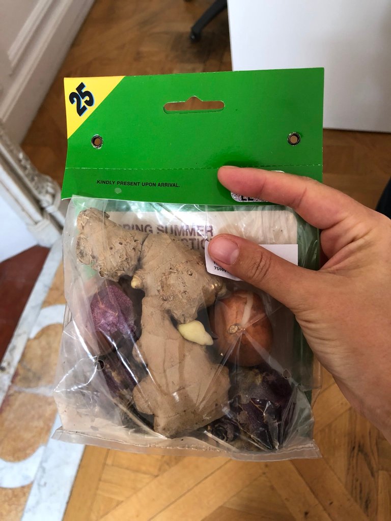
GUCCI – S/S 2019 RUNWAY INVITATIONS
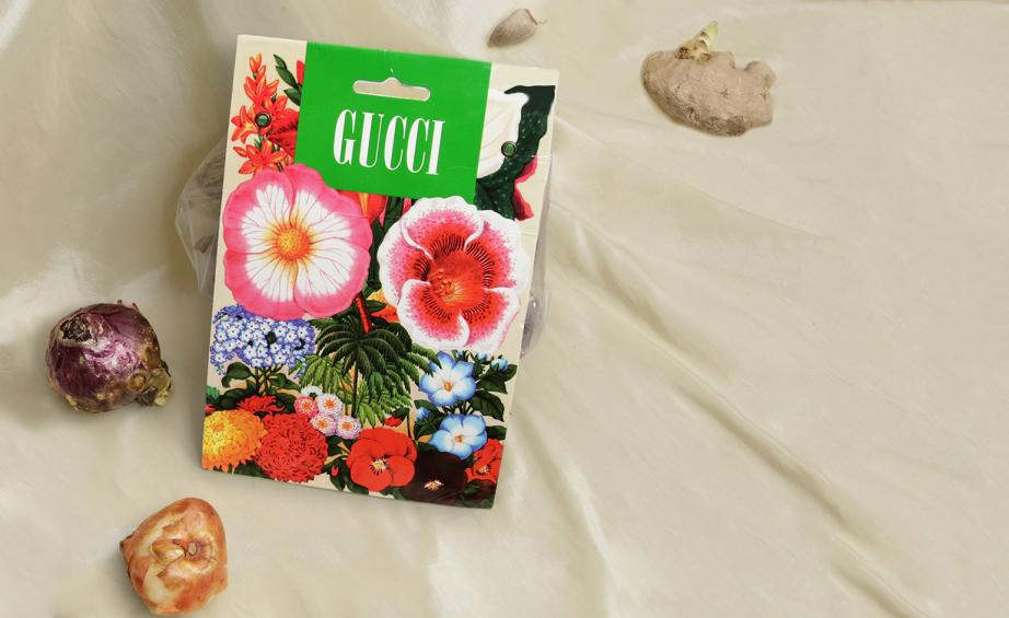
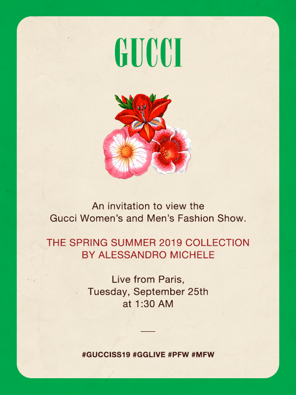
Through researching promotional design, I discovered that the purpose is to persuade a viewer, whether that be to purchase a product or attend an event. Initially I thought of flyers, posters and large billboards. Whilst researching I wanted to find examples that were more subtle, that still persuade a viewer but in a more interactive way.
Gucci have created an innovative take on invitations above, and even made the RSVP from the label of the bulbs. The idea of Gucci providing customers with bulbs to plant is a really unique way to attract viewers to buy tickets as it hints at floral being a focus for the spring/summer 2019 collection, and interestingly detracts from the use of eye-catching design. The logo has been placed on the front of the package as the brand is instantly recognisable, and the details are in small and even disguised almost on the reverse – this is possibly to engage the viewer and plays on their curiosity.
Moving image:
THE FISH – PES
Moving image has a whole host of sub-categories including motion picture, animation, stop motion etc. and I picked this category as it encases all of those. Whereas previous categories have been separate from others in their own right, I feel moving image is a generic category just like “graphic design”.
This moving image video is displaying a powerful message and I chose this not only because I am a huge fan of PES, but because of the powerful message. In collaboration with Parley, a fantastic ambassador for protecting our oceans, this video lures the viewer in through innovative designing of the fish and sound effects, before displaying the important message towards the end.
