
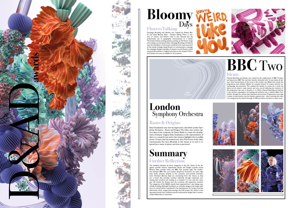
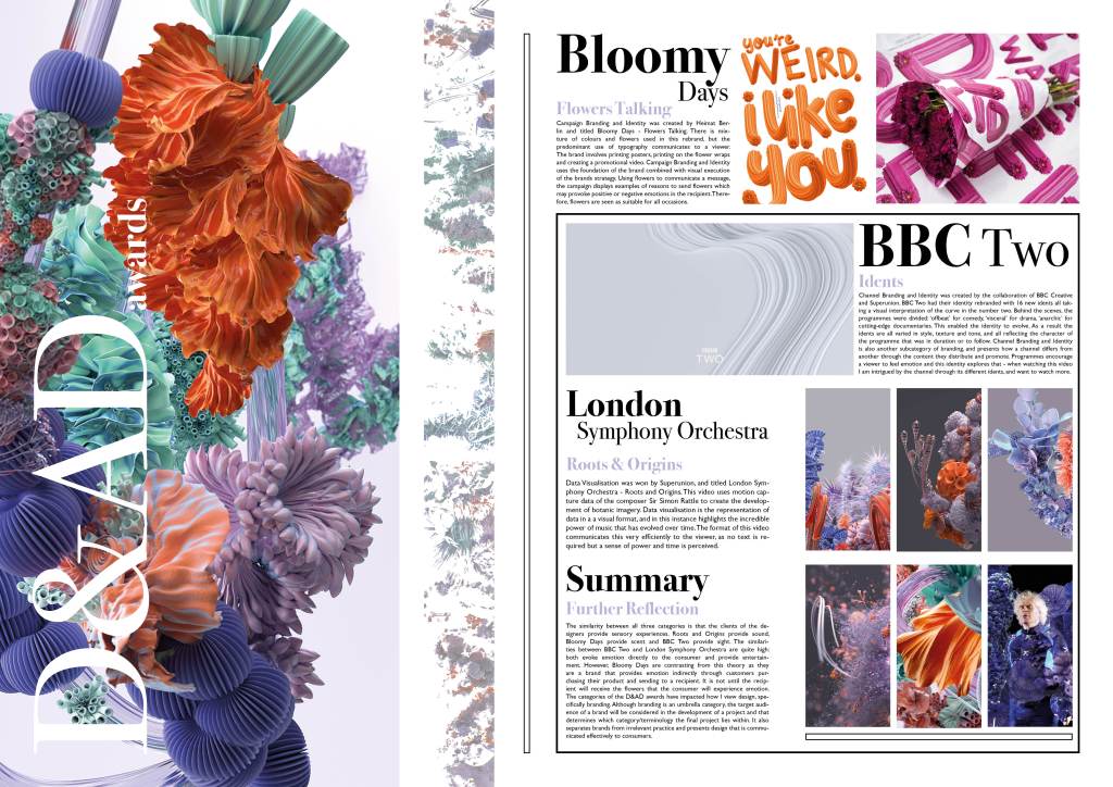
Task 1: D&Ad Winners 2019
When looking at the branding category, I noticed there are several categories:
• Brand expression in moving image
• Brand expression in print
• Brand refresh
• Campaign branding and identity
• Campaign logos
• Channel branding and identity
• Digital brand expression
• Logos
• Multiplatform TV Branding & Promotions
• New Branding Schemes
• Next designer
• Sonic branding
I am really interested in some of these categories as they use design terminology I have not even seen before. I love the projects involving moving image the most. Looking further afield and through exploring the awards, I am intrigued to the categories that are not “obvious” design, and thinking more outside the box.
Data Visualisation:
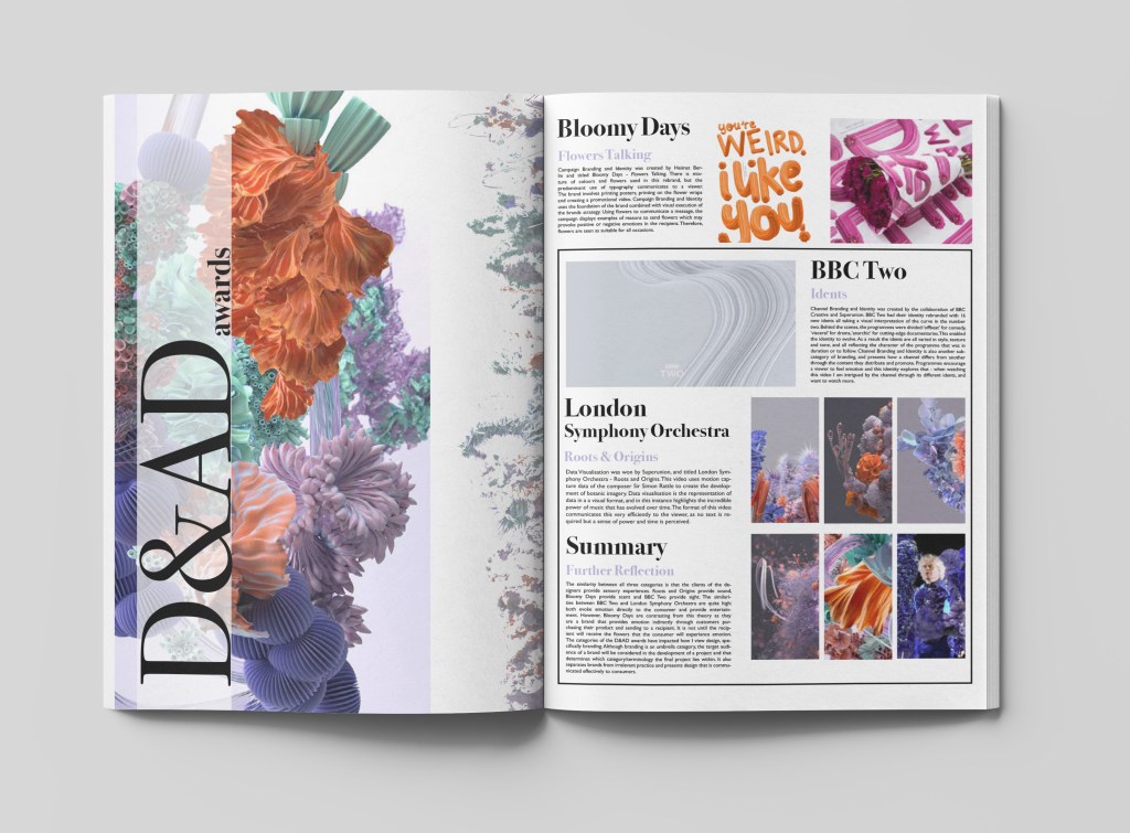
LONDON SYMPHONY ORCHESTRA – ROOTS AND ORIGINS

Promotional:
“Flowers Talking”
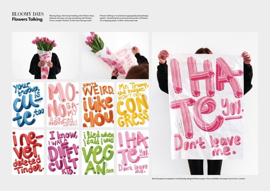
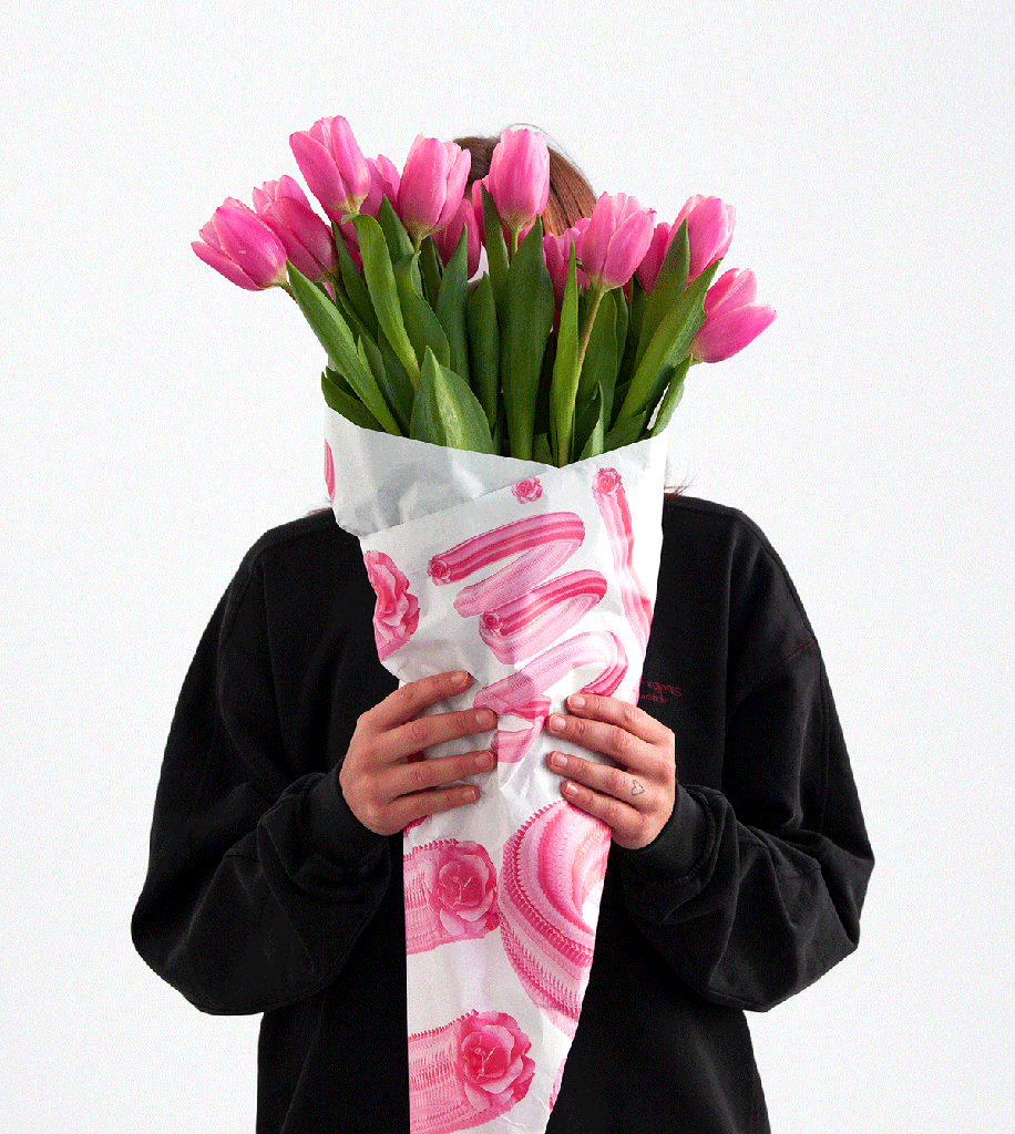
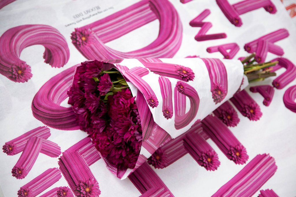
This is a very illustrative piece of promotional design, and it could even be classified as typography.
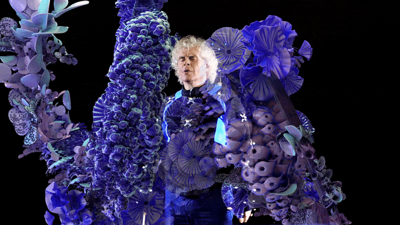
Branding (channel branding and identity):
BBC Two – BBC/Superunion
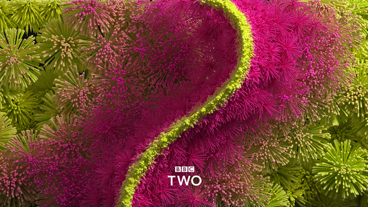
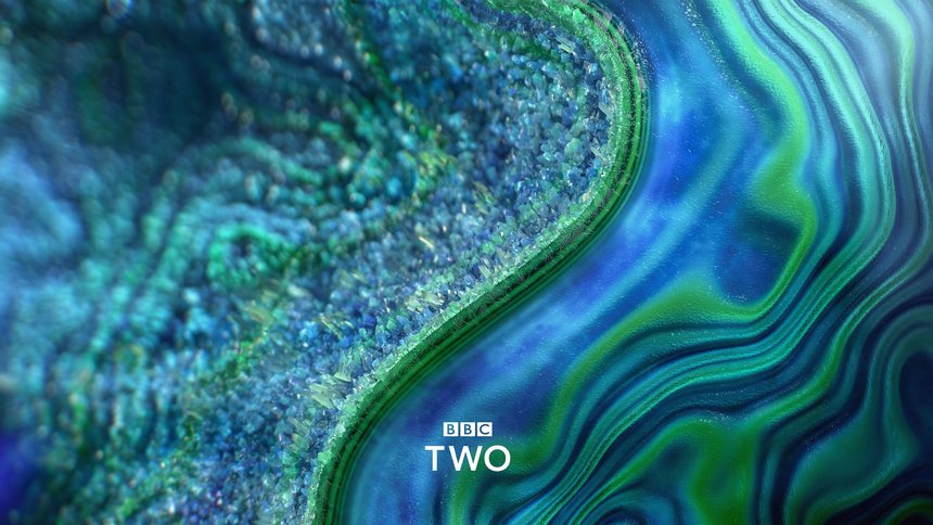
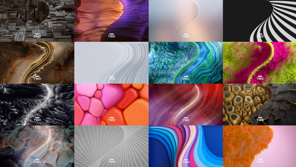
16 different idents show textures and forms, all presenting a visual interpretation of the number two.
Synopsis:
Data Visualisation was won by Superunion, and titled London Symphony Orchestra – Roots and Origins. This video uses motion capture data of the composer Sir Simon Rattle to create the development of botanic imagery. Data visualisation is the representation of data in a a visual format, and in this instance highlights the incredible power of music that has evolved over time. The format of this video communicates this very efficiently to the viewer, as no text is required but a sense of power and time is perceived.
Campaign Branding and Identity was created by Heimat Berlin and titled Bloomy Days – Flowers Talking. There is mixture of colours and flowers used in this rebrand, but the predominant use of typography communicates to a viewer. The brand involves printing posters, printing on the flower wraps and creating a promotional video. Campaign Branding and Identity uses the foundation of the brand combined with visual execution of the brands strategy. Using flowers to communicate a message, the campaign displays examples of reasons to send flowers which may provoke positive or negative emotions in the recipient. Therefore, flowers are seen as suitable for all occasions.
The category of Channel Branding and Identity was created by the collaboration of BBC Creative and Superunion. BBC Two had their identity rebranded with 16 new idents all taking a visual interpretation of the curve in the number two. Behind the scenes, the programmes were divided: ‘offbeat’ for comedy, ‘visceral’ for drama, ‘anarchic’ for cutting-edge documentaries. This enabled the identity to evolve. As a result the idents are all varied in style, texture and tone, and all reflecting the character of the programme that was in duration or to follow. Channel Branding and Identity is also another subcategory of branding, and presents how a channel differs from another through the content they distribute and promote. Programmes encourage a viewer to feel emotion and this identity explores that – when watching this video I am intrigued by the channel through its different idents, and want to watch more.
The similarity between all three categories is that the clients of the designers provide sensory experiences. Roots and Origins provide sound, Bloomy Days provide scent and BBC Two provide sight. The similarities between BBC Two and London Symphony Orchestra are quite high: both evoke emotion directly to the consumer and provide entertainment. However, Bloomy Days are contrasting from this theory as they are a brand that provides emotion indirectly through customers purchasing their product and sending to a recipient. It is not until the recipient will receive the flowers that the consumer will experience emotion.
The categories of the D&AD awards have impacted how I view design, specifically branding. Although branding is an umbrella category, the target audience of a brand will be considered in the development of a project and that determines which category/terminology the final project lies within. It also separates brands from irrelevant practice and presents design that is communicated effectively to consumers.
Editorial:
Feedback that the text would work better as white, so I have uploaded for an example:
Tweaks for final outcome:
If I were to improve this editorial, I would use more colour and be confident using it. I could explore the route of having a block colour background, to separate sections of text. I have also deliberately chosen images for each of the three categories that are all similar colour palettes – this was probably playing it too safe and I would experiment further with using different style images, including different compositions and colours. I think the good thing about the above is that I haven’t been afraid to use scale so that’s something I can take away from this.
