
References
Drawn here (and there): non-format
This is a great lecture demonstrating how Globalisation can enable people to communicate around the globe. Having one designer in America with their time zone and one designer in the UK enables more time for work to be produced. The fact they have an overlap time and communicate their progress throughout the day seems like a very effective technique for a studio.
RED SNAPPER:
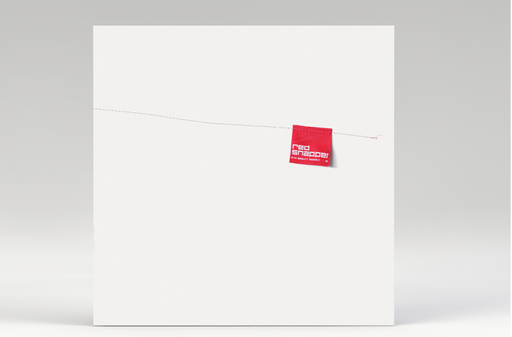
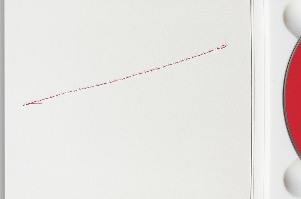
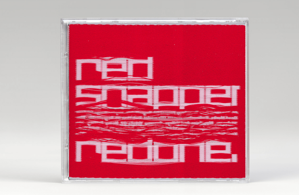
Design was printed on reverse so the reverse of the fabric showed the correct text. 
I love this packaging, the rawness of the thread just sewn (what seems like quite randomly) creates a beautiful piece of album artwork. Non-Format have thought outside of the box, and applied a mixed-media technique of thread and sewing to a record/CD sleeve. There is a powerful connotation with the thread and the label, that the sleeve is now personally owned by the artist. I really admire the whole mixing process of not limiting clothes labels solely to clothes – why not have them on records or music memorabilia?
The Wire – 2003 issues
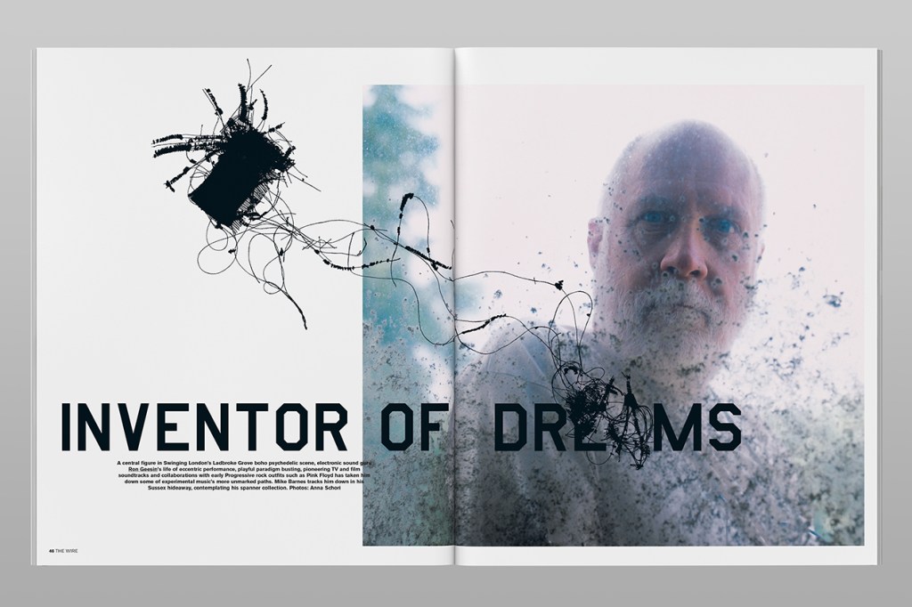

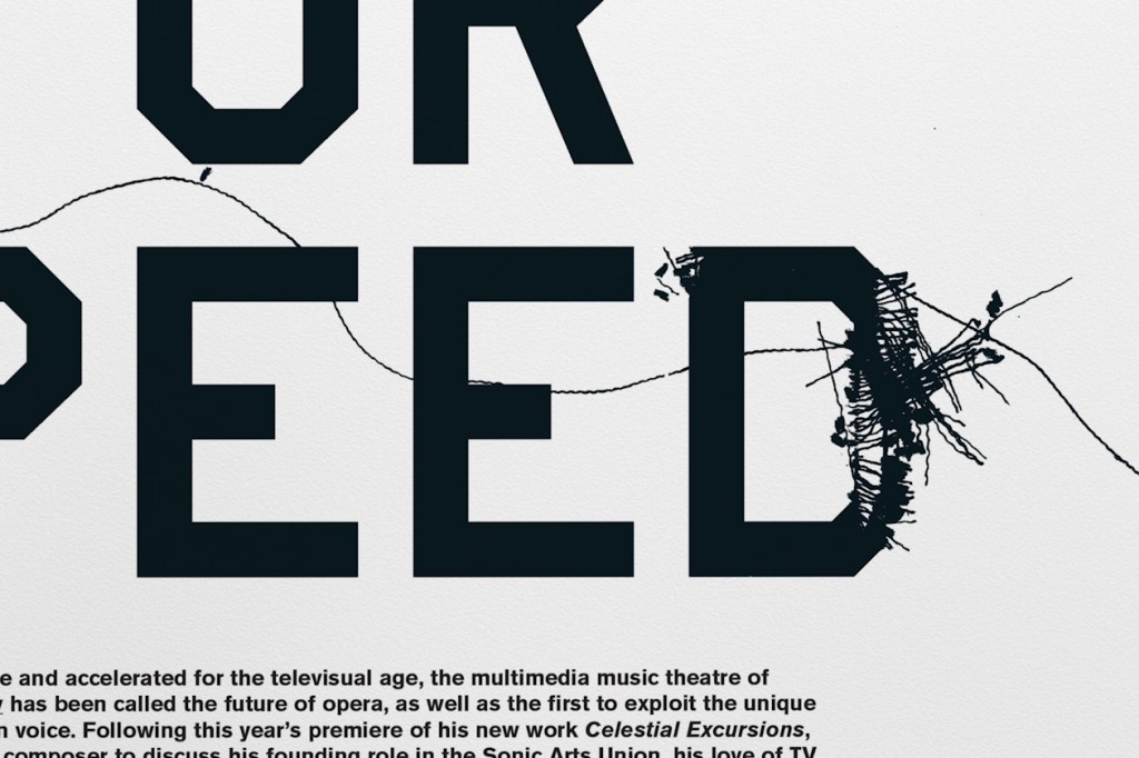
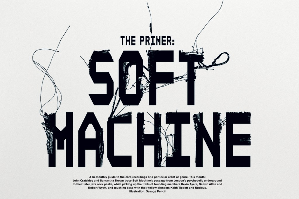
Visually, I absolutely love the minimalist yet ‘scribble’ effect that this typeface brings to these editorial issues. The frayed type actually was influenced by a black velvet backdrop that had begun to fray and drop fibres in non-format’s studio, where they decided to scan them in and overlay on text. The outcome is so visually striking through the fabrics general wear and tear, and the result appears organic on the page.
