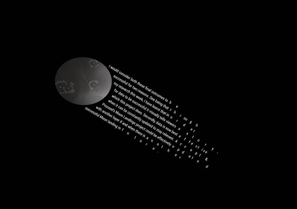
Removing the circles in the background to de-clutter the image, but more importantly give my typography space on the page. I had feedback from my tutor that the comets seem like they resemble space on their own, and potentially anything in addition wasn’t needed. I wanted to test out this:
Strengths: I really like this outcome on the stark black background. I think they have more room to breathe on the page; my next query is the format.
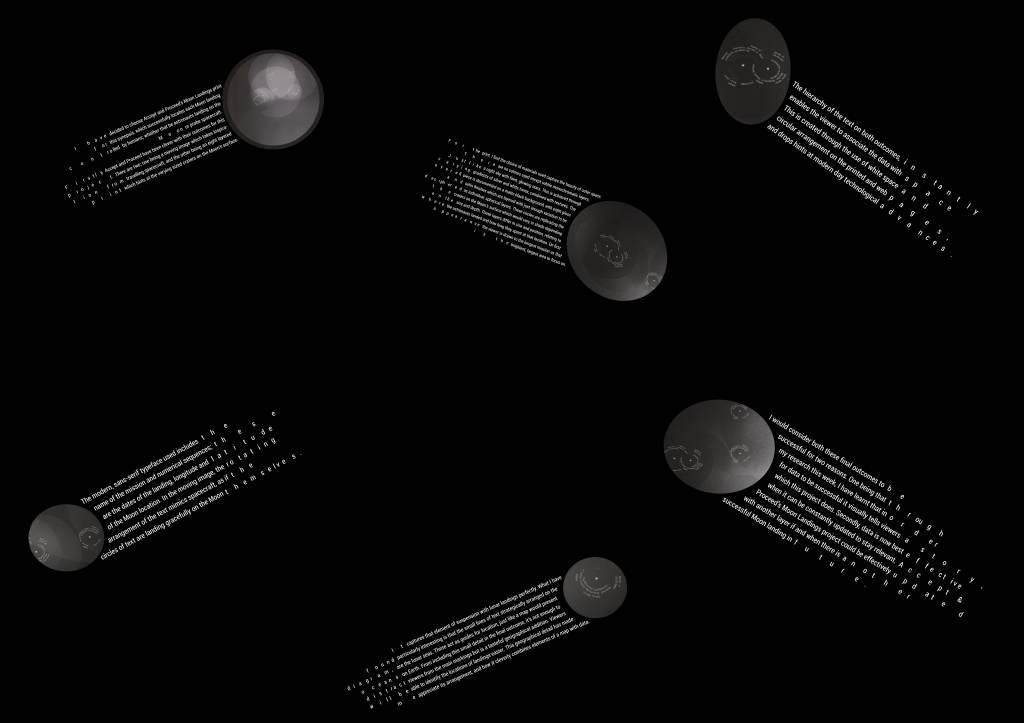
I need to consider that the text should be readable as it is so detailed. I want to present them on a very large billboard/poster and see how visually effective that is:
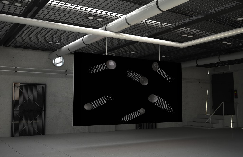
I have put this into A1 format – I have decided to go large so why not go extremely large to represent space and our solar system. Perhaps if the outcome is bigger, it will convey meaning and set the atmosphere more effectively:
From creating this extra large mock-up I did like it, but I wasn’t satisfied with this being my final outcome. There is still something missing, and I’ve come to the conclusion it’s perhaps the background and too much white space on the page!
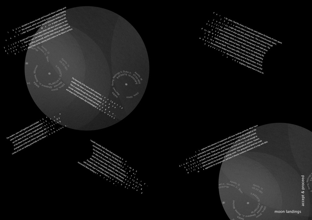
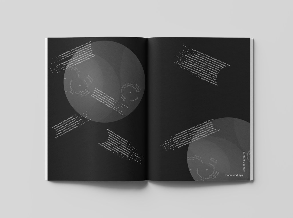
I decided to get some feedback from tutors, and I have now had written and face to face feedback from Paul and James. I’ve noted that they both advised I could explore the experiments further by separating the images from the text. I wanted to explore this as it wasn’t actually something I’d explore yet… I’ve experimented with scale, detail and format but not actually the media itself. Hopefully this will generate the outcome that pulls it all together.
Final outcome
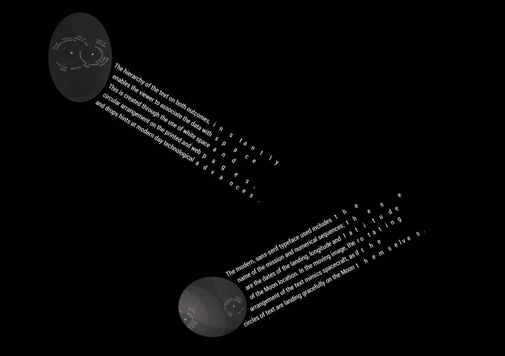
Setting myself the challenge to bring it back to editorial format and separating the text from the image has led to a much more visually successful outcome – the white space is complimenting the image and text elements, almost giving the appearance that they’re floating but not swamping the page with a plain black background.
Arranging one of the circular images on the edge of the page brings the viewer in closer to the page, as it feels like we are in the solar system itself.
Final design of Moon Landings evaluation editorial
If I were to improve this, I think I would consider transferring this to a digital platform and allowing the image to move to align with its form and function. This could be really exciting and dynamic when specific areas could move as though they’re travelling through space.