Challenge
Five examples
Florence Nightingale, Deaths from Disease (Rose Diagram, 1855)
- – Florence was a British nurse
– Diagram shows mortality in colour codes
– Red shows wounded, blue for preventable diseases and black for other causes
– Two dates for comparison; number of deaths in 1854-1855 and number of deaths in 1855-1856.
– Each wedge represents a month
– According to this source, data was gathered from analysis of statistical materials and reports such as doctor and army reports
– The visual language for this piece is called the rose diagram
Charles Minard, Global Immigration (1858)
- – Charles was a French engineer
– Map displaying emigration numbers and locations from Europe, Africa, China and South Asia
– Green = from England, pink = from Hamburg and Bremen, blue = from France, purple = from Portugal, black = from Africa, yellow = from China, brown = Eastern India
– Each route represents the amount of migrants leaving each country of origin, England displayed a large amount of migrants fleeing the UK in 1858 therefore the green line is wider on the map
– The map represents a year of data
– The visual language for this piece is a sankey diagram
Accept & Proceed, Moon Landings (2016)
- – Accept & Proceed are a design studio in London
– There are no colours used in this piece but there are different shades of monochrome and inks used to create layers in gradients
– The circles represent the amount of time and distance of area explored by astronauts/probes
– The data is not in a set time-frame; rather it is all of the moon landings over the decades to date
– The visual language for this piece (I think) is a bubble chart
Accurat and Google News Lab, WorldPOTUS (2016)
- – Accurat founder Giorgia Lupi who is now partner at Pentagram studio in London
– Google News Lab is a global network
– There are many colours used which make for a modern and vibrant selection of data
– The function for this piece of data visualisation is political. Viewers decisions on who should be the next president in an election based on topics people are talking about
– The selection of topical issues are visually depicted in fluid animated ‘blobs’ varying in size, depending on the popularity of the discussion and which country it is being talked about
– The visual language for this piece is (I think) a cluster analysis
Dunne and Raby, UMK: Lives and Landscapes (2014)
- – Dunne and Raby are a studio based in London
– UMK is a project that presents a futuristic version of the UK in four divisions of micro kingdoms: digitarian, commune-nuclearist, anarcho-evolutionist and bioliberal
– Data that exists today has been used to predict our future, such as the way technology has advanced and how we interact with it on a daily basis. We are becoming more dependant on technology to the point where it could completely take over our lives in the future; so much so we live in these divided worlds
– The visual language for this piece is initially a map but spirals out into different categories such as below
Chosen information design example
ACCEPT & Proceed / Moon landings
“We drew inspiration from our long fascination with the universe and the great space race to create a limited edition artwork charting every recorded moon landing to date, from Nasa’s early surveyor probes to the most recent landings by the Chinese Chang’e programme.
A&P
Overlapping discs depict the exact landing location of each mission and the amount of time they spent on the lunar surface. The visual language is inspired by the iconic footage of the first human moon landing, with its incredible silver and white tones, dark black shadows and enigmatic moon-dust.”
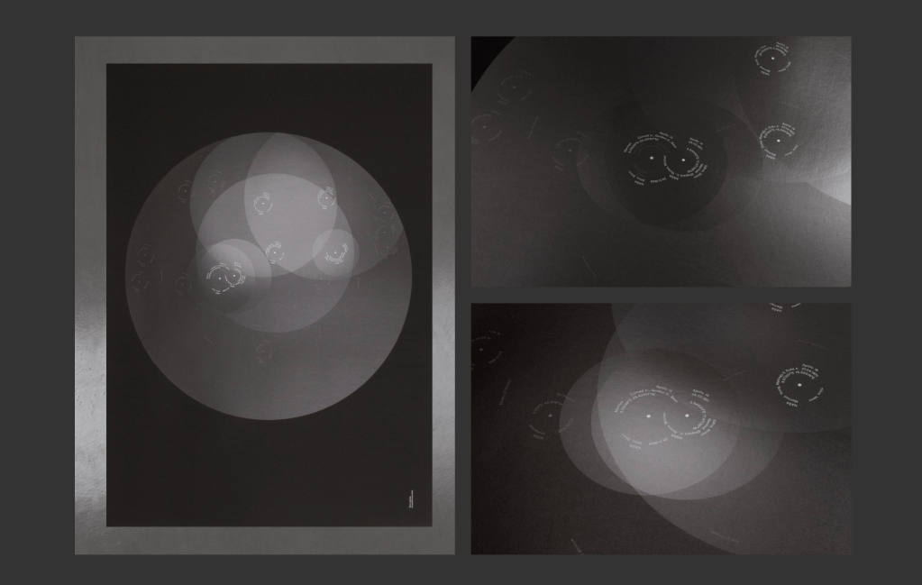
Above image: “This print depicts every Moon Landing to date, and its position on the moon. Including Nasa’s early surveyor probes, as well as the Russian Luna program and the most recent landings by the Chinese Chang’e programme, not to mention the most iconic 6 Apollo missions – that landed humans on the Moon. The large overlapping discs’ represent the amount of time spent on the Moon by each of the manned missions. Ranging from Apollo 11’s 21 hours and 36 minutes’ duration on the Moon’s surface to the final moon mission with Apollo 17’s incredible 74 hours and 59 minutes, which was three days of working, eating, sleeping and even playing golf.” – A&P
Methods and techniques used
As per the Accept&Proceed shop to purchase the print, it states the following:
• Six colour screen print
• Tinted gloss varnishes and silver
• Printed on Arjowiggins Curious Collection Skin
• Limited edition of 100
• 594 x 841mm
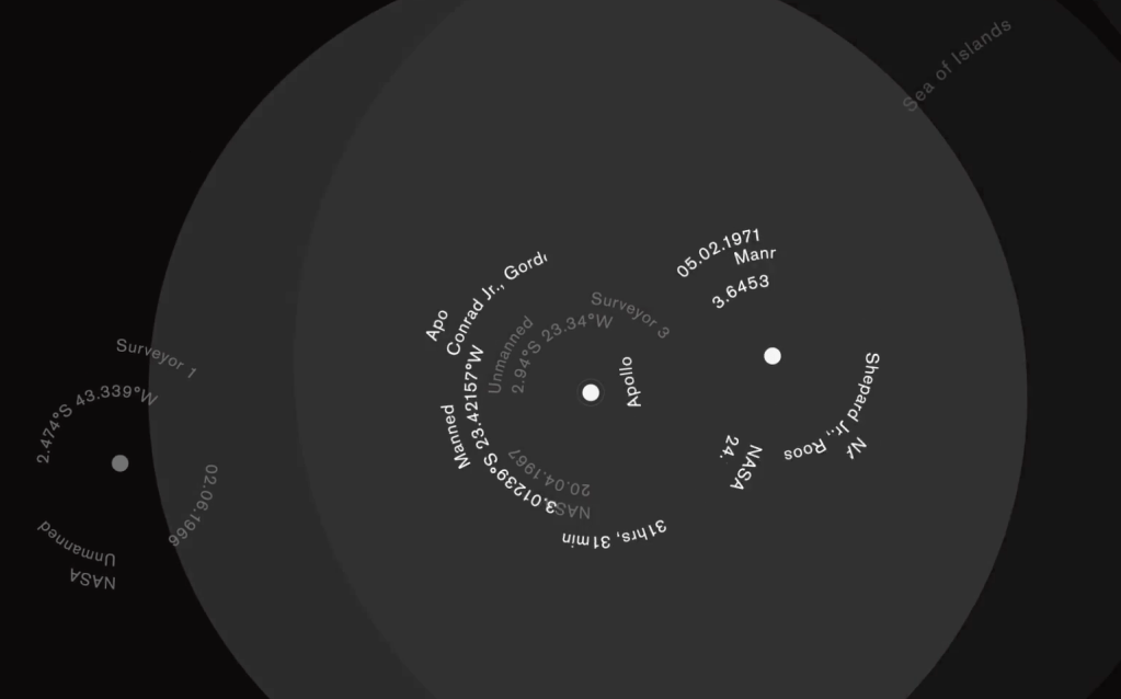
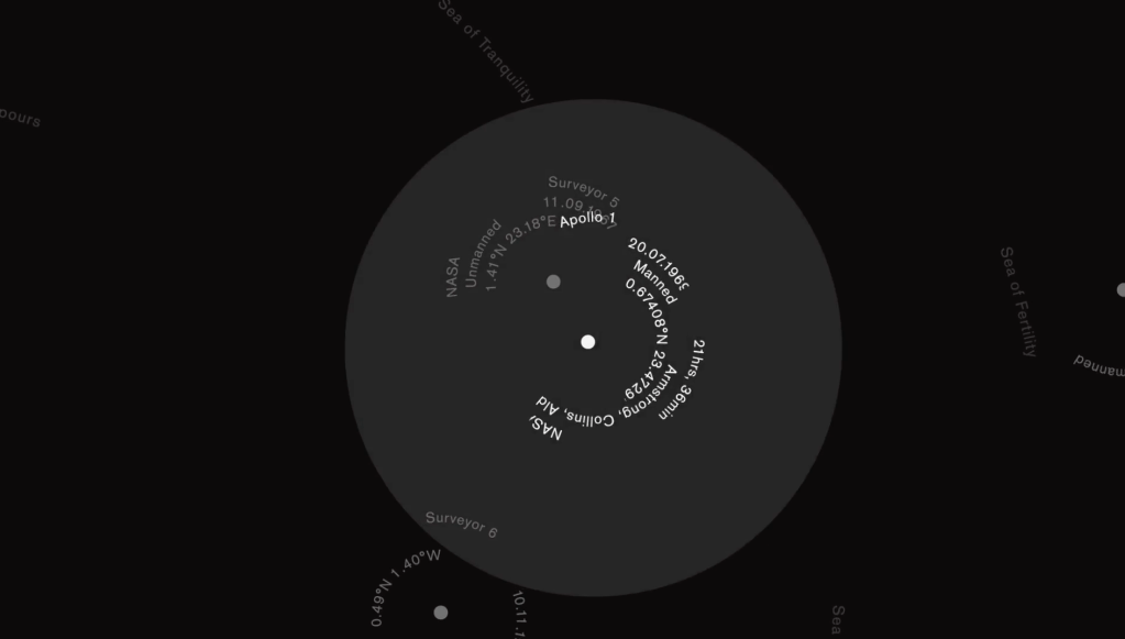
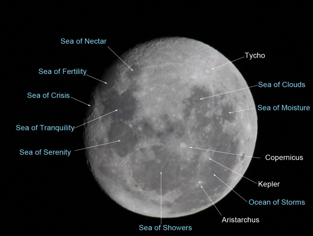
I have been trying to figure out what the tiny lines are in the final print, but then I saw the GIF of the project which showed close up detail (above two photos). These tiny lines of text actually reference the lunar seas… I found a diagram to show these: