
Reference material
Information is beautiful (book)
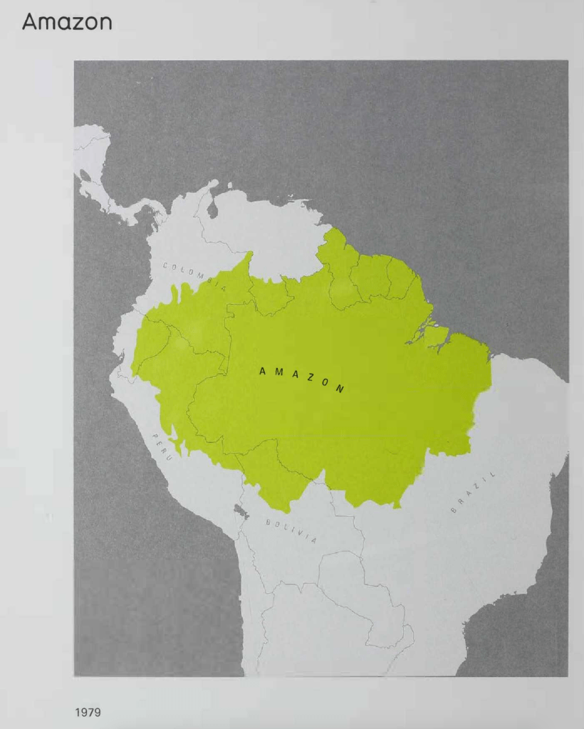
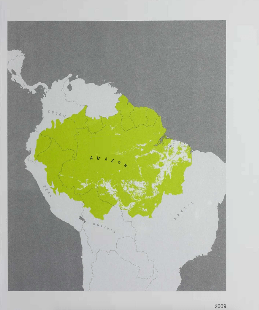

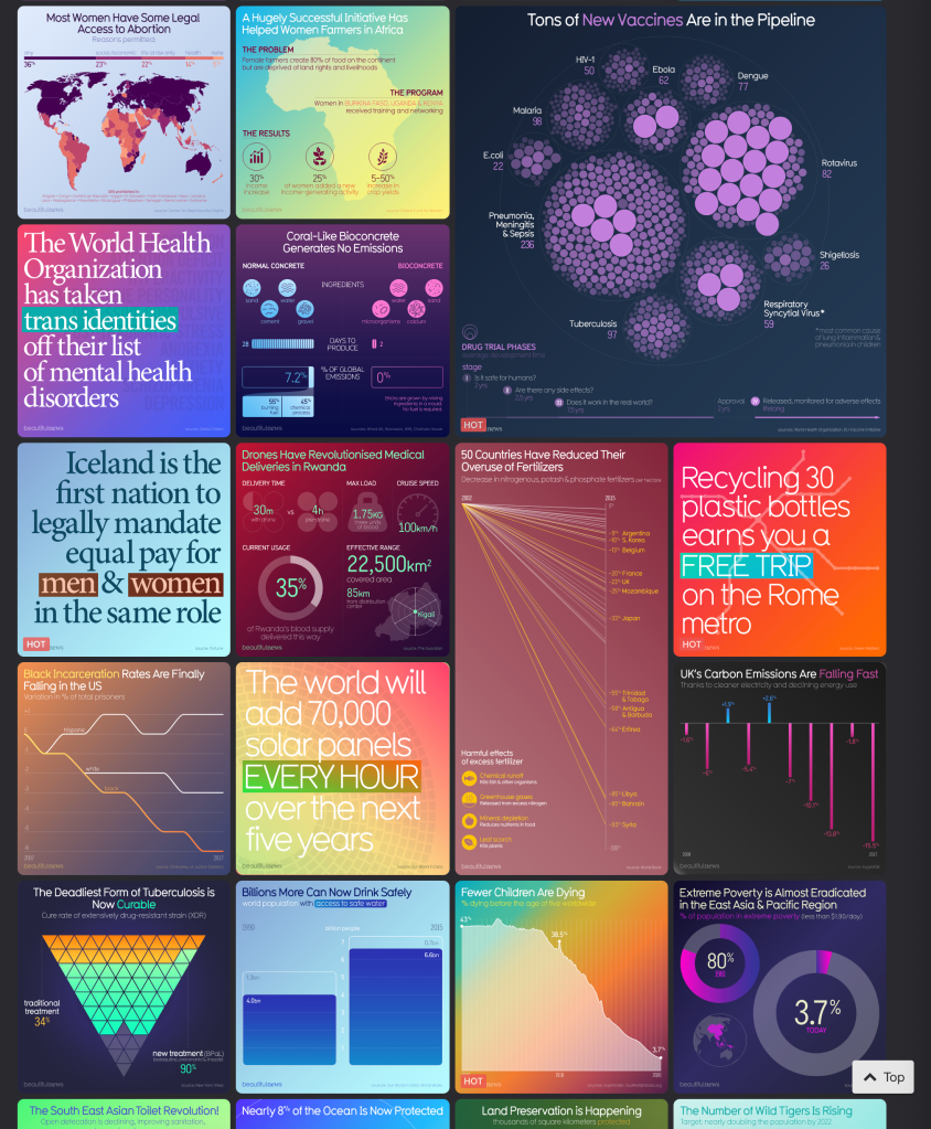
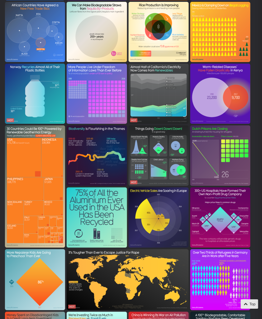
As a visual learner I found this example above to be the pages that caught my attention first; being able to associate the numbers with imagery first made it easier and quicker for me to understand, particularly with the larger images representing larger scales/numbers. The giant bottle for instance, or the giant aeroplane, instantly tells me they used more carbon than the small space shuttle.
I am aware that as a graphic designer we all appreciate visual graphics; so what I am intrigued by is the difference between a) finding things aesthetically pleasing to look at and b) being able to learn from it. I think there is a difference here, and I would class myself being a visual learner alongside being a visually curious person generally. I am sure there are graphic designers who find text and numbers more exciting than colour – whereas colour plays a huge role in how a message is portrayed for me. I do believe I learn better when colour is considered in data.
I decided to look at the types of qualities I would have as a visual learner or even what would help me learn better. According to this source, visual learners:
- Instinctively follow directions
- Easily visualise objects
- Have a great sense of balance and alignment
- Are excellent organisers
- Have strong senses of colour, and are very colour-orientated
- Can see the passage from a page in a book in their mind
- Notice minute similarities and differences between objects and people easily
- Can envision imagery easily
I have highlighted some of the above qualities that apply to the above pages and why I may have been struck by them. I have to admit instantly the colour was really bright and that alone caught my attention, particularly against the grey map and black text. This type of data is really effective for me because I am able to get a better perspective of the volume of data being presented.
Information is beautiful (online)

They are:
Top left) Scatter plot
Top right) Word cloud
Bottom right) Bullet graph
Bottom left) Gantt chart
I’ve really enjoyed reading through the ’67 Types of Data Visualizations: Are You Using the Right One?” article written by Mara Calvello – I have shared it on the ideas wall for this week. I am relatively new to data visualisation in that I have seen very little styles and don’t know many types by name apart from basic styles such as pie charts, bar charts etc. I have been able to identify four of the above styles using the article and I know for a fact I will use it as inspiration for future data designs. There are so many beautiful ways to present data.


The beauty of data visualisation
Notes from this lecture:
• Focussing on the information that is important, or telling a visual story will make it better understood by viewers
• Data is the new oil > data is the new soil. data is the foundation of information
• 0.7% aware visual content
• Eyes are sensitive to the language of patterns, variations of colour
• Language of the mind, words numbers and concepts
• Two languages becoming one
• “Let the dataset change your mindset”
• Balloon race data visualisation shows the bigger the bubbles, the higher evidence
• Data is an enormous amount of information and understanding compressed into a small space
Transforming data into beautiful stories
Notes for this lecture:
• Data is a new tool combining text and image
• We now live in a world with cameras everywhere
• Cameras capture intimate moments, it’s now deemed normal to see the president post a selfie
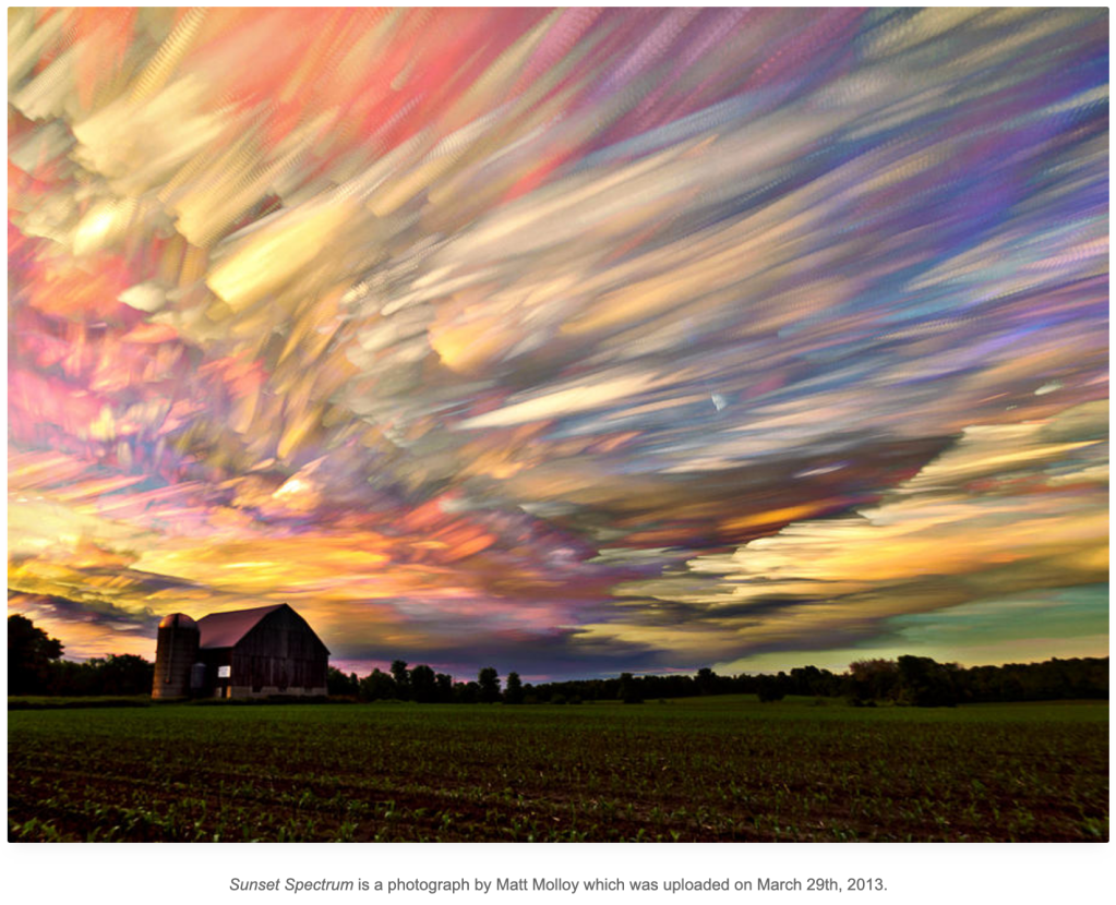
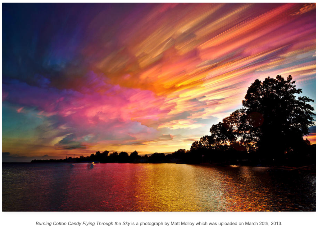
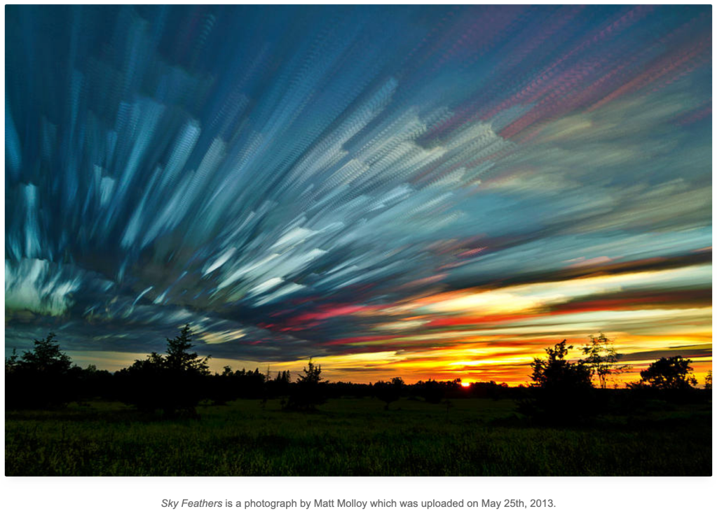
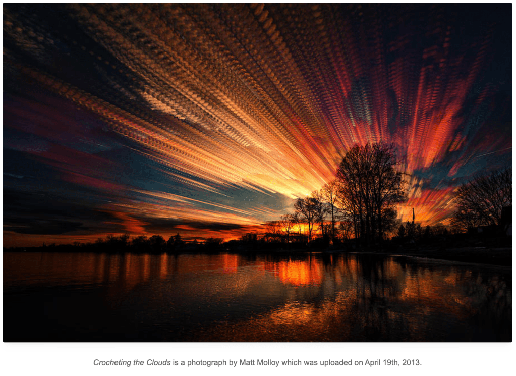
• Long exposure photography captures time, it tells a story
• Flight paths of a helicopter, aeroplanes, drones even stars
• Lights demonstrating strength of wifi signal
• Overlaying photographs of aeroplanes leaving an airport, sports people in motion, people yawning, layering seasonal images of a garden, or even David Hockney’s collage photographs
• Taking timestamps from photographs taken and putting them into data paths to show key moments in time
Matt Malloy timelapse
I also want to touch on the fact that data doesn’t have to be shapes and information as we know it today, it can be photographs. I’m glad that this lecture highlighted this because there are so many different ways of capturing a moment in time, and time-lapse photography is a wonderful example:
Flora’s Dial / Accept and Proceed
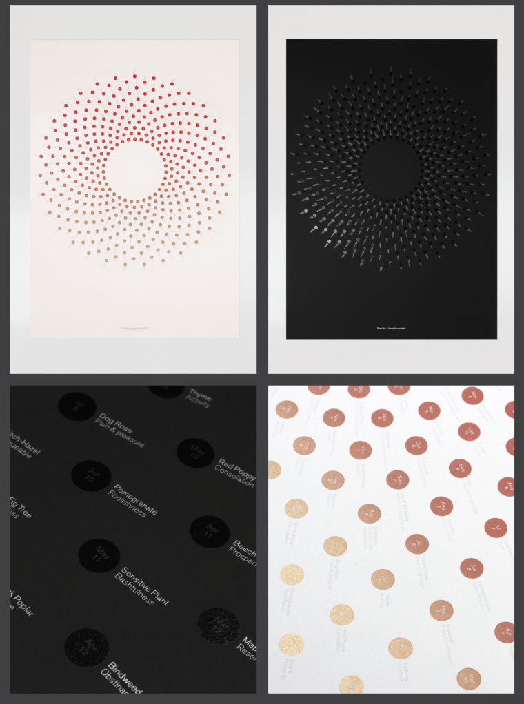
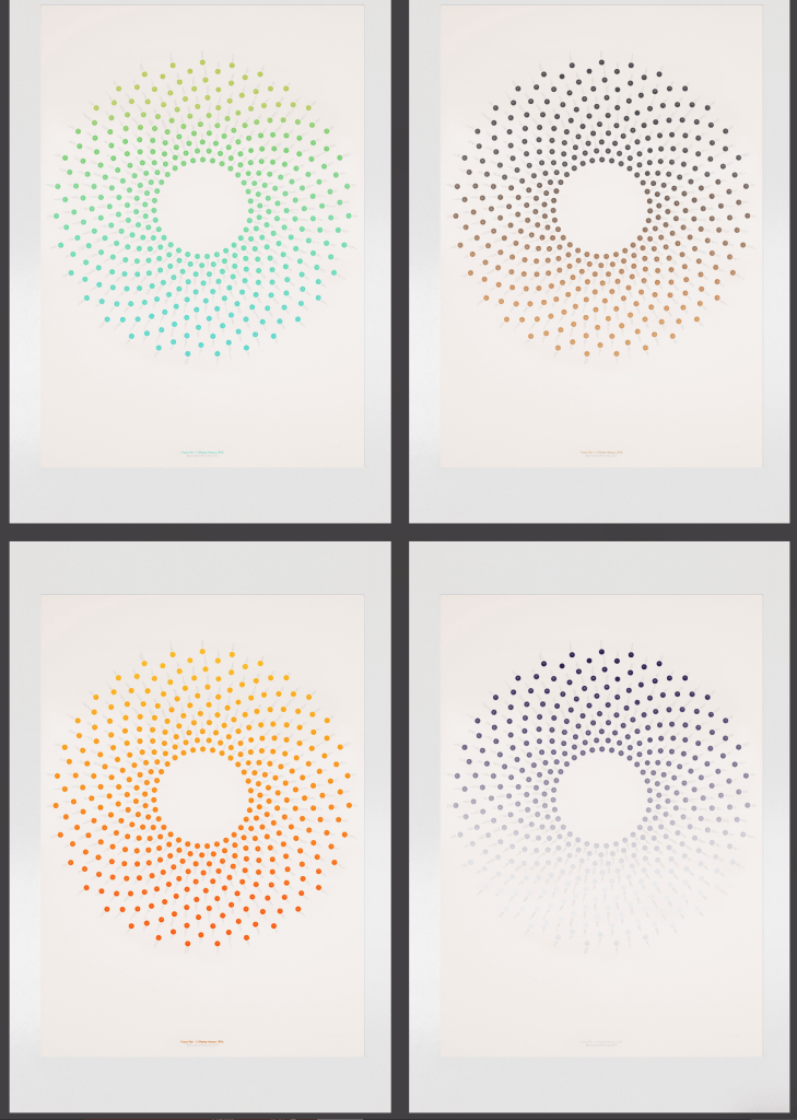
Based on the book by John Wesley (scanned copy here) this data presents a different flower for each day of the year, resulting in the form of a flower. What strikes me about this final image is how the text isn’t even noticeable; just the shapes and colour remains. As the viewer looks closer they can find the detailed text specifying what each individual circle represents – the date.
