Final outcome
Final checks:
Things to note:
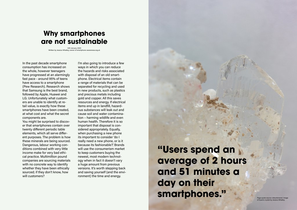
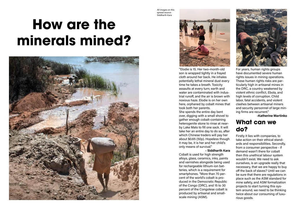
I didn’t end up using the fluorite images in the editorial (but did for the t-shirt text). I felt that using them in the t-shirts was enough, and I wanted the editorial to be minimal and not overwhelmed with imagery as I felt what I needed to say was more important. The message needed to be clear and to the point. The quartz crystal was enough I felt from the beginning; it’s a really lovely image and the subtle transparency of the Quartz hints at two things: 1) Quartz is used to make phone screens and 2) it’s transparent. In design terms this is honest design. I just felt like it fitted this brief perfectly.
This is the first time I’ve done something that is regarding ethics in this way, and such an important message for myself to design in a different way. I usually design image first then plot in my text; this was the other way around. I had to work sensitively alongside the text and information for my audience, especially as it needed to really get through.