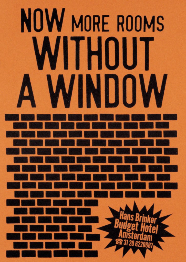
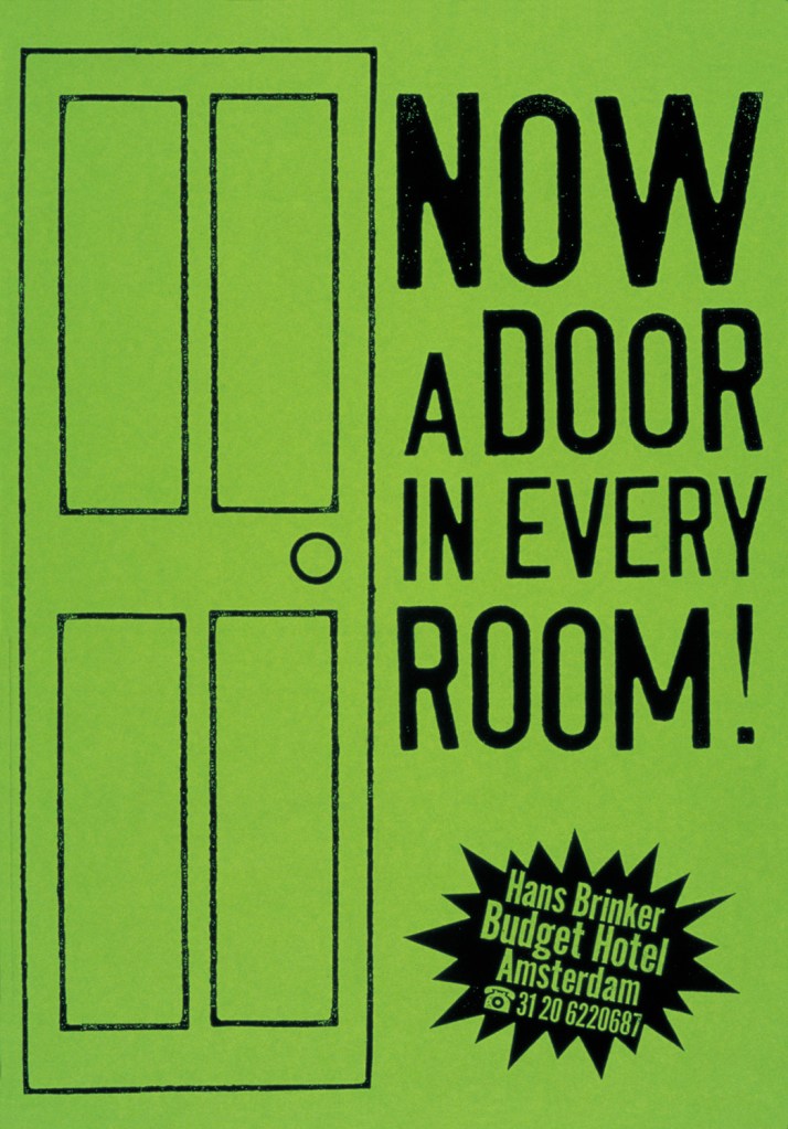
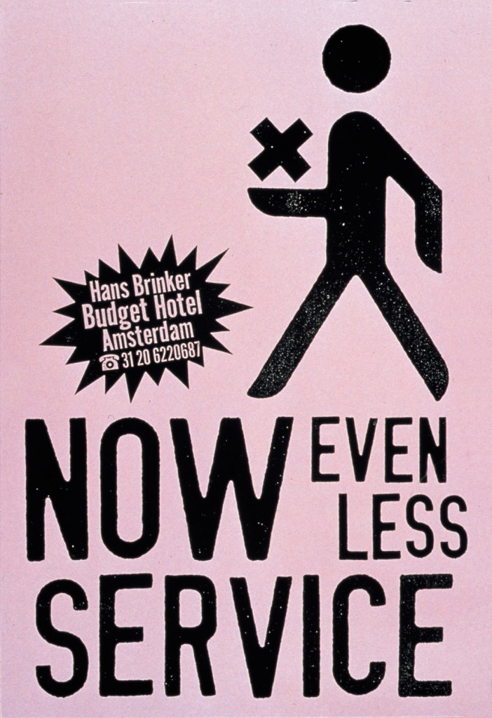
• Just because a project isn’t terrible doesn’t mean it’s good, if a project is bad it could end up being really good with improvements • Humour in design is effective through mockery of social issues such as not paying attention when distracted with technology • Hans Brinker budget hotel adverts:
I really love the wittiness in this campaign; and the colour palette. The bold, basic graphical elements such as black line illustration contrast effectively against the colour which makes for a visually striking set of posters.
• Citizen hotel advert ‘cliche’s’
PES is one of my favourite animators, the sequences are so smooth and it’s so fluid the way the animation is made. A large reason behind the animation being so effective is the sound effects, almost rustling sounds which compliment the motion video. This advert is really witty; it’s unexpected and makes you jump which I think will stick in viewer’s minds for a while. The advert itself is mocking the hotel cliche that everything is romantic and perfect, which I find interesting. Would people question the hotel’s reputation if they see a shark ruining that peace? Then again, it is relating to the audience who are watching and saying “I understand nothing is perfect”, which some people may find appealing.
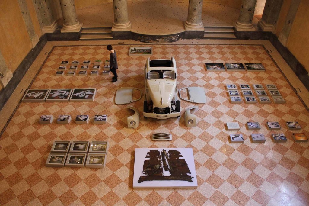
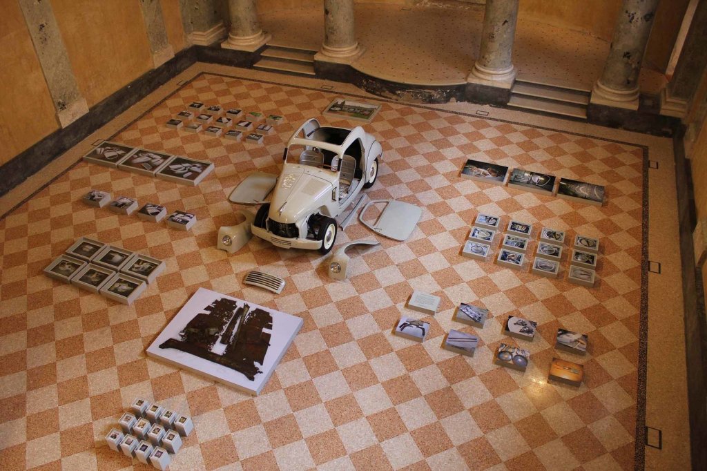
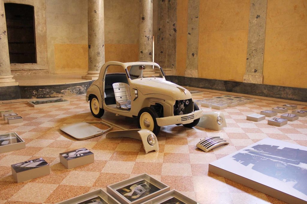
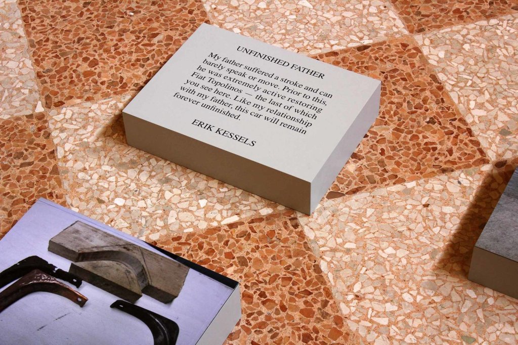
• Photo album collections, and mistakes in the film, rips, damages etc. People who are excluded from the albums. Telling a story • Unfinished father car project exhibition
I have chosen this project above to discuss because I find it wonderful. The idea of the work in progress project coming together over many many years only to remain… Unfinished. The connection with this project to the man who it belonged to, who suffered a stroke and will never again be complete himself. I find this such an emotional project with feeling when looking at this, the labour involved and detail in all of these individually made car parts. I suppose on the flip side, there is happiness in this project; look at what was accomplished. It may not be finished, but maybe that’s the beauty of it. Someone else (his son?) could complete some more – maybe it’s a project passed down through the generations which adds to the story. The graphic elements here are subtle, but important as they present the most important information. The theme of the room all being in similar colours enhances the work itself. I am intrigued as to why all of the parts are one colour; was this deliberate, or were parts of the same colour theme displayed in this exhibit only? And why?