I played around with adding in Pixabay images to eradicate the blank use of white space. I then discovered when all three were compiled that there was too much going on the page. I knew I needed to minimise it somehow, and started with adding in an additional page (below):
Draft 2:
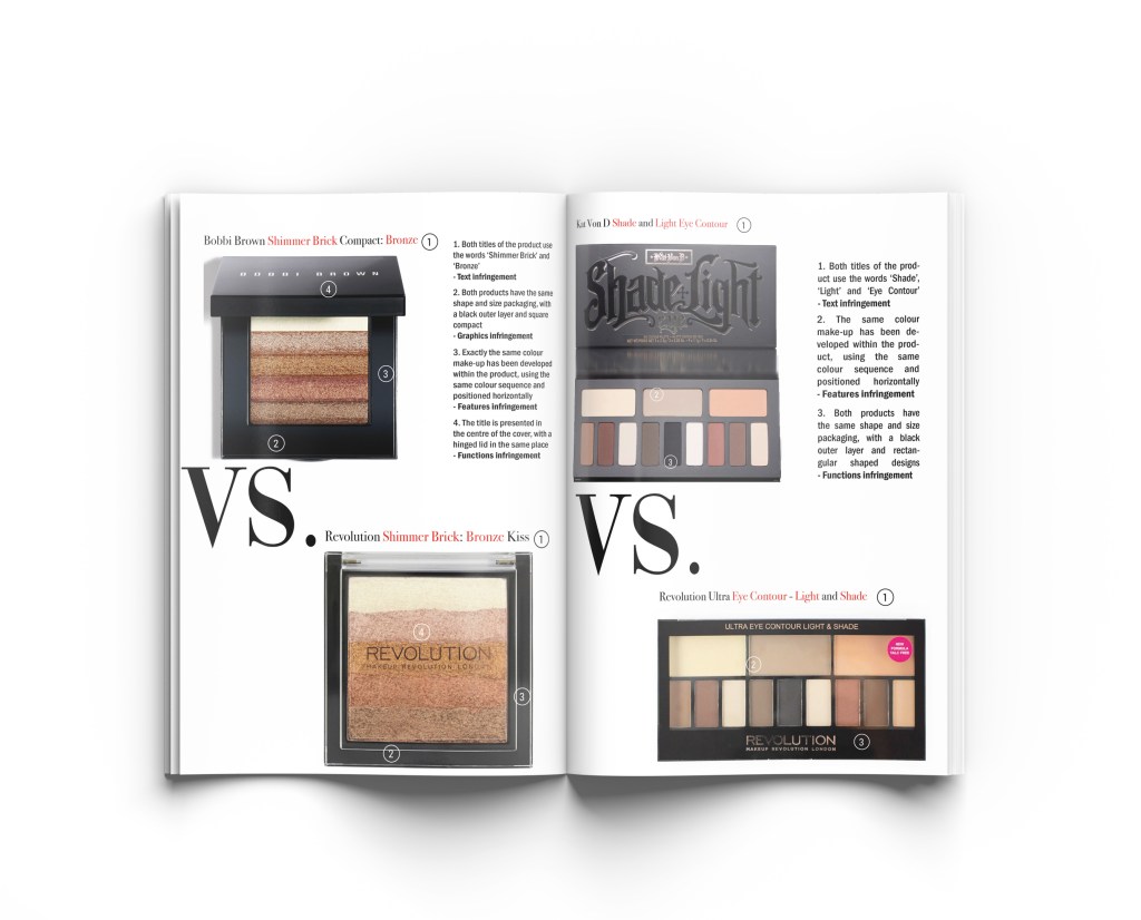
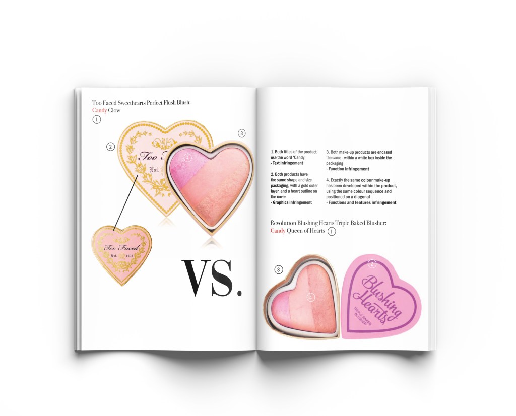
For draft 2 of my experiments for this week I encouraged white space on the page as editorials I looked at in magazines always seem to use lots of white space. I also encouraged the ‘VS’ in a typeface called ‘Vogue’ as I thought it was fitting for the brief of cosmetics and the beauty industry.
Final draft:
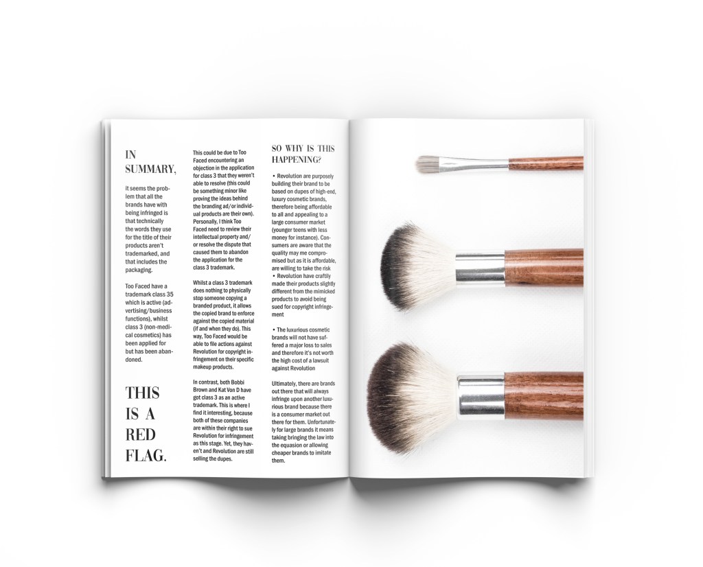
I tried to fill the pages to the best ratio of white space and content. Looking further at how text is displayed in magazine editorials I noticed there are usually no borders so I removed them. I wanted the text to be clear and eligible to the viewer, so decided to do a full page for my summary of findings. As that text is the one that discusses my findings on IP protection and terms/conditions, I felt it was fitting to have that enlarged.
Final composition:
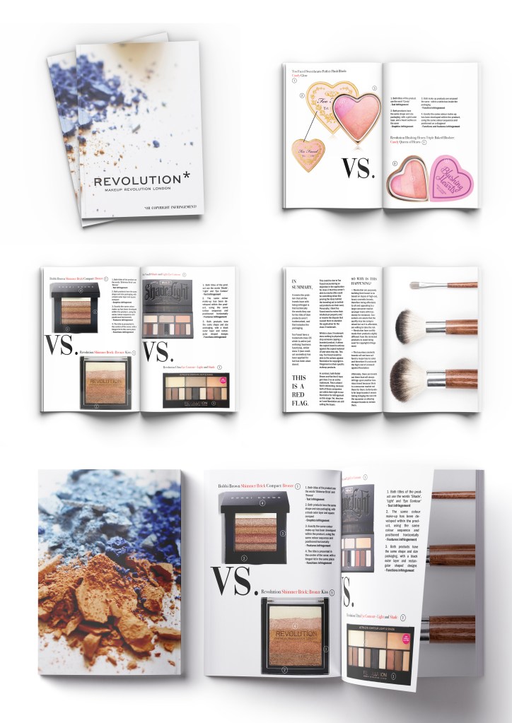
As this week needed to be an editorial piece, I really wanted to take it that extra step further and present it on mock-up pages to see how it would look printed. I have placed all of the images into mock-ups and saved them individually (above) to create the below:
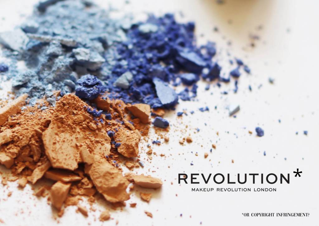
I have presented the editorial for this week’s IP infringement brief in various formats to showcase my layouts. I did it as a magazine editorial simply because there are never articles shaming copyright in the beauty industry and thought it would make a contraversial section in a magazine like Vogue for instance. I would love there to be a monthly section dedicated to copyright infringements in the beauty industry – it wouldn’t necessarily be all bad. It would be great publicity for the duped brands after all. (My findings explain this in detail if you read my summary).
To improve this piece I would consider looking at other brands potentially – something I picked up on in my research is that even make-up artists put make-up on celebrities that has been copied and this has proven to be an issue. I suppose it’s no different from someone making the same item of clothing from fabric… That’s an interesting topic in itself. In terms of appearance of my editorial I think it could be improved. I would like to play about with ratios more going forward and full scale images could be interesting – especially if presented on a different editorial format i.e. a billboard. This is something to keep in mind for future briefs. Overall I am pleased that this week does present the beauty industry quite well as I have taken inspiration from fashion and beauty magazines.