
Task 1 – Design PracticE
1) Visual identity:
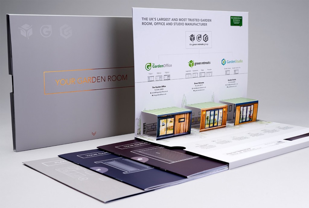
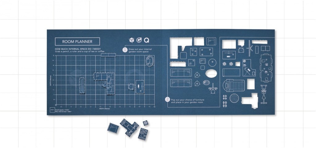
Really admire how Visual Identity have created an interactive piece for the viewer when planning the studio space for their garden. This is a simple, clear and concise piece of design that communicates instantly what the company aims to do for the customer. This is attention to detail and craftsmanship.
Company statement:
“One of the longest established award-winning agencies in Milton Keynes, Visual Identity is an innovative full marketing mix agency with almost 30 years’ experience. We build long term relationships with our clients and support them across a mixture of services. We will get to know your marketplace and understand your competitors. We believe shared ideas are more effective, preferring less to more and our ability to question makes us partners rather than suppliers. We deliver the highest levels of service by focusing on our customers’ precise needs. We work in partnership to tailor bespoke creative solutions to set our customers apart from their competitors to deliver measurable results.”

Image: VI’s website “our approach”, simplified by terminology “the 4D’s”.
Visual Identity are a graphic design agency that specialise in rebranding, with website design appearing to be the most popular category on their website. As a company, they present themselves as versatile, with a highly skilled team who are able to approach each step of the brief and guide their clients along the way. The screenshot above of the website shows that they have a particular process when working with clients, and this is appealing – as a client you may wonder what you are paying for, which VI provide the breakdown of before needing to enquire.
Being a small business of around ten employees, I am not surprised at the type of work they have displayed on their site. They have global clients, but not a huge range of sectors. I get the impression that they have a particular clientele – companies that require an overall re-brand (as opposed to a brand who wants printed collateral for instance). As the team are small, but the work seems quite broad, I sense that there are multiple talents within the team, with people responsible for two or more processes behind a brief. VI are using a faceless company name, and the name represents their work as a whole process – providing identities for business needs through visual campaigns, website design and print. Identity could also be translated into providing a client with an identity, not just the project they bring.
The company were founded in 1989 and this has a reflection of the type of clientele they work with. They have long term relationships, and refer to their clients as “partners”, not “suppliers”. This would definitely make a client feel valued, appreciated and overall I think VI are very well presented because of the attention to detail in business tactics like these. The words such as “full marketing mix” and “multichannel approach” shows the customer that VI are experienced and have the modern day technological skills involved to create successful branding.
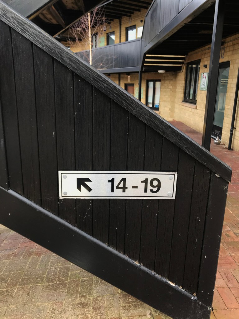
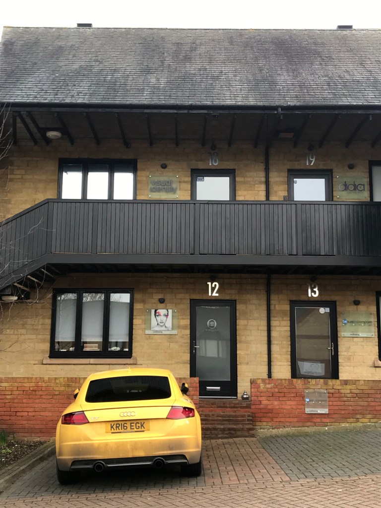
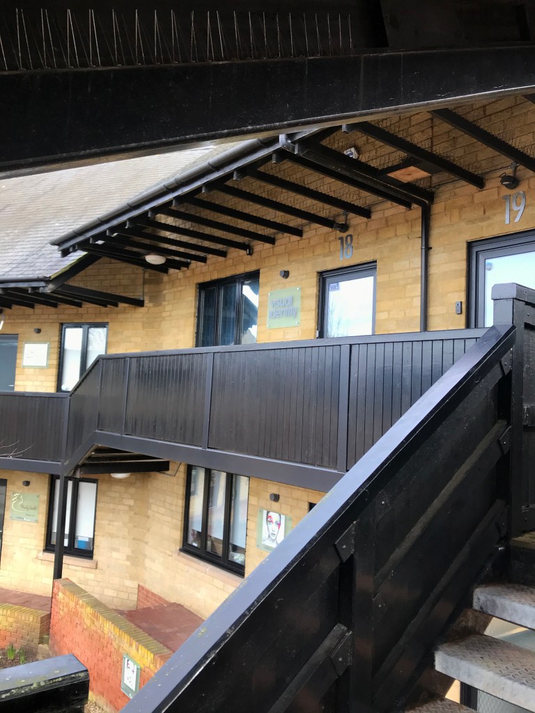
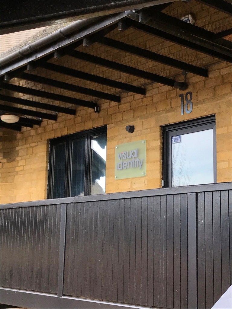
The exterior:
Address: 18 Canon Harnett Ct, Wolverton, Milton Keynes, MK12 5NF
The canon harnett court is a cluster of offices, but it is a good few miles away from shops so this would factor in to the residential costs. House prices on average in this area are £235,465, which is an interesting discovery and this is the cheapest area out of all three companies I am investigating.
The location is not central, being on the outskirts of Milton Keynes. Situated in a floor of new estate of offices as opposed to a whole building is quite unusual for a studio – but as their work is global their clientele are probably not local. Location does not matter so much when you can use technology to connect.
