References
Drip-dry shirts; the evolution of the graphic designer.
1890-1910 – Photographic images were transferred on to metal/other printing plates, as pictured below:
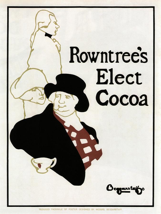
I really like that the typography in these posters above have personality – the letters are not perfect and have unique characteristics like uneven letters, serifs and large decorative letters. This is certainly a contrast to the modern day type with technology enabling typefaces to be completely perfect – it does have its benefits however this sense of craftsmanship above is definitely lessened nowadays.
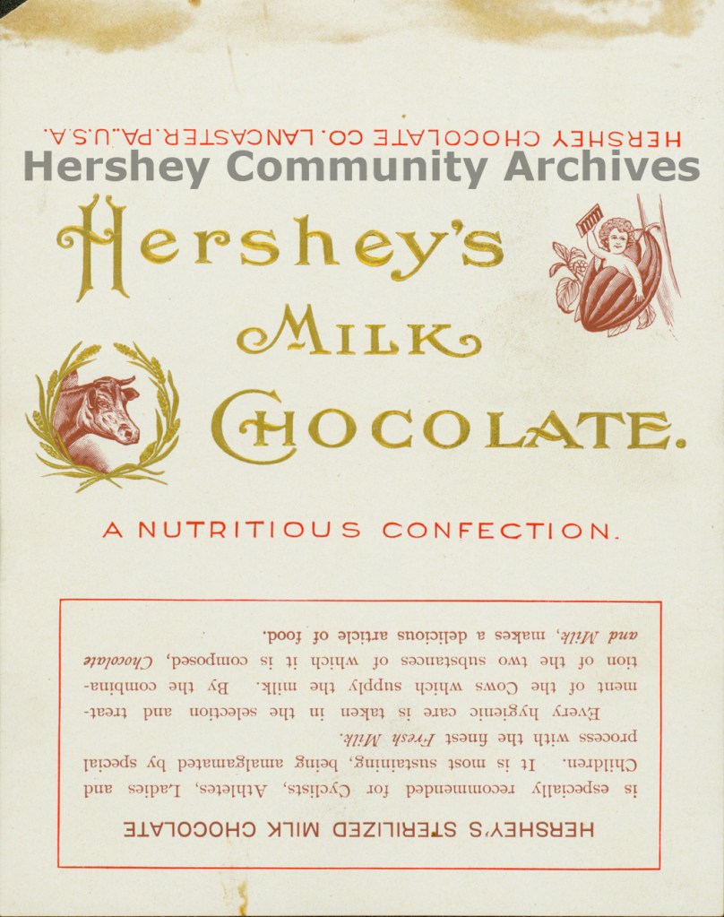
1910-1950 – The era of two world wars in the UK, Russian Revolution, the evolution and closure of the Bauhaus, and Art Deco. Beginning to see more use of colour as full colour reproduction became a commercial possibility, as pictured below:
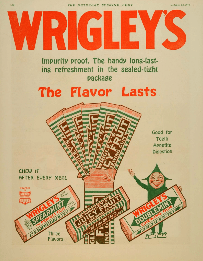
Wrigley’s Chewing Gum 1919 
Hershey’s Cocoa 1934 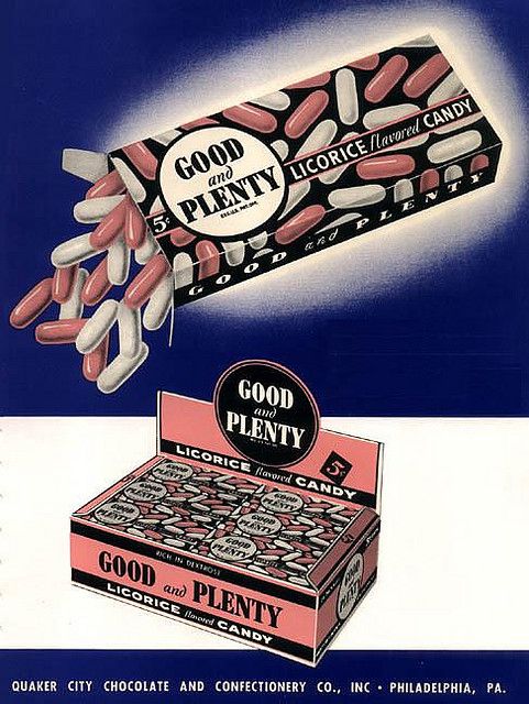
Quakers Good’n’Plenty 1950
I was surprised to discover how much colour is used in these posters considering the dates as inks were expensive. It’s interesting to see how the colours performed on posters too as they are quite dull.
1950’s – Akzidenz-Grotesk grew in popularity again during the 1950’s (after being issued in 1898) and influenced the design of both Univers and Helvetica – two of my favourite typefaces! Although these were modernist typefaces, there was still a sans-serif appreciation with classic old typefaces such as Garamond. I personally love Garamond as it reads so well and carries a vintage feel.
In the 1950’s most jobs were printed using letterpress or silk-screen for larger items like posters. Full colour was expensive and designers only limited the art to two or three colours. Designers combined photography with illustration and there was a ‘collage’ style in production of images.
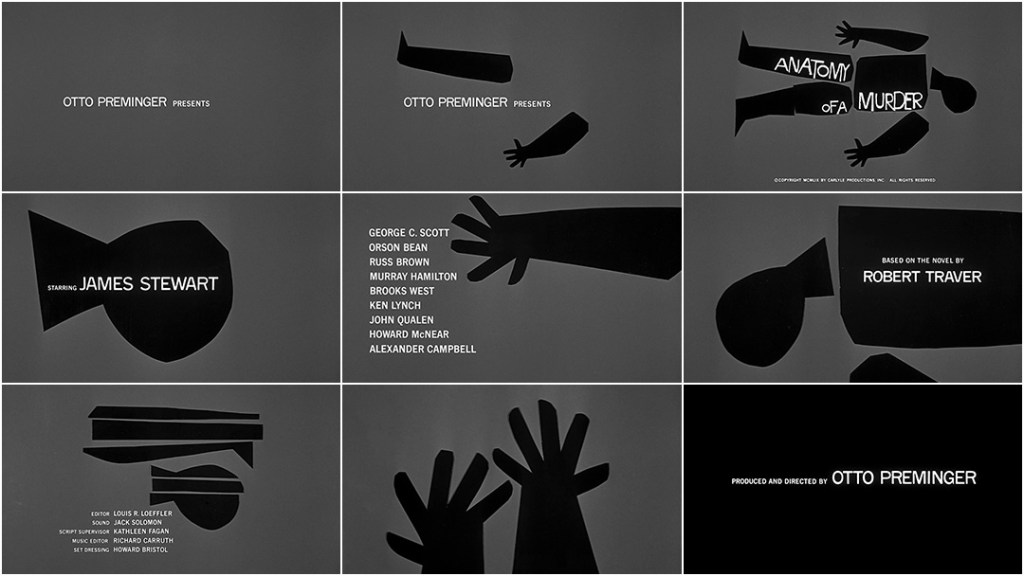
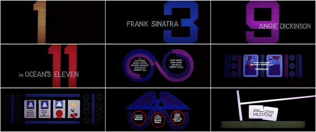
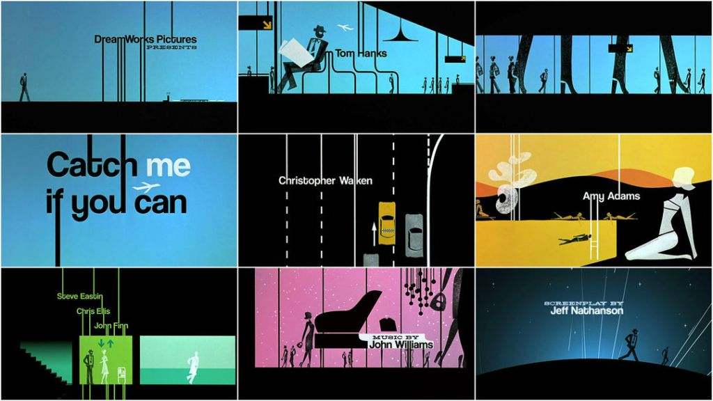
From this research I have learnt that there is a lot of fantastic work in the creative industry to take from this era (1950’s) and would even still be successful today. There was a radical shift in the design movement and movie titles personally, are a great way to see this. I have found a video which depicts this perfectly. Iconic designer Saul Bass (who is one of my favourites as I adore the pink panther title sequence and films!) has been the mastermind behind film title sequences today. Catch Me If You Can (2002), and Feud Bette and Joan (2017) are two examples of designers that have taken inspiration from Bass’ work in the 1950’s. See below:
Bass has been incredibly influential to me in the designing of movie title sequences – I remember being shown The Man With The Golden Arm title in Uni nearly 5 years ago, and I suddenly realised this man was responsible for my favourite film title sequences (Pink Panther) and when I researched his work further, was completely in awe and appreciation of his creativity. I think this is down to a number of things; how experimental Bass is in his work, and how his work is never the same.