
Workshop Challenge
This week we want you to use your visual research into letterforms from Week 1 to create a new and unique piece of illustrative typography. Do not forget to document your visual developments, and be experimental with form and legibility to create something entirely new.
Use the DNA of your initial visual research from Week 1 to create a new and unique piece of typography that spells out the name of your town or city.
Your new title lettering should reflect the identity of your town or city.
Consider the interplay between provenance and historical story, in contrast to more strategic alignment to a design’s positioning.
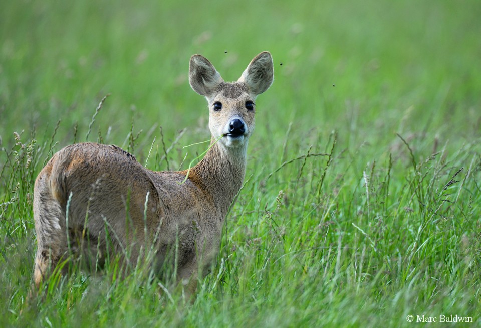
Woburn estate and deer park – Nine species of deer!
From owning an allotment not far from my home, and having had my vegetables eaten by muntjac deer, rabbits and foxes I know the fields surrounding are full of wildlife. I really think this would make interesting elements to a typeface, such as the stag deer antlers and footprints etc. Especially as I know now that there are so many species of wild deer.
I remember being surprised when I moved up here how much green space there is, as my area is situated on the outskirts of Milton Keynes and therefore hasn’t been taken over with housing developments (yet!). It would be really good to recognise this wild aspect in a time where it is still thriving.
Nine species of deer
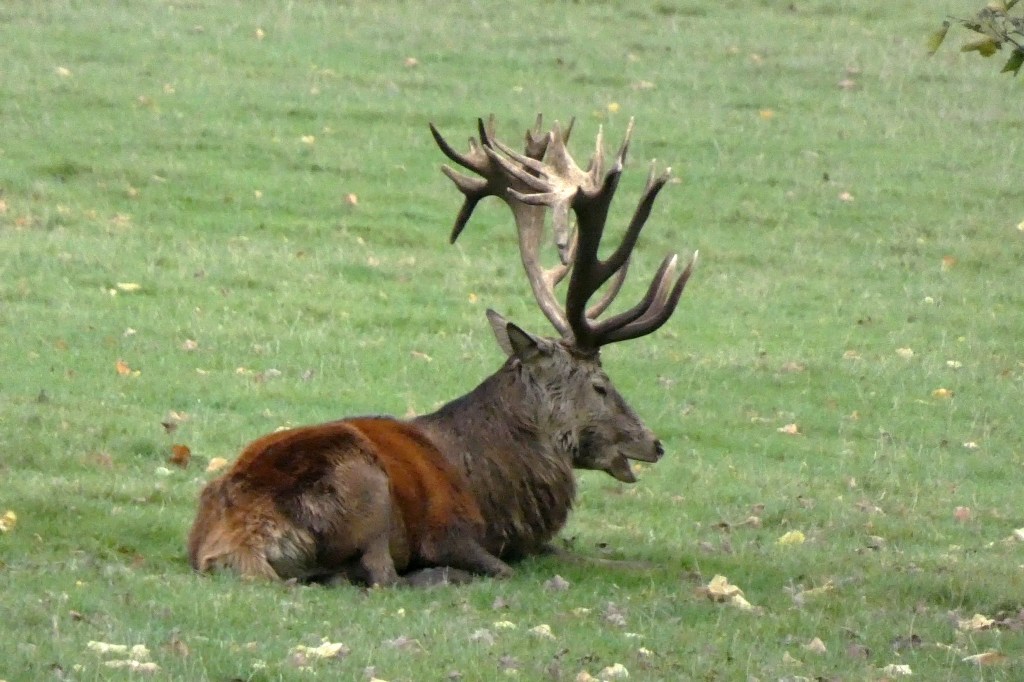
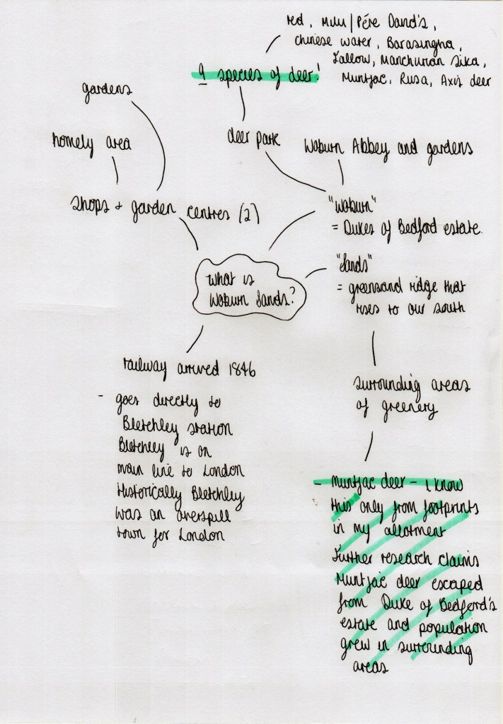
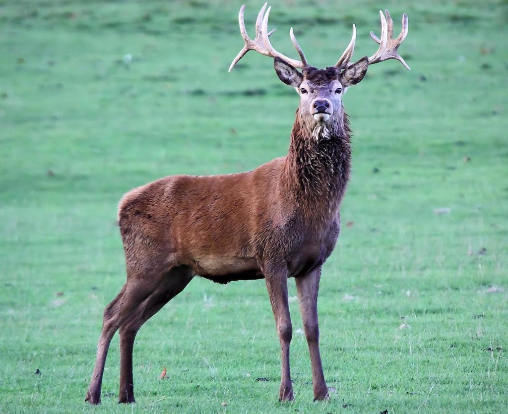
My photograph of red deer in Woburn estate deer park 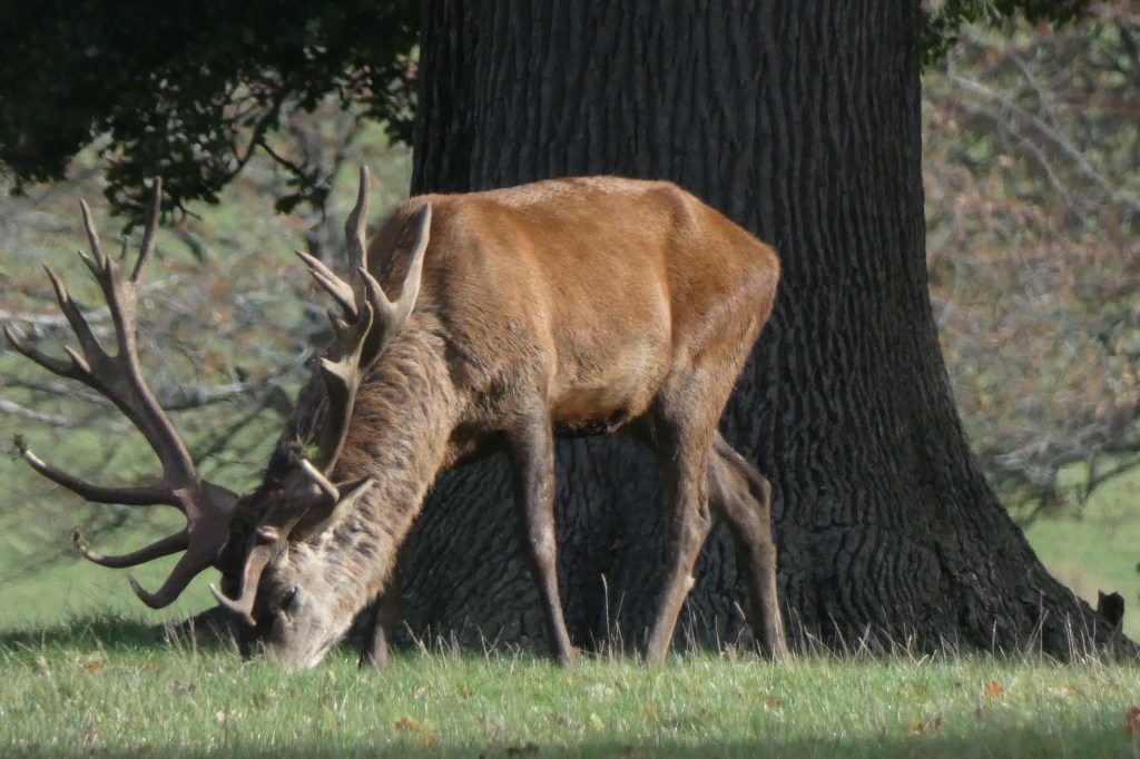
My photograph of red deer in Woburn estate deer park

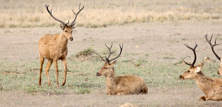
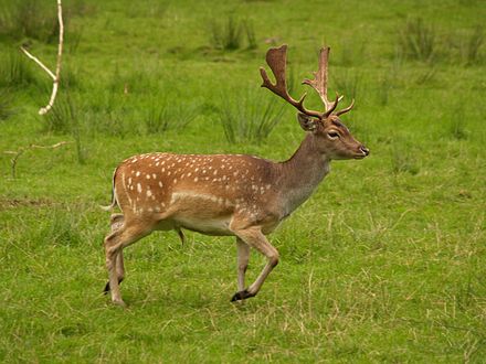
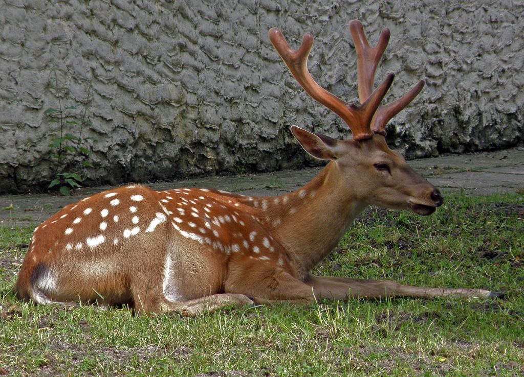
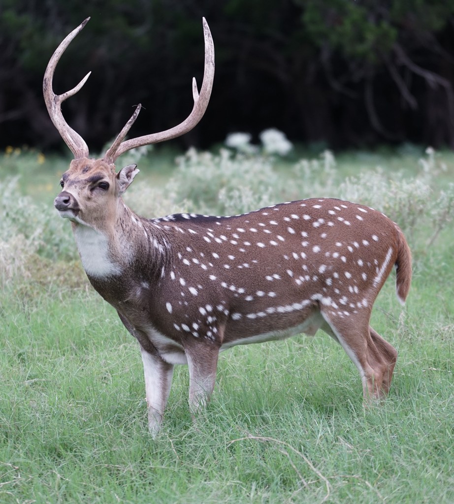
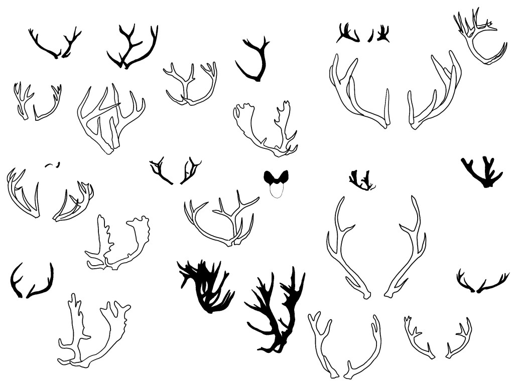
From looking at each type of deer species above, I have wrongly mistaken the spotted deer for fallow on multiple occasions as I wasn’t aware there were nine species of deer… Each species of these deer have different shaped antlers, which could make for some interesting shaped typography. I want to now experiment with the different styles of antlers and see what I can design/illustrate.
Placing photographs into a procreate spread that are a mixture of Google images and my own photography of species in Woburn, I set the transparency to light and coloured in the antlers only:
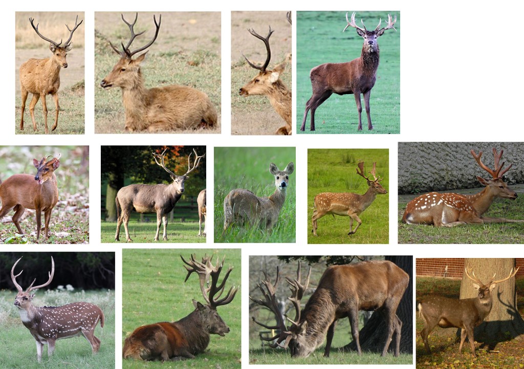
Bottom right three images are mine 
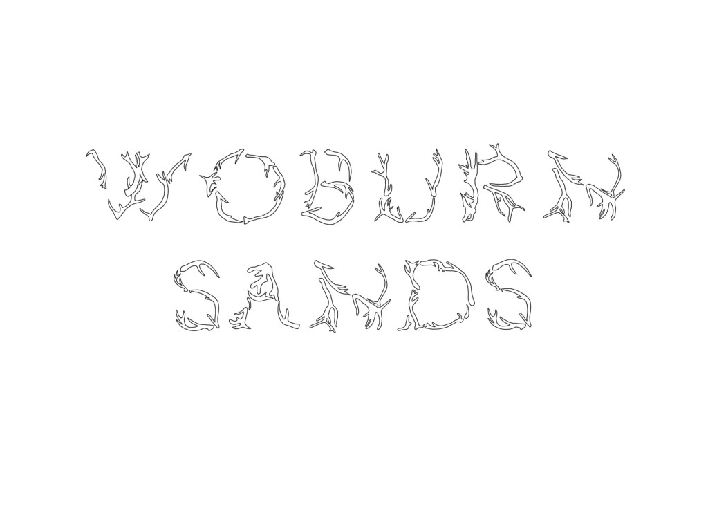
Tracing the antlers 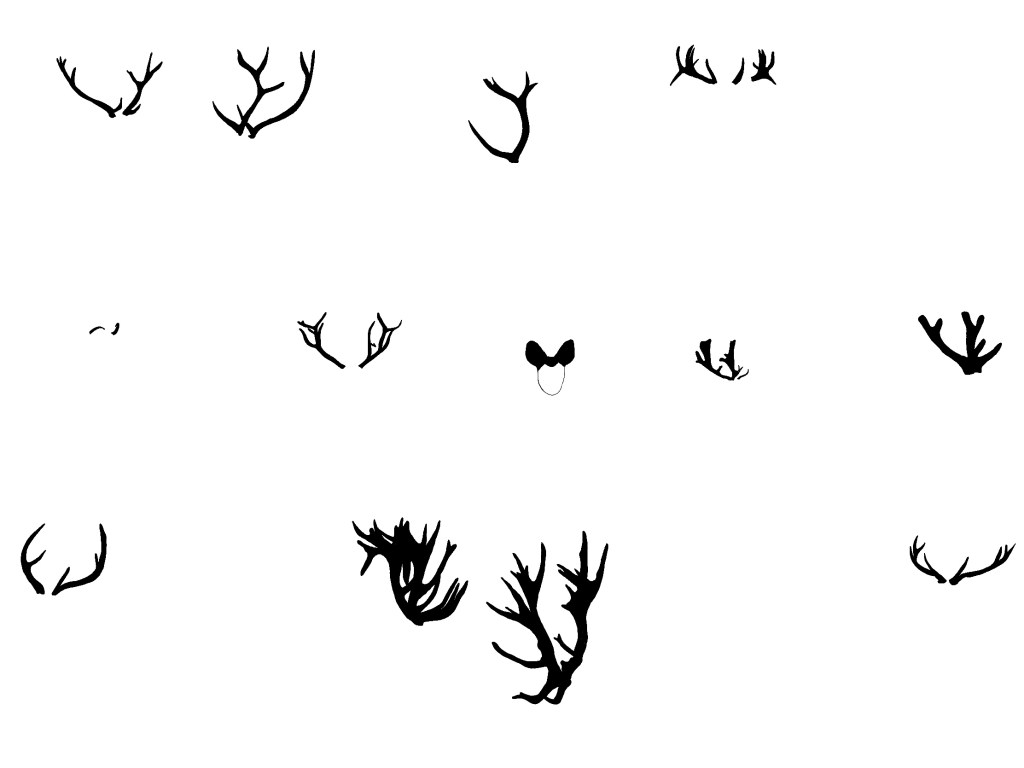
Left with the outlines; it’s amazing how different they all look!
Transferring from digital to hand illustration
I wanted to illustrate the words of my town by hand as I felt it was appropriate for the area. There are quite a few hand lettered (old victorian) signs here as I took photos of them last week (week 1) and it made me inspired to hand draw typography using a pre-typed transparent underlay and tracing paper:
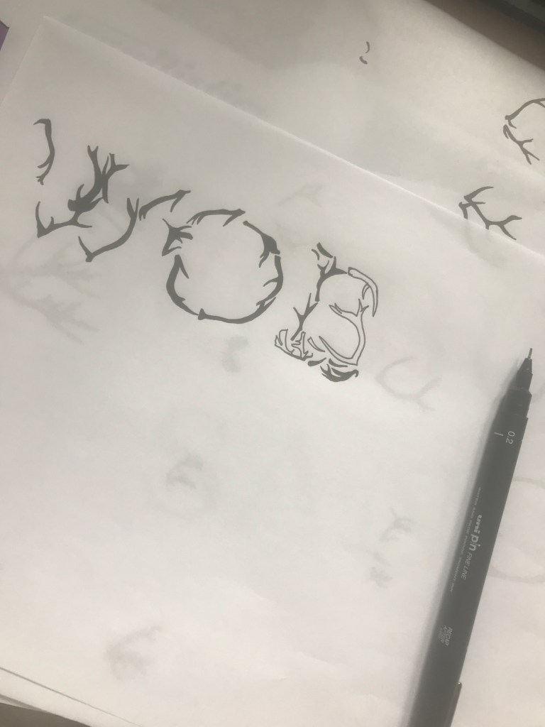

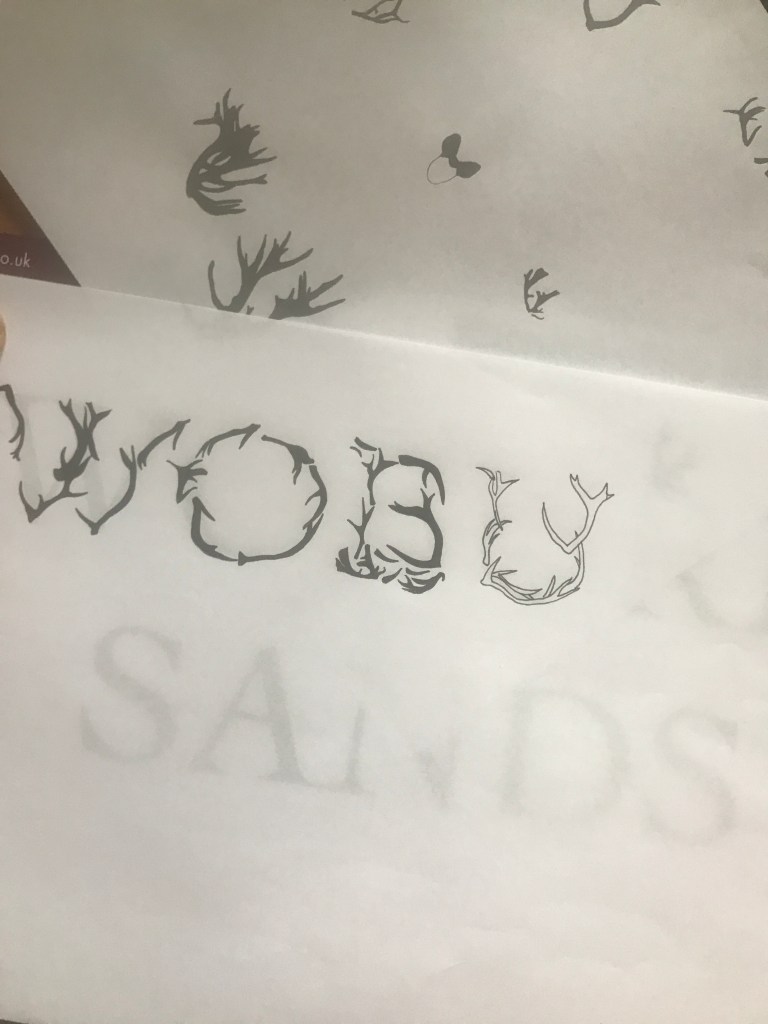
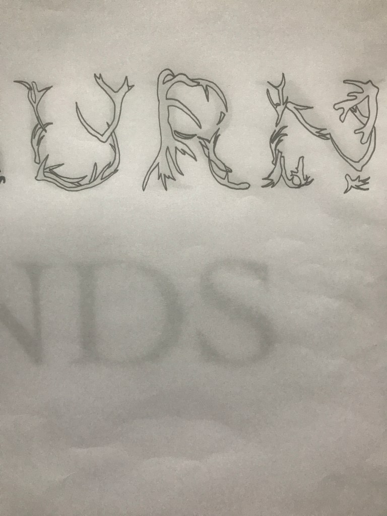

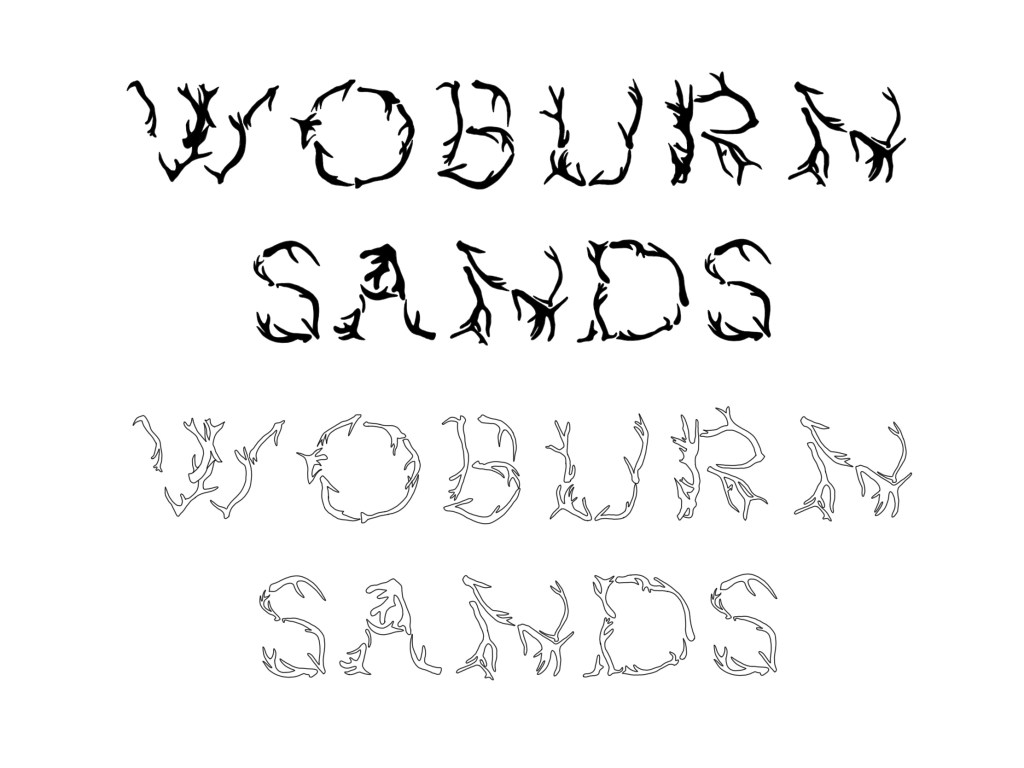
Progress
I knew I could digitally duplicate the ‘N’ and ‘S’ as these letters have already been drawn. 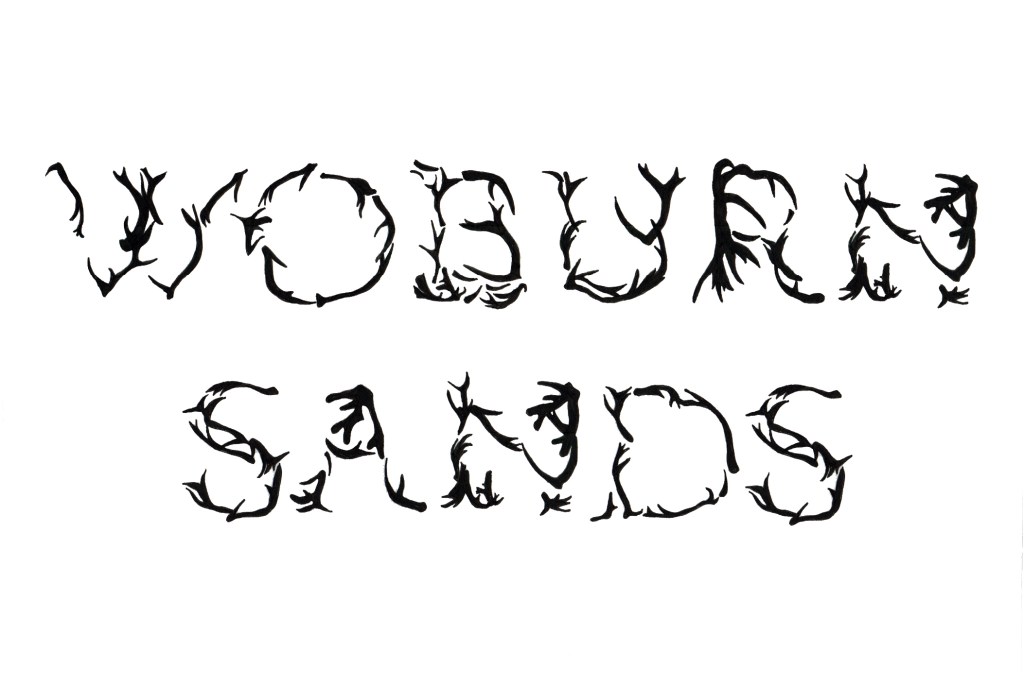

Analysis
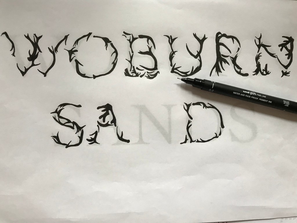
I think this outcome is a great representative of deer antlers due to the unique shapes and sizes of the letters. At the moment, the design actually resembles more of a ‘tattoo’ style lettering rather than nature – natural antlers are irregular in formation and size, and by making these letters all of the same size I don’t think it fully presents deers.
Further development
I am hugely inspired by Elliman’s Found Font and I want to recreate my antler lettering to be misshapen and of varying sizes. I think this would make for a much more accurate outcome, as antlers do come in all shapes and sizes – particularly in my area as there are so many species of deer.
Selecting many google images photographs of all of the species of deer I know that are local to me, I have drawn the antlers only to take influence from Elliman’s work:
Arranging them in varying sizes and textures could be interesting, so I’m going to experiment with creating the irregular shaped typeface:

Letters look too uniform here, although they are more natural 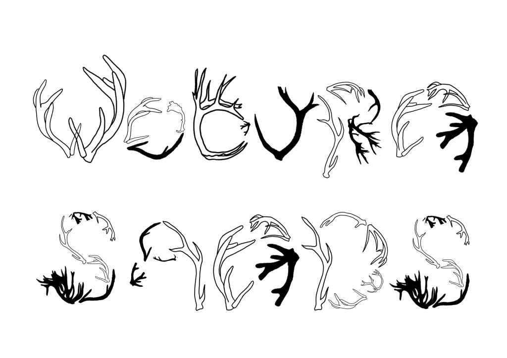
Making it more irregular by extending arms and legs
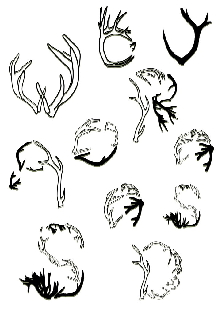
Arranging like Elliman’s Font Foundry poster

Summary
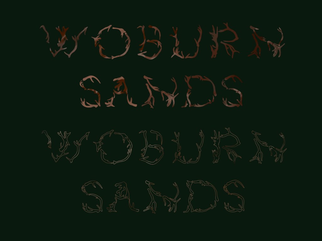
When presented in a booklet form, I am really glad I kept the typeface as black and white as it looks contemporary – fresh and modern. Woburn is timeless, it’s a popular village ever since its been built and wealth is a result of tourism. The varying thickness of lines from the antlers contrast really nicely with the white background, which I saw started to get lost in previous experiments with colour (earthy tones to reflect the wilderness).
To improve this, I would consider creating the whole alphabet in this style and writing it up in editorial format such as using my typeface for headings. I am glad I pushed the design and tried to make it more abstract with each experiment – it looks more natural this way and form is communicating the message.

_(cropped).jpg)