
Further research
David Rudnick
This is not in the resource material this week but I have found it so interesting I wanted to include! See notes below:
• New order album artwork changed his life as a child; read the cover endlessly. I did exactly the same thing as a child and I very much relate to this!
• Art history – how art was banned in places of religion i.e. churches but it didn’t work in 16th century
• Design has changed. Bigger platforms and bigger understanding of how we even view reality
• Two generations experiencing design; the ones who grew up with print, and others grew up with digital
• Designers are partially responsible for social and political work that goes out in the world
• Fresh design being associated as being lied to
• Design is an environment for its audience
• Design people we work with are clients; design people we work for are the audience
• Design is a conscious intervention into the narrative of our audience; we are becoming a moment in their history of something they remember
• Design does not have to be appealing to the wealthy and only exist in luxurious environments; David compares this with how a CD he was bought as a child had changed his life and he knew he wanted to be a designer. There are better outputs to reach the public as designers
• Design should work with the viewer and be completely free as a medium to allow the viewer to go wherever they please. This is probably why gaming thrives as the player can play however they wish, unlike a book which you need to read from cover to cover. Is a new generation emerging where we are no longer wanting to be patient? Just so say in regards to this comment as well how I absolutely agree with David; the new generation (myself included although on the older spectrum) are becoming impatient and want things done our own way. If it’s possible why wouldn’t we want this after all? This is a huge point to consider in the design world; people want information and they want it now! It isn’t a case of ‘need’ any more as waiting just doesn’t seem like an option; technology and rapid communication has removed this from our way of living. We are demanding. Our audience and clients are demanding. This could be a really fascinating project for me to further explore in future (making mental note!)
• As designers we need to focus on the audience not the client. I have quoted this below as it actually really got my brain ticking and I found it really inspiring:
“What does it mean to live in a universe of alter reality, if we move from modernity to this new paradigm – how do we consider our audience? As designers, if my plea to you as designers is to consider the audience and not the client, it is the following (and I’m not saying this is a good thing or necessarily a bad thing) crisis of graphic design which we will have to address. That is the notion that when this is your world, you move from a reality where under modernity the viewer is an observer of reality to the new paradigm, where you are the protagonist of reality. You are the camera that can move in any direction. You are the one who speeds up or slows down time you select the content you want to see. You scatter the architecture of the world if it’s no longer relevant to you, that’s how we’ll use the Internet but that’s also how increasingly we’re viewing on normative modes of reality as well. So as designers we need to work together to find solutions to how we build off studios that can operate in this paradigm, but also towards one that still privileges an audience who view themselves as protagonists. With wonders worth seeing and dreams worth aspiring, to not give up to the notion that this is now a world in which graphic design has been written out of the picture” – David Rudnick
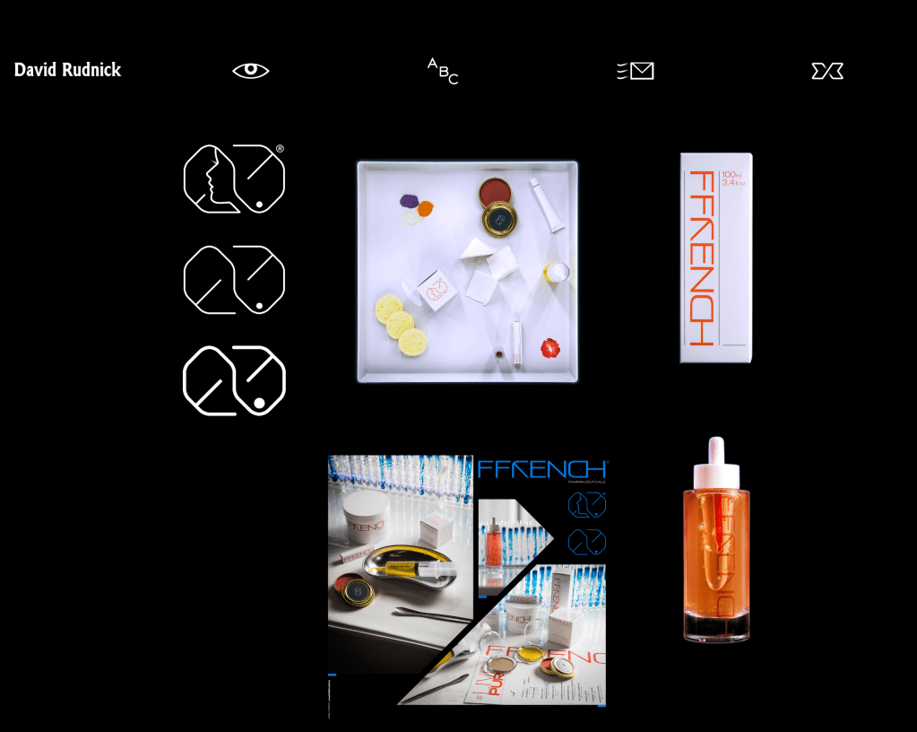


Ffrench Pharma client
Unity Terminal typefaces
Twitter rebrand
Creative Review’s article caught my attention relating to social media and how Twitter has been rebranded with consideration to its reputation, particularly in the last year with contraversial topics:
“Twitter has had its fair share of ups and down since its inception in 2006. In the past year alone, it was accused of contributing to the spread of pandemic-related misinformation, became the focal point of high profile cancellations including JK Rowling and, most recently, permanently suspended Donald Trump’s account for inciting violence following the storming of the US Capitol.”
Creative Review

Paul Elliman
Found fonts

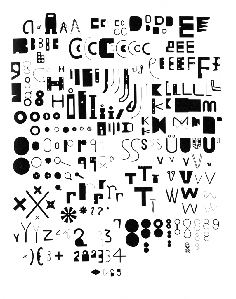
Elliman’s lettering above is wonderful – it instantly reminds me of watch parts that have tiny fragments, right through to large cogs that sit in the watch face. I did a project many years ago in college, with tiny watch pieces in a black room, and placing them in shapes of beetles on to the photo paper and exposing them for varying amounts of time to create high or low contrasting exposed photographs. I spent hours doing it and thoroughly enjoyed it. This is exactly what this project reminds me of.
“Found Font began as a collection of found human made items that were often thrown away, broken or worn out, which he started collecting while he was travelling in 1989. By using human made items to form a typeface, it shows the connection between construction of the environment and construction of language. There was a criteria to the size of the found items: each piece must be small enough to fit in the mouth, or to be passed from hand to hand like money. This made sure all of the shapes were nicely sized.” – Source
