Reference Material
Dan Rhatigan on Ryman Eco
I explored this typeface in a previous module final PDF because I’m highly interested in sustainability, so I’m really pleased this is a reference source this week! The Ryman Eco lines in the lettering include space so that there is less ink printed – 33% less ink than standard fonts. What I love most about this is that it becomes a decorative typeface when large, which is lovely for headers and page spreads, but then when it’s small you hardly notice the white space in the letters therefore it’s still readable.

My research below actually confirms sans-serif’s use less ink and now I have come back and questioned this design above for Ryman Eco…
It isn’t just what you write that can make a difference, it’s how you write it. Ryman Eco uses 1/3 less standard container of standard fonts which could help lower co2 emissions by over 6.5 million tonnes every single year, the equivalent of 15 million gallons of oil.
Ryman Eco
Even though I mentioned I loved this font through previous module research; I’m beginning to look at it in a different light. What is interesting is how this typeface was claimed to be the most ‘beautiful sustainable typeface in the world’ – yet highly critiqued. I decided to look at why people/designers think this is a bad typeface. Apparently ink isn’t as bad a contributor to the environment as Ryman make out to be (creating about 15 percent carbon footprint per printed page; the problem seems to be paper use not ink. Although making a smaller typeface would help that… But maybe people just need to print in smaller writing?!) – not mentioning the fact Ryman stationery created this font – they are an office supply store. Is this a very clever marketing ploy to get people to purchase paper and ink from them thinking they are sustainable?
Sustainable typefaces
On further research, I decided I wanted to look at what is the best eco friendly font out there that is being used; is it Helvetica, Arial, or Garamond for instance? I found a really interesting article which goes into some detail about which typefaces are better for the environment. I am learning how much impact a typeface has in the design world, and how it’s probably accountable for much more printing than many realise.
Considerations for eco friendly typefaces that use less ink:
• Kerning needs to be small
• Weight needs to be thin/lightweight
• Sans-serif uses less ink – actually this makes me question Ryman Eco! That’s Serif. Why?
• Size needs to be considered in terms of how much paper is used for printing
Century Gothic is often cited as one of the most efficient regular fonts; because of its thin print lines it uses 30% less ink on average than Arial. However, Century Gothic is a large, broad and wide set font so whilst it uses less ink, it uses more paper when comparing fonts like-for-like at the same point size. Using a smaller point size can reduce this negative impact; Century Gothic can accommodate this without losing legibility because of its wide-set nature.
Leap studio
The quote above explains whilst a typeface may have a thinner weight, it’s wide on a page and therefore uses more paper. I guess the challenge for a sustainable typeface it to consider the carbon footprint of the printed material; not just the ink. A typeface that uses more pages uses more paper, therefore more space, more fuel for transporting and energy, power, time etc. It has a really big impact.

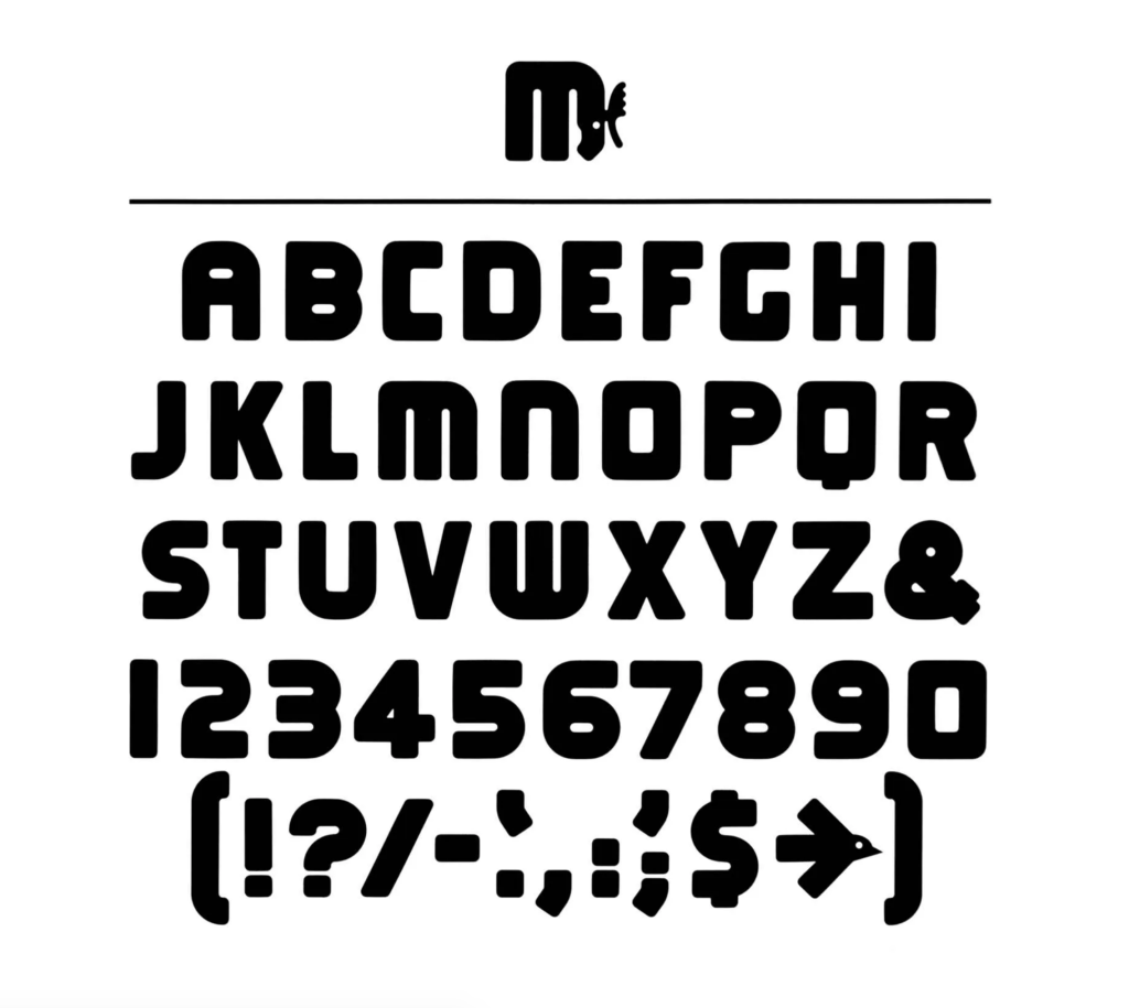
Lance Wyman
I talked about Mexico 68 in the lecture on previous page, so I want to look at Minnesota Zoo
The numbers are shaped in the animal of the relevant trails i.e. the ocean trail is one (dolphin), tropical trail (toucan); Minnesota trail (beaver); discovery trail (monkey) and northern trail (camel). I love the clever arrows in the way-finding design too; how the arrow below looks like a bird in flight.
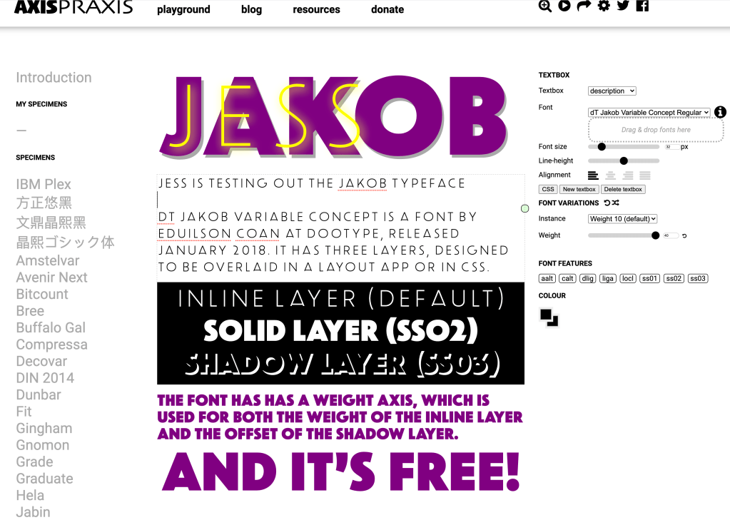
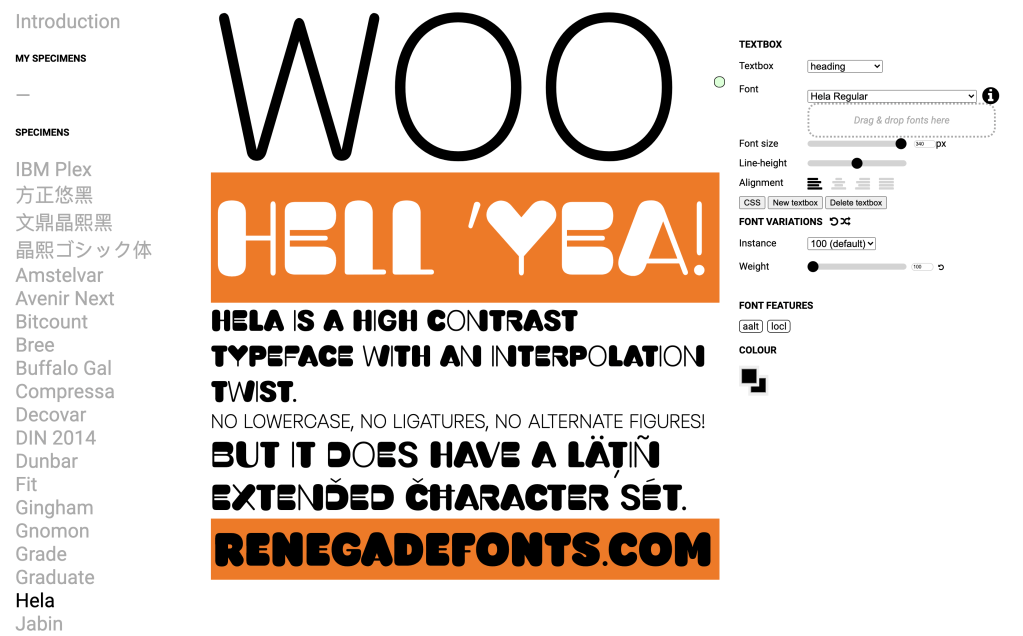
Dan Rhatigan Variable Fonts: Progress Report
• Collaborative nature is modern way of working especially in creative working
• Production tools available can aid development
• Axis-Praxic variable fonts tool
The CR podcast
• How social media is influencing tourism so much that people who live in tourist countries don’t want to be associated with the tourist attractions
• Cities have style but will evolve with time
• Local communities can feel shut out from large organisations and businesses who want to do their own thing
• Design is bringing cities together; London and Manchester are great examples of this
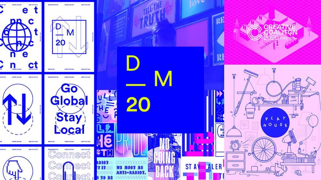
Design Manchester ’20