
Reference Material
Design genius; the ways and workings of creative thinkers
The six D’s:
• Define
• Discover
• Develop
• Design
• Deliver
• Debrief
The below five W’s is the one I currently use in my design practice but I have started using the six D’s rule above; but using both just makes sure I tick all the boxes.
The five W’s:
• Who
• What
• Where
• Why
• When (and how)
KISS (keep it simple stupid):
• Parsimony rule / Occam’s razor (the idea that the simplest idea is often the best)
TIMTOWTDI (there is more than one way to do it):
• Several solutions to any given problem

1 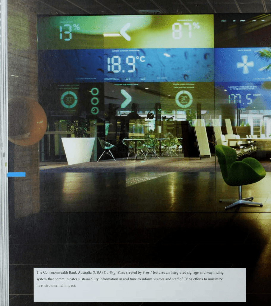
2 
3 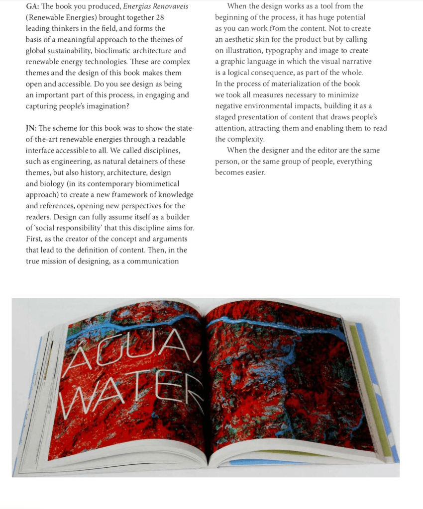
4
This text above was a great read this week and I feel as though it ties with my project perfectly. The first snapshot captures the message in a nutshell for me in regards to my campaign about raising awareness around smartphone materials. Sustainability in graphic design practice is not something that is considered occasionally, it is integrated into it. It really is so important for designers to send that message and raise awareness from consideration of materials and tools used in the process of design.
I have screenshot the photos of sustainable projects above; the first because it’s using data to highlight the importance of the planet Earth and how to protect it, and the second because there is an element of geology on the background of the page (I think it’s rock and rivers from aerial view? At least that’s what it looks like, but it just could be a close-up photo of a mineral). It appealed to me as in week 1’s design brief I used mineral as my project brief background, so thought it was an inspiring piece to look at with this week’s development. I have decided to explore textures through minerals in one of my mood boards as I think they will be really fundamental in this awareness campaign project. Something I need to consider too is how I will present a sustainable message whilst using editorial formats; recycling will be a huge factor as recycling is what I am encouraging teenagers to do with their smartphones instead of landfill.
Graphic Design: Now in Production
• Pecha Kucha slides – 20 slides, 20 seconds
• Andrew Blauvelt, Whole Earth Catalogue
• Ellen Lupton, the evolution of design in the last few decades
• Ian Albinson, script lettering has stayed in famous logos (coca cola)
• Jeremy Leslie, print isn’t dead
• Armin Vit, film title sequences!! Love this one. The combination of them all is incredible to see, so many styles and variations of visual expression through image and typography.
• Karen Fogg; film title design and film-making. Looking at conspiracy, newspapers and media to create tension and fear in film. The final video is really effective with the black and white image behind bright yellow hand drawn lines and text, well contrasting and instantly sets the scene for the film
• How data and numeric values are more effective when relative to the real world (powers of ten):
• Editorial design and social media; branding has become about reputation management
• How mistake photography taken with a thumb over the lens is actually pretty tones of skin photography, but everyone regards them as a mistake so delete … why not keep?
