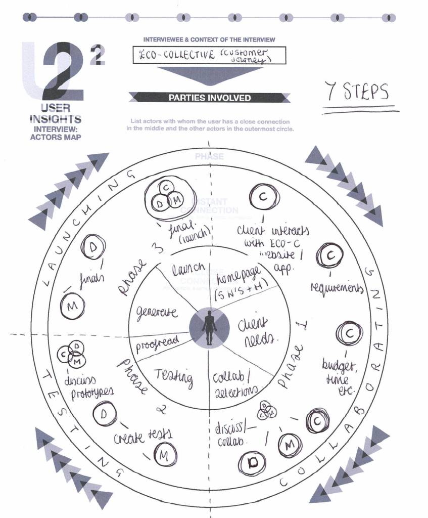
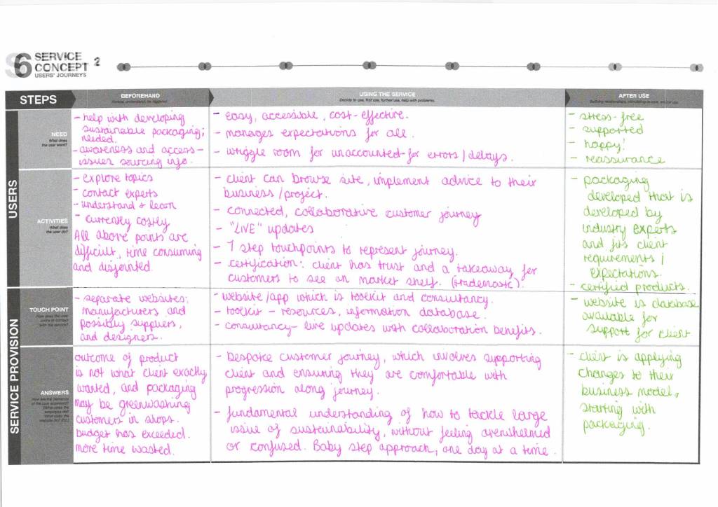
Service design
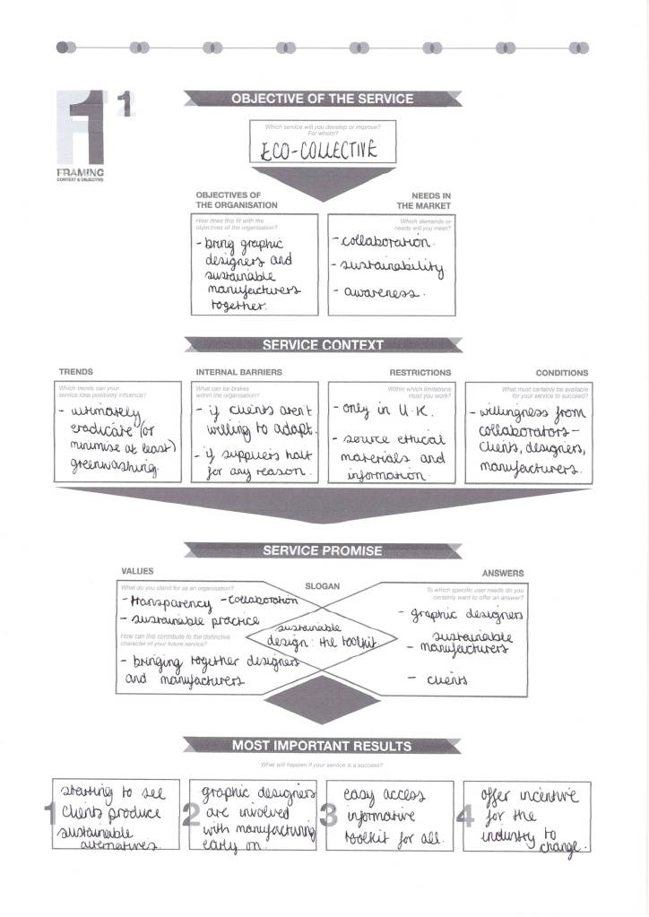
Examples of service design maps from a pack I was given by a tutor in a previous course module – I have selected five that could be relevant for my research:


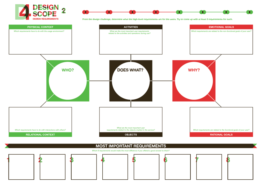
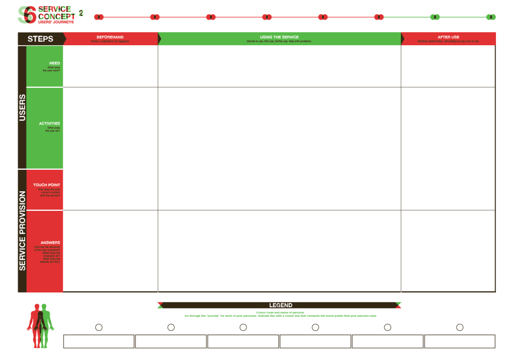
Narrowed down to 3 most important/relevant for my project:
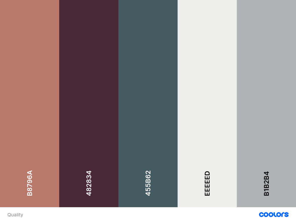
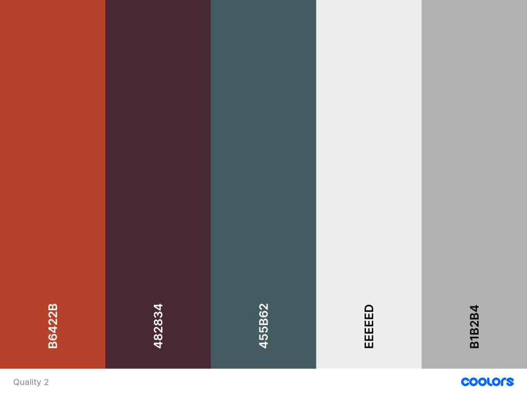
Colour palette research
13:28 – orange: vibrant, energetic, friendly and inviting, creativity and optimism, calls for attention “a great colour for call to actions without being overpowering”
16:33 – green: nature, health, new beginnings, stability, wealth “light green is associated with youth, while darker green means stability. As with orange, it is colour of call to action, related to success messages”
17:36 – turquoise: balance and stability, calming, builds confidence “darker tonality would be trustworthy and reliable”
21:07 – purple: quality, creativity and imagination “darker tonality traditionally associated with wealth and luxury”
25:35 – grey: neutral and cool, conservative and good for backgrounds/typography “silver can be sophisticated”
Colour theory
“Some common UI design color conventions include:
- Using a dark color for text to ensure legibility
- Keeping light colors for backgrounds
- Using contrasting colors for accents (as mentioned above)
- Sticking to classic call-to-action colors—such as red for a warning sign”
Generating colours:

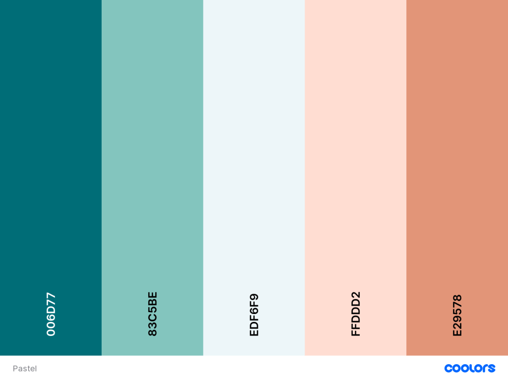
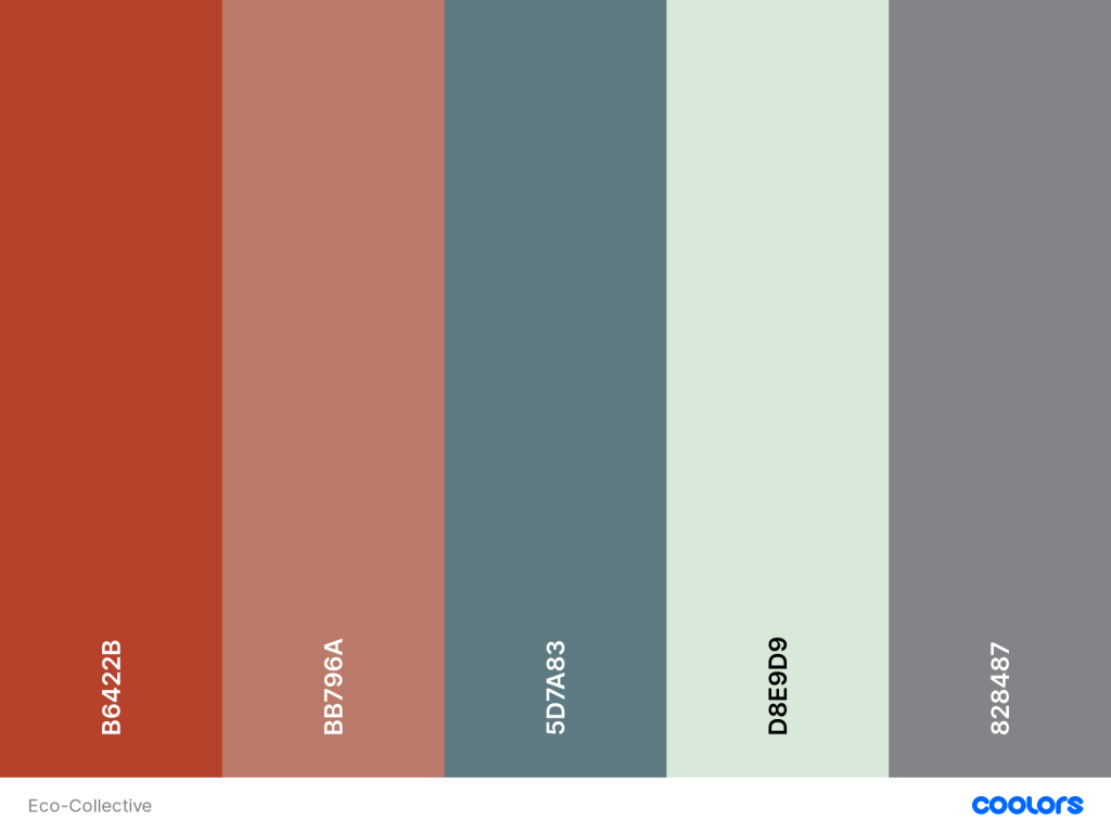
Final colours: