My images (restricted due to lockdown!):


1 
2 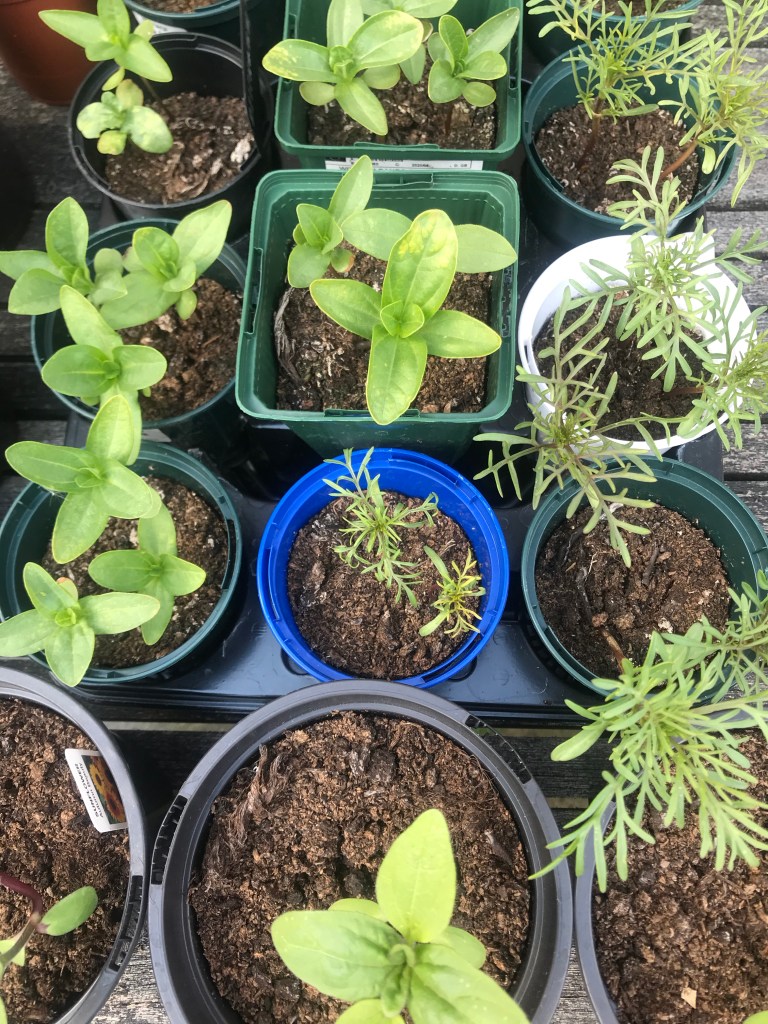
3
1 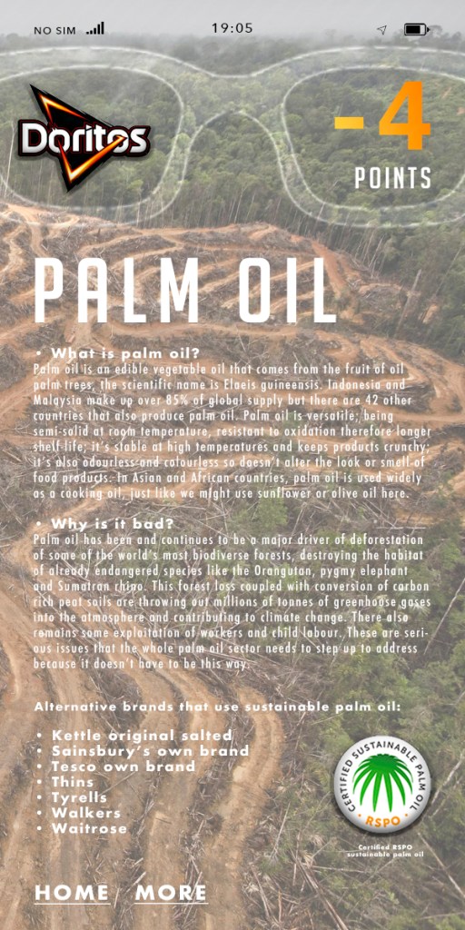
2 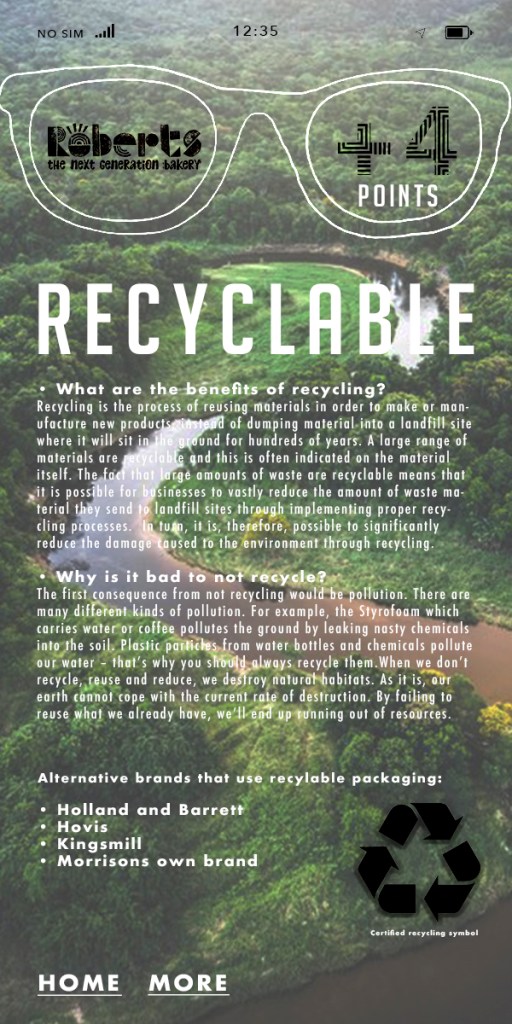
In these images:
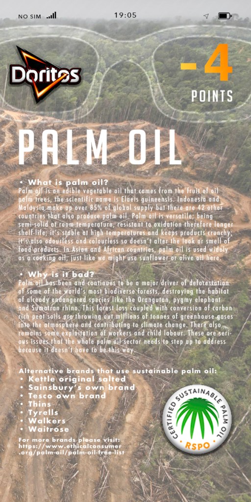
1. I originally placed the rainforest destruction as the background as that is the impact of products using palm oil. However, it was at this point I realised I wanted to keep a little bit of a brighter outlook on this app and educate people instead of bringing them down. I then found a beautiful Indonesian rainforest photograph that would present the wonder of nature and how we must preserve it.
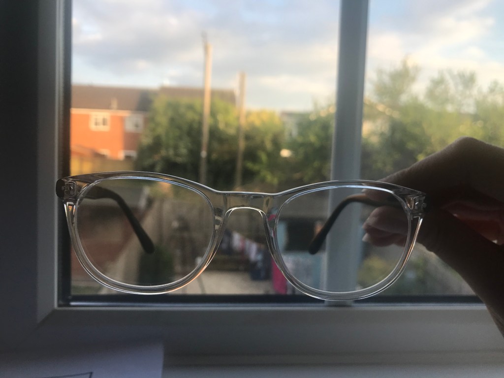
2. I minimised the sustainable logo in the second image, as I wanted to create the ‘home’ and ‘more’ links. If I was using the app, I would want to have the option to further explore that topic; for example other brands that support that sustainable practice, or even more information about the topic.
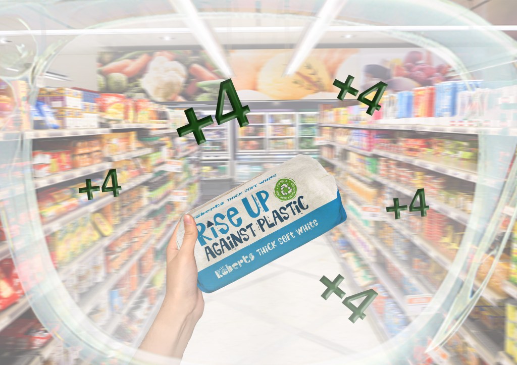
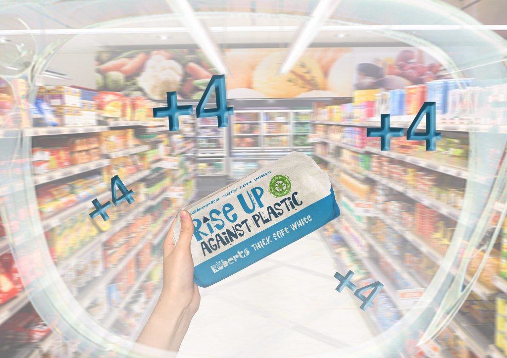
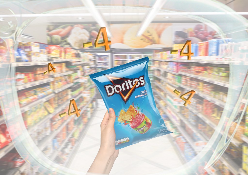
3. Inspired by the ‘Roberts’ logo, I applied an overlay of the striped texture on the ‘+4’ points. The result clashed too much with the background therefore I didn’t use the patterned numbers.
4. I used a blue plant pot (behind the text) in my photograph and felt it clashed too much with the overall background colour. I swapped this to a photo where I did not have a blue plant pot in it.
1 
2 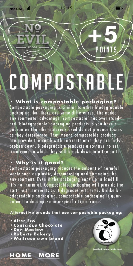
3
Images:
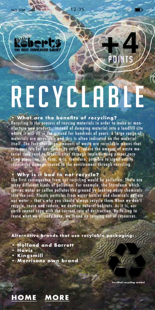
1. Recycling means less plastic and waste ends up in the ocean and can be reused. I used a WWF turtle ocean photograph to represent a cleaner place for animals the ocean.
2. In Indonesia, palm oil is one of the biggest suppliers. I have used a picture from Google images of Indonesia Rainforest to showcase the natural beauty of the rainforest, and how it needs to be preserved. (Not destroyed to make room for palm oil plantations).
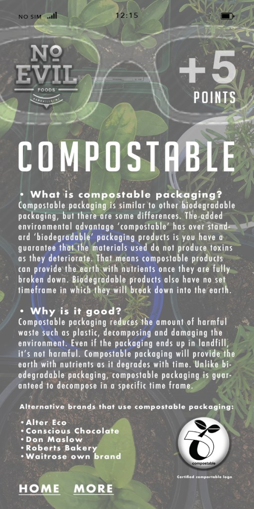
3. Compost – self explanatory here! Compostable is all about enriching the soil with nutrients from the waste, therefore not being harmful. I have used my own photograph of compost/seedlings as the background.
room for improvement?
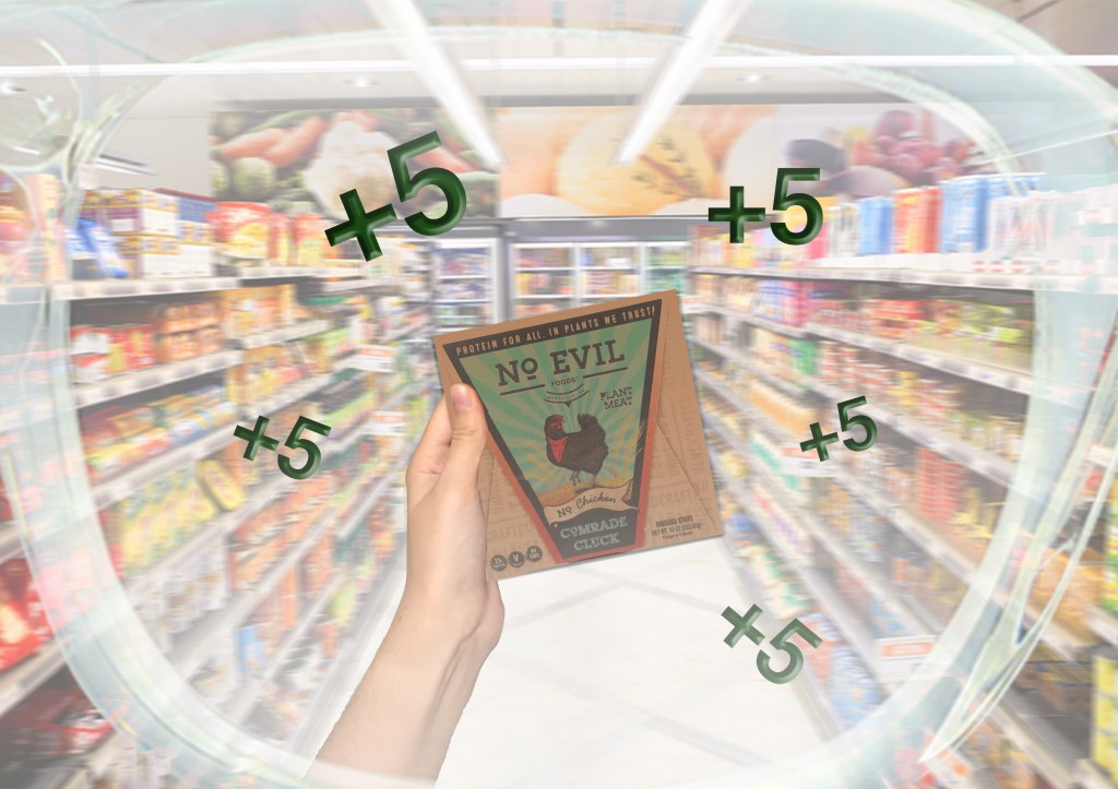
I decided that having the numbers coming from the product in different colours would be too distracting and would not emphasise that the numbers were positive or negative (the good brands vs. the bad). Therefore I’ve made them more legible by using only green for the positive points, and red for the negative points: