Workshop challenge
How do you build, promote and tell the story of your new product?
What is the name of my product and slogan?
The name of my product should represent or at the very least, suggest that the app is playful whilst bringing together a community of people.
• SUBscribe
• Sub-culture
• SUBtle
• SUBtype
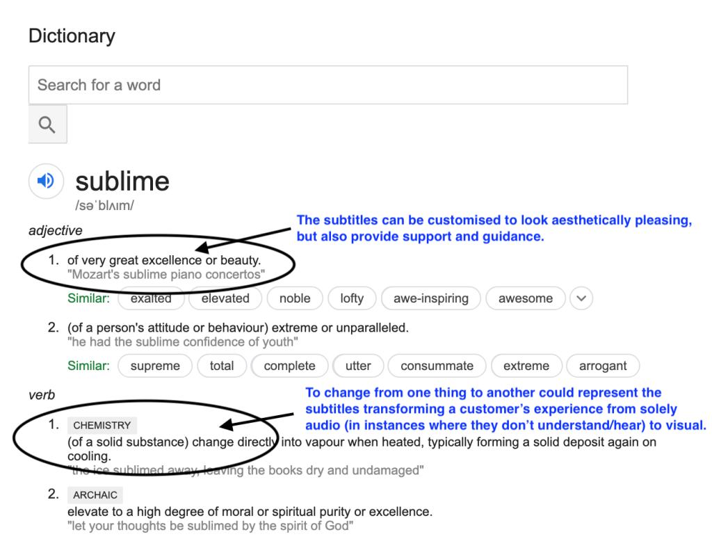
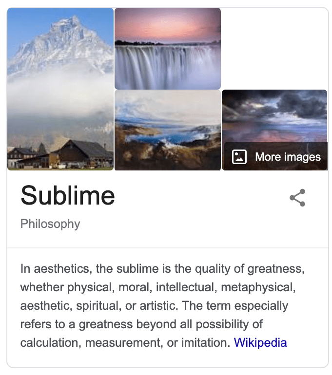
• SUBlime – I’m going to pick this one. I think ‘lime’ has playful connotations with it being a fruit, but mostly because the word sublime also relates to chemistry when changing the form of another:
What can I look at (research)?
• Karaoke videos
• Music lyric videos
• Youtube captions
• Current TV subtitles and how to improve
Existing platforms?
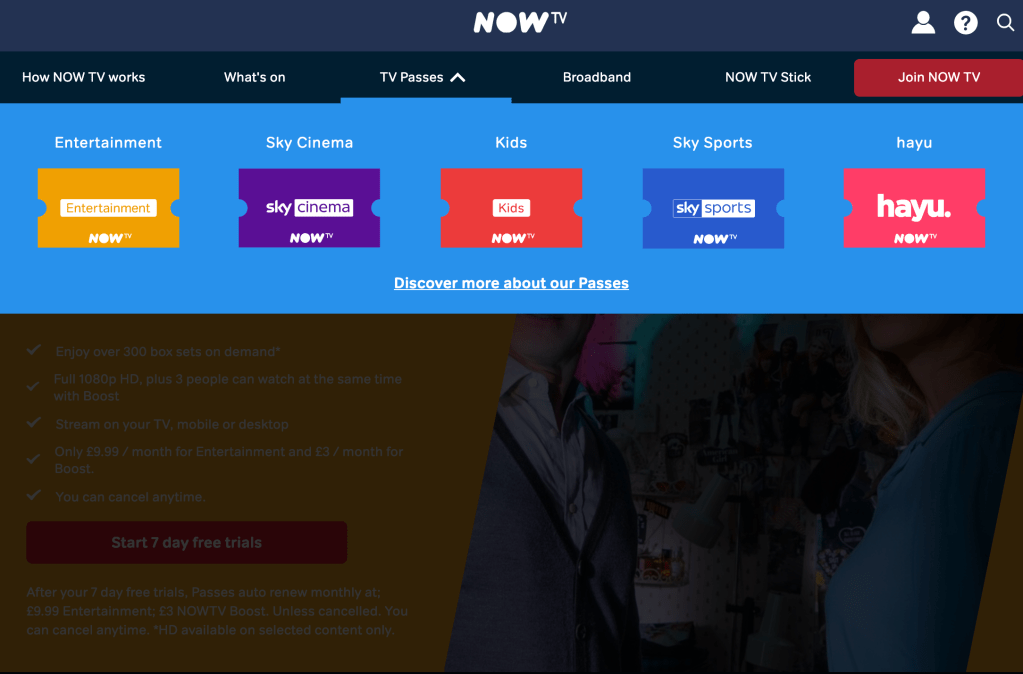
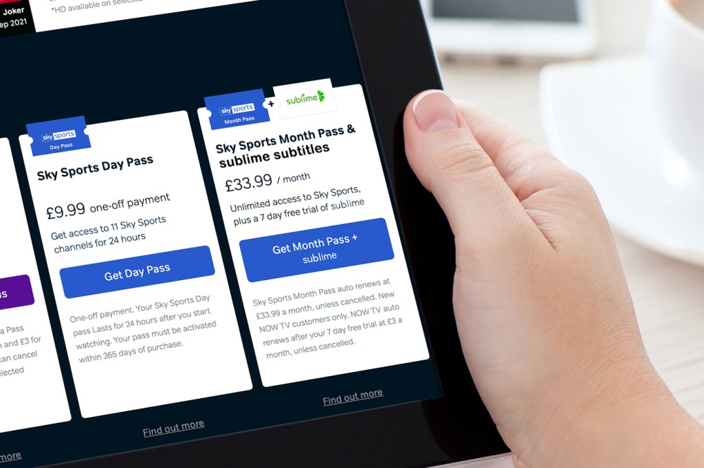
I spoke briefly in week 11 about looking into how I could work collaboratively alongside TV providers, and providing a custom package for each and every customer as a bespoke ‘add-on’ service. I’ve looked at NOW TV as a reference to see how they split their packages to tailor to a wider audience:
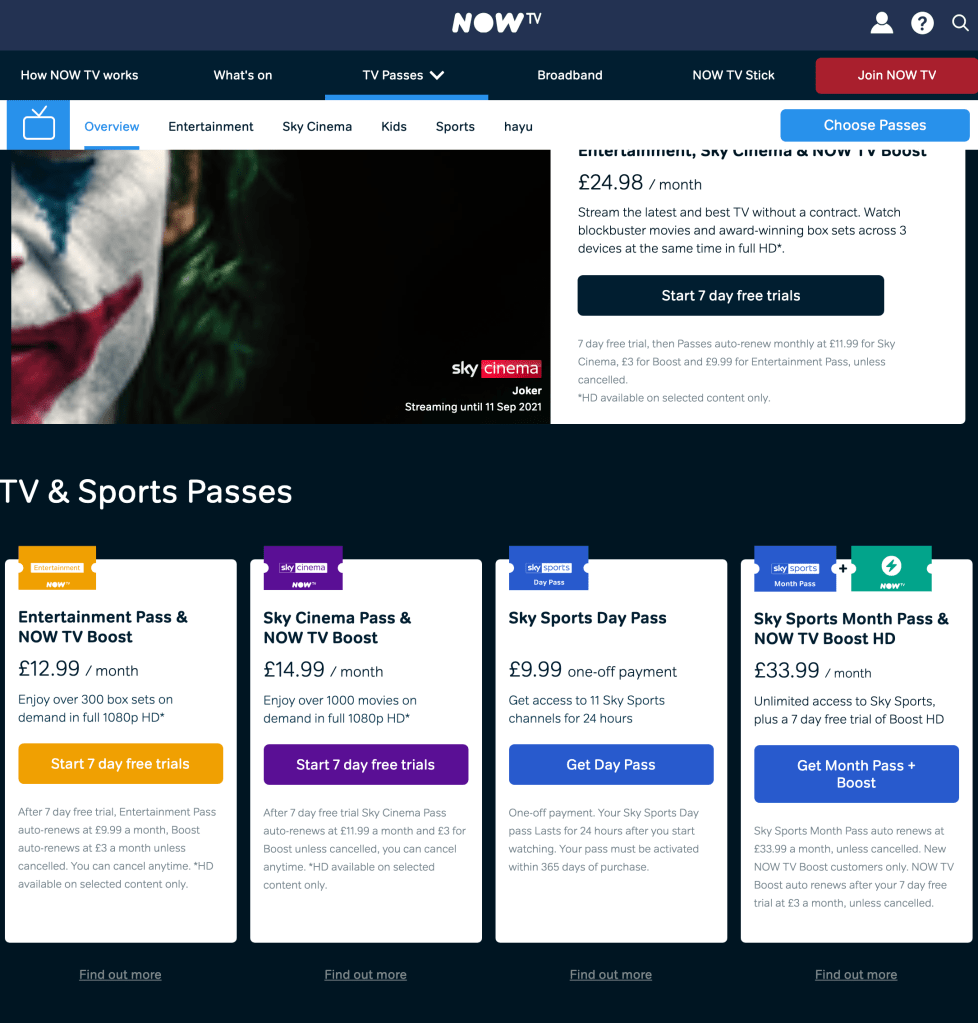
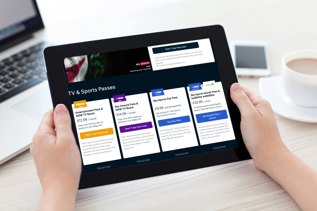
I can see the different price brackets and that’s important. I really like the ‘Sky Sports Month Pass’ and ‘NOW TV Boost HD’ which seems like an add-on – I can picture this being available for sublime – I have edited a mock-up to see what it could look like:
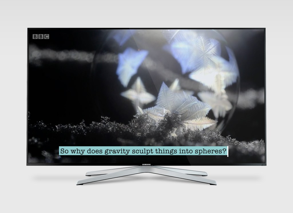
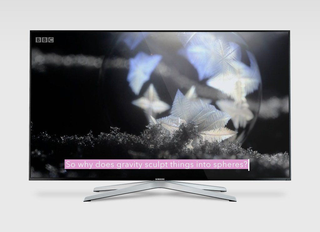
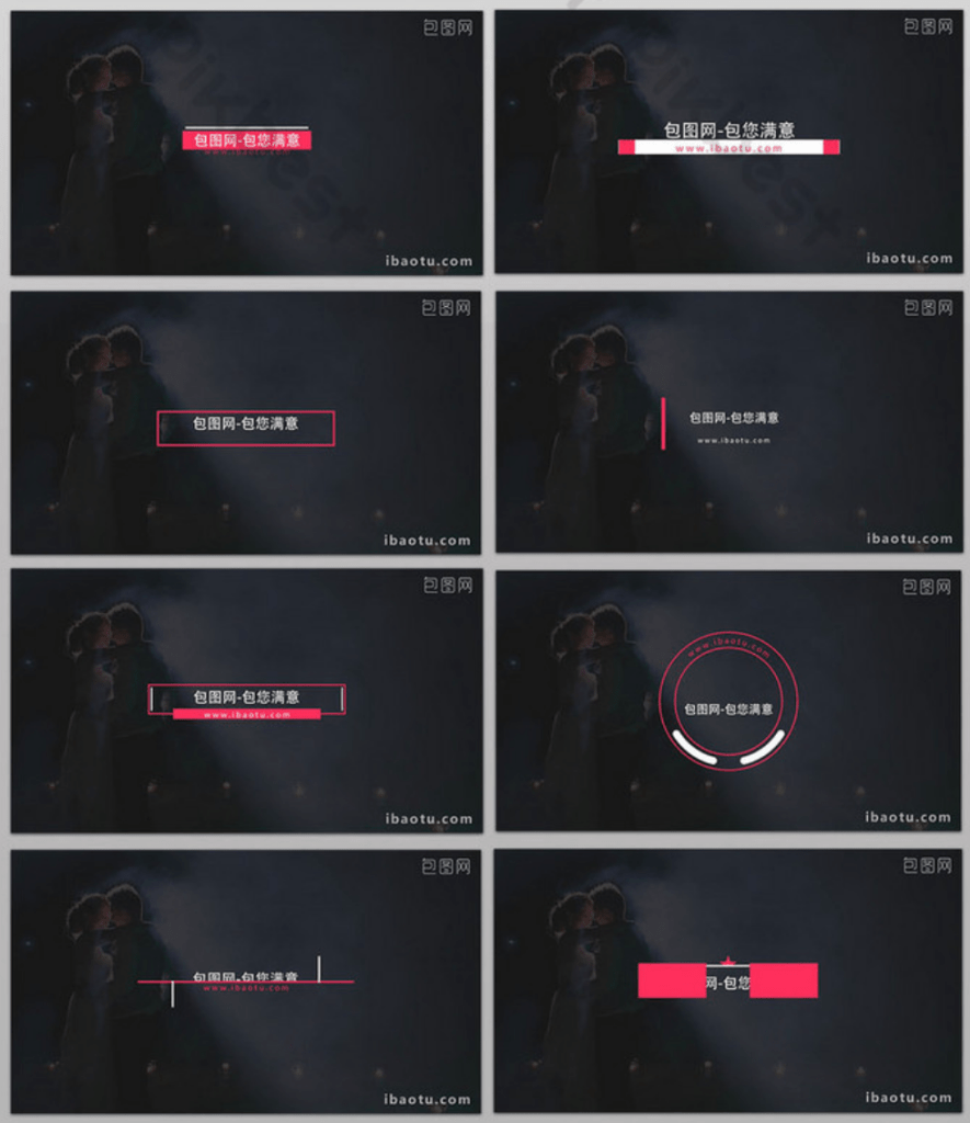
• Type – how does type fit with the audio topic i.e. children’s movie or nature? This is entirely up to the customer to choose from a customisation that would fit the programme/film they are due to watch. There could be children’s options i.e. very colourful or even with cartoons, and there could be options for adults that are much more simplified and generic. It’s important for me to include all of these options so it caters to all of my audience. Colour is also an important factor – ombre, gradients, solid or transparent text, with coloured backgrounds can be optional too.
• Composition – what custom layouts will my audience be able to choose? From looking at the above considerations, I have made some progress with different examples that the customer could choose for their subtitle appearance:
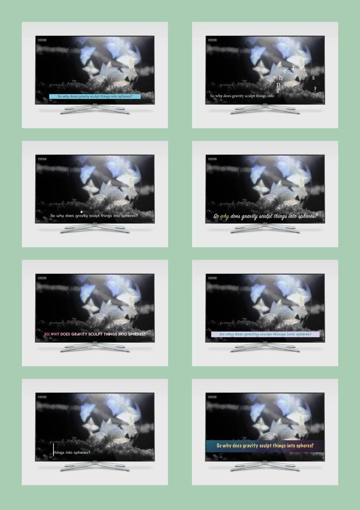
Examples of different style subtitles – I need to develop one, and then provide customisable options for the customer. As it stands with all of these, they vary too much in both appearance.
To develop an example to show in my final prototype, initially I favour the top right. I think making the text so that it moves around the screen could be visually interesting for the viewer. Also exploring how typography could be presented on the screen to relate to the message, and at the same time not clash with the video or audio, could be a great area to develop.
I have made a mockup GIF to show how it would work on a television:

After having made the above GIF, I fear this design would detract from the purpose of the subtitles. The subtitles would become difficult to read and more abstract – it is much easier to see that in this GIF so it has been a worthwhile experiment. Therefore I’m going to look at the other layout, with the text cursor ‘typing’ text out whenever there is audio.

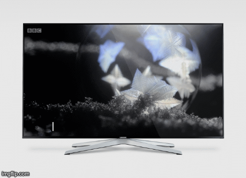

For the final idea, I have tried to demonstrate the text sliding out from the text cursor. It would swipe out in one effect, and be a lot smoother on the TV! I’m picturing the text as sliding out to the left quickly, remaining on the screen for however long the audio lasts, and then swiping back to the right to disappear. The viewer is able to read the text much more efficiently this way.
Something really nice about the above design, is that the cursor shows on the screen even when the subtitles aren’t showing (during silence). I’ve often found that I need to check the settings on the TV to see if the subtitles are switched on for a programme/film, and this cursor will show even if there are no subs, to let the viewer know they are switched on. The cursor is not obstructive and can remain on the screen at all times.