


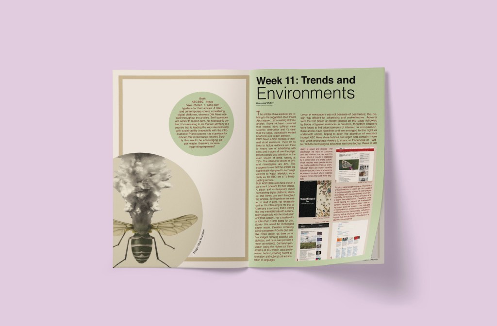
This is where I realised I wanted to explore DW News (Germany) instead of NYT in New York. As I was using my colour scheme based on that; I have changed up the design. (I have explained my choice for switching the third article in my website research previously).
I have incorporated statistics into my design and created frames around images and text to create ‘blocks’ from newspaper influences 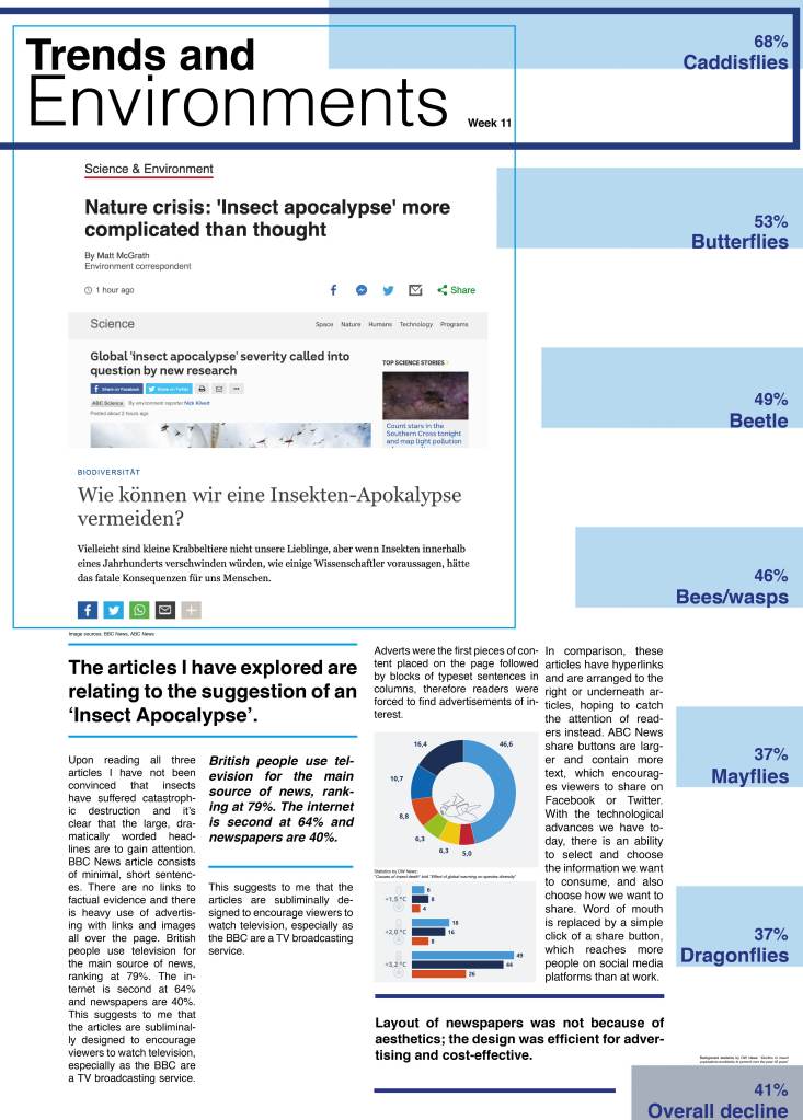
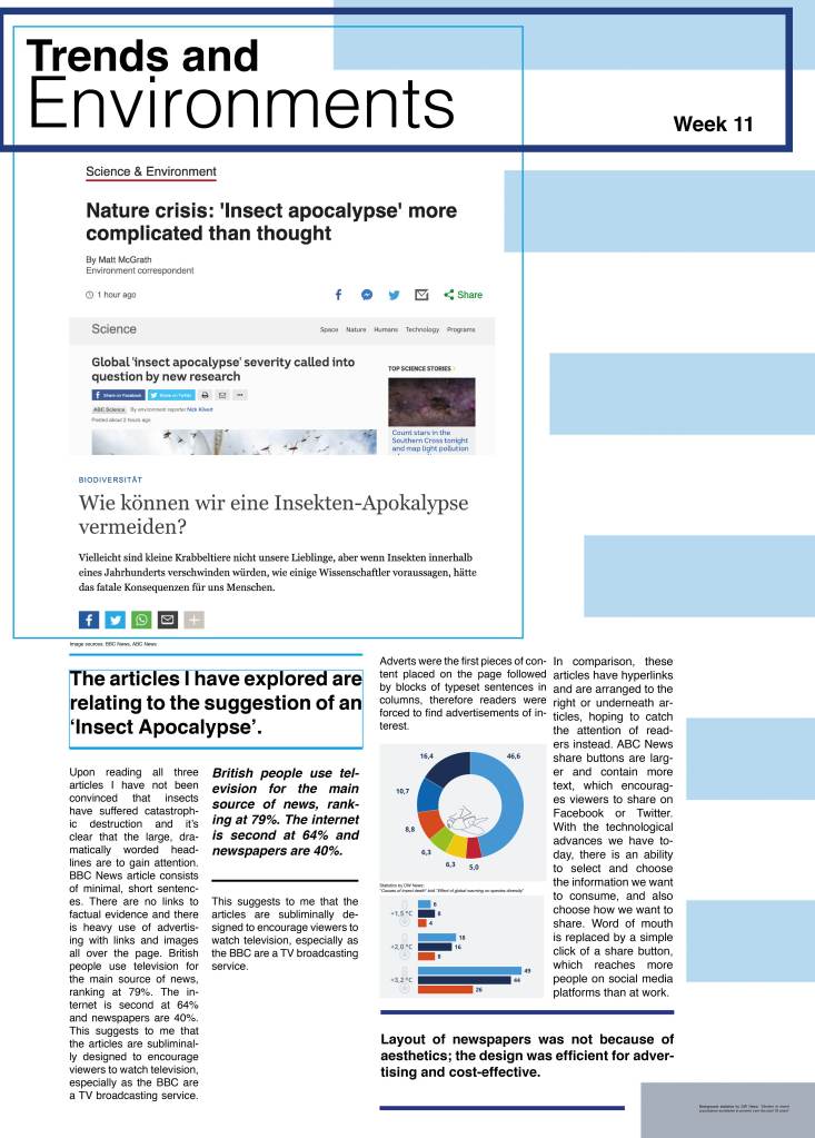
I don’t think it was clear enough what the blue lines meant, so as the original graph was in German I have added the English equivalent % and type of insect 
I really liked the images of insects on the original chart – there is a lot of text based elements on my page so I wanted to use more images – I have placed in the white space to break up sections 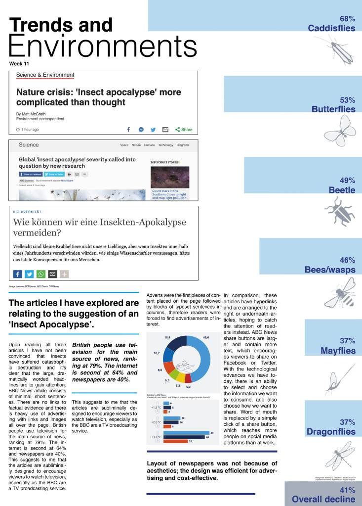
I have also tidied up the framing as that was messy. I have chosen to move my text and article snapshots to the left, allowing the statistics on the right to breathe.
Final design:
Feedback from Sarah in webinar:
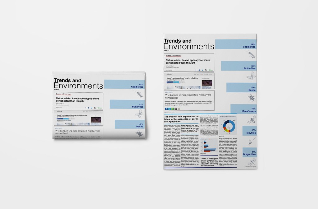
Sarah said to be mindful of the edges which I completely agreed with, and therefore I have created a mock-up of the final outcome with a border:
The border really helps to give the layout to breathe and visually, some white space with the contrasting text and image makes the overall composition much more appropriate visually. I consciously chose to keep the blue border on the right side going right to the edge as I felt that worked. Going forward I will be mindful of working close to the edge of documents as these can get cut off by printers too.
How could I further develop my work?
I would look at simplifying the article – taking away elements that I ultimately don’t need. Do I need the images of insects as well as the text of insects? Probably not. I would look at removing one or the other and see how I could create more breathing space.
I would also consider an outcome where there is an example newspaper of each country I explored – but designed in what a ‘minimal’ version would look like (just like my outcome above). I think that’s an interesting thing to think about, and would display all of the newspaper creating skills I learnt from this week.
