
Case Study 1
Take one story to see how it is reported globally. Collect three versions of the same story from three different countries. How is it reported? Headline? Text? Unpacking meaning and distorting meaning:
INSECT APOCALYPSE
BBC NEWS – LONDON:
(British Broadcasting Corporation)
Visual analysis:
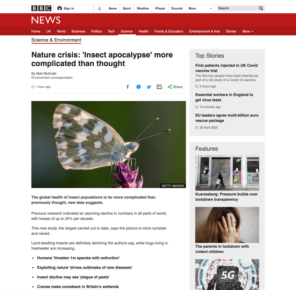
Header is bold, left aligned, eight words, sans-serif, black.
The red banner for the BBC News website is iconic, it’s recognisable on every article. The logo ‘BBC’ is in block typeface whilst “news” is sans-serif capitals on the red. Both provide great contrast.
Subheading of author and job title, then time released underneath, showing the relevance of the article i.e. how “breaking” it is for news.
Symbols for social media buttons, “share” being the only button with text.
Short sans-serif typeface sentences structured in blocks of 6-11, separated with an image. Blocks of sentences increase slightly as the article scrolls down.
There is no use of serif typeface on the article, at all.
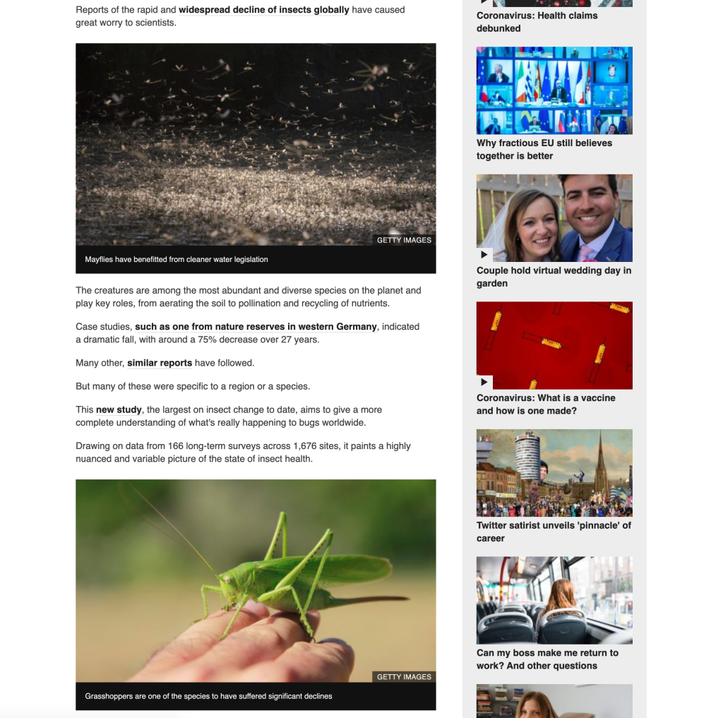
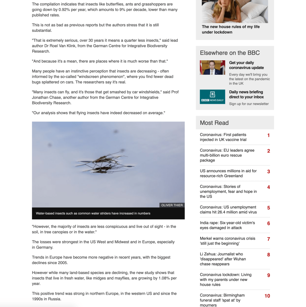
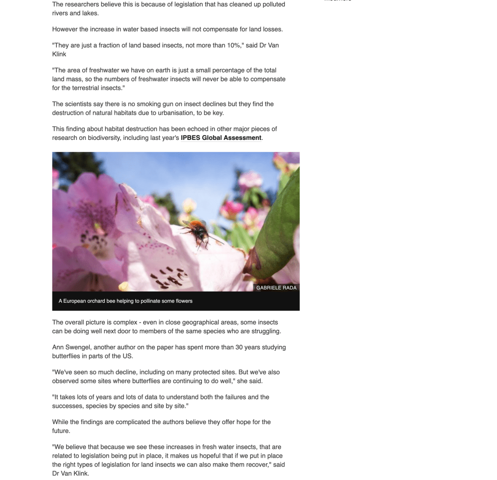
Images alternate from close up to aerial view, but mainly close up. This is probably dependant on the article, seeing as this one is tiny creatures it figures zoomed images would be most popular.
The evidence in the article is not from statistics. It seems the ‘proof’ is hyperlinks linking to other articles.
Article is central, with white space on the left, and hyperlinks to relevant articles (images and small headers, followed by just links) the viewer may be interested in on the right.
ABC News – Australia
(Australian Broadcasting Corporation)


Visual analysis:
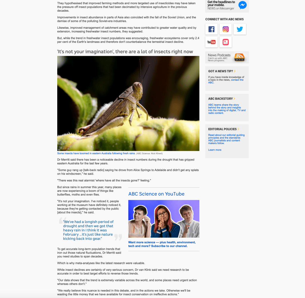
Header is bold, left aligned, eight words, sans-serif, black.
Symbols for print, email, and external social media sharing sites such as Tumblr, LinkedIn. “Share on Facebook” and “Share on Twitter” being text buttons – this is interesting they have singled out these two – are they the most popular platforms for viewers sharing articles?
Subheading of origin of article job title, and author’s name. Time article was released underneath.
Bursts of blue sentences which are hyperlinks to enlarge/pop out images.
Bold subheadings break up text, along with larger paragraph text.
The logo for the website is in caps, in a sans-serif typeface, with a spiral themed logo. This matches well with the article typeface.
The evidence in the article is not from statistics. It seems the ‘proof’ is hyperlinks linking to a science magazine, where members are only able to read the supporting evidence. Other links on the page direct back to the same article they are linked on. This is interesting – technically the same as BBC News in not being able to provide evidence of their statements in the article.
Text in 2-5 line sans-serif paragraphs, broken up with more blue hyperlinks.
Large quotation in brackets, in blue text to highlight important information to the reader.
Images support text, only three throughout article. This article is more text based but uses more variation; size of texts, bolds, colour, links etc.
There is no use of serif typeface on the article, at all.
Article is central, with white space on the left, and hyperlinks to relevant articles the viewer may be interested in on the right (images and small headers, followed by just links).
NYT – new York
(THE NEW YORK TIMES)


Visual analysis:
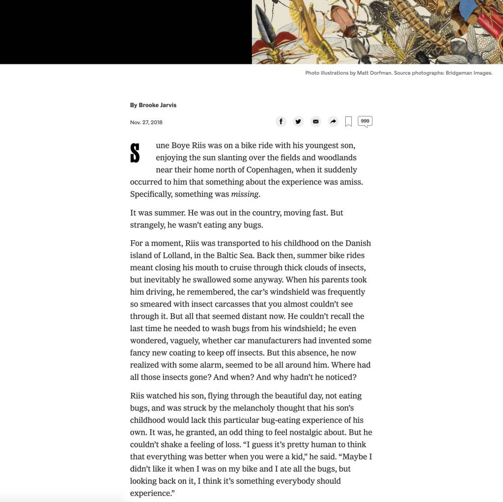
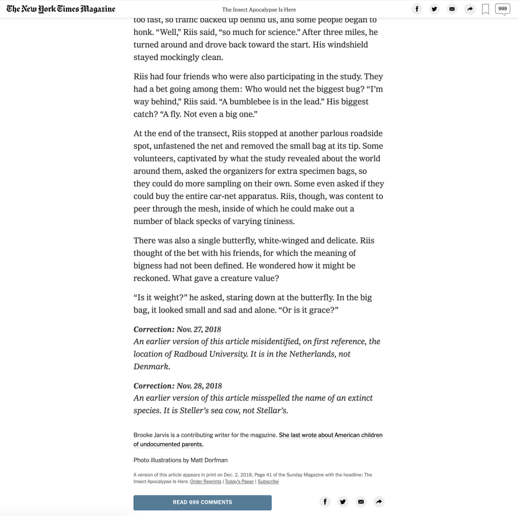
Heading is bold, serif and decorative, with question subheading in sans-serif. Both sentences are white with black background providing great contrast. The New York times logo for the website is very decorative.
Symbols for social media, sharing, login to NYT account and comments section, with the numbered total of comments inside the speech bubble.
Image is large scale, opening the article with artwork which looks creative and striking. There is contrast between text and the image.
I personally like the simplicity in the layout – the most important information is on the page.
There is a personal thank you to the viewer for reading, with a hyperlink “subscribe” which breaks up the paragraphs. This is clever – making the viewer feel valued before offering a subscription link.
Drop caps start the article. Paragraphs of serif text, left aligned and central fill the article.
There is a bold, centred, serif quote in the centre of two line breaks. This breaks up paragraphs of body text.
This article is also more of a personal story, spoken in first person narrative. It’s not designed to be targeted at someone who just wants a quick glance at the news, it’s for a reader who has a bit more time on their hands.
NOTE: I HAVE DECIDED NOT TO USE NEW YORK TIMES as I feel this IS NOT EQUAL IN TERMS OF CONTENT. In comparison to the BBC News and ABC News, both articles are typical, sharing facts, data and recent discoveries. The New York Times is basically a short story. I also wanted to pick a contrasting article in another language, so for these reasons I am picking the following:
DW News – Germany
(Deutsche Welle)
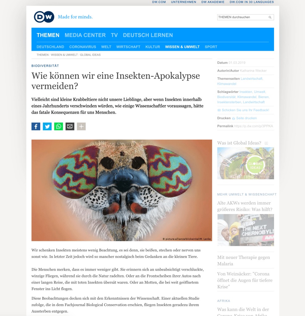

Visual analysis:
Heading is regular and in serif, with a relatively long (in comparison to other two) explanation of the article. The blue banner on the site reminds the viewers of their destination.
Symbols for social media are in block buttons, with an additional plus to extend the sharing options.
Image is large scale, opening the article with an instant image topic. The image presents an insect magnified – we would not be able to see this much detail with the human eye.
The sentences are easy to read, well spaced and the text has breathing room. This is probably down to the spacious serif typeface as well as sentence breaks.
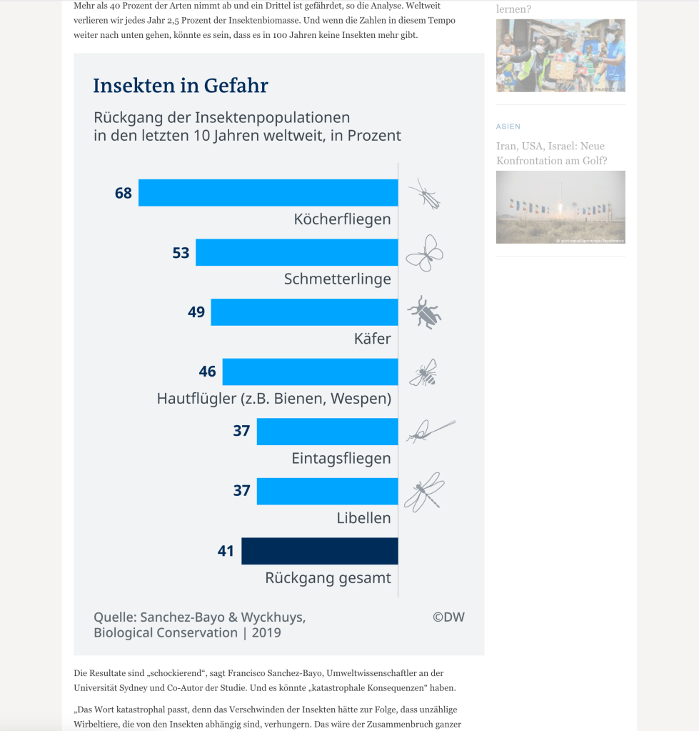
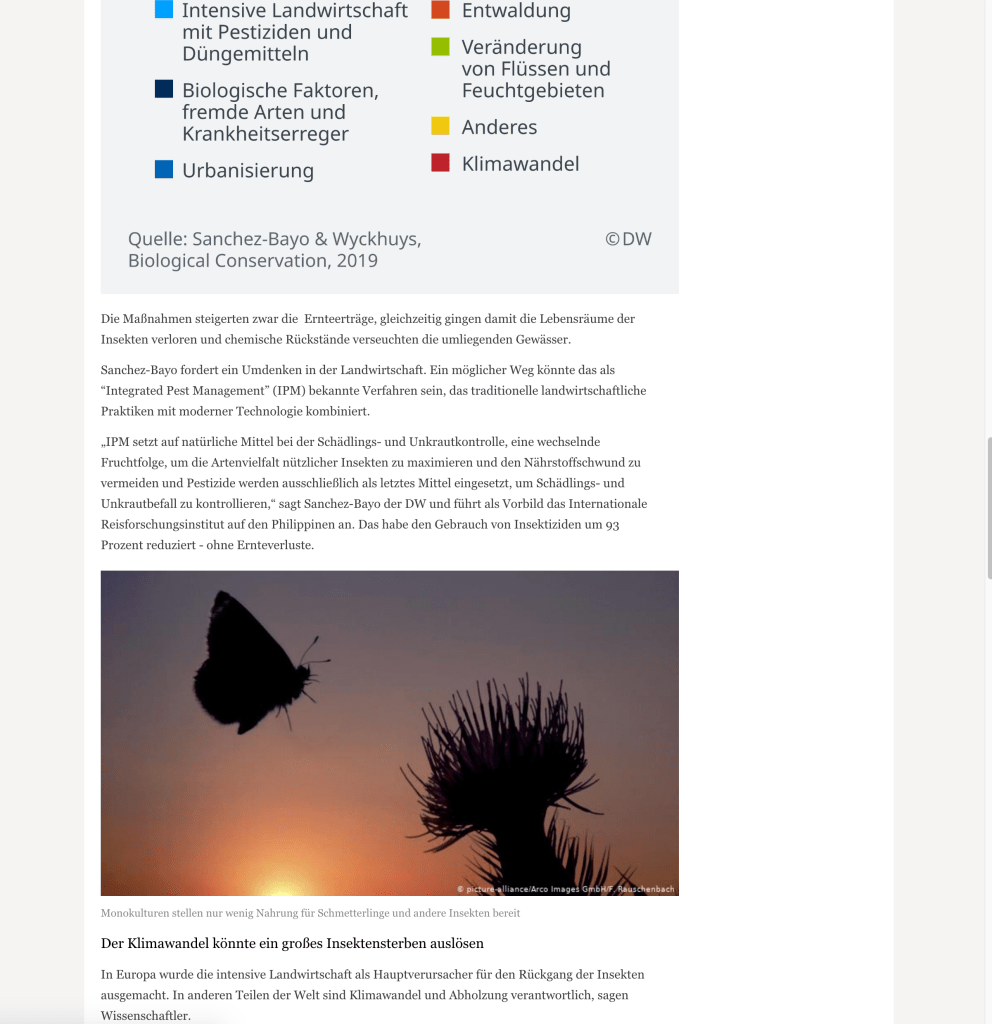
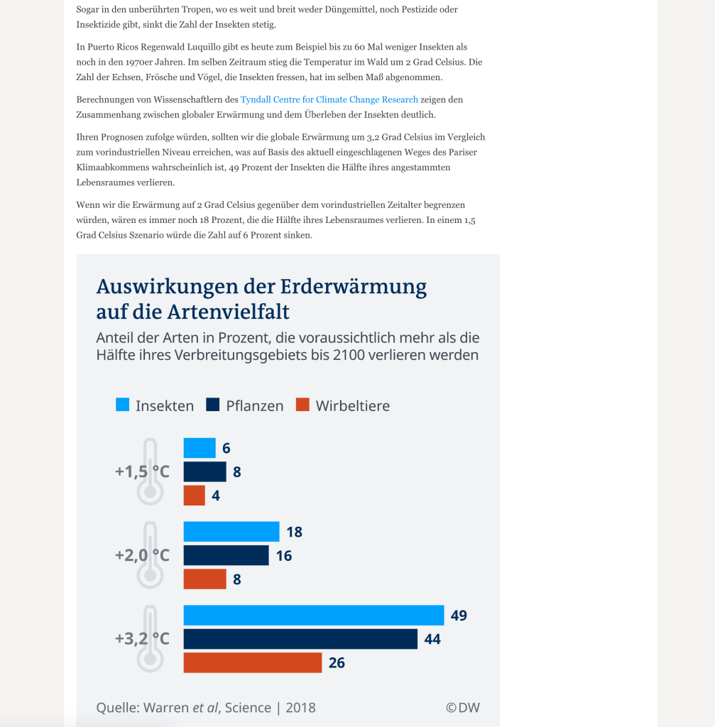
There are three data images out of the five images used in the article, it seems Germany readers rely heavily on statistics. The data comes from scientific research (as opposed to linking the ‘facts’ to other articles like the BBC News). There is also a link to a climate change research report.
Drop caps start the article. Paragraphs of serif text, left aligned and central fill the article.
There is a bold, centred, serif quote in the centre of two line breaks. This breaks up paragraphs of body text.
This article is also more of a personal story, spoken in first person narrative. It’s not designed to be targeted at someone who just wants a quick glance at the news, it’s for a reader who has a bit more time on their hands.
