
Reference Material
Part 3: Making Things Happen’, in Design, When Everybody Designs: An Introduction to Design for Social Innovation
- Companies have a much easier reach from people globally as opposed to 40 years ago when small companies only had the local audience. Customers were likely to have been the villagers or town people who lived nearby, or potentially tourists visiting the area. With the possibilities of a global online presence, small companies are able to have a larger consumer base.
- New trends have emerged from technology, however a distribution trend cannot be implemented without social innovation.
- SLOC scenario – small, local, open and connected approach to generate a vision of innovation and sustainable society.
- Replicating – every idea is a design of a new and locally appropriate solution using experts.
- Connecting – to create a connecting infrastructure, in order to coordinate a project.
- The modern day approach to collaboration makes them unique from the past due to globalisation.
- The network effect – the idea that one process will benefit all of the others. This is marketing.
- Community toolkits are designed to benefit a certain grouping of people through personalisation.
- Toolkits are being built to support both short and long term projects ranging across sectors. They must be set out clearly and they become fundamental to a design project. However, they are most effective when used as a group rather than individually.
- Social franchising is to promote collaboration – this is a toolkit designed specifically for the franchisees who can implement it locally.
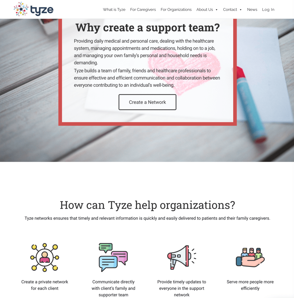
- Tyze – enabling caregivers to create, connect, communicate and coordinate a care team:
Graphic Agitation
Constructivist movement
“The movement emphasized building and science, rather than artistic expression, and its goals went far beyond the realm of art. The Constructivists sought to influence architecture, design, fashion, and all mass-produced objects. In place of painterly concerns with composition, Constructivists were interested in construction. Rather than emerging from an expressive impulse or an academic tradition, art was to be built.A new, Constructivist art would look toward industrial production; approach the artist as an engineer, rather than an easel painter; and serve the proletariat. Constructivists used sparse, geometric forms and modest materials. From paintings to posters to textiles, they created a visual language out of forms that can be drawn with utilitarian instruments like compasses and rulers. They placed visual culture under the microscope, analyzing materials like wood, glass, and metal, to judge them for their value and fitness for use in mass-produced images and objects.” – Source
Vladimir Tatlin
Painter, sculptor and architect
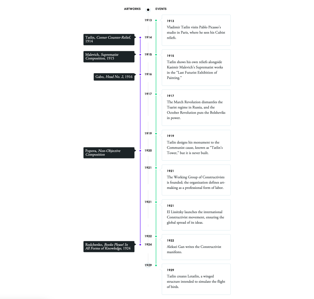
“The optimism Tatlin felt manifested most famously in his proposition for a massive tower called the Monument to the Third International. The name was a reference to the Communist International, a group that advocated for global communism. The tower was designed to be one-third taller than the Eiffel Tower, making it the tallest building in the world at the time. It would also be made of the most modern material, such as iron, steel and glass, and, being simultaneously practical and abstract, would represent the epitome of constructivist ideals.” – Source
The Monument to the Third International
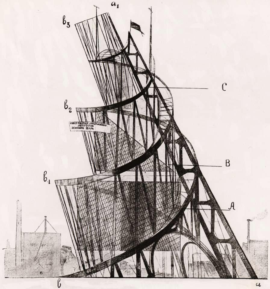
Attempting to overthrow architectural trends, Tatlin proposed to build the tower and for each room to move and rotate. The largest rotating once a year, the second largest rotating once a month, the third rotating once a week and the last rotating once an hour. Its purpose was to restore the Russian society after the destruction of revolution and war, and it served as a purpose for these artists to showcase Tatlin’s combination of modern materials, rational structure, and utilitarian forms. It was an important example of how artists could synthesise the historically disparate roles and forms of art, craft, and engineering to contribute to the formation of a new world.
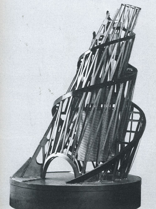
Varvara Stepanova
Painter, poet, set designer and costume designer
“The workers of the new world would live and play in the very best materials and designs: casual jumpsuits and overalls that drew on both traditional peasant clothing and the latest modernist artistic trends of futurism and cubism. Stepanova’s designs use dynamic shapes that emphasise the human body in action, with sharp angular forms, printed abstract patterns and contrasting colours: bold reds and blacks. Her clothes would enhance the flexibility and comfort of moving through the streets and the city, in the factory and on to the playing field, while unisex clothing patterns would no longer confine men and women to stifling gender norms.” Source
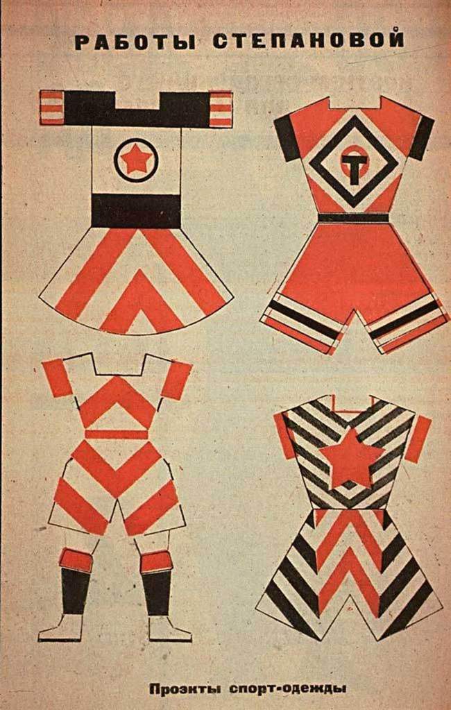
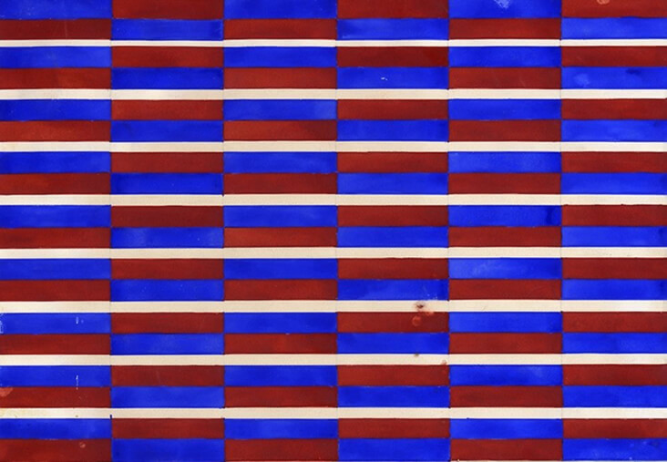
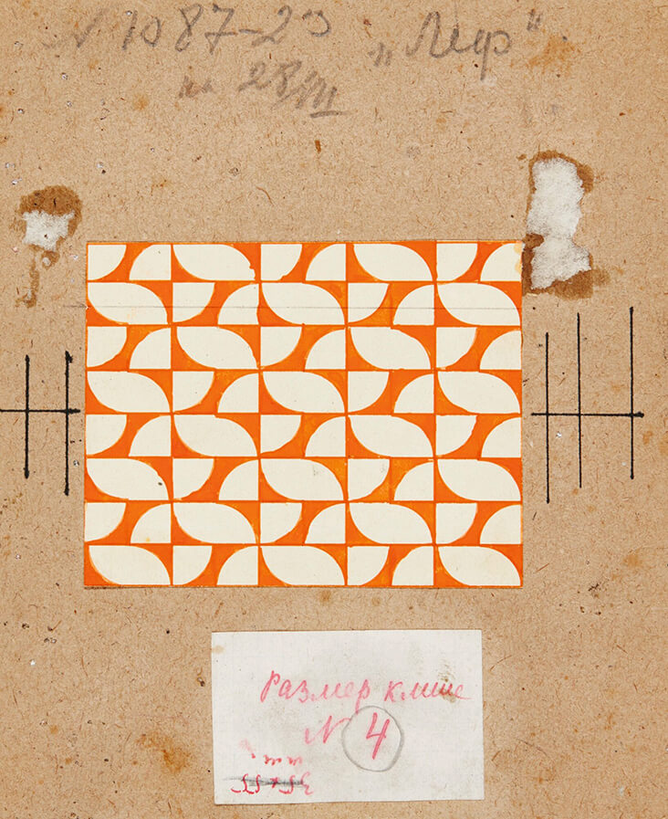
Textile designs from 1924:
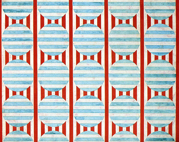
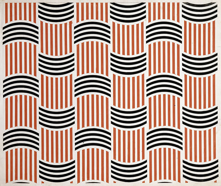
It’s clear these clothing patterns and textiles weren’t designed to be fashionable, they were designed for function. At the same time however I wouldn’t consider these military uniforms… They’re unique and define the constructivist approach through geometric forms and angular hemlines. These clothes are hard cutting, all about enhancing the edges of the garments and making them striking through bold, contrasting colour.
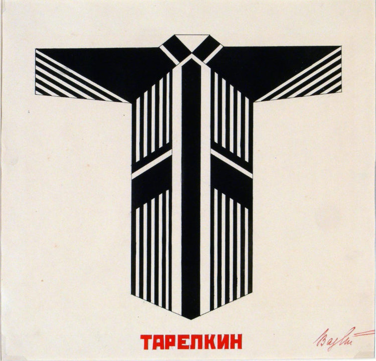
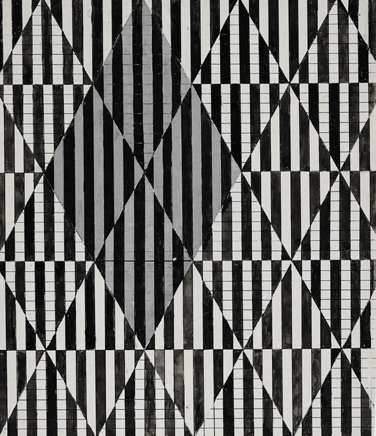
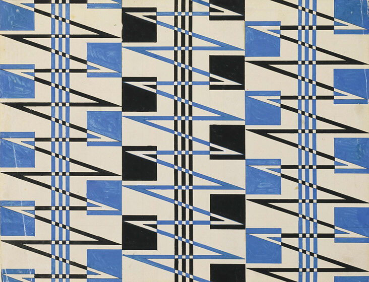
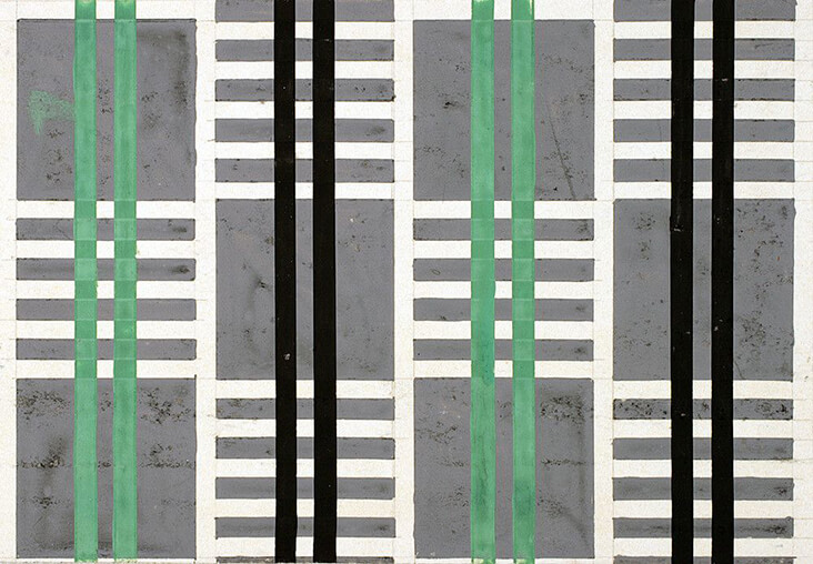
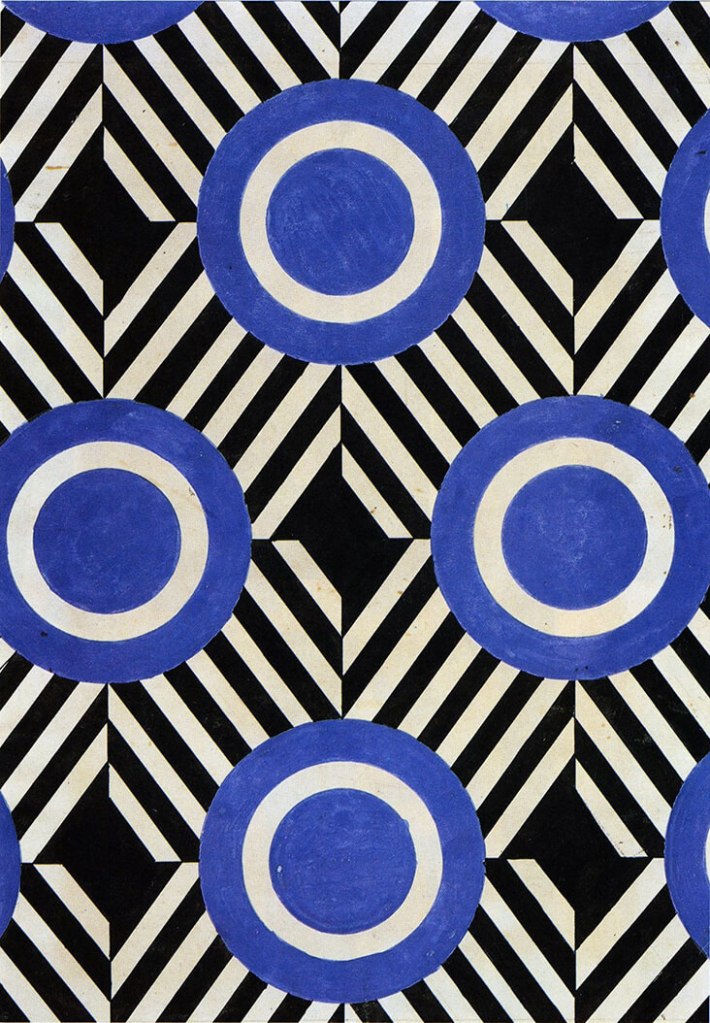
Ljubov Popova
Painter, set designer and textile designer
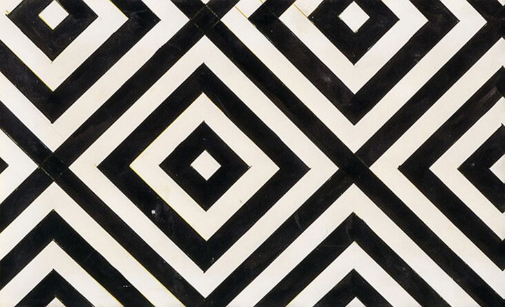
“Economic in style, her stylised designs echoed the refined geometry and ‘spatial force constructions,’ in her earlier paintings, but with a greater emphasis on flat forms, pared back colours and dazzling, eye-catching motifs. All designs were made by hand using stencils and rulers, prioritising a machine-made aesthetic. Popova particularly favoured orthogonal forms with a balanced, clear structure, including stripes, right angles and dazzling zig-zagged straight lines to create dynamism and energy, which were sometimes intersected with circles and triangles. The inclusion of black and white elements created even more drama and visual impact.” – Source
I really love the bold, angular and geometric forms that have happened as a result of the constructivist movement. Even though these would have been designed in the 20’s, I can still see them being modern… Timeless. Especially monochrome! They’re versatile and functional, exactly what the constructivists would have designed them to be.
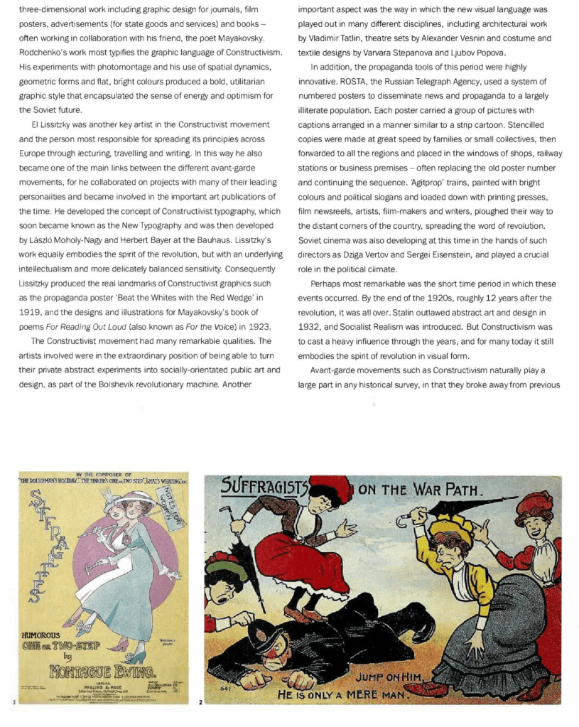
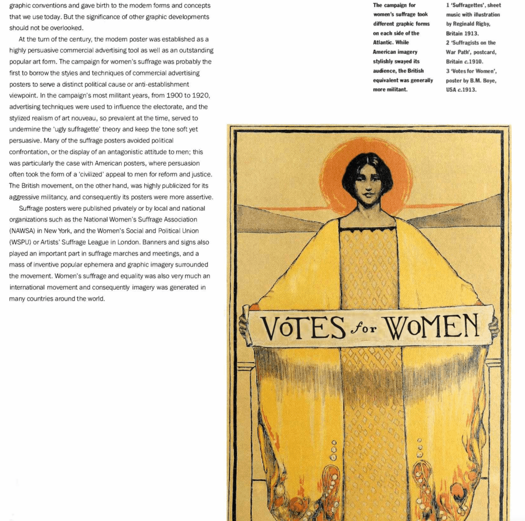
Suffrage posters – 1890 – 1919
From the references I wanted to use the mention of NAWSA (National Women’s Suffrage Association) and WSPU (Women’s Social and Political Union) as a springboard into some suffrage posters from this era.
“The posters also use colour schemes associated with the different suffrage groups; red, white and green was used to depict the more “peaceful” or constitutional suffrage movement, while white, green and purple were the colours of the militants. Another recurring theme, says Delap, is striving for something beyond the vote – the idea that the right to vote was not the only goal of the movement. Posters depict women as factory workers, university academics and more, to show how the movement would help improve working and education rights for women too. Fittingly, it was not until 1948 that women were allowed to become full members of Cambridge University, and graduate with full degrees.” – Source
Using a variety of tones, the suffrage posters were appealing to all. There were some posters that were peaceful and ‘pretty’ such as #2 below. Some posters were humorous, some appealed to middle class women (#3), some appealed to working class women (#1 and #4). The fight for women’s rights was a lengthy, political battle which did eventually become successful.
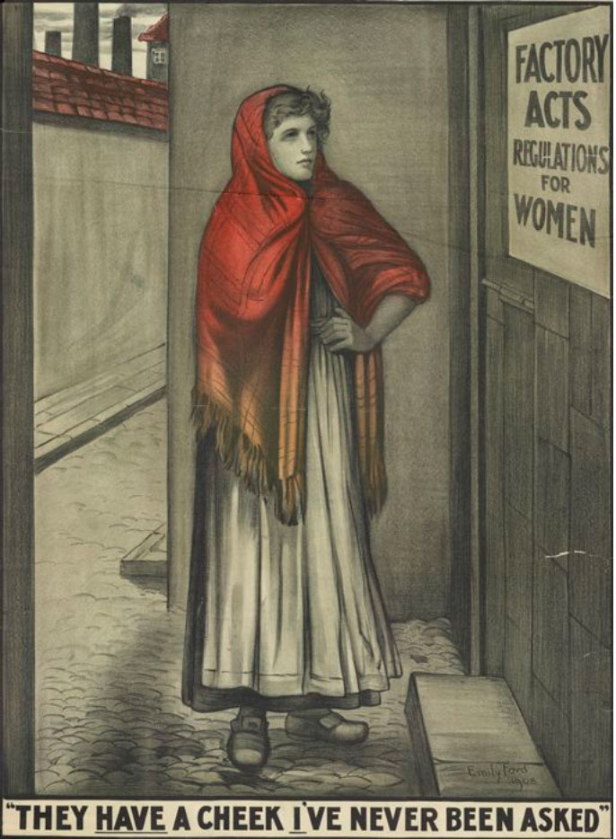
1 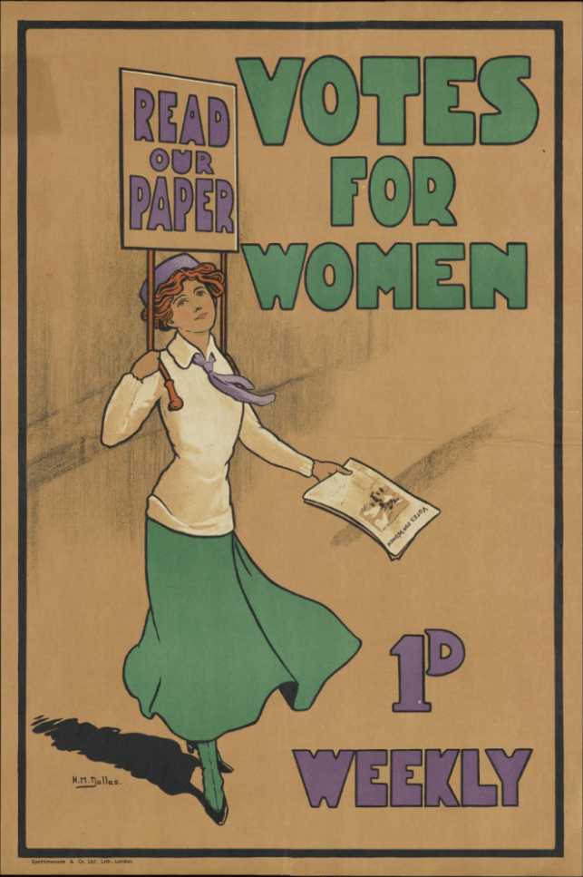
2 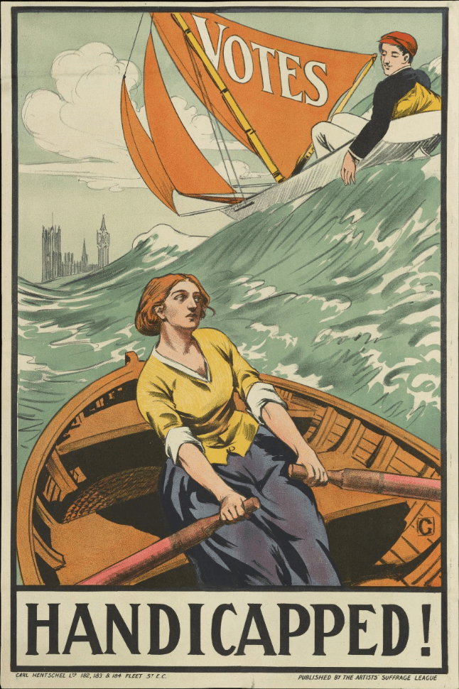
3 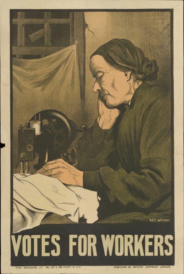
4
- Consumption versus conservation, industrial and economic expediency versus planning for the future, and government complacency versus popular protest or individual determination.
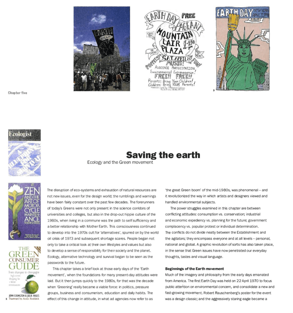
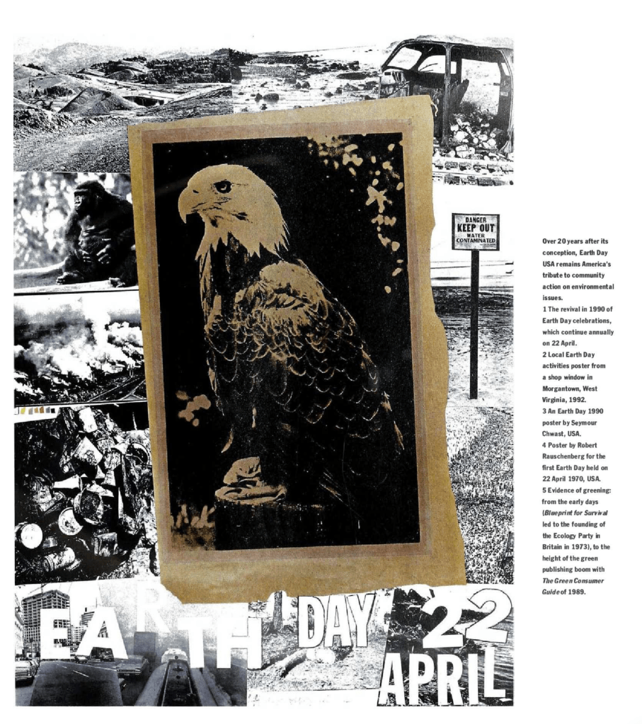
- The first Earth day was held 22 April 1970.
- The British ecology party formed in 1973 (the first in Europe) then the German Green art, Die Grunen 1983.
- Design for the Real World.
- UNICEF.
- The Greening of America 1970.
- E.F. Schumacher’s Small is Beautiful (1973).
- Rober Pirsig’s Zen and the Art of Motorcycle Maintenance (1974).
- The rise of left politics; freedom and change, including Greenpeace came into fruition in 1984.
- Greenpeace’s anti-fur trade campaigners 1985 “40 dumb animals” campaign.
- Live Aid rock concert July 1985 raised awareness around global issues and poverty.
- The media highlighted nuclear disasters as they knew it would be in demand, just like they still operate today.
- Changing the Face of America by Alaska Visual.
- Dying Waters by Judy Blame.
- Graphic designers began to sell ‘recycling’ and address their responsibilities to be eco friendly in the 80’s.
- Visualise the Future by Parco, 1992.
The acceleration of cultural change: from ancestors to algorithms
- AI still has a long way to go in terms of being at the same level of operation as the human brain. It doesn’t understand emotion which can sway a decision; it’s based purely from data.
- Interestingly, memory may be the answer to advancing humanlike artificial intelligence.
- Thinking about the future – will we ever hit the jackpot with AI or will it just keep advancing? Considering the global reach that AI would have, think of populations of people rather than individuals. How would it benefit them?
Some examples of very recent AI projects that have won the Red Dot Design award:
To benefit the office workers
Virtual personal assistant – Samsung
“The solution was developed to help office workers manage their time. Work prioritisation features like ‘Task Reminder’ use artificial intelligence to keep track of and organise users’ schedules, helping them stay on top of deadlines and tasks. VPA also eliminates repetitive steps that occur in everyday office processes; for example, simplifying the steps needed to share files or set up devices and communication systems. It also provides a predictive search system that helps users find the information they need quickly. In addition to its suite of time-saving features, VPA is also designed for global collaboration. It offers real-time translation and simultaneous document editing, which reduces potential miscommunication between teams around the world. This allows users to focus on more creative and high-value work.” – Source


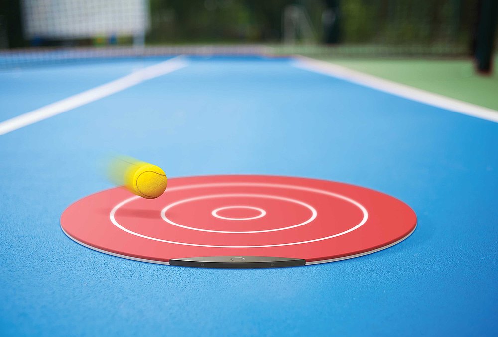
To benefit sport and athletes
Tennis mat – EMAMIDESIGN
“Tennis Mat is a silicone target mat that incorporates capacitive pressure sensors that measure the position and intensity of tennis balls that hit the mat, as well as visual sensors that measure the number of attempted shots. Data collected is automatically sent to a smartphone app, which evaluates the results and displays the information, allowing players to track their training and progress. The mat is double sided, allowing it to be used on tennis courts as well as other surfaces.” – Source
I think when the term “artificial intelligence” is mentioned people will automatically (myself included) associate it with robots. This stereotype is diminishing as AI is used for so many types of different technology, and it can be used to actually benefit our day to day working lives. Thinking about “Alexa” by Amazon for instance, how voice recognition can activate sensors that turn on music, the television or even our coffee machines for us. The question is; is it useful or is it just really lazy? This is precisely the point that the reference material above is trying to make. Will it just be something that exists but doesn’t really change the world? Only time will tell.
